Welcome to the e-Book Cover Design Awards. This edition is for submissions during November, 2017.
This month we received:
71s covers in the Fiction category
21 covers in the Nonfiction category
Comments, Award Winners, and Gold Stars
I’ve added comments (JF: ) to many of the entries, but not all. Remember that the aim of these posts is educational, and by submitting you are inviting comments, commendations, and constructive criticism.
Thanks to everyone who participated. I hope you enjoy these as much as I did. Please leave a comment to let me know which are your favorites or, if you disagree, let me know why.
Although there is only winner in each category, other covers that were considered for the award or which stood out in some exemplary way, are indicated with a gold star: ★
Award winners and Gold-Starred covers also win the right to display our badges on their websites, so don’t forget to get your badge to get a little more attention for the work you’ve put into your book.
Also please note that we are now linking winning covers to their sales page on Amazon or Smashwords.
Now, without any further ado, here are the winners of this month’s e-Book Cover Design Awards.
e-Book Cover Design Award Winner for November 2017 in Fiction
Rena Hoberman submitted The Runaway Train designed by Rena Hoberman of Cover Quill.


JF: A dynamic cover that has runaway appeal. Atmospheric and active, all elements are brought to bear to communicate the energy, intensity, the paranoia of the story.
e-Book Cover Design Award Winner for November 2017 in Nonfiction
James Egan submitted African-American Athletes in Arkansas designed by James T. Egan of Bookfly Design.


JF: A strong cover with great visuals and confident typography. Party of the beauty of this cover is the attention to detail and the rhythm established in the long column of type, and the depth of texture throughout the cover.
Fiction Covers
Alison Ingleby submitted Expendables designed by Jolly Creative Cover Designs. “My novel is a young adult dystopian thriller. It’s set in a future London and has two point-of-view characters, both of whom are featured on the cover.”

JF: Attractive if a bit dark.
Allovah D’Bone submitted A Dude vs Testicle-Monster! And Gay Stuff Happens. designed by Mindy D’Bone. “Inappropriate?”

JF: The design choices make it hard to tell whether it’s erotica or comedy.
Andrea Roche submitted Nights Arose designed by Andrea Roach. “The cover is a representation of my MC. This vivacious character has the ability to transcend as a spirit into the Astral Plane. I decided on a picture which would show her transformation into a spirit. The vibrant red lips are coated in sugar, representing she is the heiress to a sugar plantation.”

JF: An arresting image that needs much better type handling to really shine.
Anita Dickason submitted Going Gone! designed by Mystic Circle Books & Designs, LLC (Anita Dickason). “The stark reality of a kidnapped child is portrayed by a black/white image of a woman’s eye and a single tear on a black background. Time drives the desperate search. A red digital clock in the pupil accentuates the urgency of passing time. The title conveys loss and the fate of the children.”

JF: Looks pretty raw, and the typography is amateurish.
April White submitted Marking Time designed by Penny Reid.

JF: A decent cover but I would advise against having the dominant figure leading us off to the left because, even though it’s an ebook, the habit remains that we open the book from the right.
Arthur Bozikas submitted BANG AND BURN designed by Arthur Bozikas. “BANG AND BURN – Slang used by Intelligence Agencies for Demolition and Sabotage Operations”

JF: The murkiness robs it of needed contrast.
Barbara Studham submitted Under the Shanklin sky designed by Barbara Studham. “Not only did I write the book but I painted the cover picture by hand in acrylics. I have the original artwork hanging in my home. I decided it would make a great cover picture for my book Under the Shanklin sky.”

JF: It might, if you let a professional design the cover. Here the type is confused and the whole effect is underwhelming.
Brian Freyermuth submitted Demon Dance (The Sundancer Mysteries) designed by Mangal.

JF: Okay I guess, although I was struck by how passive the man’s posture is, particularly for a book with this title.
Cailee Francis submitted A Reverie of Flames (The Fae Souls Book 3) designed by Cailee Francis. “I designed my own cover for this book using art and fonts under license.”

JF: One of many demonstrations this month proving that hiring a cover designer is the best move for most authors. Here, the out of control colors and weird typography detract from the effect.
Cailee Francis submitted Cynthia and Eve: A Sexy Paranormal Adventure designed by Cailee Francis. “I designed this cover myself using stock art and fonts under license.”

Cindy Horrell Ramsey submitted Edge of Sanity designed by Cindy Horrell Ramsey. “The rose represents what the stalker repeatedly leaves for the protaganist. The dark center of this burning rose is representative of the dark tunnel of depression and insanity that the protagonist is struggling to avoid as her world swirls out of control like the edges of this rose.”

JF: The image is strong, but that static black panel kills whatever interest the cover might generate.
Dan Chabot submitted The Last Homecoming designed by Scarlett Rugers. “I provided Scarlett with a faded old b/w snapshot of the actual house depicted in my nostalgic, sentimental story, and asked if she could dress it up in Christmas trimmings with a bit of color. Did she ever! I have been extremely happy and flooded with compliments.”

JF: I agree. Even though the title is a bit quiet and the subtitle hard to read, the comfort and good feeling coming from the image reels us in.
Daniel Zadow submitted Pigeon designed by Daniel Zadow. “The negative space emphasizes the main central piece, which is the cube and the title. The white space represents something awaiting to be filled, like that of the action of quantum physics and particles waiting to inhabit a space. The reverse lettering ‘Pigeon’, is indicating a shift tangentially from a previous path of the protagonist within the story. The cube represents verisimilitudes once the negative space has come to be occupied, and in this case it is a number of masks used within that lifetime.”

JF: A record number of thematic ideas connected to very few elements. Whatever you think you are communicating, it’s not working. Unreadable, incomprehensible covers don’t interest readers or sell books (unless you already have millions of readers, of course).
Darja DDD submitted Where There’s a Will designed by Marushka from Deranged Doctor Design. “Mystery, Thriller & Suspense book cover design by Marushka from Deranged Doctor Design, Inspector Stone Mysteries, book 1”

JF: An effective series design (see 2 following) for these thrillers. The modern typography suits them perfectly, and note how the background images have been manipulated to allow the titles to be clear and readable.
Darja DDD submitted An Eye For An Eye designed by Marushka from Deranged Doctor Design. “Mystery, Thriller & Suspense book cover design by Marushka from Deranged Doctor Design, Inspector Stone Mysteries, book 2”

Darja DDD submitted A Perfect Pose designed by Marushka from Deranged Doctor Design. “Mystery, Thriller & Suspense book cover design by Marushka from Deranged Doctor Design, Inspector Stone Mysteries, book 3”

Darja DDD submitted Whiskey & Roses designed by Kitten from Deranged Doctor Design. “Thriller & Suspense cover design by Kitten from Deranged Doctor Design, The Xander King Series Book 1”

JF: This series uses the same font as the series above for the author’s name, but these covers have a completely different tone due to the classical font used for the titles and the dominant background graphics. And rather than the static tableaux in the first series, here the visuals are used to tell a dynamic part of the story. Both good.
Darja DDD submitted Vanquish designed by Kitten from Deranged Doctor Design. “Thriller & Suspense cover design by Kitten from Deranged Doctor Design, The Xander King Series Book 2”

Darja DDD submitted King’s Ransom designed by Kitten from Deranged Doctor Design. “Thriller & Suspense cover design by Kitten from Deranged Doctor Design, The Xander King Series Book 3”

Darja DDD submitted Masked designed by Milo from Deranged Doctor Design. “Science Fiction, Action cover design by Milo from Deranged Doctor Design, Superheros Undercover Book 1”

JF: Stylish and attractive.
Darja DDD submitted Lands of Dust designed by Milo from Deranged Doctor Design. “Science Fiction & Fantasy book cover design by Milo from Deranged Doctor Design, The Dying World Book 1”

JF: This strong series design depends on the central characters, backlit by exciting skies accompanied by nicely integrated title typography.
Darja DDD submitted City of Delusions designed by Milo from Deranged Doctor Design. “Science Fiction & Fantasy book cover design by Milo from Deranged Doctor Design, The Dying World Book 2”

Darja DDD submitted The Maker of Entropy designed by Milo from Deranged Doctor Design. “Science Fiction & Fantasy book cover design by Milo from Deranged Doctor Design, The Dying World Book 3”

Darja DDD submitted Queen Of Emeralds designed by Marushka from Deranged Doctor Design. “Historical Romance cover design by Marushka from Deranged Doctor Design, The Scottish Stone Series Book 1”

JF: An interesting historical romance series. This first title is the strongest, with well-placed figures and appropriate type. In the second cover the title is much weaker, and on the third it is disappearing into the background. and the characters seem much more tentative than where we started.
Darja DDD submitted The Amethyst Bride designed by Marushka from Deranged Doctor Design. “Historical Romance cover design by Marushka from Deranged Doctor Design, The Scottish Stone Series Book 2”

Darja DDD submitted His Tarnished Ruby designed by Marushka from Deranged Doctor Design. “Historical Romance cover design by Marushka from Deranged Doctor Design, The Scottish Stone Series Book 3”

Darja DDD submitted A Better Version Of Me designed by Marushka from Deranged Doctor Design. “Contemporary Romance cover design by Marushka from Deranged Doctor Design”

JF: Cute and sexy, well targeted to its intended audience.
Darja DDD submitted Falsies designed by Marushka from Deranged Doctor Design. “Contemporary Romance cover design by Marushka from Deranged Doctor Design, The Makeup Series Book 1”

Deborah Bailey submitted Once Upon A Princess: Two Paranormal Fairy Tales designed by Deborah A. Bailey. “This book includes two shifter paranormal romance novellas based on fairy tales. I knew the look I wanted, so I decided to design it myself. The woman on the cover is a character from, “Beauty and the Faun.” Her escape into the forest is what sets the story in motion.”

JF: Nice job. I sense there’s an even better balance that could be achieved with the type elements, but it works.
Ebook Launch submitted Genome designed by Ebook Launch.

JF: Draws us right into this underwater environment and adds the promise of mystery.
Ebook Launch submitted The Dragon Knight’s Soul designed by Ebook Launch.

Ebook Launch submitted Come Take Me designed by Ebook Launch.

JF: The creative title integrates perfectly with the whimsical tone of this cover. ★
Ebook Launch submitted Living the Good Death designed by Ebook Launch.

JF: Of course Death would have a pink smartphone, right? This amusing cover will stop just about anyone, and that’s already a win. ★
Ebook Launch submitted The Best Laid Plans of Mice designed by Ebook Launch.

JF: Although I usually advise simplicity in ebook covers due to the environment in which they are viewed, but here the complexity of the cover is its strongest trait. The maze attracts us piques our curiosity about the “oddd” tale.
Eeva Lancaster submitted The Patmos Enigma designed by Eeva Lancaster of The Book Khaleesi. “The Ossuary and the Book of Revelation are central to the story of The Patmos Enigma. It’s a religious mystery that starts with an archaeological find. I’ve designed Ken Fry’s 2 books in the same genre with a rocky background to signify antiquity and secrets unearthed/revealed. Hope you like it.”

JF: It’s a good cover but the very readable page that’s part of the background is a bit of a distraction.
Elaine Bossik submitted The Last Victim designed by Eric Bossik. “This is a cover design from an original oil painting.”

JF: Awkward.
Evelyne Labelle submitted Ask Me To Marry You designed by Carpe Librum Book Design. “Cover relooking for a whole existing series. Second one of 5. A modern vibe for the brand of a western historical romance.”

JF: A sensitive and workable series design, although I do think the titles could stand out a bit more.
Evelyne Labelle submitted Mail Order Deception designed by Carpe Librum Book Design. “Cover redesigned for a running western historical romance series. A modern vibe!”

Evelyne Labelle submitted The Blessed Bride designed by Carpe Librum Book Design. “First book of a new historical romance series set in California Gold Rush. Brides of Blessings focuses on the enduring strength of women as they travel west, following their families and their dreams.”

JF: A beautiful image composite that combines character, period, and landscape. The distinctive title completes the effect.
H.M. Shander submitted If You Say Yes designed by Ashlei Michel. “I wanted something to capture the romance of a winter setting.”

JF: The image is promising, but the type and layout are very weak.
Hanne Arts submitted Red Ribbons designed by Hanne Arts. “The book is concerned with a teenaged girl struggling to make her way out of the dark spiral of depression, eating difficulties and self-harm. The text on her wrist in the design symbolizes this self-harm and the kindness which she has to bestow upon herself to re-learn self-love.”
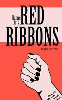
JF: Graphically strong and affecting.
J. P. Cane submitted Shadows Within designed by SKY Creative. “The cover concept comes from the moment when the hero first sees those black eyes in the mirror. The designer tried to make those eyes the focus, and with the help of the photographer and model, achieved that. The fleur-de-lis and Liberty Bells in the wallpaper reflect the story’s setting.”

JF: The creepiness element has been carefully controlled, and creates a compelling image.
Jade Zivanovic submitted Jasmine Sea designed by Steam Power Studios. “We used elements from the first books cover (Stationmaster’s Cottage) in this cover (i.e. the scroll from the first cover was mocked to look like the origami boat)”

JF: The delightful approach to the design of this cover brings a dimensionality you don’t see that often, and the one touch of color—the red ribbon—is a great cue to the thrilling romance inside. ★
James Egan submitted Blood Queen designed by James T. Egan of Bookfly Design.

JF: Beautiful typography highlights the passionate and mysterious woman beyond. ★
James Egan submitted Spectris designed by James T. Egan of Bookfly Design.
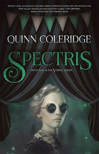
JF: An attractive color palette, and the composition with the curtains and banners emphasizes and points to the somewhat mysterious woman who is the center of the cover.
James Martin submitted The Boy Who Wanted Wings: Love in the Time of War designed by Glendon Haddix. “For this novel on the Polish Hussars at the Battle of Vienna, we chose the painting of a wonderful contemporary artist, Halina Kazmierczak.”

JF: With such a strong illustration, I’m surprised the designer used so much of the cover on green panels.
Jesse Hudson submitted The Prince of Eridu designed by Joseph Enmace. “I was shooting for something that would immediately evoke the ancient Middle East, so I settled on a theme similar to “The Lion Hunt” fresco from the palace of Asshurbanipal. I also wanted to convey the idea of ancient stories coming to life, which is why there is a live antelope beneath the stone.”

JF: The “coming to life” aspect is by far the most interesting part of this cover.
Jessie Talbot submitted Souls by the Sea designed by Sherry Soule. “Sherry Soule does great work. The genre of the book is light paranormal fantasy (witches) in a seaside town and the cover conveys the magical aspect and the setting perfectly. It’s aimed at a teen audience and Soule found a gorgeous cover model to convey that, too. Great job all around!”

JF: Thanks for submitting.
Jodie Seibert submitted East of the Sun, West of the Moon: A sci-fi retelling of Beauty and the Beast designed by Jodie Seibert. “I had to watch a few video tutorials online on Photoshop techniques to get what I wanted on this cover.”

JF: So you’re saying this is what you wanted? It lacks any design sense and the type is literally all over the place. Maybe start with some design videos.
John Kramer submitted Blythe designed by Don Wilson. “Blythe is an allegory on the spread of HIV/AIDS through society and the search for a cure. The cover, which includes a cross of even sides–symbolizing HIV positive–as well as the various rings, which are central elements in this story, are all captured in this striking cover by Don Wilson.”

JF: The cover is professionally designed, but I think you’re going to have confusion among people who will read the “cross” as a religious symbol and miss what you are trying to communicate.
Jonathan LaPoma submitted Understanding the Alacrán designed by TheBookDesigners. “The cover of Understanding the Alacrán shows a Mexican man holding a scorpion by its tail and presenting it to a volcano that looks like it could erupt at any moment (the volcano is Popocatepetl in Mexico). This relates to the book’s thematic content and tone. The photograph was taken by Pastor Soto”

JF: An evocative cover with great typography, but that silver seal is really distracting.
Joris Van den Bergh submitted Degrees of Darkness designed by MaryDes. “This book is about time traveling. That is why we’ve added the clock as a moon. The story plays in Savannah Georgia and we’ve integrated typical trees and buildings of that area.”

JF: The cover has a compelling eerie tone, and we want to just follow the woman down that path.
Kandice Iglehart-Jarrett submitted Deadly Desires: A Sweet Revenge designed by KANDICE.

JF: I see what you’re trying to do, but it’s not working because the cover looks fragmented and inartful.
Kandice Iglehart-Jarrett submitted Swiftly Taken designed by KANDICE. “It simply explains the journey of a young woman walking in her own shoes.”

JF: Has the virtue of simplicity, plus those killer heels.
Kat Michels submitted In a Time Never Known designed by A. Sutton. “A. Sutton took the photograph that is used as the main focal point, as well as designing the cover.”

JF: Graceful, if a bit static.
Kat Michels submitted Monsters in the Night designed by M. McCune. “M. McCune and I worked together to come up with the idea for this cover. She did all of the art work.”

JF: The artwork is charming, but the layout fails to capitalize on it and the title is very weak.
Kayleigh MacLeod submitted Heirs of Power designed by Oliviaprodesign.

JF: A beautiful and believable fantasy cover that highlights the heroine in action.
Kris Bailey submitted Save Them All designed by cal5086 (freelancer from Fiverr). “The bridge is an original photo of Deception Pass Bridge in Oak Harbor, WA. I found it with a Google search and emailed the photog for permission to use and he was all for it! He loved the finished product and I’ve gotten a lot of great feedback on the cover from writing groups online.”

JF: I like the way the bridge disappears into the fog.
Laura Hile submitted A Very Austen Christmas designed by Damonza. “Hats off to Damonza for creating an anthology cover that is both beautiful and uncluttered. That standout title is just amazing. As a thumbnail, this cover delivers!”

JF: The playful and holiday-themed title artwork is the best part of this cover, and the designer might have added some contrast so the faces of the two figures stood out more from the background.
M.L ruscsak submitted The New Reign designed by M.L ruscsak.

JF: There are the elements of a good cover her, but it would take someone with more graphic design sill to bring it together.
Paul Blake submitted Love In The Mind designed by Paul Blake. “A cover I made for a short story collection. I joined two images from Unsplash with commercial rights allowed and played with them to create the final look. The stories are speculative fiction so I wanted something that would remove it from the romance genre”

Peter Zelnik submitted Lilian designed by Ronil Caine.

JF: An evocative sci-fi cover enhanced by careful typography.
Randall Floyd submitted Remnant designed by Randall Floyd. “This is the 30th iteration of this book cover. I’m happy with it, but figure it could be a little lighter. I just hit the publish button after trying to get it right for so long. Thanks, Randall”

JF: The problem I have with this cover are the four strong lines running through it (the lightning, symbol, roofline of the building and that highlight across the bottom whatever it is) all at different angles and for different purposes. This makes any effort to “tweak” the details futile.
Rena Hoberman submitted The Prince of Korin designed by Rena Hoberman of Cover Quill.

JF: Classic elements and a dramatic visual make this cover stand out.
Scott Semegran submitted Sammie & Budgie designed by Keri Knutson. “Keri and I discussed three iterations of this cover. This version ticked all the checkboxes for me. I feel it truly is a work of art. When readers and bookstore owners see it, they fawn over it. I couldn’t be happier with this book cover.”
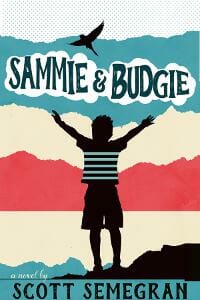
JF: “Fawning”? Really?
Stewart Raffill submitted Rage designed by Kit Foster. “Kit Foster the designer was able to create a cover that has the political feel that the reader encounters in Rage. He’s captured the military, Ohio class nuclear submarine, and the government that is integral to this political thriller.”

JF: It’s the skill of the designer that brings all these disparate elemtns together and imbues them with the politico-military feel.
Tamar Sloan submitted Make it Count designed by AM Designs.

JF: A striking image but the contrast color is a bit jarring.
Terri Bertha submitted Spooky Twisties II designed by Charlotte Volnek. “The book cover connects with the first story in Spooky Twisties II, but also has a connection to a story in Spooky Twisties I.”

JF: Fun and well organized.
Tony Moyle submitted Soul Catchers designed by Lucas Media. “When designing the cover we wanted to have some reference to the first book in the series (The Limpet Syndrome). The shards of glass covering the floor are the pieces of that cover. We wanted the two halves of the face in the apple to challenge the readers interpretation of good and evil.”

JF: The various elements here never come together into one cohesive whole.And those faces are way too small and subtle to have much impact.
Vikki Kestell submitted Tory, Girls from the Mountain, Book 2 designed by Vikki Kestell.

JF: The sophisticated air and smooth finish help make this cover attractive.
William Markham submitted Missing: A Mason Gray Case designed by James, GoOnWrite.com.

JF: The black areas at top and bottom frame the story elements quite nicely, and the type design is mostly spot on. ★
Yogesh Sharma submitted Rompimento designed by Yogesh Sharma. “A man standing alone near lake surrounded with high mountains as the book title suggest Rompimento aka breakup. You are surrounded with whole world but still feel alone. You have a pure heart like a pure lake water but still there is no one. You are all alone.”

JF: Nice image, but the cover looks unfinished.
Zoella Rose submitted The Space Between designed by Zoella Rose. “It is a moody, young adult mystery.”

JF: Great take on an alienation scene, but I wish the title had more visual clarity.
Zoella Rose submitted Among Spirits designed by Zoella Rose. “The fire treatment of the font is symbolic of hellfire.”

JF: Stylish and aspirational.
Nonfiction Covers
Aarti Patel submitted Picture It: Homeopathy designed by Aarti Patel, N.D.. “With this book, I wanted to make homeopathy more accessible to the modern reader or student. I wrote and illustrated the inside of the book and thought, hey, why not challenge myself to match the cover to the contents? So I designed my first cover.”

JF: With all respect, I believe you will reach many more people with your message if you put a professional cover on your book.
Alex Berger submitted Practical Curiosity: The Guide to Life, Love & Travel designed by Karolina Stankevičiūtė. “The challenge in crafting the cover was how to visualize the three key focus areas of the book: Life, Love & Travel in a way that was organic, had ample whitespace but didn’t feel too academic, romance/travel-oriented, or clinical. Color was chosen because it was neutral and complimentary.”

JF: It’s a lovely cover created with skill, but oddly subdued considering the “colorful” subject matter.
C. L. Hoang submitted Rain Falling on Tamarind Trees designed by Nick Zelinger. “Nick and I designed the cover together.”

JF: Again, a very subdued and static design for a book that promises a colorful journey. Seems like a mismatch.
Christopher Pesce submitted Shocked and Awekword: American Vernacular designed by Christopher T Pesce. “Every word, every image, every flaw — belongs to the author. Thank you for the opportunity to share my work!”

JF: Thank you for sharing.
Chuck Storla submitted Zen and the Art of Christmas Letters designed by Chuck Storla. “My humor book is tied to Christmas (obviously) so the ornament hanging off the “Z” makes that link along with the red & green used in the text. The first word is in the Kaushan Script font to make the “Zen” standout.The Sunday font is used for “Christmas Letters.””

JF: Yes, the Christmas theme comes through. The type might look better with more attention to the leading (interline spacing).
Inderjit Kaur submitted Transitions and Beyond designed by Inderjit Kaur.

JF: Visually disjointed, but the real problem is this cover tells us nothing about what’s in the book.
Jacqui Olliver submitted Doing This ONE Thing Will Change Your Life Forever! designed by Jacqui Olliver.

JF: To do this justice you would need to be a professional typographer. The awkwardness of the type drains the cover of impact.
Linda Bonney Olin submitted Now Sings My Soul—Readers Edition designed by Linda Bonney Olin. “A collection of new hymns and faith songs. While the stained glass window conveys “church” and “Christian,” its contemporary Tree of Life design suggests that the songs are modern and broad-minded. (Based on a chapel window created by Nel Bernard.)”

JF: The window and general concept are strong; the typography, equally weak.
N. J. Lindquist submitted Christmas with Hot Apple Cider: Stories from the Season of Giving and Receiving designed by N. J. Lindquist.

JF: Delightful, and fully in the holiday spirit. ★
Rebecca Brockway submitted Miss Matched at Midlife: Dating Episodes of a Middle-Aged Woman designed by Alan Pranke.

JF: Looks like an uncomfortable combination of contemporary fiction and memoir.
Simeon Davis submitted Dwelling in the Mirror: A Study of Illusions Produced by Delusive Meditation and How to Be Free from Them designed by Brother Simeon Davis. “This was difficult, and the first version of the cover was simply the title text over the mirror, which did not correctly convey the genre. When it occurred to have a ghosted meditator reflected in the mirror, it seems more appropriate and better conveyed the subject matter. I welcome your thoughts.”

JF: A good effort, but I think you’ve interpreted the cover much too literally. What is the mirror—with its magical ability to reflect an image of another world—a metaphor for in the story?
Steve Fata submitted The Perfect Business : Master the 9 Systems to Get Control, Work Less, and Double Your Profit designed by Steve Fata.

JF: Clean and to the point, and that makes it effective for this genre. ★
Steve Fata submitted The Humility of Christ: The Cornerstone for Spiritual Transformation designed by Steve Fata.

JF: Perfectly appropriate for this market.
steve fata submitted Light Without Shadow : The Sound of Your Silence Holds All of the Answers designed by Steve Fata.

JF: A pretty picture, but the author doesn’t want us to know what the book’s about. Strange.
sunny lockwood submitted Cruising The Mediterranean designed by Parker Wallman. “Thanks for the chance to get some feedback… sunny”

JF: Although the artwork is attractive the composition and the type handling need a lot of help.
Ebook Launch submitted The Uber Fights designed by Ebook Launch.

JF: A very effective way of visually capturing the forces arrayed against the upstart Uber. Clean and professional. ★
Well, that’s it for this month. I hope you found it interesting, and that you’ll share with other people interested in self-publishing.
Use the share buttons below to Tweet it, Share it on Facebook, Plus-1 it on Google+, Link to it!
Our next awards post will be on January 22, 2018. Deadline for submissions will be December 31, 2017. Don’t miss it! Here are all the links you’ll need:
- The original announcement post
- E-book Cover Design Awards web page
- Click here to submit your e-book cover
- Follow @JFBookman on Twitter for news about the E-book Cover Design Awards
- Check out past e-Book Cover Design award winners on Pinterest
- Subscribe to The Book Designer Blog
- Badge design by Derek Murphy


