Welcome to the e-Book Cover Design Awards. This edition is for submissions during May, 2017.
This month we received:
84 covers in the Fiction category
18 covers in the Nonfiction category
Comments, Award Winners, and Gold Stars
I’ve added comments (JF: ) to many of the entries, but not all. Remember that the aim of these posts is educational, and by submitting you are inviting comments, commendations, and constructive criticism.
Thanks to everyone who participated. I hope you enjoy these as much as I did. Please leave a comment to let me know which are your favorites or, if you disagree, let me know why.
Although there is only winner in each category, other covers that were considered for the award or which stood out in some exemplary way, are indicated with a gold star: ★
Award winners and Gold-Starred covers also win the right to display our badges on their websites, so don’t forget to get your badge to get a little more attention for the work you’ve put into your book.
Also please note that we are now linking winning covers to their sales page on Amazon or Smashwords.
Now, without any further ado, here are the winners of this month’s e-Book Cover Design Awards.
e-Book Cover Design Award Winner for May 2017 in Fiction
Carissa Galloway submitted Biome designed by Carissa Galloway. “In a genre overwhelmed by dark covers, chunky text, neon pops of color and no space for the eyes to rest, we wanted to do something different. Biome’s imagery was procured from a spanish fashion designer’s Tron-inspired photoshoot featuring her original creations from 2011.”
JF: Nice! The arresting, surrealistic image stops us in our tracks, and when combined with apt typography makes this one a winner.
e-Book Cover Design Award Winner for May 2017 in Nonfiction
Francis Shaw submitted Breadcrumbs: A Collection of Spiritual and Philosophical Essays designed by Kit Foster. “All the essays in the book have ‘journey’ as a common theme. The fist includes reference to Hansel and Gretel. Hence the Breadcrumbs link.”
JF: Artfully gets the point of the stories across by blending illustration with type that we “follow” along the winding trail. Well done.
Fiction Covers
A. P. Hubbard submitted The Laundromat at the Edge of the Universe designed by A. P. Hubbard.

JF: Love the title, but the cover is weak, and putting white type on a light background guarantees that it will be hard to read, like your title.
Alexa Rowan submitted Winning Her Over designed by Sarah Hansen of Okay Creations. “Sarah Hansen of Okay Creations designed this wonderful cover for the first book in my BigLaw Romance series, Winning Her Over. It captures the playful feel I wanted for this multi-cultural contemporary romance and creates a sense of movement that (hopefully) draws in the reader. I love it!”

JF: Expertly done, and it has a peppy energy that’s very attractive. Note how the tilted type provides a dynamic “platform” for the interaction between the two people at the top.
Alexandra Brandt submitted The Etruscan Mysteries designed by Alexandra Brandt. “Adventure story set in the late 1700’s with supernatural elements. I tried to convey “fantasy” and “adventure” through a scene from the story plus font choices, while making sure it looked historical. Did I succeed? (Also it’ll be a series, so I set up some series branding.)”

JF: Well put together, with good font choices and great artwork. Not sure about that blue color though.
Alexandra Brandt submitted Illegal Upload designed by Alexandra Brandt. “A cyberpunk adventure, very fast-paced and full of bright colors, so I tried to make sure the cover reflected that. Purple is a color associated with one of the protagonists.”

JF: Fun and exciting with solid typography that relates to the genre, and an interesting way to integrate the silhouette into the cover. ★
Amanda Linehan submitted Uncover designed by Amanda Linehan. “This cover is for a YA suspense novel.”

JF: Well done. Unlike a lot of the effects we see applied to titles, the gentle ghosting here really heightens the air of mystery.
Anita Belli submitted The Art Forger’s Daughter designed by Charlie Peacock. “Image is a detail from an original painting ‘The Letter Writer’ by David Skynner”
JF: A good piece of art, but the overall layout and typography are very weak.

Barbara Plum submitted The MisFit–The Early Years designed by Patty G. Henderson. “I wanted a dark, brooding mood evoked on the cover. I also requested that the reader not see the character’s face. My cover designer, Patty G. Henderson, definitely came through for me.”

JF: Visually interesting, but the book is described as a crime thriller and the cover looks like sci-fi?
Caleb Meyer submitted The Junkyard Kids designed by Matthew Ryan.

JF: Murky and indecipherable.
Crystal Marcos submitted Bartholomew Buggins: A Zombie with Different Cravings designed by Marie Marcos.
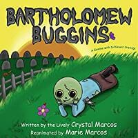
JF: That’s one cute zombie.
D. Pierce Williams submitted The White Light of Tomorrow designed by James Egan. “The story follows a knight and his squire on an adventure in a universe where Earth’s former colonies have regressed to a feudalistic state, people living among surviving relics of ‘ancient’ technology. I think James at Bookfly Design captured it very nicely. Thanks for your consideration! -DPW”

JF: A lovely and engaging cover that draws us into the light, and into the story.
Damon Freeman submitted Seeds of Hatred designed by Damonza.com.

JF: A strong composition with lots of story elements and an almost magnetic attraction. Note how the designer leads us past the dark figure right to the lighted entryway. What an invitation.
Damon Freeman submitted Savage designed by Damonza.com.

JF: Great combination of the title and the artwork. Here all the focus is on the confrontation at the center of the cover, a very strong design.
Damon Freeman submitted Body of Work designed by Damonza.com.

JF: In this cover the effects applied to the type become part of the background illustration, leading to a very integrated and powerful design.
Damon Freeman submitted Cold Lake designed by Damonza.com.

JF: Stunningly effective, with every element helping to communicate the tone and promise of the story inside. ★
Damon Freeman submitted Dark Mountain designed by Damonza.com.

Damon Freeman submitted Asper designed by Damonza.com.
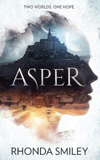
JF: A pretty amazing combination of images but I’m not sure there’s just too much packed into it, sacrificing some clarity.
Damon Freeman submitted Suitcase Girl designed by Damonza.com.
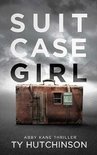
JF: Beautifully balanced, clever, and with great typography. ★
Dan Pahnke submitted Us: An Intimacy Innovation designed by D. Pahnke. “The book is a novel infused with a practical relationship guide. The bright red large heart and silhouetted lovers instantly establishes the genre. That the book goes beyond mere escapist entertainment is stated explicitly by the “More than” qualifier and the sentence on “sustained togetherness”.”

JF: What I see is a bunch of dissociated elements, oddly inappropriate imagery, and way too many words, ending up a cover that’s confusing and artless.
Dan Van Oss submitted Synapses designed by Dan Van Oss.

JF: A strong genre cover.
Dan Van Oss submitted The Wedding Stipulation designed by Dan Van Oss / CoverMint Design.

JF: The background treatment adds atmosphere to this cover, which is highlighted by the tension in the fonts shifts of the title typography.
Dan Van Oss submitted Girl With A Secret designed by Dan Van Oss / CoverMint Design.

JF: A well designed cover, but I’m not sure the lighted window isn’t working against the optimal eye path.
Dan Van Oss submitted Primal Deception designed by Dan Van Oss / CoverMint Design.

JF: An expert and emphatic cover for this suspense thriller, with a twist on the silhouetted figures we see so often.
Dane Low submitted Sattler’s Woods designed by EbookLaunch.com.

JF: A terrifically atmospheric image accompanied by careful typography, and the sensitive color balancing helps to hold it all together.
Dane Low submitted Brother Wars designed by EbookLaunch.com.

JF: Fun, and the perspective on the title helps emphasize the active subject of the artwork.
Darja DDD submitted Keep Away From The Heat designed by Marushka from Deranged Doctor Design. “Romance, Multicultural & Interracial book cover design by Marushka , from Deranged Doctor Design. Keep Away From The Heat (A Warning Labels Novel).”

JF: A genre series design that knows exactly what appeals to its readers.
Darja DDD submitted No Relationship Required designed by Marushka from Deranged Doctor Design. “Romance, Multicultural & Interracial book cover design by Marushka , from Deranged Doctor Design. No Relationship Required (A Warning Labels Novel Book 2)”

Darja DDD submitted Edge of Atlantis designed by Milo from Deranged Doctor Design. “Mystery, Thriller & Suspense, book cover design by Milo, Deranged Doctor Design Book 1: Legacy of Atlantis”

Darja DDD submitted Betrayal designed by Milo from Deranged Doctor Design. “Science Fiction & Fantasy, book cover design by Milo, from Deranged Doctor Design Pathways of Fate Book 1”

JF: There’s an ethereal quality to this illustration that’s perfectly matched by the antique looking type and frame.
Darja DDD submitted Perfection Unleashed designed by Milo from Deranged Doctor Design. “Science Fiction & Fantasy Design, book cover design by Milo, from Deranged Doctor Design. Perfection Unleashed (Double Helix Book 1)”

JF: Colorful but the woman’s posture makes it a bit static.
Darja DDD submitted Perfect Betrayal designed by Milo from Deranged Doctor Design. “Science Fiction & Fantasy Design, book cover design by Milo, from Deranged Doctor Design. Perfect Betrayal (Double Helix Book 2)”

JF: This one makes a much clearer statement.
Darja DDD submitted Perfection Challenged designed by Milo from Deranged Doctor Design. “Science Fiction & Fantasy Design, book cover design by Milo, from Deranged Doctor Design. Perfection Challenged (Double Helix Book 4)”

Darja DDD submitted Yesterday designed by Kitten from Deranged Doctor Design. “Science Fiction & Fantasy,book cover design by Kitten, from Deranged Doctor Design The Bridge Book 1”

JF: The clock images tell us it’s a time travel story, and the back-to-us figure leads us there.
Darja DDD submitted The Colony designed by Milo from Deranged Doctor Design. “Post-Apocalyptic, Dystopian book cover design by Milo, from Deranged Doctor Design. Rasper Book 1”

Darja DDD submitted Dead Leaves, Dark Corners designed by Kitten from Deranged Doctor Design. “Horror , Anthologies, book cover design by Kitten, from Deranged Doctor Design”

JF: A terrific cover with great type handling and an amazing image, completely compromised, in my opinion, but the black bar at the top. Why not put it under the author’s name?
Deborah Camp submitted Solitary Horseman designed by Patricia Schmitt. “I was looking for something that was different from the usual “couple clutch” found on western romance novels. It took some doing, but Patricia came through for me and this cover speaks to the moods of loss and loneliness I want to convey.”

JF: Nicely done, especially that beautiful horse.
Deborah Coonts submitted Lucky Break designed by Andy Brown.

JF: Charming.
Dedra Stevenson submitted Desert Magnolia designed by Rodney Harper. “The cover design reflects the juxtaposition of the two cultures of the Middle East and the American South. Since this theme is at the heart of the book’s plot, the design really works.”

JF: The Middle East is apparent, the south not so much. The type choices and positioning could be improved—a lot.
Dedra Stevenson submitted The Revenge of the Blue Jinni designed by Rodney Harper. “This is the first of my fantasy fiction trilogy and the cover really reflects the Middle Eastern, “Genie in a Bottle” flavor of the novel.”

JF: Good elements, but if you softened or eliminated some of the “grass” the gravy boat would stand out more. Also, please look up the meaning of “kerning” so you can get rid of that bit space between the “T” and “A” in the title.
Dedra Stevenson submitted The Skinwalker Resurrection designed by Sheika Bin Jarsh. “The cover designer read the book and came up with the design based upon her impression of the story, and her feelings about some of the inspirational pictures of Navajo culture that she was provided with. The book is largely about a Navajo folk horror legend, and the cover really captures this.”

JF: Uh, maybe, but the lack of contrast dulls the whole image, and it looks like the type was intentionally made into an exercise in illegibility.
Del Henderson submitted The Unicorn Hunter designed by Del Henderson Jr. “The Unicorn Hunter is the story of a man’s desperate search to find the truth behind his daughters tragic death. This cover captures the mystery of this tale as it unravels the dark reality of a commonly favored mythological creature.”

JF: A non-cover that completely lacks impact.
Douglas Debelak submitted The Ghostwriter’s Wife designed by Michelle Arzu. “The Ghostwriter’s Wife is the sequel to The Involuntary Ghostwriter. There are many references to erotic dreams of a mysterious woman in both books. One thread of the first book is entirely from the Ghostwriter’s perspective. The second focuses on the wife’s perspective.”

JF: Is that what it looks like when you have an erotic dream? I find that completely believable.
Ellie Douglas submitted Fear Inducer designed by Ellie Douglas.

JF: Another non-cover. I would strongly suggest hiring one of the wonderful cover designers whose work you see here. Some of them are quite reasonably priced.
Greg Roensch submitted Breakfast with the Alien and Other Short, Short Stories designed by Aimee Stevland. “Thanks for your consideration.”

JF: An interesting cover with an expert illustration that works much better on the paperback version of the book.
H.G. Chambers submitted Recreance designed by Rob Joseph. “Thank you for reviewing this work”

JF: The beautiful illustration does most of the work by showing the theme of the story very expressively for this sci-fi/fantasy title.
Haley Reed submitted False River designed by Staci Whitworth. “Staci captured the barren loneliness the main character feels, but also the brightness of hope and new growth, as seen in the apple. She used water imagery throughout the silhouette to represent the story setting, and the theme of renewal and redemption. Thank you for consideration, Haley Reed”

JF: The image composite is clever, but the overall effect is cold, brutal, and confused from the gratuitous font switches.
Hilary Murray submitted Far Side Of The World designed by Diana Buidoso. “A dream of a new life. The pull of the old.”

JF: A lovely cover that emphasizes both character and story equally. I was disappointed I couldn’t find out anything about the designer, which seems odd.
Ima Erthwitch submitted First Hunt designed by Ima Erthwitch. “Treya steps into unknown and strange territory when she signs up to be a bounty hunter. The blue background represents portals to another realm. She has turned her back on a life she hopes to leave behind forever.”

JF: The cover shows a strong design sense, but weak execution. To make better covers you will need to improve your skills or collaborate with a pro.
Jack Lewis submitted Storm Coming – A novel of the Civil War in western Virginia designed by Jack Lewis. “Cover created using Mac Pages. Image from a painting by Edwin Forbes in 1864 titled “Cavalry Orderly, Rappahannock Station, Va.” commissioned by the Federal government to sketch and paint live scenes during the Civil War. Painting once belonged to J.P. Morgan. Gifted to Library of Congress in 1919.”

JF: Tip for authors: the tools and processes you used, the source of your illustrations are all irrelevant when it comes to evaluating covers intended for the marketplace. This cover is more “assembled” than designed, and among other things, the incongruence between the implication of the title and the “happy blue” color used is jarring.
James Egan submitted Impulse Spy designed by James T. Egan of Bookfly Design.
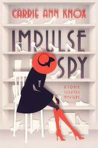
JF: Charming cover for this cozy-spy-mystery with a fun and saucy style.
James Egan submitted The Complete Revanche Cycle designed by James T. Egan of Bookfly Design. “Cover for the box set of books 1-4 in Craig Schaefer’s Revanche Cycle series.”

JF: A great solution for a box-set cover, combining images from all four books into one, beautifully textured, whole. ★
Jean Gill submitted Fortune Kookie designed by Jessica Bell. “This is Book 2 of Looking for Normal, a series aimed at teen readers so a branded look is important.”
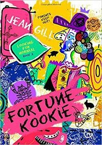
JF: A delightful departure from the usual book cover design, and one that may well delight your intended audience. Fun!
Jeannie Wycherley submitted Crone designed by Jennie Rawlings. “I asked Jennie for something that would stand out from the crowd, as horror cover designs tend to be quite dark. I also wanted something that unnerved the viewer. This design, which embraces the forest and the antagonist at the heart of the story, is genius! It both draws you in and repulses you.”

JF: I agree, it stands out and accomplishes something difficult, “It both draws you in and repulses you.”
Jeff Bolinger submitted Shanghaied: Escape from the Blackwolf designed by Carey Fessler. “Omar Aranda (illustrator) & Grant Slaney (title). Children’s novel 9+. Revealing the setting inside and out. The kids may be in the control room, but they hardly look in control of the situation. The submarine is shooting a torpedo to look more menacing and set the tone and the stakes.”

JF: I think you had a good idea, but here the images seem dissociated and the composition is awkward.
Jennifer Froelich submitted A Place Between Breaths designed by Jennifer Froelich.

JF: An effective combination of images, and the focal point of the man is enhanced by the framing device along the edges. You didn’t need the cute letter flipping in the title.
Jim Cliff submitted Bad Memory designed by Jim Cliff.

JF: Gets the job done.
Jordon Greene submitted To Watch You Bleed designed by Paramita Bhattacharjee (Creative Paramita).

Jorge Pelegrin submitted DEATH IS ONLY AN ILLUSION designed by J. PELEGRIN. “The cover suggests an alternative Planet in the Parallel Universe, showing a Galaxy full of stars and Planets, featuring a special one, with a Fiction/Reality banner. Simple but suggestive, with a unique lettering and types.”

JF: The “lettering and type” is not unique, and the font choice seems wildly inappropriate. It would be a better cover with stronger typography.
Karen Bryson submitted Only the Pretty ones designed by Tony Bryson.

JF: Is she supposed to be criminal, or angry? The type combinations are very awkward and hard to read.
Kate Stead submitted The Little Green Boat designed by Chris Stead. “In each Willy Nilly adventure he is the focus of the cover with different elements and backgrounds that relate to the current adventure.”

JF: Lovely, looks like fun.
Kevin Flanders submitted The Inhabitants – Origins designed by Kevin Flanders & Brandi Doane McCann. “This is my book cover “The Inhabitants – Origins”. Thank you for your consideration Kevin Flanders”

JF: A very strong image that has rendered the title almost irrelevant.
LJ Evans submitted my life as a country album designed by Ally Evans. “Cam relives her life growing up with Jake through their summers at the lake. Diving, swimming, and sharing life’s major milestones. They try to valiantly to reclaim their Polaroid moments of color and passion while life continues to pull at the fabric that is them.”

JF: Cute idea, not sure it has resulted in a book cover that will attract readers.
Lyn Horner submitted Capturing Gabriel designed by Kim Killion. “This cover illustrates danger and romance in a land of jungle and mountains, with mystery suggested by the ethereal woman in the background.”
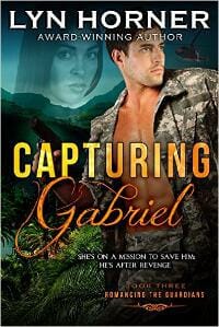
JF: This series (see the 2 following) uses some elegant textures and interesting image composites, but the juxtapositions of the heads seems strange, and the proliferation of type elements amidst so much image data overloads the covers.
Lyn Horner submitted Decoding Michaela designed by Kim Killion. “Mystery and an island romance fraught with danger are portrayed on this cover, with colors of a glowing sunset over water.”

Lyn Horner submitted Rescuing Lara designed by Kim Killion. “This cover expresses a sense of mystery, adventure and romance, setting a tone and format for successive book covers in the series.”

M. B. Gibson submitted Harps Upon the Willows designed by Panagiotis Lampridis. “Harps Upon the Willows is set in 18th century Ireland when the landowners tormented commoners, often to the point of starvation. For his part in supporting a secret agrarian society, a local priest is tried, convicted, and executed on trumped-up murder charges. This is based on a true story.”

JF: Excellent layout and imagery, but it’s undermined by type that’s fading into the background and the unnecessary use of 3 fonts for the 4 words of the title.
Mariah Sinclair submitted The Buckeye designed by Mariah Sinclair. “WWII Historical Fiction… one of the reasons I love designing historical fiction covers is the opportunity to research type. The title is in the beautiful Corvinus, released in 1934 and popular during the 40s and 50s.”

JF: Thank you, Mariah. Corvinus is classy and useful display face, and your cover shows it well.
Mark Matthews submitted Garden of Fiends: Tales of Addiction Horror designed by Zach Mccain. “The cover has received tremendous accolades. “Garden of Fiends” is the title of one of the novellas featured inside, and the cover highlights the garden variety of substances inside. The terror on the face of being trapped by all these substances captures the tone. The earthy colors match the theme.”

JF: Great solution for the challenge of an anthology cover, although I do find the very classical, almost sedate title a little underpowered for the theme of the collection. ★
Mina Chara submitted Hero High: Figure In The Flames designed by Marina Charalambides. “This design was for the first in a series of books about superheroes and reality TV and because all superheroes defend their city, the cover was intended to be a portrait of that city, a complete contrast to the dark, brooding cityscapes of gritty superhero films with an upbeat, optimistic feel.”

JF: When I finally scrunched up my eyes enough to make out the subtitle, I was astonished, in the midst of the snowy scene, to read “Figure in the Flames.” Huh? This cover makes no sense on any level.
MJ Logue submitted Babylon’s Downfall: 1644 designed by Rosemary Tree Press. “Sixth in the series with linked cover themes.”

JF: A lot going on, but it works, and the background textures are lush and absorbing.
Nancy Pennick submitted 29 designed by Matt Pennick. “Thanks for acknowledging covers! My son did a great job on my book covers, and I’d like him to get some recognition. This is a four book series. He came up with the idea for each cover to have a main character from the story on front with their own color.”

JF: Matt did a great job with this minimalist cover (to go with your minimalist title) that focuses us squarely on the empathetic character.
Pippa DaCosta submitted The Heartstone Thief designed by Bookfly. “James at Bookfly was given the brief of Grimdark fantasy complete with an insane sorceress and ‘action’ elements. I think he pulled it out of the bag ;)”
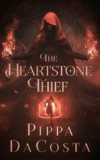
JF: Terrific combination of images that has us running, along with the protagonist, straight at the danger. Combined with careful typography, a strong and effective cover. ★
Priya Prithviraj submitted I Still Remember designed by Angela Jose.
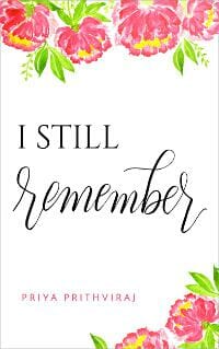
JF: The lovely use of hand lettering helps this cover stand out.
Rachael Brownell submitted Sticks & Stones designed by Marisa Shor. “Sticks & Stones deals with the sensitive subject of bullying. The tagline “Sticks and stones may break my bones, but my past does not define me” is a play on words that ties in with the story. As it pertains to the cover, she’s holding a stick and her emotions are written all over her face.”

JF: Too bad we can’t see her face, then. Craftmanship is good, but the font and color choices render the title virtually nonexistent.
Rachael Tamayo submitted Claim Me (Friend-Zone book 3) designed by Melissa Miller.

JF: Might be an interesting visual, but the font choices and typographic layout are non-starters.
Rita Toews submitted The Scholars designed by Rita Toews.

JF: Sensitive typography elevates this cover, but the stock image doesn’t seem to have been manipulated at all, making it similar to other books using the same art.
Rita Toews submitted You Don’t Need a Prince to Lead a Charming Life designed by Rita Toews.

JF: Cool. Love the frog king, and although I cringe just a little at all the fonts used in the title, this cover works well.
Robin Helm submitted Understanding Elizabeth designed by Damonza. “Since the book is a Regency romance, I wanted the look of a miniature. Chess games between my main characters were instrumental in bringing them together, and the resigned king shows that he capitulated to her. Her expression displays her confusion, as he rejected her the first time he met her.”

JF: Touches all the bases.
Roman Blair submitted The Island of Echoes designed by Roman Blair.

JF: Very pretty, but does it really tell us anything about the genre of this book or the story inside? Simply no hook at all.
Sanja Gombar submitted The Believers designed by Sanja Gombar.

JF: Okay, but all that glass in his face makes me skittish.
Sanja Gombar submitted Geliebter Geist designed by Sanja Gombar. “The task was to design cover for love story about a lonely and lost woman around 35 with not so nice husband who moves into a new house and falls in love with a ghost who resides there. Feel should be that it´s a quiet story, no erotic involved and little bit spiritual.”

JF: It creates the right atmosphere, but on covers with complex image combinations, adding something like the birds on the right detracts from the impact.
Terry John Barto submitted Nickerbacher designed by Kim Sponaugle. “Nickerbacher is a dragon and aspiring comedian who travels to La La Land to audition for The Late Knight Show.”

Thomas Burchfield submitted Butchertown designed by Cathi Stevenson/BookCover Express. “Once again, Cathi Stevenson knew what I was thinking before I thought it. The location of this 1920s gangster novel is a character in itself and its grim face beautifully portrayed here in all its desolation.”

JF: It communicates the desolation very well.
Ty Mitchell submitted The Color of Love designed by CreateSpace. “The cover has the main character, Daisy, in black and white. She’s a painter so she has brilliant paint strokes across her eyes. The idea is love is color blind. On on one level this addresses race, which is in the book, but on another level it can also address blue and pink (a person’s sexuality)”

JF: An interesting idea, but the typography is much too weak to create a good balance.
Nonfiction Covers
Aarti Patel submitted The Art of Health designed by Pixel Studios. “This e-book cover came together exactly as I imagined in my mind, with a synergistic image of nature, health, and art.”

JF: And the color palette is just right for the subject of the book.
Anthony Bryson submitted The Trump Card designed by Tony Bryson.

JF: Emphatic and well positioned, but the layout makes all the elements feel squeezed in, and a defter hand here would have been an improvement.
C. Hope Clark submitted The Best of FundsforWriters, Vol. 1 designed by Shaila Abdullah. “This is the first in a series of FundsforWriters how-to type books, drawing from 18 years of newsletters and website aiding writers to become successful in their efforts to become professional.”

JF: Great to see Hope publishing some of the content from her endlessly useful newsletter, and I think the designer hit just the right note to reflect the homey and practical tone of the publication.
Cristina Dior submitted The Healing Wound designed by Cristina Dior. “In print, people respond to the cover design with a gasp and awe. When I first released it, I was inundated with people sending me photos of the book… yet it doesn’t seem to be translating to on-line sales. i’d love your honest review!”

JF: I don’t find it very impressive. Your friends may be responding to the heightened emotion in the photo, but the rest of the cover leaves a lot to be desired and is pretty obviously not the work of a professional.
dame DJ submitted Downsize to Freedom designed by dame DJ. “The cover was my real photo on my iPhone in central London as I wanted to capture simple classic architecture/irony then splash it with yellow to make it contemporary. I worked with Okomota who is a young Greek man on Fiver (he charged $35.00) as we did several reviews to get the balance right.”

JF: Effective, and both the color choices and classical type handling help.
David Bookbinder submitted Paths to Wholeness: Fifty-Two Flower Mandalas designed by David J. Bookbinder. “The cover image is one of 52 in the book, each associated with an inspirational quote and a matching essay. The cover image is associated with the chapter “Grace.””

Dustin Renwick submitted Pens, Plows, & Gunpowder: The Collected Works of J.P. Irvine designed by Cara Willenbrock. “J.P. Irvine wrote most of his poems and essays about the U.S. Civil War and life in the country afterward. The cover needed to convey the opposing themes of war and peace.”

JF: Lovely cover for a history, with font choices that allude to the period and a burnt map to suggest the violence of war. ★
Elena Newton submitted The ONE Habit designed by Elena Newton. “Thank you in advance for your feedback!! You have a great eye and your feedback is always helpful.”

JF: The clean look and direct approach will appeal to business readers, but the tiny graphic inside the “O” is unreadable at this size, and I wonder if you really needed that vertical rule next to the title.
Gregory Edward Flood submitted God: A User’s Manual designed by Gregory Edward Flood. “About the cover: The border represents the frenzy of the world. My metal centerpiece represents my rational, no-nonsense fix for it. And the review quote suggests that the book is a whole lot of fun to read.”

JF: Of course we can’t read the review quote at this size, but the emphatic look will help the cover stand out. We are so used to seeing books with “God” in the title feature clouds and swirly fonts, this cover succeeds by working against the norm.
Justin Trosclair submitted Today’s Choices. Tomorrow’s Health: Small steps to improve health, food choices, and exercise. designed by Rob Williams. “For the last few years I have been the sole American in a small China city delivering chiropractic adjustments in a hospital. The cover incorporates the national colors of Red and Yellow and the design is inspired from traditional 1300-1700 Chinese door designs and common decoration patterns.”

JF: Clean and effective, with great textures from those decorative patterns.
Kathleen Flanagan submitted Dancing Souls: The Call Book One designed by NZ Graphics.

JF: Some very nice elements that, taken together, create a visually confusing cover.
Michael Eli Vineberg submitted The Love Metric designed by Vila Design. “The cover represents the task of returning home to one’s heart. I love the visual movement toward the heart, created by having it off-center, with the path and the title balancing above and below.”

JF: I might quibble with the kerning of the word “Love” in the title, but the cover does a good job of highlighting both the themes and aspirations of the book, partly by smart use of colors.
Michelle Smith submitted My Life As A Mermaid designed by Carolinavlucero (mermaid drawing) Karoline Cover type, spine, and back. “Hello, Thank you for your time! I used fivver for my cover design.”

JF: This is a “channeled” book which may account for its fiction-like look. The mermaid is the chief draw, and the cover highlights the drawing well.
Randy Ellefson submitted Creating Life (The Art of World Building, #1) designed by Milo at Deranged Doctor Design. “This series is about how to do world building in SF/fantasy, so I wanted an open book on the cover to suggest that the reader can fill their stories with better ideas as a result of reading this series. Not sure they’ll get that but the result is good.”

JF: A terrific combination of images that, by showing both the creation of the world, and one of its inhabitants, creates real excitement. ★
Rebecca Demarest submitted Roots and Wings designed by Rebecca Demarest. “This memoir is by a young Greek-American woman about her journey through PTSD and the way her heritage and theater/dance facilitated her recovery. In this design, I strove to strike a balance between the classical Greek imagery that plays a large part in the book with a modern and hopeful feel.”

JF: Colorful and attractive.
Sanja Gombar submitted What Really Happened in Medieval Times: A Collection of Historical Biographies designed by Sanja Gombar. “This was re-design for the What Really Happened stories. I try to make here eye-catching and simple design to represent the story.”

JF: The cover has a warm tone and does represent the era well, I just with the title type had the same clarity.
Simeon Davis submitted Spiritual Benefits of a Vegetarian Diet designed by Simeon Davis. “For this I wanted to make things very simple, easily readable on Amazon. A simple san serif font for both title and author, simple graphic, and a halo over the vegetables to imply the spiritual aspect.”

JF: Makes the point, although it’s all a bit “raw.”
Well, that’s it for this month. I hope you found it interesting, and that you’ll share with other people interested in self-publishing.
Use the share buttons below to Tweet it, Share it on Facebook, Plus-1 it on Google+, Link to it!
Our next awards post will be on July 24, 2017. Deadline for submissions will be June 30, 2017. Don’t miss it! Here are all the links you’ll need:
- The original announcement post
- E-book Cover Design Awards web page
- Click here to submit your e-book cover
- Follow @JFBookman on Twitter for news about the E-book Cover Design Awards
- Check out past e-Book Cover Design award winners on Pinterest
- Subscribe to The Book Designer Blog
- Badge design by Derek Murphy


