


By Joel Friedlander
Welcome to the e-Book Cover Design Awards. This edition is for submissions during January, 2020.
This month we received:
46 covers in the Fiction category
7 covers in the Nonfiction category
Guest Judge
 We are once again pleased to welcome Tanja Prokop to The Book Designer as a guest judge this month. Tanja was born in Germany, but lives and was raised in Croatia. Her three beautiful daughters and her amazing husband are her biggest inspiration in life. She has an MA degree in German language and literature and philosophy. A few years ago she started her own design company and became a professional book cover designer. She designs covers, and is constantly creating new visual experiences for her clients. Tanja is also a multiple winner of various book cover design contests and has created thousands of covers. You can find her pre-made covers at Book Design Templates, or visit her site at www.bookcoverworld.com.
Comments, Award Winners, and Gold Stars
I’ve added comments (TP: ) to many of the entries, but not all. Remember that the aim of these posts is educational, and by submitting you are inviting comments, commendations, and constructive criticism.
Thanks to everyone who participated. I hope you enjoy these as much as I did. Please leave a comment to let me know which are your favorites or, if you disagree, let me know why.
Although there is only winner in each category, other covers that were considered for the award or which stood out in some exemplary way, are indicated with a gold star: ★
Award winners and Gold-Starred covers also win the right to display our badges on their websites, so don’t forget to get your badge to get a little more attention for the work you’ve put into your book.
Also please note that we are now linking winning covers to their sales page on Amazon or Smashwords.
Now, without any further ado, here are the winners of this month’s e-Book Cover Design Awards.

e-Book Cover Design Award Winner for January 2020 in Fiction
James Egan submitted Right to the Kill designed by James T. Egan of Bookfly Design.

TP: Powerful, appealing and perfectly done! The typography is amazing and just right! This is a true winner if you ask me.
e-Book Cover Design Award Winner for January 2020 in Nonfiction
Megan Griswold submitted The Book of Help: A Memoir in Remedies designed by Jessie Sayward Bright.
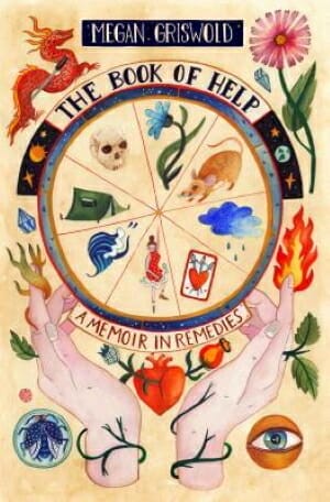
TP: This is a very appealing cover design. All features are in communication and work well together. Nice job!
Fiction Covers
A.E. Stanfill submitted Children Of The Cursed designed by Next Chapter Publishing.

TP: At first sight you can tell that every element is exactly where it should be. Maybe the title could be more emphasized by using different effects. Other than that, a nice cover design.
Alex Carter Emerson submitted Bloodstained Skies: The Hostile Alliance designed by David Henry. “The cover shows the most important moment in this story, the battle that will change everything. I wanted an original design instead of stock photos. The new “Mad Max” movie and the planet Arrakis from “Dune” were my inspiration, that’s why I’ve chosen a mix of brown, yellow and orange.”

TP: The illustration is very powerful. I think that this cover has a lot of potential. I would love to differentiate the title from the subtitle and author name by changing the size and placement. The font itself works, but it is unclear what the title and what the subtitle is. Also, I would avoid placing any textual parts from edge to edge.
Amala Benny submitted Living Lime designed by Mayflower Studio.

TP: The imagery is very powerful and appealing! If you drop a bit of shadow under the title and subtitle, it would be more visible, which is pretty important. Nice job.
Darja DDD submitted Watch Over Me designed by Marushka from Deranged Doctor Design. “Mystery, Thriller & Suspense cover design”

TP: The image is powerful and the message is clear. The typography makes the difference between a solid and a great cover. This is a great cover! Simple, strong and powerful. ★
Darja DDD submitted Blood Cartel designed by Milo from Deranged Doctor Design. “Young Adult Fantasy book cover design, Kat Drummond Book 2”

TP: This is again a very powerful series created by Milo. Amazing fonts, placements and colors. Great job! ★
Darja DDD submitted Darkness Beckons designed by Milo from Deranged Doctor Design. “Young Adult Fantasy book cover design, Kat Drummond Book 5”

TP: Strong and appealing! Well done!
Darja DDD submitted Lost Huntress designed by Milo from Deranged Doctor Design. “Young Adult Fantasy book cover design, Kat Drummond Book 6”

TP: Again, vivid colors and scenes. A perfect combination of typography and imagery. You can’t go wrong by using Milo as your designer.
Darja DDD submitted All At Stake designed by Milo from Deranged Doctor Design. “Post-Apocalyptic book cover design, Lights Out in Vegas Book 1”

TP: A well-done series design with recognizable design elements.
Darja DDD submitted Double Or Nothing designed by Milo from Deranged Doctor Design. “Post-Apocalyptic book cover design, Lights Out in Vegas Book 2”

TP: Again, a great cover design with mighty images that go along with the title and the whole series.
Darja DDD submitted Fighting Chance designed by Milo from Deranged Doctor Design. “Post-Apocalyptic book cover design, Lights Out in Vegas Book 3”

TP: This is my favourite design in this series. Overall, amazing work!
David Madison submitted The Aim Is Song: Listen—How It Ought To Go designed by David Madison. “The title derives from Robert Frost’s “The Aim Was Song.” “Song” is composed of elements of music notation. The “S” is a treble clef reversed, the tail of which serves as the “L” of the subtitle; the “O” is a whole note; the “N” is an eighth-note pair; and the “G” is an upside-down quarter note.”

TP: The cover looks interesting and the idea behind it is very good. Sometimes covers are a bit too crowded because we want to show too much. The main purpose of a cover design is to appeal the reader to pick it up. You should never have to read the explanation of what you are looking at, unless it’s something abstract. As I said, the idea is very good, but maybe the typography should be a little bit better placed and sized. But overall, interesting.
David Madison submitted The Witch of Sulphur Mountain: The Supernatural Life of Agnes Baron, Meher Baba’s Beloved Watchdog designed by David Madison. “The title and subtitle being lengthy, I kept the font simple and large on a color-contrasted gradient background illustration so they would be as legible as possible in thumbnail. The yellow font of the title symbolizes the color of sulphur; the white subtitle mirrors that of the moon.”

TP: When a designer has such a large title to work with and on top of that, the title needs to be visible in thumbnail size, this is probably the best you can do. The color contrast is very good and the cover overall is appealing, which is good. A solid cover design.
Elizabeth Bell submitted Lost Saints designed by James T. Egan. “My designer and I had to follow the branding of the first book in the series using a new color. Half the novel takes place in the American South and half in the American West. In addition to signifying the chapters set among the Cheyenne Indians, the two bison symbolize two particular characters.”

TP: An amazing cover design!
Fleur Hamill submitted The Little Red Rosebud designed by F.L.Hamill. “All illustrations are simple watercolors by author designed to create a gentle feeling to match the story. Intended to evoke magic and wonder in children whilst encouraging them to use their imagination.”

TP: I think that this cover has a lot of potential, but the typography could go in another direction in order to make the title more visible and vivid.
I.M Redwright submitted The Sapphire Eruption designed by Joe Bousema. “The blue colors and the mermaid represent the Queendom of water, where the action happens. The orange color and the phoenix represent the Kingdom of fire where the story begins. Both main characters were chosen by the spirits of a sword, therefore the name of the series.”

TP: I truly love the illustration and the appeal of this cover design. The font choice if very genre-appropriate and I think that this cover is truly beautiful! ★
Ihor Tureha submitted Animal Kingdom: Riot designed by MiblArt.

TP: A very interesting cover design. The typography is perfect and the whole cover looks amazing in combination with the illustration. ★
Ihor Tureha submitted The Healing Mendez designed by MiblArt.

TP: A powerful and eye-catching cover design.
Ihor Tureha submitted Hamsters: Night of Terror designed by MiblArt.

TP: Another great cover design, where all elements are in it’s right place. I truly love the typography here.
James Egan submitted A Cry in the Dark designed by James T. Egan of Bookfly Design.

TP: A stong, yet very delicate cover design. Every element has it’s purpose and meaning. Amazingly done!
James Egan submitted Medicis Daughter designed by James T. Egan of Bookfly Design.

TP: A clean and eye-catching cover design. I wish the ornament was a little bit more visible on the right side, being inline with the left side; other than that, nice!
James Holmes submitted The Last Disciple designed by Adam Hall. “My 14-year-old daughter came up with the initial concept for this cover design, the cave and the light. Then we sent those ideas to Adam for a professional version.”

TP: The balance of the colors on the cover amazes me. Beautiful and appealing. Nice work! ★
Jeff Brown submitted Noble Traitor designed by Jeff Brown. “I worked closely with JR Tomlin to create a cover that represented the mood and content of the book well. I enjoyed working on something with such a unique composition.”

TP: An incredible cover design! Great, genre-appropriate typography and striking design elements. ★
Jeff Brown submitted Harbinger designed by Jeff Brown. “This is book 9 in the series and a continuation in the color palette and mood, I decided to take a close-up view as a change in the series artwork.”

TP: Great title treatment in combination with an impressive image. Good work!
Jeff Brown submitted The Gods Who Chose Us designed by Jeff Brown. “I worked closely with the author to make a cover that represented plenty of symbolism from the book. It was a difficult genre as it was science fiction yet dealing with greek and norse gods.”

TP: A solid cover design with nicely balanced design elements.
Judi Eastman submitted Long Nose Legacy: A Dog’s Story of Royalty and Loyalty designed by J. G. Eastman. “Carnegie, the Borzoi (Russian Wolfhound) on the cover dreams of living as royalty in the Imperial Palace in Russia. The Plaza title font was selected because Borzoi were popular in the art deco era and reflect that aesthetic. The Jenna Sue subtitle was chosen to be friendly for middle grade readers.”

TP: The illustration is interesting and audience appropriate. What I always recommend is to have up to two different fonts on the cover. Nice colors.
Kristen Collins submitted Down The Rabbit Hole designed by Rachel Olson.

TP: A solid cover design. Maybe it would look a bit more balanced if the designer had rotated one of the characters, so that they aren’t facing each other this way. I would also like to see the author’s name on the cover.
Kristen Collins submitted Elsewhere Series: Goldilocks designed by Rachel Olson.

TP: The illustration is very abstract and interesting but the title isn’t following the same path. I would definitely recommend using a different font for the title.
Kristen Collins submitted The Child With Silver Eyes designed by Rachel Olson.

TP: Sometimes it’s better to tell more with less. The wolf himself is probably sufficient.
Lindsay Mayer submitted Tell, or the Adventures in Themiddle designed by Ricardo Nunez Suarez. “The cover design began with a detailed specification document of the characters, settings and objects found in the book. The designer/illustrator, Ricardo Nunez Suarez, translated these elements into a visual allegory and theme found in the novel: The protagonist fleeing from his own imagination.”

TP: The illustration looks amazing! Maybe the title could be a bit more playful.
Mark Matthews submitted Lullabies for Suffering: Tales of Addiction Horror designed by Dean Samed. “Captures the tone and mood of the stories inside, and tells a story all by itself. Dean Samed created an epic piece, and has received incredible praise.”

TP: A very genre – appropriate cover design. The typography accompanies the background nicely.
Melisa Ruscsak submitted Mjolnir designed by M.L. Ruscsak.

TP: I would be lying by saying that this isn’t an alluring cover design. I’m just not sure what it is about. The author name is also missing.
Melisa Ruscsak submitted Revolve designed by M.L. Ruscsak.

TP: When the illustration isn’t crisp and clear and “storytelling”, then the typography has to take care of that. The title could be much larger and the subtitle and author name should be written in a legible font.
Melisa Ruscsak submitted Call Sign: Ghost designed by M.L.Ruscsak.

TP: The typography should maybe be in white, written in a block font which allows large titles and subtitles to look better. If possible, avoid very noticeable shadows under the text. Sometimes they are used on purpose to create a great effect on plain backgrounds, but here that’s not necessary.
Michele DeFilippo submitted Arrows of Fire designed by Michele DeFilippo.

TP: The background image is impressive and the typography goes nicely with it.
Michele DeFilippo submitted The Planet on the Detergent Box designed by Michele DeFilippo.

TP: An interesting cover design with a perfectly visible title.
Nancy Roe submitted The Accident designed by Milan Jovanovic. “I used 99 Designs for the cover of my mystery novel.”

TP: A very suggestive cover design, that says a lot with not too many design elements. Nicely done!
Nihls Andersen submitted House of Zolo’s Journal of Speculative Literature, Volume 1 designed by JE Solo. “This cover beautifully reflects the themes in the book. There are 33 short stories and poems involving themes of Transhumanism, Climate Change, Technology, the future. The way the artist was able to capture so many ideas in one image is masterful.”

TP: The illustration is very unique and abstract, but very dark. It isn’t very appealing per se. If it has a great significance for the book, then the typography should be the appealing part of the cover. Maybe a bit more color could make a difference.
Rebekah Clayton submitted Midwinter Folk designed by Troubador/Amanda Clarke. “The image describes a scene from Midwinter Folk where the two protagonists, Rowan and Charli, are taken by the stag to Summerland. The cool palette is evocative of a wintry snowscape and the typography suggestive of ice and organic forms. The fox and hare also reference figures in the book.”

TP: A nicely balanced cover design. Beautiful illustrations.
Robin Mahle submitted The Fractured Empire designed by Daqri Bernardo. “The sword and necklace represent the two main characters, both their hindrances and that which brings them together. The gears subtly woven into the background hint at both the steampunk elements and the interconnectedness of each story in the world. The explosion in the background is the catalyst.”

TP: I love how the sword looks like and the whole background is nicely created. I would just like to see a more legible title treatment. The font itself is well chosen.
Sharon Milling submitted Mum, I Want To Pee designed by Jason Lee. “I would really love my ebook to be considered as the cover matches the story which is funny and enjoyable to read. I wanted the cover bold and colourful as this matches the story. I cannot really say too much as the cover says it all.”

TP: The illustration says it all :) The cover could look a little bit better with a simpler placement of the author name.
Sherry West submitted It’s Raining Cats! It’s Raining Dogs! It’s Raining Bats! And Pollywogs! designed by Sherry West. “I designed the cover – created the characters/illustrations, color palette, etc. My publisher set the type. It took me several months to decide on the final color palette which is comprised of six colors (that I alternated on each page) to provide a fun yet beautiful layout throughout the book.”

TP: I have to say that the layout is very amusing. The only thing I would change is the size of the textual elements, because they aren’t visible enough.
Simon Carr submitted Pie-eyed designed by Simon carr.

TP: I love the simplicity of this cover design. I would just maybe use a different font for all textual elements.
Simon Carr submitted The documented doings of Rick toenail space sheriff and princess power designed by Simon carr.

TP: Given that this is an eBook, the typography has a huge role in making the cover appealing. The title and author name aren’t visible enough and therefore not legible.
Tanya Searle submitted Finding Soul designed by Tanya Searle. “The three silhouettes depict the main protagonists. The girl is pale as she is known as the Translucent and stands with one boy to illustrate their connection; the boy alone is finding himself. The colours depict a rainbow/spectrum theme throughout. Stars show they are searching the world together.”

TP: What I would suggest here is to put the word “soul” in lowercase, to make the title more balanced. The cover overall looks good, however, the subtitle should be more prominent.
WJ Sulder submitted Devout Species designed by WJ Sulder. “The cover portrays two separate skeletal hands. The homo sapien to the left and the ancient ancestor of the human to the right. The hands are in a “devout” posture. The background is of an excavation field notebook – which portrays the plot of the book.”

TP:I would recommend using the font “Trajan” rather than “Cinzel”. The mentioned fonts are very similar, however, Trajan is more appropriate for such a cover design.
Nonfiction Covers
Michele DeFilippo submitted Stormy’s Words of Wisdom: An enlightened dog’s profound insights on life designed by Michele DeFilippo. “Part of The Concious Bond series.”

TP: A really nice cover design. Informative and well done. ★
Michele DeFilippo submitted Voices of the Animals designed by Michele DeFilippo. “Part of The Concious Bond series.”

TP: Again, a very nicely balanced cover design with all the important elements in its correct place.
Rachel Greenwell submitted How to wear a crown designed by Rachel D. Greenwell. “I did this photoshoot along my own journey to learning to wear a crown. I did it just for myself and later had a vision wear I was shown that this photo would be my book cover. I speak about the image in the first few pages of the book. It is very symbolic photo for me.”

TP: A solid cover design. I would only suggest to make “a” small, just like “to” is.
Sandra Wendel submitted Mozart in the Garden: Silicon Valley and Me. We Grew Up Together designed by Domini Dragoone. “Thank you for considering this amazing cover design. I (Sandra Wendel) am this book’s editor and publishing consultant to the author (Tom Liggett). In all the years I have been editing books, this is my favorite cover. The designer is a genius, and everything works here: image, color, words, flair.”

TP: A nice and suggestive cover design
Smilena Kirilova submitted ZODIAC SIGNS: Characteristics in Relationships, Love, and Career designed by Krasimir Kirilov. “Predominant color: different shades of sandy gold; Image: It carries scales and symbolizes the double side of the human nature: good and bad; how we tirelessly looking for answers by weighing our everyday decisions, shared opinions, and any type of relationships we participate in.”

TP: The title is legible, but I would remove the shadows under it. The background seems a bit stretched and all other textual elements aren’t visible enough.
Wageedah Salie submitted Rhodesian Ridgeback Puppies designed by Wageedah Salie.

TP: What makes this cover very appealing is a smart choice of imagery. The typography is solid and harmonious.
Well, that’s it for this month. I hope you found it interesting, and that you’ll share with other people interested in self-publishing.
Use the share buttons below to Tweet it, Share it on Facebook, Link to it!
Our next awards post will be on March 30, 2020. Deadline for submissions will be February 29, 2020. Don’t miss it! Here are all the links you’ll need:
- The original announcement post
- E-book Cover Design Awards web page
- Click here to submit your e-book cover (See New Submission limits)
- Follow @JFBookman on Twitter for news about the E-book Cover Design Awards
- Check out past e-Book Cover Design award winners on Pinterest
- Subscribe to The Book Designer Blog
- Badge design by Derek Murphy
