Welcome to the e-Book Cover Design Awards. This edition is for submissions during January, 2015.
This month we received:
113 covers in the Fiction category
15 covers in the Nonfiction category
Comments, Award Winners, and Gold Stars
I’ve added comments (JF: ) to many of the entries, but not all. Remember that the aim of these posts is educational, and by submitting you are inviting comments, commendations, and constructive criticism.
Thanks to everyone who participated. I hope you enjoy these as much as I did. Please leave a comment to let me know which are your favorites or, if you disagree, let me know why.
Although there is only winner in each category, other covers that were considered for the award or which stood out in some exemplary way, are indicated with a gold star: ★
Award winners and Gold-Starred covers also win the right to display our badges on their websites, so don’t forget to get your badge to get a little more attention for the work you’ve put into your book.
Also please note that we are now linking winning covers to their sales page on Amazon or Smashwords.
Now, without any further ado, here are the winners of this month’s e-Book Cover Design Awards.
e-Book Cover Design Award Winner for January 2015 in Fiction
Rebecca Grous submitted The Determining designed by Sophia Feddersen of the Scarlett Rugers Book Design Agency.
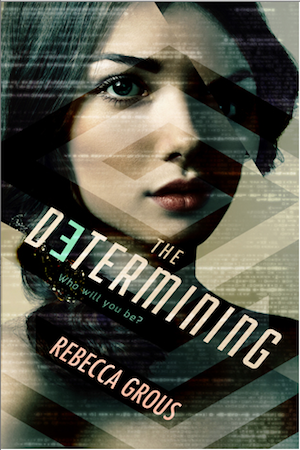

JF: An exciting sci-fi cover that where an adept use of type, the evocative gaze of the woman, the fractured image and all the texture woven into the design combine to achieve a magnetic effect. Great stuff.
e-Book Cover Design Award Winner for January 2015 in Nonfiction
Damon Za submitted Modern Manhood designed by Damonza.com.

JF: Great stuff, and I love how the designer has effortlessly combined the concept of the cover with the art, all rolled into one. It actually made me smile when I saw it, that’s real impact.
Fiction Covers
Aaron Mahnke submitted Consumed designed by Aaron Mahnke. “The goal was to create a mood and set a tone for the reader. Clear typography and subtle depth help add polish and realism to the artwork. The photography helps to draw the shopping in while also echoing the story.”

JF: An artful and atmospheric cover, and type that’s well integrated with the visual.
AK Chenoweth submitted Benign Surrender designed by Lianne Chenoweth.

JF: I like the colors but find the image confusing and too busy for the delicate font.
Alex P. Berg submitted Cold Hard Steele designed by Damon Za. “Book two of my Daggers & Steele series—a mystery with elements of fantasy, noir, and humor. That last part isn’t evident from the cover, but I think the rest is.”

JF: No, the humor doesn’t come through, but that doesn’t keep this from being a strong cover.
Alexander von Ness submitted Pappy Moses’ Peanut Plantation designed by Alexander von Ness | Nessgraphica.com.

JF: This cover is confusing. On the one hand the ghosted image, deft typography and good color combinations work really well together, but on the other it seems that the title has been mangled by the shrinking of the last word to virtual irrelevance.
Allie Potts submitted An Uncertain Faith designed by Damir Jahic, Danny Design Studio. “Without going into too much plot summary, my novel is about a woman who is very much stuck between the proverbial rock and a hard place. She feels very much alone even though she has family and friends. My designer was able to capture the starting point of my protagonist’s journey perfectly.”

JF: It’s certainly an arresting image, and the title has flair.
Amanda DeWees submitted Sea of Secrets designed by James T.
Egan of Bookfly Design. “Sea of Secrets previously had a traditional woman-running-from-castle gothic romance cover. When I decided to rebrand, James came up with a brilliant new concept that beautifully evokes the mood, period, and setting of my book.”

JF: Amazing attention to detail and a strong visual concept add up to another winner.
Andrea Pearson submitted Discern designed by Andrea Pearson. “Thanks! I created this cover while my toddler was recovering from the flu. :-) My usual cover designer was overbooked. My brother (a professional photographer) shot the picture of the model and I did everything else.”

JF: Nice job, Andrea, although I find the photo oddly static.
Antara Man submitted The Wishing Coin designed by Tanja G.. “a fairy tale/fantasy/women’s fiction. Take a look at at the abbreviation on the microphone – AEC (the broadcasting company) and the buildings.”
JF: Looks to be well targeted for the likely readers of this book, with an engaging woman and some fanciful typography against a scene-setting backdrop.

Ashley Fontainne submitted Growl designed by Ashley Fontainne.

JF: Nice tone of creepiness, but the effects on the authors name detract from the attention that should go to other elements on this cover.
Ben Miller submitted Like Minds designed by Patrick Laurent. “Patrick used elements throughout the book to craft an exceptional and professional looking cover for Like Minds. Key elements include the computer electronic traces that become like finger prints and the divergence of the red and blue minds.”

JF: The concept for the image has some interesting possibilities, but there’s no reason to virtually hide the title.
Benjamin Wende submitted Expensive Taste designed by Benjamin Wende. “Thank you JF for your valuable comment on my first attempt and I hope this one works out. Thanks for your time.”

JF: I don’t think so, BW. When you paste together clip art images that don’t match stylistically and combine them with a distracting background and primitive type, you end up with something that doesn’t look very… professional.
Branden Holder submitted In the City of Fallen Saints: The Complete District Trilogy designed by Branden Holder.

JF: What’s good about this cover is the way it goes against the norm. If everyone else has a color cover, one way to stand out is to create a strong black and white design, as the artist did here.
Brett Dent submitted Schism designed by Erik Sukke. “Erik Sukke designed this cover with the only preliminary guidance being that I knew I wanted an image of the Trans-Allegheny Lunatic Asylum on the cover. He nailed the idea of what I wanted to represent. Cover photo was taken by Donnie Nunley. Thank you!”

JF: A workable, if a bit murky, cover.
Brian Greiner submitted Darkness Creeps Forth designed by Brian Greiner. “The cover is based on a photograph I took of frost on my window, with the colours tweaked using GIMP. The font is League Gothic.”

JF: Creative use of a frosty window, and simple style that’s very workable.
Bridget McKenna submitted A King in Exile designed by Bridget McKenna for Zone 1 Design. “19th-century society and a dinosaur named Rex were the inspirations for this cover for a Victorian science fiction story.”

JF: That’s a tall order. If the sky was gray I wonder if the green dinosaur and light title would stand out more. And there’s something disconcerting about how differently the scene and the dinosaur are lighted.
Brooke Burgess submitted The Cat’s Maw designed by Sara Machajewski. “Thanks for the opportunity! The Cat’s Maw interiors were created with one of your awesome templates, so I hope you appreciate the cover as well :-) The original image was based on a sketch I did, which was then interpreted by a classical artist and a digital painter. Cheers, Brooke”

JF: Interesting and well planned image but the title seems very weak.
Carol Caruthers submitted Universe: The Edge of Tomorrow designed by Carol Caruthers. “I selected an image which I thought best represented the story line and mood of the novel. I asked the artist to make changes to the photograph to match the hair color of my heroine and transform it from an underwater scene to outer space. I replaced large bubbles with planetary bodies.”

JF: Looks like it’s from the hallucinogenic school of art, and the title font is a bizarre choice.
Carol Fiorillo submitted Exile designed by Carol Fiorillo. “I wanted the cover to capture the mood of the book. I did this by using color, layers and textures to draw the reader’s attention to the model. Gave hints of why the Exile took place with the flag. I wanted to give enough clues for the reader to want to know more.”

JF: The image is interesting, but the title looks like it’s being pushed off the book, and the fussy treatment of the author’s name is quite distracting.
Cat Bruno submitted The Girl from the North designed by Brenda Nemeth. “Hand drawn with pencil on acid-free paper. Digitally scanned.”

JF: Anti-design.
Christina E. Pilz submitted Fagin’s Boy – The Further Particulars of a Parish Boy’s Progress designed by Bookfly Design – James T. Egan. “James took my historical novel, my many suggestions, and made this handsome, inviting cover. Story elements are represented in subtle ways, in the books and the damp street scene; the touches of color in the curving font tell potential readers that this is a romance. I couldn’t be more thrilled.”

JF: There’s real artistry in the design and artful execution of this cover, but it doesn’t look at all like a romance to me, more like historical fiction or a coming-of-age story.
Christopher Geoffrey McPherson submitted Blackmail at Wrigley Field designed by Matt Hinrichs. ““Blackmail at Wrigley Field,” the fourth James Murray Mystery, is set in 1937 Los Angeles.”

JF: Great use of a period photo to set the tone and some interesting background texture, although the typesetting of the title is a bit uncomfortable.
Connie Almony submitted One Among Men designed by Lynnette Bonner. “This is a book that crosses genres. It is Women’s Fiction/Romantic Suspense. The Women’s Fiction feel comes through from the image. The Suspense is threaded in with the font choice.”

JF: An interesting combination, but I wish the title was easier to read.
Craig C. Charles submitted The North Country Confessional designed by Clarissa Yeo at Yocla Designs. “Top image of cover is a cicada which is an element in my mystery novel. Bottom image is the Mount Washington Hotel which is the main setting of my book.”
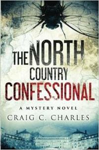
JF: Mesmerizing and effective.
D. Perdue Henderson submitted Hayden Heyer and the Twin Guardians designed by Createspace. “The cover design had to be ethereal in nature yet divine. I achieved this with the white dress and spirals over a blue background. It also had to portray positive vs. negative or good vs. evil. I achieved this with the duel characters in reverse, one trapped, reaching for help, and the other free.”

JF: An image that has strong possibilities, but overall this cover lacks impact.
D.M. Webb submitted Mississippi Nights designed by Ambassador International.

JF: Very difficult to even make out what the dark shapes are supposed to be, and the fussy title font isn’t helping.
Damon Za submitted Taken By Storm designed by Damonza.com.

JF: Some powerful imagery in a good composition but the typography is underwhelming.
Dana Pratola submitted DESCENDED~AARO designed by Suzanne D. Williams. “The theme of the series is continuity and trees provide that. This one specifically, with stumps around, significes the young lives cut down in the story and the fact that the hero discovers them in the woods.”

JF: A strong and haunting image although the title is disappearing into the background.
Dane Low submitted Cheater designed by Dane & Brittany at EbookLaunch.com. “I love the idea of different shoes representing the heroine’s duplicitous life. I have her running which represents her wanting to leave her suburban mom life behind. I think the pastel colours work very well for the Chick Lit genre. The script font for the title is feminine, but also a bit sinister”

JF: Although I love the light tone, colors, illustration and title font, I don’t get any whiff of sinister, I had to enlarge the cover to figure out what that dripping blood was, and the elements just don’t all seem to belong on the same cover.
Dane Low submitted H.A.L.F.: The Deep Beneath (Volume 1) designed by Dane & Brittany at EbookLaunch.com.

JF: Strong, demands attention.
Dane Low submitted The Crown in the Heather (The Bruce Trilogy Book 1) designed by Dane & Brittany at EbookLaunch.com. “Series redesign for book 1.”
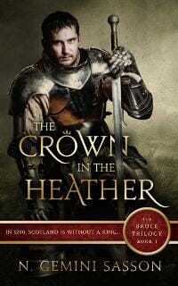
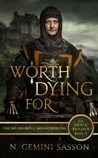
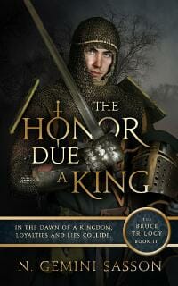
JF: These three covers show series design at its best. The emblematic characters each convey the tone and context of the books, and they are held together by the overall look and the strong series branding. ★
Dane Low submitted Worth Dying For (The Bruce Trilogy Book 2) designed by Dane & Brittany at EbookLaunch.com. “Series redesign for book 2.”
Dane Low submitted The Honor Due a King (The Bruce Trilogy Book 3) designed by Dane & Brittany at EbookLaunch.com. “Series redesign for Book 3.”
Dane Low submitted The Ruins designed by Ebook Launch.

JF: There’s a fascinating contrast between this cover and the one directly below for *Rotting Frontier.” Both have nearly identical elements for the designer to work with. Here, they are composed for maximum impact, readability, and to convey a sense of excitement and interest in the story. ★
dave atwell submitted Rotting Frontier designed by Dan Atwell. “took a sudden job lay off and wrote 2 books in 6 months. my brother, dan, edited and designed the covers for both books so far. its been a great adventure working this close with my brother. thought my life was over when I got the news about the lay off, it turned out to be the beginning.”

JF: In this cover both the image and the title are remote and ill-proportioned, with the featureless background allowed to take control of the visual space, yielding a cover with very little impact on the viewer.
dave atwell submitted Rotting Frontier: Revelations designed by Dan Atwell.

JF: In this cover the relationship between the elements has improved, but there’s no sense that the typography has been integrated with the rest of the cover.
David N Humphrey submitted Valguard: Knight of Coins designed by David Humphrey. “When self publishing his first novella, David designed & artworked the cover himself, proving you can bring a book to market for under £50, incl. ISBN & still look professional. Strong, clean medieval type stands out of the dark with other covers featuring different silhouettes on recoloured skies.”
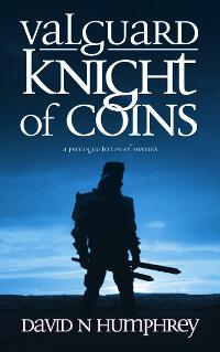
JF: Joel Friedlander, looking at David N Humphrey’s self-designed cover, has to admit David has done a reasonably good job on his cover design, but hopes David has not injured his elbow by twisting it too much.
David Pennington submitted Peer Through Time designed by Filament Communications. “This cover was designed by Filament Communications, via Writer.ly Star Services.”

JF: A nice concept, but I can’t understand why, with all the diagonal elements already on this cover, the designer felt it necessary to add a few more distracting and content-free lines on top of the rest.
Diane Rinella submitted Something To Dream On designed by Heidi “Azurylipfe” Darras. “This cover was designed to mirror a painting in the book that is important to the plot. I sent Heidi a few scenes that spoke of it, and she was able to bring it to life, thus giving the reader another way to connect with the story. Every detail was added for a reason.”

JF: Yes, I get that, but nobody else knows what those reasons are, right? Or are you designing the cover for the people who have already read the book? That’s not generally what covers are for.
Elayne Griffith submitted Azimuth designed by Elayne Griffith. “Created on Photoshop with images from Shutterstock.com”

JF: Nice job, although putting all the type in white deprives any element of added emphasis.
G. Elizabeth Kretchmer submitted The Damnable Legacy of A Minister’s Wife designed by Laura Paslay/Visual Quill. “Thanks so much for considering my book cover in your next contest. The watercolor painting was created specifically for the novel, representing the protagonist as she faces the mountain Denali (her nemesis), and intended to attract the primary reader audience (women’s and literary fiction)”

JF: A lovely piece of art that deserves a much stronger title treatment.
Gemma Ramji submitted The Day My School Fell Down designed by Gemma Ramji. “The cover took me (Gemma Ramji, author and illustrator) three months to design in oil paint. I used oil paint for the vibrant colour it produces, and wanted the texture of the paint to come through in the cover. I hoped my painting would create an almost 3D effect of the school, to bring it to life.”

JF: It would take an actual designer to turn this into something resembling a book cover.
Harry Dayle submitted The Faslane Files: Volume One designed by Aisling Whybrow. “We wanted to convey fast action and a sense of claustrophobia, while keeping the design very simple, and easily brand-able for future volumes in this spin-off series.”

JF: Some nice elements, but it really is giving me vertigo.
J.F. Penn submitted Gates of Hell designed by Derek Murphy, Creativindie. “The Key is a custom design through 99Designs and the cover was then put together by Derek Murphy, Creativindie”

JF: There’s a lot going on here, but the strong typography helps to keep it under control, creating overall a compelling cover.
Jackie Castle submitted Illuminated designed by Elena Dudina. “This book is aimed for YA readers”

JF: A lovely image that could have made a good cover, but in this case comes across as flat.
James Egan submitted A Plain-Dealing Villain designed by James T. Egan of Bookfly Design.

JF: Lots of textures, confident typography and a strong central image make this cover stand out.
James Egan submitted Song of Blood and Stone designed by James T. Egan of Bookfly Design.

JF: Masterful compositing and a title treatment that just sings combine with the “aspirational” look of the woman to create an arresting cover treatment. ★
James Egan submitted The Lover’s Knot designed by James T. Egan of Bookfly Design.

JF: An elegant treatment aided by strong illustration and clever use of textures throughout the cover.
Jasna Tosic submitted Asanni: The Langaer Chronicles Book One designed by Laura Stobbe. “The she-wolf represent the heroine, Astrid, half-wizard, half werewolf. The rose in her hair symbolizes her human (wizard) part. The Celtic design (rose; background) represent’s the geographical origin of her kind. The moons-phases symbolize her transformations, both physical and spiritual.”

JF: A lovely and well balanced cover, and I like the font used for the title here, it really adds to the overall tone.
Jennifer Comeaux submitted Crossing the Ice designed by Sarah Schneider. “The cover was designed by Sarah Schneider with photography of the skaters done by Ann Bowes-Shaughnessy. The skaters on the cover are Alexandria Shaughnessy and James Morgan, a pair who train in Boston. I was very excited to have an elite Team USA pair model for my cover!”

JF: Interesting image, very weak typography. Note that the identity of the models is only meaningful to you, no one else.
Jennifer Roberts submitted But I Said Forever designed by JelenaM.

JF: Well targeted for “chick-lit” readers with type that matches the illustration style well.
Joye Emmens submitted She’s Gone designed by Alisha at Damon Za. “The author wanted the cover to reflect a young girls journey through the heart of the sixties’ cultural revolution.”

JF: Although it’s history now, I actually remember the era and the riot of new approaches to graphic arts that it spawned. This cover holds together very well and evokes the era nicely.
Karri Klawiter submitted Fade to Black designed by Karri Klawiter.

JF: Serviceable, although I think the designer has taken the title a bit too literally.
Karri Klawiter submitted The Conquered Shore designed by Karri Klawiter. “Book Five in a six part series for science fiction author Mark Whiteway.”

JF: Both of these designs (this and the one below) work very well for the sci-fi niche, with excellent artwork that makes full use of the cover to depict a story element and type that suits well.
Karri Klawiter submitted The World of Ice and Stars designed by Karri Klawiter. “This is the second book in a six book series done for science fiction author Mark Whiteway.”

Katherine Brankin submitted The Family Girl designed by Kate Brankin. “Designed by the author, who also happens to be an award-winning graphic designer. Perhaps a little retro, but the bold design makes it stand out from the sea of other covers. Typeface is Decima Pro by TipographiaRamis. Book 1 in a trilogy.”

JF: Good job creating a cover that will stand out. Almost missed the bullet used as a character in the title.
Kim DDD submitted LEONOR, Discovery Series Book 6 designed by Kitten from Deranged Doctor Design. “Cover design and Series branding for 24 book long Short Story Historical Series “DISCOVERY”. Client requested abstract design with very strong series connection between books. Each book represents one character POV, so we decide that each character should have it’s own color & Symbol/Medallion.”

JF: Lovely texture and color choices, although the squeezed type of the title is a bit painful.
Kim DDD submitted TINIMA, Discovery Series Book 2 designed by Kitten from Deranged Doctor Design. “Cover design and Series branding for 24 book long Short Story Historical Series “DISCOVERY”. Client requested abstract design with very strong series connection between books. Each book represents one character POV and each character has it’s own color & Symbol/Medallion.”

Kim DDD submitted Star Rider on the Razor’s Edge designed by Marushka from Deranged Doctor Design. “Cover design for SF Space Romance/Action “Star Rider on the Razor’s Edge” by Heidi Skarie. Designer tried to get romance feel which will appeal to female readers, but also show that you’ll get excitement and adventure.”

JF: That’s a challenge the designer met here, where both elements—the sci fi adventure and the romance—mesh seamlessly to create an emphatic and interesting cover.
Kimberly Amato submitted Steele Resolve designed by Deranged Doctor Design. “Deranged Doctor Design captured the essence of the books lead character. Showing how the lead is a detective, trying to protect a large city with death looming above her. The large font type showing that the weight of her world is always on her shoulders.”

JF: Terrific and well controlled genre cover that hits all the right notes. Appropriate typography and a real hook into the story to be found inside.
Kura Carpenter submitted A Necklace of Souls designed by Kura Carpenter. “The author wanted an ebook cover representative of fantasy, but not medieval, that would appeal to YA and women in their 20s, and which wouldn’t scare off male readers.”

JF: The images look unnaturally assembled, and the typography needs help.
L.L. Sanders submitted What’s Done in the Dark designed by Karri Klawiter.

JF: While I don’t care for the confusing font shifts in the title, the cover still works well with an good dose of “creepy.”
Leslie Taylor submitted What You Don’t Know Now designed by Leslie Taylor, Buffalo Creative Group. “This cover incorporates all aspects of the book from the time setting (summer of 1967), to the location (santorini, greece) to the heroine (head-strong beautiful teen). Font, colors and scenery chosen to directly relate & give an immediate impact on the viewer and incite curiosity!”

JF: Well said, and well done. I’m a little disturbed by the “deadpan” look in the teen’s eyes, but everything else is impeccable.
Libbie Hawker submitted Tidewater designed by Original art by Lane Brown, design by Libbie Hawker. “Historical/literary fiction, gritty and accurate; not your typical “love story” take on the whole Pocahontas and John Smith thing. I asked Lane to create a painting that felt bleak and stark, a reflection of the novel’s atmosphere.”

JF: Great job, it captures the time, the tone of the story, has a unique title treatment, and the look on the girl’s face is our best hook into the story. ★
Lilly Gayle submitted Helpless Hearts designed by Alexander Winston. “Can a former gunslinger find redemption through love? Helpless Hearts is a western historical romance set in 1870’s Kansas.”

JF: Awkward, not what we want or expect to see in a book cover.
Linda Ramirez submitted Big Sky Siren designed by Alisha at Damonza. “This cover is two pictures I sent to Alisha at Damonza, and she did a beautiful job of creating the cover with the vision I had in mind.”

JF: Beautiful and engaging, with clear, strong typography.
Mallory Rock submitted Sleep Tight designed by Mallory Rock.

JF: Great integration of words and images, with an appealing, hypnotic quality. A winner. ★
Marlene Wynn submitted Chandrea – The Return of the Avatar Queen designed by Fiona Jayde. “Cover designed by Fiona Jayde. I wanted a cover depicting a “child of two worlds”, and feel that Fiona did a wonderful job doing just that! I’ve had many compliments on this cover.”
![]()
JF: I’m happy for you. Although it’s a good concept, to me the images don’t blend well, and the type is a little to weak to carry the load.
Matt Pike submitted Zombie RiZing: Scared to Beath designed by Matt Pike (Illustrator Steve Grice). “I used Steve Grice’s awesome cover illustration of Beath+Zombies+Moon as the base point, embedding a textured feel to his work. For the title, I gave the lettering an ‘All-American high school’ feel, smashed it together with a goth vibe and more than a hint of traditional tattoo styling.”

JF: When you’ve got an illustration this good, it’s hard to mess it up. However, I think the balance between your series brand and the title treatment could be improved, and the title should take precedence.
Matt Sinclair submitted Billy Bobble Makes a Magic Wand designed by Kirbi Fagan. “The image on the cover of Billy Bobble Makes a Magic Wand was created by Kirbi Fagan; the full cover was designed by Charlee Hoffman. Billy Bobble is a MG/YA science fiction work that launches the first series of novels for Elephant’s Bookshelf Press.”

JF: The illustrator is obviously talented, but the overall design is a bit of a disaster with way too many elements for us to take in at a glance, and the strange and ineffective typography doesn’t help.
May Woodworth submitted Heart of the Hurricane designed by Big world network.

JF: A cover with no excitement, no intimation of story, and no “hook.” Why would anyone pick this up?
Melissa Gill submitted Salt and the Sea Venture designed by Melissa Gill. “The story is about the Sea Venture, a 1609 resupply ship bound for Jamestown. It sunk off Bermuda following a hurricane. It’s a middle grade novel told from the POV of a cat onboard named Salt. I wanted to evoke Erin Hunter’s “Warriors” series, while remaining as simple and uncluttered as possible.”

JF: Nice idea, but I don’t think it works. The images are wildly incongruent and nothing makes much of an impression. For the story you describe, an exciting illustration would be much better.
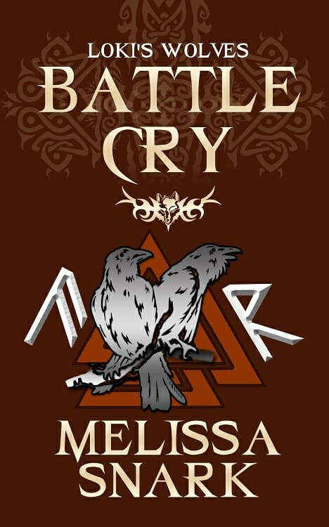
Melissa Snark submitted Battle Cry designed by Farah Evers. “The cover contains a lot of Norse symbolism. The two ravens belong to Odin. The runes are from the Old Norse runic alphabet and their meanings are relevant to the book’s themes.”
Mia Mitns submitted Tea Leaf: What Hides Beneath designed by Mia Mitns. “Tea leafs are used in a type of fortune telling called tasseography. This relates to one of the characters who is a fortune teller. There is also a scene with tea leafs, and they are a symbol in the story.”

JF: Unreadable and mystifying. No one will know what this book is about.
Michael Jasper submitted Finders, Inc. designed by Michael Jasper.

JF: Another demonstration that you can’t make a book cover by simply slapping overworked type on top of a photo.
Michele Orwin submitted Landfall designed by Alan Pranke, amp13. “The author died suddenly last May before his book could be published. His wife and son went ahead with it. The cover is from a painting by the son, Peter Jablonski. Designer Al Pranke (amp13) used part of the painting, deepened the colors and heightened the contrast to make it work as a cover.”

JF: A beautiful job, and I’m very glad they put it into print. Love the delicate title treatment, too.
Michelle Lashier submitted Quivers and Quills designed by Dane from eBook Launch.

JF: Beautiful textures and a lovely series brand make this cover stand out.
Mit Sandru submitted Vampire Slayers (Vlad V Bk 3) designed by Dumitru Sandru.

JF: And with a sensational subject like this, you couldn’t think of one visual to attract readers into your story?
Mit Sandru submitted Vampires of Transylvania (Vlad V Bk 4) designed by Dumitru Sandru.

JF: [sigh]
NLB Horton submitted The Brothers’ Keepers designed by Rebecca Lown. “All credit for the beauty of this evocative cover goes to the artist and the designer. Conveying international suspense with a female protagonist is hard, but creating that imagery without the elements of violence or sexuality requires professionalism and a gift.”

JF: Well, as often happens after reading the glowing “reviews” submitters provide for me, I have to act like a churl to disagree with the overwhelming opinion of the rest of humanity, as conveyed by the author. In this case, the cover looks to me to be the opposite of something conveying “international suspense.” It’s so static, quiet, and peaceful there isn’t a pixel of suspense anywhere. And the composition and typography remind me of books of Greek poetry, not suspenseful novels.
NLB Horton submitted When Camels Fly designed by Rebecca Lown. “All credit for the beauty of this evocative cover goes to the artist and the designer. Conveying international suspense with a female protagonist is hard, but creating that imagery without the elements of violence or sexuality requires professionalism and a gift.”

JF: Well, as often happens after reading the glowing “reviews” submitters provide for me, I have to act like a churl to disagree with the overwhelming opinion of the rest of humanity, as conveyed by the author. In this case, the cover looks to me to be the opposite of something conveying “international suspense.” It’s so static, quiet, and peaceful there isn’t a pixel of suspense anywhere. And the composition and typography remind me of books of Greek poetry, not suspenseful novels (although this one is better than the last).
P.E. Musik submitted Brightbuckle designed by P.E. Musik. “The door from the novel “Brightbuckle” is featured on the cover. It needed to be as described in the book; mysterious yet as colorful as a well dressed Christmas tree. The leading character’s cap is also positioned in the bottom right corner. This is a setup for a running theme in series covers.”

JF: An attractive illustration, but the title needs more emphasis, it needs to tame that door just a bit.
P.E. Musik submitted Brightbuckle Holiday designed by P.E. Musik. “For this sequel to the book “Brightbuckle” I wanted to continue with featuring of the Time Machine Door but bring a holiday twist to the original design. A red wall, tree decorations, a wreath and a Santa Cap in place of the cap as featured on the cover of the first book; “Brightbuckle.””

P.E. Musik submitted Speegeltog-The Bully, The Dinosaur & The Fart Machine designed by P.E. Musik. “I wanted to create a sense of mystery with a touch of humor for the cover. I wanted the characters to be “Nerdy” but posturing in a classic hero stance. I like “wrap-around” designs so, with this cover, I reversed the perspective of the heroes and pushed for a little extra mystery on the flip-side.”

Phin Hall submitted Montgomery’s Trouble in the Underworld designed by Jon Wotton.

JF: A pretty nice illustration, but the typography is rather lifeless, and that doesn’t help.
PJ Colando submitted STASHES designed by Cliff Cramp. “Cliff Cramp, the cover designer, called his work a ‘narrative illustration’ and his cover aptly portrayed the comedic tone of STASHES, as well as the relationship between the two main characters. Also illustrated are several of the novel’s plot stashes…”

JF: It’s an interesting approach, and the illustration is good, but to me the chief interest is the interaction of the couple, so I would have zoomed in on them and cropped out a lot of the extraneous detail that’s just a distraction.
Rebecca Timmis submitted Thrum designed by Nadia Asserzon and Rebecca Timmis. “Nadia (illustrator) created a digital painting based on a layout sketch provided by author Pete Lans. The background reflects the Australian setting and the passion-fruit elements reflect a common theme in the story. The title text (by Rebecca) was made to look like it was vibrating / thrumming.”

JF: The sensual colors and overtones make this an appealing cover.
Rebecca Timmis submitted Tim and the Children of Cornucopia designed by Nadia Asserzon and Rebecca Timmis. “Nadia’s digital artwork was done using photos of dogs, horses, bird wings and material as visual references. The long title needed to be handled with care so it was easy to read against a multi-hued background without covering up too much of the image.”
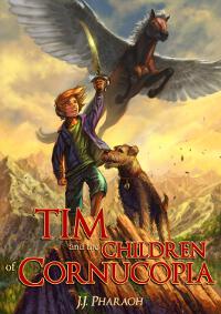
JF: An illustration with tons of promise and lots of action, but I don’t think the title succeeds as well, it’s getting lost against that background.
Richard Lester submitted The Check Out designed by Damian Browning. “The book cover is based on 70’s exploitation movie posters. It was created by Damian Browning, a graphic designer in the UK.”

JF: Pretty cool, and I like the way the architectural type plays against that gory ID tag.
Ruth Schwartz submitted Girl on the Gangway: A Travel Writer’s Tale designed by Ruth Schwartz. “The author had some definite image ideas, and I had just gotten Ed Lewis’ KD Cover Kit (thanks to Joel Friedlander), so I thought I would see if, with my limited Photoshop skills, I could pull together something that worked. This looks nothing like the template I used and the client was very happy.”

JF: Well put together, strong typography, and with the blue color tying all three parts of the cover together.
S.A. Youngman submitted STRANGELOVE designed by S.A. Youngman. “I’ve had this vision of my book cover since my novel’s inception. The black/white elements (especially in the title) directly correlate with the antagonist and his relationship with the heroine, while the unforgiving spotlight and the unconcealed blood splatter are intended to generate suspense.”

JF: Needs a border of some kind around it to prevent it “leaking” onto the page, as the left side does here.
Sam Kaplan submitted Munsrat Lives designed by Kim Lichttenegger. “Kim captures a key scene, and even more important, the essence of my novel, Munsrat Lives. She does this in a way where she literally shines a light on the title, creates mystery with the silhouetted, flashlight-holding figure and beckons the reader into the novel. A practical and artistic success.”

Sandra Hutchison submitted The Short, Spectacular Indie-Publishing Career of Matilda Walter designed by Sandra Hutchison. “This is a free stand-alone comic short story I wrote to entertain friends, so I didn’t want to invest much $$, but I did want to match the “brand” of my professionally designed novel covers. No chance of an award here, but I’d welcome your feedback. It certainly isn’t selling itself, even at free.”

JF: It looks like nonfiction, that could be part of the problem. Tantalize us, that can work well.
SANDY PAULL submitted Clouds of Grey designed by studio1design.com. “I was really pleased that the designer captured the feel of mystery whilst hinting at the clouded mind of the lead character, and displaying scenery from the core of the plot as per my request. Sandy (author)”

JF: The image composite is quite good and effective, but I find the typography a bit monochromatic stylistically.
Shana Festa submitted Time of Death: Induction designed by Laura Gordon/Christian Bentulan. “Post-apocalyptic zombie fiction”

JF: A strong image that draws us into that weird landscape, and good type treatments make this cover stand out.
Sharyn Kopf submitted Spinstered designed by Susie Jarvis. “Designed by Susie Jarvis with Route 1 Manuscripts Editing & Design. Christian women’s fiction. The main character lives in CO and loves to hike but also often feels alone so that was the feeling I asked Susie to convey — beauty and solitude. I was delighted with her photo and design.”

JF: Looks like it should appeal to your market.
Shelley Marshall submitted Night on the Milky Way Railroad designed by Shelley Marshall. “This cover is for a translation of a classic Japanese fantasy tale of two boys traveling on a train through the Milky Way, in the space between life and death.”

JF: If it’s a translation, why have Japanese on the cover? Unfortunately, it has a “home-made” look to it.
Sherry Ficklin submitted Queen of Someday designed by Strong Image Editing. “The cover was designed to reflect an upper teen historical novel with modern dialect/esthetic.”

JF: I have trouble parsing your book description, but the cover has lots of appeal.
Shirley Raye Redmond submitted Prudence Pursued designed by Amanda Matthews. “This charming cover by Amanda Matthews captures both the time period (Regency England) and the setting (Bath–the Royal Crescent in the background is the clue) of PRUDENCE PURSUED.”

JF: Everything is artfully arranged, but I can’t help thinking the title should be almost twice the size it is here. Tough to make an impact when you’re whispering.
Stan Sudan submitted Sisters of Light, Book One of Dancers of Light and Darkness designed by Deranged Doctor Design.”The design team diligently considered symbolic branding versus real-character images with this mixed-genre, paranormal epic fantasy before Marushka at DDD came up with the final concept for Book 1, which required a thematic thread to carry forward into the opening trilogy of the series.”

JF: An unfortunate image composite (is she supposed to look like she’s breathing fire? Hard to tell) with type that’s been overworked makes this cover a bit garish.
Susanna Shore submitted The Croaking Raven designed by Susanna Shore. “The book is suspense/thriller and I hope the cover tells that with one glance.”

JF: Not really. What it says at a glance is: “The author made this.”
Sylvia Frost submitted Hawkridge designed by Sylvia Frost of Sylvia Frost Designs. “The author wanted very clear branding that said cowboy fantasy that could be replicated across his series.”

JF: I know we’re seeing these genres split again and again into ever smaller niches, but that is one bizarre combination of images.
Sylvia Frost submitted Bloodbound designed by Sylvia Frost of S. Frost Designs. “As both a book cover designer and an author I do my own serial covers. My focus is always on very strong clear branding that intrigues the reader and clearly communicates genre and mood.”

JF: Well done. Everything is nicely balanced on this cover that has a lot of visual content. I particularly liked the atmosphere, partly driven by that thin layer of “fog” at the bottom. The whole series is consistent, too. Lovely.
Sylvia Frost submitted Huntbound designed by Sylvia Frost of S. Frost Designs. “As both a book cover designer and an author I do my own serial covers. My focus is always on very strong clear branding that intrigues the reader and clearly communicates genre and mood.”

Sylvia Frost submitted Moonbound designed by Sylvia Frost of S. Frost Designs.

Tammi Labrecque submitted For Better, For Worse designed by Tammi Labrecque. “FBFW is about a wedding, sort of, so the base is a stock image intended to be a wedding invitation. But it’s also about the idea of when and why do you or don’t you “stick it out” with someone, and where might those choices lead, so I added the cake toppers and then knocked them around a bit”

JF: Good concept that, in the hands of a professional designer, would make a good ebook cover.
Tammy Seidick submitted Venus for a Day designed by Tammy Seidick.
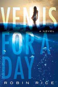
JF: Scrumptious, attractive, and mysterious all at the same time. ★
Tamraparni Dasu submitted Spy, Interrupted: The Waiting Wife designed by CreateSpace team + T. Dasu. “Based on a photo by Kumar D., the cover captures a critical plot moment where the Spy in the title rushes to protect his Wife from a sniper who has caused a flock of birds to take flight. The ray of light bouncing off the battlement of an ancient fortress adds to the mystery and drama of the birds.”

Vanessa Leavitt submitted 5 Tales of Transformation designed by Brian Leavitt. “The cover includes images that are central to some of the stories in the book, namely the mountains in the background and the dandelions in the foreground. The stories are speculative fiction, the border around the cover gives the feeling of wiping a dirty window and looking into another world.”

JF: And when you look out the magic window, you see … dandelions? Those are weeds, right? I just don’t see anything remotely resembling or alluding to transformation in this cover, and the type isn’t helping.
Waheed Ibne Musa submitted Johnny Fracture designed by Waheed Ibne Musa. “Everything in this cover is designed in Photoshop. The cigar shadow and smoke is also done in Photoshop, but the cigar picture is taken from the internet.”

JF: And I use WordPress for my blog. Does anyone care? I think not. I think you went a little overboard on the “fractured” type, but the image does have some atmospheric drama to it.
William Reichard submitted Evertime: The Iteration of the Martingale designed by William C. Reichard.

JF: Not sure I could tell what this book is about, and the subtitle only deepens the mystery. However, a big bold title is a good think in ebook land.
Ynne Black submitted The Hidden Village designed by Ynne Black.

JF: Truly a strange illustration with type that looks like it came off a corporate brochure. Does that dude have a crossbow?
Z. R. Southcombe submitted What Stars Are Made Of designed by Z. R. Southcombe.

JF: Despite the crude artwork and zany typeface, this cover does have appeal, maybe from the interesting title.
Nonfiction Covers
Avis Williams submitted Visual Inspirations: A Visual Guide of Inspiring Words and Quotes designed by Avis Williams.

JF: Some nice choices here, but I’m perplexed by the shadows the tree and figure are casting. On what?
D.M. Webb submitted 30 Days: A Devotional Memoir designed by Ambassador International. “I wanted a soft image that represented patiently waiting and weathering the storms that come. My publishers wanted the worn journal look since this was a memoir style devotional.”

JF: A good treatment for a devotional, although the title needs some kerning help because the “30” looks to be floating away from the “Days.”
Damon Za submitted The Very Worst of The Beatles designed by Damonza.com.

JF: A clever cover that’s maybe too clever, because it definitely looks upside down to me.
Dawn Taarud-Martinez submitted Cocaine & Champagne designed by Dawn Taarud-Martinez. “This is a true story of a woman who has struggled with her addictions for many years and suffered many losses because of it. I tried to show how alone she felt and now the long road to her recovery.”

JF: A very nice approach to this cover with the lone exception of the remarkably weak title treatment. Change that and you’ve got a great cover.
Debby Gies submitted Words We Carry designed by Yvonne Less.

JF: The whole look and texture of this cover, the friendly artwork and familiar suitcases, combined with its interesting premise, makes me want to pick it up, and that’s the whole battle right there. ★
Debmita Dutta submitted Before the First Breath – The Memoirs of A Newborn designed by Minal Dusane Mali. “The cover illustrates a newborn baby, who is the narrator of the story. The book is about the the amazing story of how a single cell turns into a complete human being – starting as an obscure single cell with a miniscule amount of cytoplasm in the Left Ovary till she emerges into the world outside.”

JF: Very cute illustration, needs stronger typography.
Diane Topkis submitted A to Z: 26 Keys to Unlock Career Change Success designed by fiverr/pro_ebookcovers. “I wanted a clean simple look. This is the first in my Career Clarity series. The top and bottom banner will stay consistent through the series. The link between the title and the image are pretty self explanatory.”

JF: Nothing wrong with the design, but it’s delivering a confused message between “keys” and the implied “alphabetical” scheme, and the “for Midlife Women” truly looks like an afterthought, not one of the main premises for the book.
Greg Strandberg submitted Stand Out: Your 2015 SEO, Social Media and Content Marketing Guidebook designed by Greg P Strandberg. “This is a premade I got from James over at Go On Write. It’s probably my 8th or 9th premade from him, and for cash-strapped authors putting out a book a month like I do, it’s a great option. I chose the title for the book after selecting the cover.”

JF: A good graphic that symbolizes the offer of the book, but if you’re going to name it “Stand Out” you really really need to make that title STAND OUT, not whisper.
Ian Woods submitted Sub Teaching designed by Ian Woods.

JF: On the other hand, it probably didn’t cost anything, right?
jose maria cal carvajal submitted Valencia Las Fallas designed by jose maria cal carvajal. “The main image is an artistic dolls group from a Falla.”

JF: Looks a bit confused, but I don’t know what a “falla” is, so take it with a grain of salt.
Kimberly Moreland submitted A Mom’s Point Of View: Beginning Adulthood designed by Kimberly Kay Moreland. “The photo in this book was taken while my family was on a trip to the Regan Library a few years ago. I think the photo can be inturpreted as moving on in life or venturing out into the world, as my book is a starter guide to adult life.”

JF: Well, beginning adulthood is a very exciting, frightening, engaging time full of adventure and self-discovery. On top of that, “Mom” adds a strong emotional element. However, I see absolutely none of that in this very static design.
Maarten van Lier submitted How to make a million in 10 years, and how we did it in 13 designed by Maarten van Lier. “The imagery on the cover are the actual graphs, tables and portfolios he has stared at over the 13 years of achieving his financial goal (as covered in the book)”

JF: You have an admirable ability to make money, but it hasn’t translated into a skill at cover design, so I suggest (since you can obviously afford it) you hire one of the excellent designers whose work you see on this page.
Nathan Meunier submitted Write Short Kindle Books: A Self-Publishing Manifesto for Non-Fiction Authors designed by Author-designed. “I put this cover together in Photoshop, after tinkering with it quite a bit. This is the second major design I came up with. I put both designs up for a vote to my mailing list, and the vast majority chose this one. Pretty proud of it, considering I’m not a pro designer. Cost me $0.00”

JF: An excellent job, does exactly what a nonfiction book is supposed to do: get attention, then define the audience for whom it was written. I think I’ll buy this one. ★
Tom Buford submitted Living With Fibromyalgia Patients: 79 Ways You Can Make Their Lives Better designed by Mera Buford. “The author’s wife, who is is a fibromyalgia patient, is also the graphic designer. The butterfly is a symbol of solidarity for fibromyalgia sufferers. It was our intention to use that in a cover that suggested the possibility of a better life – one with more days when the pain is easier to handle.”

JF: A beautiful way to communicate about this troubling disorder. I like the enthusiasm implied by the “!” at the end of the title, and the composition is really quite pleasant. ★
Well, that’s it for this month. I hope you found it interesting, and that you’ll share with other people interested in self-publishing.
Use the share buttons below to Tweet it, Share it on Facebook, Plus-1 it on Google+, Link to it!
Our next awards post will be on March 16, 2015. Deadline for submissions will be February 28, 2015. Don’t miss it! Here are all the links you’ll need:
The original announcement post
E-book Cover Design Awards web page
Click here to submit your e-book cover
Follow @JFBookman on Twitter for news about the E-book Cover Design Awards
Check out past e-Book Cover Design award winners onPinterest
Subscribe to The Book Designer Blog
Badge design by Derek Murphy


