


By Joel Friedlander
Welcome to the e-Book Cover Design Awards. This edition is for submissions during February, 2020.
This month we received:
37 covers in the Fiction category
10 covers in the Nonfiction category
Guest Judge
 We are once again pleased to welcome Tanja Prokop to The Book Designer as a guest judge this month. Tanja was born in Germany, but lives and was raised in Croatia. Her three beautiful daughters and her amazing husband are her biggest inspiration in life. She has an MA degree in German language and literature and philosophy. A few years ago she started her own design company and became a professional book cover designer. She designs covers, and is constantly creating new visual experiences for her clients. Tanja is also a multiple winner of various book cover design contests and has created thousands of covers. You can find her pre-made covers at Book Design Templates, or visit her site at www.bookcoverworld.com.
Comments, Award Winners, and Gold Stars
I’ve added comments (TP: ) to many of the entries, but not all. Remember that the aim of these posts is educational, and by submitting you are inviting comments, commendations, and constructive criticism.
Thanks to everyone who participated. I hope you enjoy these as much as I did. Please leave a comment to let me know which are your favorites or, if you disagree, let me know why.
Although there is only winner in each category, other covers that were considered for the award or which stood out in some exemplary way, are indicated with a gold star: ★
Award winners and Gold-Starred covers also win the right to display our badges on their websites, so don’t forget to get your badge to get a little more attention for the work you’ve put into your book.
Also please note that we are now linking winning covers to their sales page on Amazon or Smashwords.
Now, without any further ado, here are the winners of this month’s e-Book Cover Design Awards.

e-Book Cover Design Award Winner for February 2020 in Fiction
Darja DDD submitted Shadow of the Colossus designed by Milo from Deranged Doctor Design. “Science Fiction book cover design, A Holly Drake Job Book 4”
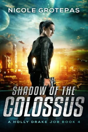
TP: When you have to look again and again, not because you can’t read something, but because the image is so beautiful, then you are looking at a great cover design! Great job!
e-Book Cover Design Award Winner for February 2020 in Nonfiction
Alberto Vezendi submitted Awake, Arise, Or Be Forever Fallen! designed by Alicia Varela.

TP: The colors are very appealing and the designer has used a font that works on most covers. Given that this is an eBook, I would recommend to make the author name more prominent.
Fiction Covers
Aaron A. Reed submitted Subcutanean designed by Aaron A. Reed. “Thanks for running this! =)”

TP: This cover has a very appealing, well done title design. The whole cover surely has a lot of potential. Unfortunately, the author name and all other textual parts aren’t readable at all.
Amanda DeWees submitted A Dangerous Observer designed by Victoria Cooper.”A Dangerous Observer is historical romantic suspense in the tradition of old-school gothic romances, and Victoria’s cover captures the sinister romance of the classic “girl running from house” cover art.”

TP: A very genre-appropriate cover design where the designer has used the right fonts and images to create a good cover design. In order to make it a bit better I would leave more “white space” around the characters head so that the author name can fit in better. Other than that, a really nice cover design.
Ben Gartner submitted The Eye of Ra designed by Anne Glenn Design. “The Eye of Ra is a middle grade time travel adventure. This cover was beautifully custom illustrated by Anne Glenn, who has worked with some pretty famous authors. I felt fortunate to work with her on this cover.”

TP: I love how the colors work well together on this cover. I would maybe just suggest placing the author name at the bottom to make it more balanced, but even like this, the cover looks awesome.
Brandon Barkey submitted Stone of Matter designed by B. L. Barkey.

TP: Every element is where it should be. This is a solid cover design with an intriguing illustration.
Bruce Most submitted The Big Dive designed by Cheri Foxley. “The concept of the police car, taken from the plot, was mine, and Cherie brought it to life with both her skills and improvements.”

TP: I have to say that I really love the image that was chosen for this cover and the enhanced back lights are a great touch. The title would probably look a little bit better if it wasn’t tilted. Also, I would recommend to avoid placing textual parts that close to the edge of the cover.
Christian Canning submitted The Super Awesome Secret Adventures of Billy the Brave – A Bad Hair Day designed by Edison Goncalves and Len Simon.
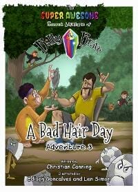
TP: There is a lot going on on this cover design. The illustration per se is nicely done with suggestive details. I understand what it means when you have too much text that you have to fit onto the front cover. What happens is that you end up having too much text on a small area and then you can’t enlarge the size of the chosen font, which makes the text unreadable. A different font would help here. I would also avoid using too much color in the text, given that the illustration is very colorful.
Christian Canning submitted The Super Awesome Secret Adventures of Billy the Brave – Jungle Mayhem designed by Edison Goncalves and Len Simon.
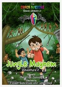
TP: Again, the illustration is great, but the typography needs a bit more work. When you are dealing with series designs, it would be great to have one constant detail that is appearing on every cover, which is mostly the same typography approach. I would recommend using the same font for the title on all designs.
Christian Canning submitted The Super Awesome Secret Adventures of Billy the Brave – The Crystal of Hope designed by Edison Goncalves and Len Simon.
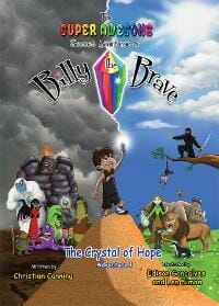
TP: All illustrated elements are very nicely done. When you have so many details in one cover, you get lost easily. I would like to see very simple typography on such backgrounds.
Darja DDD submitted The Ninth Sorceress designed by Milo from Deranged Doctor Design. “Epic Fantasy cover design, The Price of Magic Book 1”

TP: A beautiful cover design with great design elements. An amazing cover design! ★
Darja DDD submitted The Lost Sister designed by Marushka from Deranged Doctor Design. “Mystery, Thriller & Suspense book cover design, Detective Arla Baker Series Book 1”

TP: This cover is very simple, yet very appealing and suggestive. Well done.
Darja DDD submitted The Keeper of Secrets designed by Marushka from Deranged Doctor Design. “Mystery, Thriller & Suspense book cover design, Detective Arla Baker Series Book 2”

TP: The whole series is very well done and the typography is as prominent as the imagery. A great cover design.
Darja DDD submitted The Forgotten Mother designed by Marushka from Deranged Doctor Design. “Mystery, Thriller & Suspense book cover design, Detective Arla Baker Series Book 3”

TP: The whole series is very well done and all covers are using very powerful background colors and recognizable typography. Great job.
Darja DDD submitted Eye of the Colossus designed by Milo from Deranged Doctor Design. “Science Fiction book cover design, A Holly Drake Job Book 1”

TP: Again, a great series design. There isn’t much I can comment on here, because everything is perfectly done. I love the colors and the typography. Wonderful!
Darja DDD submitted Heart of the Colossus designed by Milo from Deranged Doctor Design. “Science Fiction book cover design, A Holly Drake Job Book 3”

TP: The background colors are very appealing and spot on! A great cover design!
Dylan Peters submitted Everflame: Mystic Wild designed by Dylan Lee Peters.

TP: I really like the idea behind the title treatment. The image representing the flame should stand out more and be more visible. Grey and brown don’t work well together.
Dylan Peters submitted The Hands of Ruin: Book One designed by Dylan Lee Peters.

TP: This is a very interesting cover design. I really like how this cover looks like. My only recommendation here would be to match the letter color to the color of the splash.
Gabrielle Prendergast submitted Loyalties Betrayed designed by Gabrielle Sara Prendergast. “This was a cover fix after the client had a disappointing experience with a “designer”. I stuck with the client’s very classic genre concept and just tried to make it cohesive and evocative.”

TP: A genre-appropriate cover design. Don’t be afraid to think outside the box and add some additional elements which might make it more interesting. In my opinion, the textual parts are too close to all edges. The text visibility is very important, however, the title doesn’t have to be edge-to-edge.
Gabrielle Prendergast submitted Echoes of Silence designed by Gabrielle Sara Prendergast. “The author supplied me with two original photographs from the WWII period with which to compose this cover, the latest in a series I did for him. I liked the way the merging of the photos turned out.”

A very appealing title treatment. I think that the image works well with the title, but the rest of the typography should be a bit more visible.
Ihor Tureha submitted She Said Three Said designed by MiblArt.

TP: Great work! Appealing, visible, nice colors. Everything works on this cover. Nice job.
Ihor Tureha submitted Relic: The Mars Frontier Series Book 3 designed by MiblArt.

TP: The image and the typography work amazingly well together. Well done! ★
J. Philip Horne submitted The Rescue Nurse designed by J. Philip Horne.”The Rescue Nurse is an adult thriller. The cover is intended to create a tension between the viewer’s expectations tied to the word “Nurse” and the visual imagery and style of the cover. I’m hoping that tension leads to an itch that needs to be scratched be checking out the book.”

TP: I have to say that I’m not crazy about the image that was used here, but the typography is nicely done. The author name would (maybe) look a bit better if the orange part was replaced with the same yellowish color that was used for the title.
J.L. Strange submitted A Little Bit Psycho designed by LJ Anderson.

TP: I like the overall appearance, but the cover would be more appealing if the colors weren’t so reduced. But even like this, the cover looks very well.
J.M. Robison submitted The War Queen designed by Cora Graphics. “The braided crown on the female is what I call a “war crown” since she is in charge of her army and leads them to battle. The red gems are filled with explosives she throws at the enemy.”

TP: A nice cover design, however the typography could use s bit more work. The title should be more prominent and in a different color.
Jason Adams submitted Mother and the Mice designed by J. David Adams and Eva Bitter.”I designed a beta version of this cover and Eva put her spin on it. The cover is just about the only thing that remained from my original design of the book. Much of Mother and Mice’s charm is the accompanying art, so the cover had to give readers a solid first impression.”

TP: This illustration is very sweet and the typography works well with the illustration, however, nothing besides the title is readable in a thumbnail size.
K. Rose Quayle submitted The Book of Moon: an Loúr ihn G’éalach designed by K. Rose Quayle.”Author-designed, no design services offered. YA illustrated novel. Colours used and the “moon faces” allude to the identity of the main character, pictured on cover.”

TP: This is definitely a unique cover design. I’m not sure that this Celtic font works well with the theme of the book, but besides that I think that the textual parts should be more visible.
K.A. Wiggins submitted Blind the Eyes designed by Christian Bentulan. “It’s hard to “know your genre” on a first book, so this redesign 18 months post debut was an attempt to get back on trend after launching with a graphic/illustrated cover that was more distinctive but less clear on the genre (YA dystopian dark fantasy).”

TP: This is definitely a beautiful cover design, where every single element is in its perfect place. Beautiful work! ★
Karri Klawiter submitted Traitor’s Code designed by Art by Karri. “Redesign for a sassy space adventure.”

TP: A truly beautiful and eye-catching cover design. Very well done!
Kevin Chapman submitted Deadly Enterprise designed by Bespoke Book Covers. “The key element here is the face of the dead girl in the river, which is central to the plot. The story unfolds mainly in Brooklyn, so the view of the Brooklyn Bridge sets the scene nicely, along with the dark mood for this crime thriller. Kudos to Peter from Bespoke Bookcovers!”

TP: I would love to see more color within this cover design. The cover has a lot of potential.
Morgan Dax submitted How to Grow a Stripper designed by Morgan Dax.

TP: A solid cover design. The typography needs a professional touch.
Natalie Hibberd submitted Inside Out designed by Matador Books Cover Design Team. “The first time I saw the cover for my debut novel, I cried with joy. The amazingly eye-catching lightening motif fits perfectly with a narrative set in a world violently torn assunder, as does the bold graffiti-style font choices.”

TP: A very appealing cover design. I see why the text isn’t centred and how the designer has aligned it, but I wish the designer had shifted the lightning image a bit to the right, so that the title and everything else could be centred. This way, everything is amazing, but this slight shift of the text pokes my eye. ★
Nathan GK submitted Tales From Ridgeway Furrow. Book 1: Save The Stream designed by N.G.K.. “This is my first book cover. The silhouette is from the well established ‘Harry Saves The Ocean’ book,will hopefully give the cover some familiarity. The font will be a constant across books in this series, the colour palette will change for each book but be shades of the sae colour. Thank you!”

TP: Given that I’m a mother of three little girls who love mice, I’m very bias here and I have to say that this illustration is very cute, but the designer should have used a combination of a sans serif font with another script font. These two fonts don’t work well together.
Peter Rendell submitted Merlin Parnassus designed by I J Keiller. “This book cover was designed using DAZ 3D and Fireworks. The brief was to depict Merlin at an after-show party. Each layer of the scene took several hours to render. Merlin Parnassus was the wizard at King Arthur’s Court, a Real Magician; he is still alive today.”

TP: This cover should be redone by a professional designer, because I’m afraid it harms a potentially good book. The book cover is, after all, the first thing a reader sees.
Stephen O’Connor submitted This Is No Time to Quit Drinking designed by Higgins and Ross.

TP: I have to say that the title is very interesting :) All elements are ok, but I would suggest placing the author name at the bottom of the cover in one row. I would also make it a lot larger.
Susan Holt submitted The Heart Casts No Shadow designed by Tessa Baty.

TP: Oh I really like this cover. The font is beautiful. The only thing I would change is the color of the author name.
Tjalara Draper submitted Shards of Venus designed by Deranged Doctor Design. “Colour Theme: Teal, Significant Symbols: Crystals or “Shards””

TP: A nice cover design where the designer probably followed all directions provided by the author. The crystals at the bottom are very distracting, while the rest of the cover is very nicely done.
Vona Stewart submitted The Lost Emerald of Briarwood designed by Luis Felipe.

TP: This is a very beautiful cover design. I really love the illustration and the colors.
Nonfiction Covers
Alberto Vezendi submitted LOOKING FOR HAPPINESS? LOOK INSIDE! designed by Alicia Varela. “This books is the next in a series after Awake, Arise, Or Be Forever Fallen! You can see the man holding the Sun on the summit of a mountain, which is taken from the cover (and central pages) of Awake, Arise, Or Be Forever Fallen!”

TP: I like the idea behind this cover and the message is well conveyed, but again, I think that the author name should be more prominent.
Angelo Razafimamonjy submitted Black Candy designed by Debbie O’Byrne.”The six black candies represent the mains characters in the stories, with the leader falling in the middle of the white world for the benefit of the remaining members of his family. Australia is the promised land.”

TP: This cover needs professional assistance. Too many fonts were used and the colors don’t work well together.
Bruce Irons submitted A Fan’s Guide To Understanding The NFL Draft – Strategies, Tactics, And Case Studies For Building A Professional Football Team designed by Bruce Irons.

TP: Given that the image is pretty simple, the typography could use a bit more color and work.
Lela McGee-Harvey submitted Underneath the Poisoning, Flint, and Genesee County (Our Untold Stories) designed by Andre Williams and Jennifer Fitzgerald.”Thank you for the opportunity to submit. I am a survivor of that which is hidden under Flint and Genesee County. The book cover designers created the poverty, a rotten apple for the perpetrators who poisoned us, and the flowers are our survival. Thank you”
")
TP: A very interesting illustration. I would reposition some elements here to allow the illustration to be more prominent, while the title is still visible.
May Woodworth submitted Gaga For Goats! designed by may woodworth.”Our buck -Zeus-is featured in the cover photo. He was our herd sire and favorite goat! Gaga for Goats is a photo book geared toward young readers which highlights our small goat herd”

TP: I have to say that this is a very nice image of a goat, but it simply doesn’t have the elements of an eBook design that would be appealing or would help the sales. It definitely needs a professional touch in order to attract people to buy the book. The title is barely visible and the author name is too small.
Peterson Francois submitted Inspirations: My Vivid Imagination Has Been Transformed into reality designed by Peterson Francois.

TP: This background image and the artistic part of the cover ensures enough space to place a nicely designed title and text placement. This font isn’t the best choice because the reader can’t read the author name at all and it is very hard to read the title as well. I would recommend a different font.
Rita Louise submitted The Dysfunctional Dance Of The Empath And Narcissist: Create Healthy Relationships By Healing Childhood Trauma designed by ProBookCovers.”Abuse of any kind is tragic. Many individuals who enter into these unhealthy kinds of relationships often find themselves mute, mute to their abuser and silenced by their shame. Thus the sewn up lips is a visual representation of the pain and suffering they have endured.”

TP: This background image says it all and I think that it works well with the topic of this book. The typography could be a little bit better placed and designed in order to look appealing and professional. I would also recommend to use the same or a similar font for all textual parts.
Vinnie Apicella submitted Escape from America: An Introspective Journey from America into China designed by Vinnie Apicella.”My idea was simple but complex due to the multifaceted nature of my book. Visually I wanted to show “America” with the US flag lifting upward to reveal this beautiful place and then a subtle doorway to China. Conceptually, I did not want this to wrongfully appear like a travel guide or war story.”

TP: I think that this background image is very promising. The black bar is too appealing and it distracts from the title. I would simply remove the black bar and shift the title a bit lower. That way the cover would be more balanced and the overall design would look much better.
Wageedah Salie submitted Cruise Control: A Complete Guide to Carefree Cruising designed by Wageedah Salie – One Story Creative.

TP: A solid cover design where all elements are very visible and in its right place.
Well, that’s it for this month. I hope you found it interesting, and that you’ll share with other people interested in self-publishing.
Use the share buttons below to Tweet it, Share it on Facebook, Link to it!
Our next awards post will be on April 27, 2020. Deadline for submissions will be March 31, 2020. Don’t miss it! Here are all the links you’ll need:
- The original announcement post
- E-book Cover Design Awards web page
- Click here to submit your e-book cover (See New Submission limits)
- Follow @JFBookman on Twitter for news about the E-book Cover Design Awards
- Check out past e-Book Cover Design award winners on Pinterest
- Subscribe to The Book Designer Blog
- Badge design by Derek Murphy
