Welcome to the e-Book Cover Design Awards. This edition is for submissions during December, 2017.
This month we received:
75 covers in the Fiction category
18 covers in the Nonfiction category
Comments, Award Winners, and Gold Stars
I’ve added comments (JF: ) to many of the entries, but not all. Remember that the aim of these posts is educational, and by submitting you are inviting comments, commendations, and constructive criticism.
Thanks to everyone who participated. I hope you enjoy these as much as I did. Please leave a comment to let me know which are your favorites or, if you disagree, let me know why.
Although there is only winner in each category, other covers that were considered for the award or which stood out in some exemplary way, are indicated with a gold star: ★
Award winners and Gold-Starred covers also win the right to display our badges on their websites, so don’t forget to get your badge to get a little more attention for the work you’ve put into your book.
Also please note that we are now linking winning covers to their sales page on Amazon or Smashwords.
Now, without any further ado, here are the winners of this month’s e-Book Cover Design Awards.
e-Book Cover Design Award Winner for December 2017 in Fiction
Kimbra Swain submitted Tinsel in a Tangle designed by Hampton Lemoureux. “We wanted the cover of this paranormal romance/urban fantasy book to be sexy and whimsical with a Christmas flair. The series is full of “Southern” humor and crazy fairies.”

JF: You succeeded, it all comes together with maximum attractive power. A delightful combination of color, a holiday theme, a sexy heroine, and a touch of magic.

e-Book Cover Design Award Winner for December 2017 in Nonfiction
Renee Barratt submitted This Is What Perfect Looks Like designed by The Cover Counts – Renee Barratt.

JF: Perfectly apropos for this memoir of raising a special-needs child. The image of the infant captivates us, and the tasteful typography and color keys create an attractive and winning cover.

Fiction Covers
Aarti Patel submitted Modern Day Fables designed by Pixel Studios. “We envisioned a cover that invites the reader to go on a journey, within the 11 modern fables of the book.”

JF: The font you used seems like an odd choice for a book of fables.
Alexander Sylazhov submitted SOVREV: The Faith Endeavor designed by Alexander Sylazhov.

JF: The dramatic graphic makes a great “hook” and the title treatment complements it well.
Alexandra Brandt submitted The Giving Year designed by Alexandra Brandt. “Fantasy Solstice story with Iron Age Picts, but also there is a romance between two women in it, and now I am suddenly wondering if the cover needs that element instead…?”

JF: The atmospheric look is attractive, but something else because it communicates the “fantasy solstice” part, just not the romance.
Alexandra Brandt submitted At the Heart of Trickery designed by Alexandra Brandt. “The story references Shakespeare, midsummer, midwinter, fairies, and food. I thought this image hit on all of those things in a really fun way.”
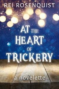
JF: It’s really not necessary to reference every single theme in the book, and the cover works just the way it is (without a food reference).
Christina Boyd submitted The Darcy Monologues designed by Shari Ryan, MadHAT Books and Covers. “Cover intent to convey 15 authors share Mr Darcy’s POV in short stories spanning Regency to Contemporary”

JF: Anthologies are always a challenge, but I think including two characters unnecessarily complicates this cover, which also has to have all those names on it. The print cover, with only one character, is much stronger.
Cierra Bluu submitted Paintball Love designed by Saltyspirit Photography. “The book cover is designed to show an emotional connection between two people that are in love. Their body language expresses passion and desire.”

JF: A very odd design if it’s meant to communicate relationship, and I feel bad for the type, which has obviously been tortured in a dark room somewhere.
Claudia Caren submitted Fated Loss designed by Damonza.

JF: A beautifully put together cover with strong atmosphere.
Cora Graphics submitted Il Diavolo ela Rosa designed by Cora Graphics.

JF: A lot of the effect of this cover is from strong details like the treatment of the woman’s hair and the delicate border element. And two people with their backs to us.
Damon Freeman submitted The Time Seller designed by Damonza.com.

JF: Attractive and spot on for the sci-fi/fantasy genre.
Damon Freeman submitted Kill Shot designed by Damonza.com.

JF: Strong composition, typography and scene-setting give this cover its impact. ★
Damon Freeman submitted Torrent designed by Damonza.com.

Damon Freeman submitted Wail designed by Damonza.com.

JF: The floating woman pulls us into the story, and the title with its “watery” distortion fits right in.
Damon Freeman submitted The Thought Cathedral designed by Damonza.com.

JF: This thriller cover uses focus not once, but twice to steer us right where the designer wants us to look: at the face revealed in the rectangle, then on the eye at the center of the focusing target. Although other elements are present, they are suppressed to allow the main element to predominate. ★
Damon Freeman submitted Empaths designed by Damonza.com.

JF: A beautiful and evocative cover with a figure that perfectly matches the title idea. ★
Damon Freeman submitted White Water, Black Death designed by Damonza.com.

Damon Freeman submitted Valley of the Kings designed by Damonza.com.

JF: The attention paid to the detail of the amulet, background, and typography help situate this historical novel in its era.
Dan Van Oss submitted The Club Jomtien designed by Dan Van Oss.

JF: Strong typography, great color control and another figure-with-his-back-to-us combine to represent this noir thriller.
Dan Van Oss submitted MemoryMen designed by Dan Van Oss.

JF: Strong composition and an interesting concept are somewhat mitigated by the very complex nature of the illustration at this display size.
Darja DDD submitted Phoenix Descending designed by Milo from Deranged Doctor Design. “Science Fiction & Fantasy book cover design by Milo, Deranged Doctor Design, Curse of the Phoenix Book 1”

JF: Solid composition and expert typography give this fantasy title great positioning.
Darja DDD submitted Hotsuka’s Story designed by Milo from Deranged Doctor Design. “Science Fiction & Fantasy book cover design by Milo, Deranged Doctor Design, Book 1 of the Dragon Pearl Series”

JF: Strong series design using dramatic lighting effects to isolate the main figure and an allusive font for the titles with distinctive series “branding.” Note that two of these covers show the central character facing away from us, one facing toward us. Wonder why?
Darja DDD submitted Barid’s Story designed by Milo from Deranged Doctor Design. “Science Fiction & Fantasy book cover design by Milo, Deranged Doctor Design, Book 2 of the Dragon Pearl Series”

Darja DDD submitted Omid’s Story designed by Milo from Deranged Doctor Design. “Science Fiction & Fantasy book cover design by Milo, Deranged Doctor Design, Book 3 of the Dragon Pearl Series”

Darja DDD submitted Vice designed by Marushka from Deranged Doctor Design. “Contemporary Romance cover design by Marushka from Deranged Doctor Design, Vegas Sins Series Book 1”

JF: Looks like a hard-boiled Vegas romance, with cues from the playing cards and strip of cityscape at the bottom. A short word like “Vice” lends itself to this type of emphatic type treatment.
Darren Howell submitted The Purging of Ruen designed by Darren Howell. “Thomas describes this book as “Wind in the Willows meets James Bond”, neither of which is represented by the cover. His uninspiring self-made cover does, however, afford excellent public protection from his utter lack of storytelling ability and possessive apostrophe usage.”

David Callinan submitted Torn Apart designed by David Callinan. “I have a number of books in a series and am trying to create a look or feel. And I want the cover to stop people even for a moment but not be a lookalike cover for every other thriller out there. Yet, it must say thriller to the reader.”

JF: A valiant effort, but the cover lacks the polish a professional would bring to the task.
David Grad submitted Happiness Is Just a Pill Away designed by Vernon J Allan. “Thanks for the opportunity. Cheers”

JF: The strong graphic design is a plus, but the small and indistinct title is a minus that’s easily fixed.
David King submitted Mars Out Of Time designed by David Avoura King. “I designed this cover using a stock photo image of Mars, and added a swastika and the stars of the EU flag superimposed on top of Mars.”

JF: The image composite is effective, but the awkward type treatment can’t keep up.
David Wind submitted A Better Place To Be: Based on the Harry Chapin Song designed by Scott Wienberg. “Because this book is based n the Harry Chapin Song, my designer and I decided to make the cover reflective of 2 of the verses of the song. I am submitting this, because I think the artist did an incredible job in capturing the essence and emotions of those verses in the cover.”

JF: So then why confine all the goodness of the illustration in that little rectangle in a sea of black background? The type also needs to be stronger.
Dean Klinkenberg submitted Double Dealing in Dubuque designed by Peggy Nehman.

JF: While the cityscape in the background is strong, I wonder about making a match the centerpiece of this cover. Wasn’t there anyone interesting enough to put on the cover?
Deborah Coonts submitted Lucky Double designed by Glendon of Streetlight Graphics. “The entire series has recently been redesigned by the talented Streetlight Graphics team.”

JF: Lots of incompatible and confusing type treatments blunt the impact of the artwork.
Eric Tomlinson submitted Pog and the King’s Armour designed by Kate Burke. “Kate produced a brilliant collage of events from the book. Every element refers to a scene, but gives nothing away. Months after the final artwork arrived I still look at it and think – wow, she picked that up. She hit the brief and then exceeded it by a mile. Easy to work with and easy to recommend”

JF: Of course, including all those scenes eliminates the possibility of having one, clear and focuses image on the cover, which seems to be best for ebook covers.
Erin Michelle Sky submitted The Intuitives designed by Eugen Zhuravel. “The art and concept was by Eugen Zhuravel. Wickedgoodbookcovers.com found the title font. Jordan D. Gum of imperialwerewolfoctopus.com finished the layout, hand-tooled the lettering, and tweaked the color.”

JF: Mysterious.
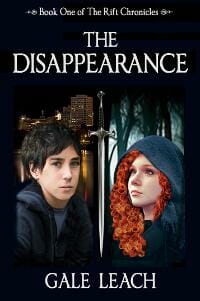
Gale Leach submitted The Disappearance: Book One of The Rift Chronicles designed by Gale H Leach. “YA Epic Fantasy”
Henry Hyde submitted Evening Falls designed by Henry Hyde. “The client gave me an unusual brief, asking me to emulate the look of an old book, printed with gilded decoration on leather covers. Obviously, this type of production isn’t possible for Kindle or CS, so I just aimed to create the right ‘feel’, which could also be applied across a fantasy series.”

JF: Might have more impact if the title was larger, it’s a bit quiet, which is an accurate reflection of this type of (historical) binding style.
James Egan submitted Witch of the Water designed by James T. Egan of Bookfly Design.

JF: A masterful combination of image, concept, and typography. The birds help integrate the two elements, and an overall air of mystery and threat represent this occult thriller. ★
James Egan submitted Gravitas designed by James T. Egan of Bookfly Design.

JF: A terrific sci-fi cover that promises lots of super-villain excitement.
James Egan submitted Cold Clay designed by James T. Egan of Bookfly Design.

JF: Lovely and artistic cover using two-dimensional elements to suggest cut paper for this cozy mystery.
Janine Pestel submitted The Bucktown Babies designed by Cover Mint.

JF: The designer makes good use of this stock image with the addition of expert typography.
Janine Pestel submitted The Mons Connection designed by Lisabooks.

JF: Effective sci-fi cover.
Jennifer Rackham submitted A Dash of Belladonna designed by Jennifer Rackham. “Thank you.”
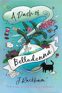
JF: I love the artistry and hand made quality of this cover, which plays well against the many glossy images usually on display.
JF Garrard submitted Trump Utopia or Dystopia Anthology designed by Dark Helix Press. “Cover for dark and light stories inspired by Trump’s presidency! Human beings are both good and bad, we wanted to show this with the halo and the horn. The symbolic hair gives away who he is without the need for a face. The orange and white split made a more interesting background.”

JF: Awkward and heavy-handed art, and the split background makes it more confusing.
Joanna Penn submitted Map of Shadows designed by JD Smith Design.

JF: The art brings an air of mystery and menace based to the map motif, and the classical type complements it nicely.
Johanna Mesa submitted Arbo makes an unlikely friend designed by JMR.

Julie Hall submitted Huntress (Life After Book 1) designed by Nathalia Suellen. “The cover represents her ascension to a heavenly realm after death, and the black bodysuit is her battle armor that she can materialize and dematerialize at will. In the story, and too her frustration, often revealing her true emotions.”

JF: Both of these covers artfully use the background and branded title to frame our attention on the attractive and animated heroine. Nice job.
Julie Hall submitted Warfare (Life After Book 2) designed by Christian Bentulan. “The main character leaves the heavenly realm and turns her back on her friends to save her family on Earth. The broken glass represents a forcefield-like dome that is protecting her family, but is shattered during an demonic siege.”

Kimbra Swain submitted Bless Your Heart designed by Hampton Lemoureux. “This is the first in the series paranormal romance/urban fantasy book. The tattoo was designed by a tattoo artist (the character uses it to store power), and we wanted to convey the magic through the tattoo. We also paid homage to the traditional romance novel with the series banner.”

JF: The artwork spotlights the relationship between the characters and draws viewers into the story, while the magical elements tell us more about what kind of story it is. And a distinctive title treatment, too.
Lance Charnes submitted Stealing Ghosts designed by Damonza. “Continuing with the Saul Bass-inspired look established by THE COLLECTION, the first installment in the series.”

JF: Amusing and different.
Lindsey Pogue submitted Dust and Shadow designed by Molly Phipps. “Each civilization in the Forgotten Lands Series has its own unique symbol. The butterfly is a major theme in Dust and Shadow. Both the insect and an heirloom butterfly pendant help the story’s main characters, Jo and Clayton, uncover many secrets and find out many truths about Sagebrush Canyon.”

JF: A beautifully detailed and well thought out cover with surprising details, but I think it would benefit from a title that has more contrast with the background.
Lon Brett Coon submitted Panther Across the Stars designed by EbookLaunch.

JF: The moonlight and simple composition help this cover, and the title font is very distinctive.
M.L. STRICKLAND submitted The Sunrise 2000 designed by MARY L STRICKLAND. “The setting is St. Petersburg, Florida, mostly in the 1970’s. The typical green bench faces the waterfront, showing sailboats in the harbor, and is empty, to express the overall theme of a meaningful life not yet found. Photo was purchased from a service and color edited and cropped to suit.”

JF: The image has possibilities, but the way it’s handled here seems amateurish.
Mark Dame submitted The Andor designed by Damonza.

JF: Exciting! Don’t you want to know what’s going on here?
Mark Ellero submitted Netcrash designed by Mark Ellero. “A very minimalistic approach for a cyber thriller packed with hackers and Internet data centers.”

JF: I suppose putting a label on the cover might help, but it really does look like the cover of a PDF on how to make money online.
Max Held submitted Whisper of the End designed by Diego Novamim Zuniga. “Cover design is supposed to be reminiscent of the Dragonlance series. My characters were supposed to look the part, with furred armor for my northern fighter and a practical kit for my mage. The character were designed to clearly convey their role with a glance.”

JF: And the title is supposed to be more than an afterthought, but the characters do stand out.
Meka James submitted Not Broken: The Happily Ever After designed by Design for Writers. “My FMC has a painting in her house that she reflects on throughout the story. When thinking about what I wanted for the cover, I knew a representation of that painting and the feelings it created needed to be the design.”

JF: Both serene and intriguing at the same time.
Michael Dirk Thalmann submitted Europa Affair designed by M.D. Thalmann. “This is a view of Jupiter from the surface of Europa, where the ice mining in the story takes place. I did all of the artwork, but hired a designer for the typography.”

JF: A workable sci-fi cover although some of the art looks a bit pasted together.
Patricia Lillie submitted Ghosts in Glass Houses designed by Patricia Lillie. “This cover for a first-in-series cozy-ish mystery was designed with the look and branding for future series books in mind.”

JF: A very effective ebook cover that maximizes readability and knows that just a small amount of illustration can pack in a lot of meaning. ★
Rhoda Baxter submitted Girl In Trouble designed by Rhoda Baxter. “The genre is British ‘Chick lit’ (contemporary romantic comedy). Set in London in the summer. Hopefully conveys the non-nonsense attitude of the heroine.”

JF: Love the soigné art, the typography is dull and inert.
Ric Dortone submitted Witch’s Pie designed by Bob Dortone. “The story is about an evil witch who turns children into pumpkins and uses them to make pies for her annual Halloween feast. Our cover is designed to show the key elements and characters of the story in a fun, spooky, but not to scary way.”

JF: Doesn’t look like it has risen to the level of finished artwork.
Richard Due submitted Idiot Genius: Willa Snap and the Clockwerk Boy designed by Richard Due. “Artwork by Carolyn Arcabascio”

JF: Attractive, if too busy, artwork.
Robert Enright submitted Doorways designed by Joshua Jadon. “This cover was the redesign after I required the rights back from my publisher and self published the book myself.
The concept about the book is another world that envelopes ours, that lives in the shadows. Hence the smoke and the impactful title.”

JF: Although the image is evocative and the cover well made, it doesn’t really tell us much about the story, although maybe that was your intent.
Robert Wheeler submitted Scions of Azazyel: War in Heaven designed by Robert K Wheeler Jr.

JF: The black band at the bottoms looks divorced from the rest of the cover.
Roh Morgon submitted Runner: Book II of The Chosen designed by Deranged Doctor Design. “The light from the Golden Gate Bridge and the full moon provide the backdrop for this night huntress as she contemplates entering the city. Milo’s use of color shift in this essentially monochrome scene offers focal points for the eye, causing the viewer to linger just a tad longer. The font and ornament confirm the supernatural aspect of this urban fantasy, and the moon provides an additional binding element for the series.”

JF: Another strong series design.
Roh Morgon submitted Watcher: Book I of The Chosen designed by Deranged Doctor Design. “This newly redesigned cover for the second edition of Watcher utilizes stark contrasts in color and elements to capture the protagonist’s conflict between her simple life in the mountains and the sleek sophistication of her lover’s world. The font and ornament help lend a supernatural feel to this urban fantasy/paranormal romance.Cover design by Milo at DDD.”

Sandy Day submitted Fred’s Funeral designed by Ciara Crozier.

JF: Interesting photo but a little underwhelming as a cover.
sean deville submitted Cobra Z designed by Severed Press. “Basically the book is a zombie horror that sees the initial contagion break out in london”

JF: Succeeds because it involves you in the story immediately.
Shirley Gilmore submitted Bucky and the Lukefahr Ladies: Walking the Labyrinth designed by Shirley Gilmore. “This novel is a contemporary fantasy with undertones of ancient history set in the Ozark Mountains of Missouri. All elements of the cover—the color-enhanced sandstone background, the Hittite cuneiform, the little green blobs, and the triskele spiral design—are all related to the story.”

JF: Inartful and it shows.
Stacy Claflin submitted Girl in Trouble designed by Didi Wahyudi.
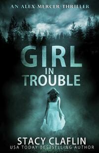
JF: Yet another effective series design, this one making full use of the back-to-us heroine, a carefully controlled color palette, and an atmosphere that promises mysterious doings.
Stacy Claflin submitted Little Lies designed by Didi Wahyudi.

Stacy Claflin submitted Secret Jaguar designed by Rebecca Frank.

JF: An adept combination of elements that hold together and which are complimented by a stylish title treatment for this story fantasy romance featuring a shape-shifter.
Stacy Claflin submitted Sweet Dreams designed by Najla Quamber.

JF: Suffers from the the couple being too far away to really engage with.
Tal Nuriel submitted Sammy the Station Wagon designed by Aidar Zeineshev. “Aidar made some amazing illustrations (including the cover) for my children’s book, Sammy the Station Wagon.”

JF: Cute. Are the cars dreaming?
Tiana Warner submitted Ice Kingdom (Mermaids of Eriana Kwai #3) designed by DJ Holmes. “I wanted the bottom of an iceberg, but I wanted the iceberg to have a bit of character — almost like an upside-down crown, to symbolize an underwater kingdom in anarchy. I think Deana nailed it!”

JF: It works.
Will Thompson submitted PATRIOTS: Book One designed by Mary Graw and Alaina Garren. “As this novel is about college students, I was so excited to find two current design students at Virginia Tech who had read an early draft of the book, loved it, and wanted to take a stab at the cover. I ended up not only going with their cover, but had them design much of the marketing campaign.”

JF: I think “stab” is correct, but this cover, although it shows design skills, does not make it as a book cover which needs stronger communication and better legibility.
William Larsh submitted L’Archevêque designed by William Alan Larsh. “My book is a novel based on the true story of Paul L’Archevêque, a French fur trader dealing with the Shawnee Indians in the Ohio Valley in the 1700s. The cover of the book is a depiction of L’Archevêque in his canoe loaded with furs on the Ohio River.”

JF: Looks self-published, and I don’t mean that as a compliment.
Nonfiction Covers
Christopher Herndon submitted The Wicked Problem of Cultural Heritage and Conflict: Military Involvement in the Protection and Devastation of Cultural Property designed by Christopher V. Herndon. “I designed the cover using a picture of Palmyra, Syria to stress that while writing, ISIS was occupying, looting, selling and destroying Palmyra. The book is about cultural property protection and points out that terrorist groups are selling antiquities in order to fund their terror.”

JF: Not too bad, but marred by the two incompatible color bands and little sense of composition.
Cora Graphics submitted Il Re degli Inganni designed by Cora Graphics.

JF: A warm and humane design making use of color and texture to situate the story (which translates as “The King of Deception”).
Daniele Della Valle submitted Happy Weight designed by Daniele Della Valle.

JF: Looks like a really interesting concept sketch you would give to a professional designer to make a real book cover from.
Debby Gies submitted Twenty Years: After “I Do” designed by Yvonne Less. “I feel the artist has captured the essence of the book with the elements and their display, and the pastel background to enhance the feeling of a relationship through the years.”

JF: Visually beautiful, but I’m not sure the images says “20 years later” because it looks more like a wedding photo. And I admit to being mystified by the colon in the title.
Eshan Sharma submitted The Teacher I Never Met designed by Raghav Sharma. “The cover of The Teacher I Never Met is philosophically designed by a 18 years old boy. You can see Dr.APJ Abdul Kalam, most loved president of India with the Indian flag in the background. The cover is self-explanatory and professionally designed.”

JF: But isn’t “philosophically designed” by an 18-year old kind of the opposite of “professionally designed”? Nevertheless, the cover has charm. Might be a good idea to name Dr. Kalam in a subtitle.
Filemon Schoffer submitted The 3D Printing Handbook designed by Tom Debicki / Multitude. “The cover depicts the most common design rules for 3D printing. A great job from the designer in my opinion, creating a visually attractive, on topic, cover for an engineering book.”

JF: I agree completely that it is visually attractive, on target, and professionally done… for an 8.5″ x 11″ print book. Not for an ebook cover, where all the detail and little drawings simply get lost.
Gisela Hausmann submitted The Little Blue Book for Authors: 101 Clues to Get More Out of Faceboo designed by Gisela Hausmann. “My new series”

JF: Both these covers are functional but very dull and, in the one below, awkwardly composed.
Gisela Hausmann submitted The Little Blue Book for Authors: 53 Dos & Don’ts Nobody Is Telling You designed by Gisela Hausmann. “my new series”

John Griffith submitted A Dad’s Fun Guide to Raising Happy Daughters: Imagination Activities Against
Body-Snatching Zombie Naysayers
and Other Foes of Happiness designed by Mark Foster.

JF: It looks like an interesting piece of art, but as a book cover pretty much misses the point. Way too much detail to see at this size, and all the type has been minimized and pushed aside, making it irrelevant.
Lauren Jefferson submitted Past Lives: Journeys Revealed designed by Lauren Jefferson. “After Damian hosted a show on LMN about past life regression as a form of therapy, I felt it was important to feature him on the cover in an approachable, classic “self-help” way that which would inspire a sense of familiarity and legitimacy.”

JF: An adequate design, but you might want to control your desire to keep adding rules (lines) and borders that have no use and only distract from your message.
Mary-Margaret Stratton submitted Eat Like Eve designed by Mary-Margaret Stratton. “Art direction and book production by me. Cover photo was shot by Julie Klima.”

JF: Fire yourself and hire a pro.
Nancy O’Hare submitted Dust in My Pack designed by Bright Wing Books. “The goal of my cover was to convey the theme of exploring our world and shining a new light on different places people perhaps had not considered visiting. Dust in My Pack is a mix between travel stories and travel guidance based on my most memorable trips over twenty years.”

JF: Considering the visual subjects available to travel writers, I’m stumped by why you decided on this cover which is pretty uninspiring, a bit dull, and doesn’t (at least to me) say anything about travel or shining a light on anything.
Peter Dixon submitted The Bride’s Trunk designed by James Morgan. “An authentic background image was used. Authenticity was more important to the author than author marketing.”

JF: I take your statement to mean “the author wanted a cover that pleased her, regardless of how it affects book sales.” And that’s fine if that matches your intent.
Prophet Charles Light submitted The LightBringer Chronicles designed by Zenaida.

Randy Ellefson submitted Creating Places designed by Deranged Doctor Design. “The open door perfectly complemented the idea of opening new worlds for creative people, with the book overlay targeting the main audience: storytellers.”

JF: The lush feeling and allusion to fantasy covers works to your advantage since the market for the book is world-creating writers. An effective cover. ★
Ravi Chandra submitted Facebuddha: Transcendence in the Age of Social Networks designed by Viet Le and Ravi Chandra. “Designed to be a take on a Facebook profile. The cover image is by Tenzing Rigdol (Hollywood Buddha).”

JF: It does have that Facebook look, although the cover overall could use more impact.
Ted Larkins submitted Get To Be Happy: Stories and Secrets to Loving the Sh*t Out Of Life designed by Gabriel Gandzjuk. “After working for six months with three designers, with over 20 concepts, my friend texted me the image of the smiling palm tree and I said, “That’s it!” I knew it in my heart.”

JF: A happy marriage of image and theme, well put together and sure to interest your readers. (When submitting covers like this, add a soft or thin rule to prevent the white background from “bleeding” onto web pages.) ★
Well, that’s it for this month. I hope you found it interesting, and that you’ll share with other people interested in self-publishing.
Use the share buttons below to Tweet it, Share it on Facebook, Plus-1 it on Google+, Link to it!
Our next awards post will be on February 19, 2018. Deadline for submissions will be January 31, 2018. Don’t miss it! Here are all the links you’ll need:
- The original announcement post
- E-book Cover Design Awards web page
- Click here to submit your e-book cover (See New Submission limits)
- Follow @JFBookman on Twitter for news about the E-book Cover Design Awards
- Check out past e-Book Cover Design award winners on Pinterest
- Subscribe to The Book Designer Blog
- Badge design by Derek Murphy


