Welcome to the e-Book Cover Design Awards. This edition is for submissions during December, 2013.
This month we received:
72 covers in the Fiction category
16 covers in the Nonfiction category
Comments, Award Winners, and Gold Stars
I’ve added comments (JF: ) to many of the entries, but not all. Remember that the aim of these posts is educational, and by submitting you are inviting comments, commendations, and constructive criticism.
Thanks to everyone who participated. I hope you enjoy these as much as I did. Please leave a comment to let me know which are your favorites or, if you disagree, let me know why.
Although there is only winner in each category, other covers that were considered for the award or which stood out in some exemplary way, are indicated with a gold star: ★
Award winners and Gold-Starred covers also win the right to display our badges on their websites, so don’t forget to get your badge to get a little more attention for the work you’ve put into your book.
Also please note that we are now linking winning covers to their sales page on Amazon or Smashwords.
Now, without any further ado, here are the winners of this month’s e-Book Cover Design Awards.
e-Book Cover Design Award Winner for December 2013 in Fiction
Rachel Cole submitted Zebras in London designed by Littera Designs. “The author said zebra stripes, rain, and the colour red were important elements in the story. But I took a bit of literary license with the zebra stripes as my immediate thought were the famous “zebra crossings” in London.”

JF: Great job. Economical with a strong graphic sense, a design that stands out boldly, yet at the same time contains just enough story to create a powerful allure.
e-Book Cover Design Award Winner for December 2013 in Nonfiction
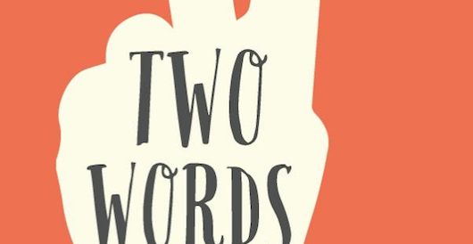
Emily Timbol submitted Two Words: Why Hearing “I’m Gay” Changed My Straight, Christian Life designed by Kevin Snow.
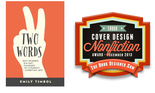
JF: I love the strong graphic look of this cover, the way it draws us in to find out what “two words” means, and the integration of the title, the illustration, and the meaning they are meant to convey.
Fiction Covers
A. F. Stewart submitted Fairy Tale Fusion designed by A. F. Stewart.

JF: Despite the attempt at atmosphere, the typography weakens this cover.
Abel Valdivia submitted Murder & Mochas designed by Abel Valdivia. “I designed this e-book cover for my friend Rhett Bigler, author of Murder & Mochas. A Southern noir sci-fi detective story, Murder & Mochas bounces a sarcastic and gritty detective off aliens and life in a small southern town where an entry portal is present.”

JF: Well, you’ve got MY attention.
AJ Salem submitted Almost Demon designed by Menachem Krinsky.
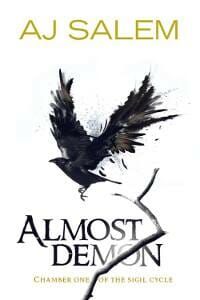
JF: Good typography and a strong illustration, unfortunately, don’t add up to a coherent cover, which also needs a border to prevent “bleeding” onto the page, and that’s not helping.
Ally Nathaniel submitted Sparkly Me designed by SugarSnail. “This book was the #1 best seller for 16 weeks straight. I believe the cover design was just brilliant.”

JF: Beautiful. Shows that no matter what your genre, knowing your audience is primary. ★
Andy Brown submitted Our Husband designed by Andy Brown. “One of my favorite covers done for the best-selling author Stephanie Bond. Playing off of the traditional wedding cake with a bride and groom on top, this cover uses a humor to convey the story of three jilted women getting their revenge. Bright color and large readable type make it pop off the page”

JF: A clever cover somewhat undone by disjointed typography and harder-to-read-than-necessary light blue type on a white background.
Andy Brown submitted True Hollywood Lies designed by Andy Brown. “Combining multiple stock photos along with a dazzling type treatment I tried to convey the sexy Hollywood setting of this romance novel.”
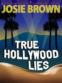
JF: I love the design of this cover but not the gratuitous 3D type effects on the author’s name. What does it add?
B.W. DeCaro submitted Grown Men Don’t Cry designed by K. Vossen. “The cover symbolizes a man at the crossroads as he battles inner demons and struggles to find purpose in an unforgiving world. Cheers, B.W. DeCaro”

Bryce Beattie submitted The Journey of St. Laurent designed by Adam Masterman / Me. “I met Adam on deviant art and he has done one cover painting for me before. The book is an action/adventure/aliens/zombies pulp, and I thought his style fit the bill. Adam did the digital painting and I did the lettering.”

JF: Great sci-fi illustration, it would be interesting to see it with more pulp-inspired typography. Nice.
Carol COOPER submitted ONE NIGHT AT THE JACARANDA designed by White Glove. “Not my first choice of font, but I hope the cover still conveys something about this darker than average novel about dating.”

JF: Nicely evocative, but the title could be stronger.
Cathy White submitted The Flash Mob designed by Kirsty Jordan. “The cover was designed to reflect the authors and content. Each character is one of the authors, with an element of a story incorporated into the design. The four authors are standing against a wall, like a ‘mob’, to echo the title.”

JF: Unfortunately, it has that “I’ve never done a book cover before” look to it, and that’s probably not what you want. Please compare to the other covers on this page.
Christina Tarabochia submitted Broken Wings designed by Nicole Miller of Miller Media Solutions. “We wanted to capture the 1940s look of a Scotish RAF nurse and an American bomber pilot in WWII. The live model shoot really nailed the characters, the romance, and the war. We were able to get poses for all six books in the Thistle Series by the late Dianne Price.”

JF: Awkward.
Christina Tarabochia submitted The Journey of Eleven Moons designed by Nicole Miller of Miller Media Solutions. “Another live model shoot. We needed to find girls who could look Aleut and like half-sisters, and be from the 1850s. (Youngest girl happens to be my/the Publisher’s daughter.) Wanted to capture the fierceness of the girls as they survive the harshness of Alsaka, but also highlight the beauty.”

JF: Very dull, despite the nice lettering. Would need a much stronger photo to make this work.
Christopher McPherson submitted Sabotage at RKO Studio designed by Matt Hinrichs. ““Sabotage at RKO Studio,” the second James Murray Mystery, is set in 1930s Hollywood. I asked Matt Hinrichs to create a design that evokes the covers of pulp magazines of the period; but stay true to the design of the first book, “Murder at Eastern Columbia.” I think he did a bang-up job.”

JF: Matt knows how to do it, and I love the whole design of this cover. But the pattern in the background seems a bit strong to my eye, and I keep thinking it’s some kind of moiré effect.
Conzpiracy Digital Arts submitted The Whitechapel Demon designed by Conzpiracy Digital Arts. “This is my first foray into more supernatural flavoured territory, I’m predominantly a Horror / Post-Apocalyptic cover artist. Great fun!!”

JF: Great job, very enticing in a scary kind of way, and the “ghosted” type is perfect here. ★
David McIntyre submitted The Cyber Claus designed by David McIntyre. “Created in Photoshop and Maya 3D”

JF: Looks cool but hard to make out what the illustration is about.
David Tatum submitted In Treachery Forged designed by Alex Kolesar. “This novel is a new adult heroic fantasy series. The author (me) has a small platform in the world of anime and manga to which I am trying to market this book.”
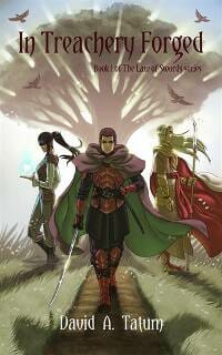
JF: Well, good luck with that. You have a terrific illustration just begging for better typography to establish a strong brand.
Ebony McKenna submitted The Summer of Shambles (Ondine Book #1) designed by The Masked Maven. “I needed covers that relayed a strong sense of magic, intrigue and romance. There is an ‘old timey’ feel to the books, so the font choice needed to evoke a 1970s feel.”

JF: The 70s? Was it really that long ago? I remember it well. You could try Korinna, it drove me crazy in those days. Seriously, your cover is excellent, enticing, with real pop. ★
Ed Wolfe submitted Comin’ Down Fast designed by Shaelee Michelle Wolfe. “The story is dark and foreboding since it’s about the end of the world as we know it and so the cover designer mixed elements of normal life, the car in a parking lot, with a mood of darkness with the clouds, trees and the male figure.”

JF: Serviceable, if a bit disjointed. Lackluster title type.
Edwin Tipple submitted Harrowing designed by Me & Aourd Srisamai. “Local Thai artist Aourd Srisamai’s painted the cover for Harrowing. The picture, 18″x27″, depicts a scene from the woman’s nightmare, when she realises the girl will die in the imminent train wreck. I added the text digitally & when Aourd paints it in, I’ll have a unique picture to hang on my wall.”
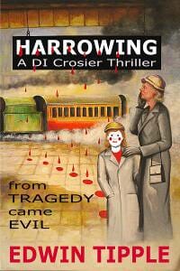
JF: Odd.
Falafel Jones submitted Press One for Yes designed by Falafel Jones. “This cover consists of two images. The keypad was manipulated so that all of the numbers were replaced by the number two. Then the graphic was darkened and blurred. Next the cigarette layer was added in screen mode allowing the numbered keys to show through. Lastly, the text was added.”

JF: I wouldn’t mind a falafel right now, actually. This is a nice cover from a strong concept, but the title ought to be much stronger and drop the fussy features. If I was designing this cover, by the way, I’d make sure the title covered that smoke, because here it’s competing with your main focus point and leading the eye in the wrong direction.
Greg Strandberg submitted Tarot Card Killer designed by goonwrite.com. “Here’s my NaNoWriMo book. This detective thriller throws together Tarot cards with my firsthand knowledge of Hong Kong. James over at Go On Write was able to come up with this cool design based on my ideas, and I think I’ll simply change the card out for the next two in the series, nothing more.”

JF: Simple, effective.
Hillel Cooperman submitted The Madrona Heroes Register: Echoes of the Past designed by Caroline Hadilaksono. “This is the hand painted cover for my new YA superhero fantasy novel – The Madrona Heroes Register. It was published in December of 2013. Enjoy!”
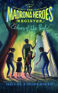
JF: I could quibble about the subtitle being hard to read, by why complain about this cover since it works so well, and I like the “caught in the action” illustration, too.
J. B. Chicoine submitted Portrait of a Girl Running designed by J. B. Chicoine.

JF: Communicates . . . what, exactly?
James Egan submitted Cash Burn designed by James T. Egan of Bookfly Design.

JF: Right on target with this strong design, although there might be another solution for that subtitle.
James Egan submitted Illuminated designed by James T. Egan of Bookfly Design.
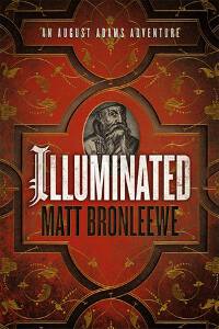
JF: Nicely done, sends a clear signal to readers of this genre.
James Egan submitted Occupation designed by James Egan of Bookfly Design.

James McDonald submitted An Operation of Cooperation designed by James McDonald. “A continuation of the Sami and Thomas series of books for kids.”

JF: Well suited to its audience, and I love the rubber-bandy title type.
Jan Hurst-Nicholson submitted With the Headmaster’s Approval designed by Vanessa Burger. “The story appeals to readers who love romance, as well as those who ‘never read romance’, so the romance aspect had to be understated to attract both sets of readers. The MC often stands with his hand in his pocket, and the pen represents his ‘approval’.”

JF: The pen is superfluous, and the design treats it that way.
Janet Hurst-Nicholson submitted The Race (an inspiring story for left-handers) designed by Vanessa Burger. “Although the story is about a left-handed child who wants to win the egg & spoon race, there is also a chapter at the end to help parents and teachers of left-handed children. The cover is intended to attract parents, grandparents and teachers,(who will be buying it) as well as the child reader.”

JF: Cute and engaging, and that’s what you want for this kind of book.
Jason Walsh submitted Nervous System designed by Jason Walsh. “I am submitting this on behalf of myself as designer and Andrea Ring (Author).”

JF: Even though this illustration is fantastic, it’s been allowed to take over the cover, to the detriment of the whole.
Jennifer Ellis submitted A Pair of Docks designed by Andrew Brown, Design for Writers.

JF: Nice drama in this attractive cover that uses the idiosyncrasies of the title lettering to great effect.
Joshua Steelman submitted Marcuria’s End designed by David Wilkins. “The roles of Light and Dark in the world of Marcuria are twisted perversions of what we understand them to be. Though unseen, darkness is everywhere, enveloping everything in a cocoon of nurturing care. The Light only seeks to destroy; this is represented by the angry glare of Light from the eyes.”

JF: A little coldly symbolic for my taste.
June Pace submitted Benjamin McTish and the Door Through The Grandfather Tree designed by June Pace. “The second book in the series is almost ready for publishing…on my blog you’ll see a sample of the art for the second book..it completely follows the theme of the first book..and I hadn’t even read your article about following that consistency yet..so there you have it!”

JF: Nice drawing, too bad the cover is so hard to read.
K.C. Blake submitted Bait designed by K.C. Blake.

Karen A. Wyle submitted Division designed by David Leek and Karen A. Wyle. “This design was a team effort. Beta reader Lehsa Griebel came up with the puzzle element, and David Leek and I worked closely together on the overall design. Another designer, my friend Michelle Hartz, did the final photo editing for the “twins” image.”

JF: Awkward and a little creepy. Overall a weak cover.
Kelly Abell submitted Mabe’s Burden designed by Kelly Abell.

JF: The “pasted-on” look combined with three styles of typography pointing in different directions.
Kelly Abell submitted Secret From the Flames designed by Kelly Abell.

JF: Tortured.
Latasha Lewis submitted A Whistle in the Night designed by Lee Taylor.

JF: Why burden this conceptually strong, well designed, beautifully executed cover with a title that can’t be read?
Laurie Boris submitted Sliding Past Vertical designed by Paul Blumstein. “I wanted the artist to capture not just the diving metaphors in the story but also the chaos in the protagonist’s life.”

Lexi Revellian submitted Wolf by the Ears designed by Lexi Revellian.

JF: The author/designer knows exactly what readers are looking for, and delivers.
Loni Townsend submitted Thanmir War designed by Loni Townsend. “I wanted something that said fantasy with a bit of foreboding atmosphere. I designed the cover myself with input from family, and tested it on a few friends. As a DIY, I’m pleased with the results. I would love to hear any feedback you have for it.”

JF: A great job for your first time out. Keeping a simple palette and focusing on one main graphic element really helps, but you’ll need much better typography to get to the next level.
Madge Walls submitted Buyers Are Liars designed by Heather Walls.

JF: Looks like a real estate thriller. I find hard to read type a distraction.
Mari Hsu submitted Radium Baby designed by Laura Ramie.

JF: Sadly, another victim falls to the pack-in-the-symbolism virus.
Maria Novillo Saravia submitted The terrible neck pain of Sunny the Sunflower designed by www.beautebook.com. “This children’s book is illustrated by Florencia Marquez. It is intended for ages 5 to 7 years old.”

JF: Nice design, but do kids actually want to read about “terrible neck pain”?
Mark Matthews submitted Wicked Smart Carnie designed by Mark Matthews. “This is a short story. The cover photo is one which I obtained the rights to and was not designed by me.”

Martin Crosbie submitted Believing Again: A Tale Of Two Christmases designed by Jun Ares. “Jun Ares came up with another great cover for me. He seems to instinctively know what’s going to work. I was very pleased with this cover.”

JF: Beautiful and evocative.
Matt Sinclair submitted Whispering Minds designed by Charlee Hoffman. “The image aims to convey the fragility of the lead character both in the echoing effect of the model’s face, the wintry colors and background, and the frozen, cracking skin.”

JF: A nicely integrated, attractive cover.
Melissa Ryan submitted Special Attraction designed by M.L. Ryan.

JF: Works beautifully, and the image itself is a great hook.
Michael Thies submitted The Trials of the Core designed by Angela Schmitt.

JF: Seems to be ignoring its genre.
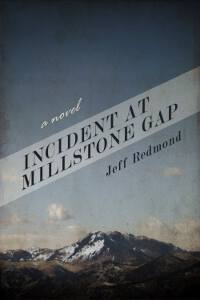
Niki Bradley submitted Incident at Millstone Gap designed by J.N. Bradley.
Patrick Moeller submitted Love Me Later designed by Patrick Moeller, Dorothea Martin. “The cover is a combination of text taken from the book itself and assembled in various layers to look like the face of the main character. It hints at what she is going through without giving away too much of that.”

JF: It might have been better to emphasize the way the illustration is built from text, because as it is the cover doesn’t focus, and the title is poorly handled.
Paul Duffau submitted Finishing Kick designed by Kit Foster. “I found Kit Foster here on your site and asked him to create a cover that conveyed the tension and passion of a girl racing her last cross-country meet, vying for a championship. He did a terrific job of building that passion and drive with the image, background setting, and font.”
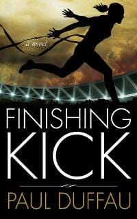
JF: Very effective, with lovely typography.
Rebecca Berto submitted Pulling Me Under designed by Berto Designs.

JF: A good concept lacking contrast in both the illustration and the type.
Richard Pierce submitted The Failed Assassin designed by Richard Pierce. “I wanted this to be a subtle cover for an erotic thriller. Not only did I want to evoke the anonymity of sex and the anonymity of an assassin; I also wanted to allude to the fact that the book is written as a literary riposte to 50 Shades of Grey.”

JF: Seems a bit subdued for this genre unless browsers make the connection.
Rinelle Grey submitted Twin Curse designed by Hidesy Designs. “I wanted a cover that was different to my other (sci-fi romance) covers, but still conveyed a similar feeling. I loved this image, and the title fits in perfectly.”
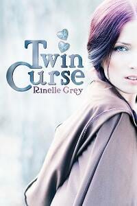
JF: Might be even better with more contast.
Roz Morris submitted Lifeform Three designed by Roz Morris. “This novel is literary fiction set in the future, and a journey for the central character. I decided to focus on images that suggested the themes – memories, lost times and what we have unwittingly destroyed – tied together with the door, which is an important emblem.”

JF: Nice job, very intriguing.
Scott Jenkins submitted Bullet Catch: Smoke & Dagger Book 1 designed by Jennifer Perry. “This is a story about a magician who finds himself over his head in a strange city where an assassin is after his parents. We used stock photos of a troubled man over a shot of Berlin at night. The text and logo were completed in Photoshop.”

JF: A good thriller cover with strong series branding.
Scott Marlowe submitted The Five Elements (The Alchemancer: Book One) designed by James at humblenations.com. “I threw a couple of stock images at my designer with the disclaimer, “I’m not sure if you can do this, but… .” Little did I know the guy’s a wizard!”

JF: A strong genre cover.
Sharon Kay submitted Wicked Wind designed by Amanda Simpson at Pixel Mischief. “The goal here was a simple, striking image. I wanted to show my main character’s strength and struggle, as well as the neat ability to conjure fire in his hands.”

JF: Similar images have played a central role in other covers submitted to this competition, and this cover makes great use of it here.
Shelton Keys Dunning submitted The Trouble with Henry designed by humblenations. “A quirky murder mystery set in Chicago.What drew me to this image was how clean it looked, even as a black & white thumbnail. & I really liked the bright red toetag. I think humblenations did an excellent job with the typography too.”
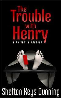
JF: I agree, a tight and quirky cover for sure.
Stacy Claflin submitted Silent Bite designed by Bryan Hufalar

Suzanne Dritschilo submitted Drama Geek designed by Suzanne Dritschilo. “I wanted my YA fiction about a 17yo junior and her close circle of outgoing, dramatic friends from her high school theater dept to have symbols of the MC’s changing interests that many teens struggle with in daily life, with a passionate red as the underlying background color to bind it all.”
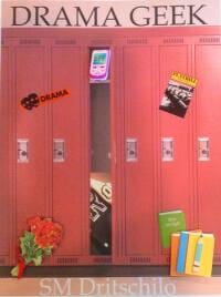
JF: I like the idea, but in practice all the elements have become so small as to be indecipherable.
Suzanne Synborski submitted Behind Lace Curtains designed by Suzanne M. Synborski.

Tatlin submitted Cool Side of the Pillow designed by Tatlin.net. “”
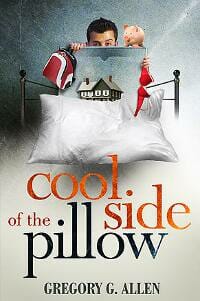
ghJF: A delightful ebook cover with sophisticated typography, well done.
Tatlin submitted A forgotten man designed by Tatlin.net.
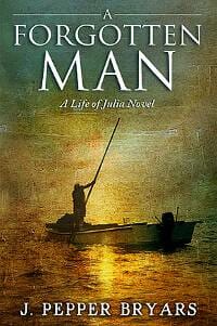
JF: Classic typography that the designer uses to focus us on the central point of the cover. Combined with a great painting, it makes a memorable impression. ★
Ted Fauster submitted Deomans of Faerel designed by Ted Fauster. “The Deomans of Faerel cover was created using a purchased and licensed stock image that was colorized and then layered with text placed in Photoshop.”
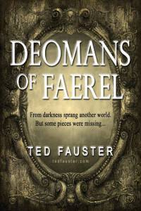
JF: A solid cover well targeted to its readers.
Teresa Irvin submitted Seeds of Rebellion designed by Cover art by Randy Steele.

Tom Conyers submitted Forever Human designed by Bright Spark. “I held a competition on 99 designs. Over 150 entries. I picked three winners . From those three winners I picked Bright Spark’s design as my cover. Simple but striking. Looks great full res’ but also thumbtack size.”

JF: A very professional-looking cover with a well-integrated message.
Tyler Compton submitted Wicked Games designed by Derek Murphy. “Colors and cityscapes in the background were the only things that changed over time. The font, colors of the font, and the chess pieces stayed the same.”
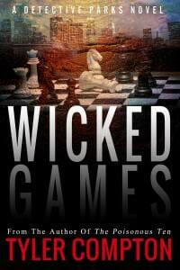
JF: A very accomplished thriller cover that uses story elements and graphic type treatments to make just the right impression.
Will Wight submitted The Traveler’s Gate Chronicles, Book 1: Tower of Winter designed by Patrick Foster. “TOWER OF WINTER needed to be obviously connected to Wight’s main trilogy, and yet be clearly not _part_ of that set of books. Connection is implied through typography; the disconnect from the main trilogy is crafted via a ver different colour palette and illustration style.”

Y. K. Greene submitted Ash of Ambitions designed by Y. K. Greene. “Featuring the title character of Ash, elements of glowing coals and crumbling ashes I hoped to convey a little of the dark fantasy setting of the novel as well as the strength and beauty of the lead character.”

JF: Wow. No, it doesn’t work for me, a truly inexplicable composite that, while sexy, doesn’t seem to make much sense.
Nonfiction Covers
A. Paige Turner submitted Top Goon designed by MRC Designs, LLC.. “This is a tell all memoir about a former gangster turned law abiding citizen. This is a 3 part series and this entry is Book 1. The cover is meant to convey the point in his journey where he is fully immersed in crime and how he got there.”

JF: Indecipherable.
Cynthia Adams submitted A Widow’s Pursuit designed by Lori Terry. “My book cover shows a mother and two daughters walking along the beach. This illustrates my two daughters and myself as we journeyed through grief together.”

JF: Needs a better title treatment.
Eldon Sarte submitted Wordpreneur Peeps: 107 Successful Indie Publishers designed by eldon Sarte.

JF: Another great cover from an author who really understands graphics, and has a playful side, too. ★
Eric Lorenzen submitted Hiring Paperwork designed by Eric Lorenzen. “This guidebook is the first in the Be a Better Boss series, offering practical help to managers, supervisors, and small business owners. I, as the general manager of Genuine HR, did the design work. Photo by GlobalStock/iStockphoto.”

JF: Sideways or vertical titles rarely work well for nonfiction books, and I think this cover shows why.
Ford Baker submitted Time Out for a Better Marriage: The Husband Guide Volume I designed by Ford and Kandy Baker. “Time Out for a Better Marriage explains a sensible process for struggling husbands to slow down and reassess their marital situation before it completely falls apart.”

JF: Simple, but it gets the point across.
Ian Cumpstey submitted Lord Peter and Little Kerstin designed by Ian Cumpstey. “The book is a collection of Swedish traditional narrative folk ballads translated into English verse. I had already published this in paperback and wanted to maintain a continuity in the design for the ebook cover. The necessity for larger type for the ebook cover was an important factor.”

JF: The lovely watercolor creates a perfect environment for this sensitive cover.
James Perdue Ed.D. submitted One More Play designed by James Perdue and Shirly Phipps. “The book cover represents the essence of my life with the love of sports that ironically limited my mobility, the wheelchair that partially restored mobility, and the dog Ricardo that restored the reason for mobility.”

JF: Needs professional intervention.
Janet Wellington submitted Cats of Italy/Gatti d’Italia designed by Janet Wellington.

JF: You can’t go wrong with a cute cat on your cover, but in this case the fussy type seems to be fighting with all the detail in the photo.
Joseph D’Agnese submitted The Scientist and the Sociopath designed by Jeroen ten Berge. “Jeroen managed to fuse the personalities of two men who lived in vastly different times in British history: a modern scientist and an Elizabethan conman/sociopath.”

JF: Love the composition and concept on this cover, and the clever illustration, but why does it have to be hard to read? A little contrast between the title and the background would fix it.
Kirsty McGregor submitted Go Hard or Go Home: The Little Book of Overlanding designed by Adam Togni. “This cover embodies ‘overlanding’ – scenic landscape views, tyre tracks and army issue sand mats (synonymous with overlanding). The perspective of main shot represents the endless freedom of the road. We use the same tyre tracks as theme across all our overlanding books.”

JF: A very solid cover that seems a bit murky.
Kirsty McGregor submitted It’s NOT a Holiday! The A-Z Guide to Group Travel designed by Adam Togni. “The idea behind this cover was to have an idyllic ‘utopia/paradise’ (hence the 3D computer generated image) that represents a stereotypical holiday shattered by tyre tracks. Overland travel, the main type of group travel we talk about in the book is NOT a holiday, it is a life experience.”

Laura Roberts submitted Montreal from A to Z: An Alphabetical Guide designed by John Moore Williams.

JF: With all the great visuals of Montreal, it might have been nice to use one on this cover.
M.M. Justus submitted Cross-Country: Adventures alone across America and back designed by M.M. Justus. “The photo is one I took, on the travels that inspired the book. The dark is pulled from the color of the road. I’m strictly an amateur cover designer, for my own books only because I don’t have a lot of money to invest, but I’d like to know what you think of this one.”

JF: Simple but effective, showing that even with some carefully chosen elements, non-designers can create workable ebook covers.
Richard Epworth submitted Bottleneck designed by John Cox. “Had fixed ideas about message cover should convey. Johns website gave confidence to trust his judgement, huge relief. Result: an enigmatic cover to lure people in. Interacting with him brought back excitement into my project, such fun to have another creative individual involved.”

JF: Yes, and what a payoff. A terrific surrealist cover with great texture and presence. Memorable. ★
Tatlin submitted A Short History of the World designed by Tatlin.net.

JF: Another clever and effective cover from a talented designer. ★
Well, that’s it for this month. I hope you found it interesting, and that you’ll share with other people interested in self-publishing.
Use the share buttons below to Tweet it, Share it on Facebook, Plus-1 it on Google+, Link to it!
Our next awards post will be on February 10, 2014. Deadline for submissions will be January 31, 2014. Don’t miss it! Here are all the links you’ll need:
The original announcement post
E-book Cover Design Awards web page
Click here to submit your e-book cover
Follow @JFBookman on Twitter for news about the E-book Cover Design Awards
Subscribe to The Book Designer Blog
Badge design by Derek Murphy


