By Joel Friedlander
Welcome to the e-Book Cover Design Awards. This edition is for submissions during April, 2019.
This month we received:
44 covers in the Fiction category
7 covers in the Nonfiction category
Guest Judge
 I’m very pleased to welcome Tanja Prokop to The Book Designer as a guest judge again this month. Tanja was born in Germany, but lives and was raised in Croatia. Her three beautiful daughters and her amazing husband are her biggest inspiration in life. She has an MA degree in German language and literature and philosophy. A few years ago she started her own design company and became a professional book cover designer. She designs covers, and is constantly creating new visual experiences for her clients. Tanja is also a multiple winner of various book cover design contests and has created thousands of covers. You can find her pre-made covers at Book Design Templates, or visit her site at www.bookcoverworld.com.
Comments, Award Winners, and Gold Stars
I’ve added comments (TP: ) to many of the entries, but not all. Remember that the aim of these posts is educational, and by submitting you are inviting comments, commendations, and constructive criticism.
Thanks to everyone who participated. I hope you enjoy these as much as I did. Please leave a comment to let me know which are your favorites or, if you disagree, let me know why.
Although there is only winner in each category, other covers that were considered for the award or which stood out in some exemplary way, are indicated with a gold star: ★
Award winners and Gold-Starred covers also win the right to display our badges on their websites, so don’t forget to get your badge to get a little more attention for the work you’ve put into your book.
Also please note that we are now linking winning covers to their sales page on Amazon or Smashwords.
Now, without any further ado, here are the winners of this month’s e-Book Cover Design Awards.
e-Book Cover Design Award Winner for April 2019 in Fiction
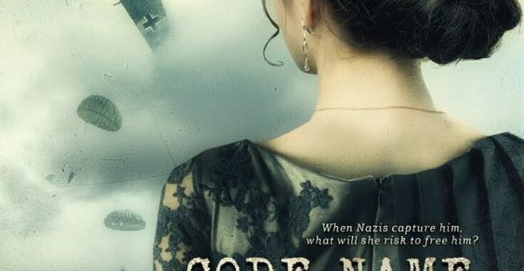
Darja DDD submitted Code Name: Beatriz designed by Marushka from Deranged Doctor Design. “Historical Thriller book cover design”


TP: Going through all designs, this cover caught my eye immediately and I knew that this was the winner. A perfect combination of imagery and typography.
e-Book Cover Design Award Winner for April 2019 in Nonfiction
Murray Ewing submitted Story Sense for Writers designed by Murray Ewing.
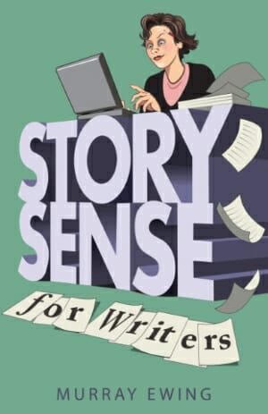
TP: Appealing, interesting and it definitely makes a statement.
Fiction Covers
Alison Stuart submitted Gather the Bones designed by Fiona Jayde. “My designer had a tough brief but she brilliantly captured the dual time line (the regency girl morphing to the 1920s girl), the diary and the WW1 connections (the poppies)… and of course the mysteries to be solved (the blood drops).”
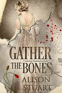
TP: A really nice cover design. The designer has used a lot of images, but still managed to create a good cover.
ashok rajamani submitted tea unbrewed: a collection of poetry designed by ashok rajamani. “I understand there is no category for ‘poetry,’ but the beauty of this cover must be submitted. it depicts the serene face of Buddha, seated in a red velvet, candle-lit altar. It perfectly reflects the joyful, spiritual poetry in the collection, granting serenity the moment your eyes look upon it.”

TP: A clean design. I would only like to see a little bit more symmetry in the typography.
Bonnie Loshbaugh submitted Anyone But the Earl designed by Bonnie Loshbaugh. “Historical romance set in New York – was very pleased to find a useable background image of Central Park.”

TP: A very genre-appropriate cover design. The typography and the colors work well together.
Brandon Barkey submitted Stone of Matter designed by B.L. Barkey. “Thank you for your time and consideration!”

TP: I really like the image that was used in this design. The typography looks solid and it would probably look more fiction-like without the black box under the title, subtitle and author name.
Catherine Gigante-Brown submitted Better than Sisters designed by Vinnie Corbo. “I partnered with my designer Vinnie Corbo to create a meaningful cover design for my YA/Women’s crossover novel that conveyed relevant story elements. He presented me with at least a dozen designs and this one resonated with me–feminine yet evocative and powerful.”

TP: The imagery, coloring and typography work well together. All together a really nice cover.
Cathi Stevenson submitted Occupied designed by Cathi Stevenson. “It is based on a true story. The licensed image on the front cover is remarkably similar to a photo of the two boys featured in the book that was taken approximately 80 years ago, only with their backs to the camera.”

TP: A powerful image. Everything is well balanced.
Chris Pribilo submitted Into The Game: Dungeon Crawl Quest: A LitRPG Adventure designed by Darko Tomic.

TP: A very powerful cover design. I really like how the cover design looks multi-dimensional. The designer has created some sort of motion without hiding important elements of the cover. Very nice and powerful.
Connor Coyne submitted Urbantasm, Book One: The Dying City designed by Sam Perkins-Harbin / Forge22. “This is the first of four covers designed for a serial novel of four books. Motifs and concepts introduces in Perkins-Harbin’s first cover are developed throughout the books for come.”

TP: I really like this cover design because of its color combinations. The only thing I don’t love is the outer glow effect, but this is just my personal preference.
Dan Van Oss submitted To The Bone designed by Dan Van Oss.

TP: The typography makes the cover very eye-catching and the asymmetry of the title forces you to re-read the title and look closer, which is never a bad thing if you have something good to show. Nice.
Dan Van Oss submitted Witchy Ways designed by Dan Van Oss.

TP: I really love the glow-effect used in this cover. A beautiful cover overall.
Darja DDD submitted Mistress of Thieves designed by Milo from Deranged Doctor Design. “Dark Fantasy book cover design, Chronicles of a Cutpurse Book 1”
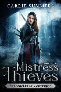
TP: Strong typography, bright colors and expressive imagery. The whole series is great.
Darja DDD submitted Ruler of Scoundrels designed by Milo from Deranged Doctor Design. “Dark Fantasy book cover design, Chronicles of a Cutpurse Book 2”
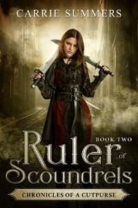
TP: My favorite cover design in the series. Mainly because of the coloring, everything else is greatly done in all three designs.
Darja DDD submitted Queen of Tricksters designed by Milo from Deranged Doctor Design. “Dark Fantasy book cover design, Chronicles of a Cutpurse Book 3”

TP: Very nice title treatment. It is often very hard to create three equally good cover designs in a series because the title length can create a problem in the design process, but this designer managed to do everything spot on.
Darja DDD submitted Fortune’s Fool: A Gideon Quinn Case designed by Milo from Deranged Doctor Design. “Steampunk Fiction & Fantasy book cover design, The Fortune Chronicles Book 3”

TP: Again a great and powerful series design by Milo. Beautiful.
Darja DDD submitted Soldier of Fortune: A Gideon Quinn Adventure designed by Milo from Deranged Doctor Design. “Steampunk Fiction & Fantasy book cover design, The Fortune Chronicles Book 1”

TP: This series design definitely deserves praise and if this cover doesn’t make you buy the book, nothing will. ★
Darja DDD submitted Outrageous Fortune: An Errant Enterprise designed by Milo from Deranged Doctor Design. “Steampunk Fiction & Fantasy book cover design, The Fortune Chronicles Book 2”

TP: I’m really not a fan of “edge-to-edge” typography if they don’t have a design purpose per se, but I can’t say that I dislike the usage of the typography here. Very nice.
‘db’ Morgan submitted Trollrider: The Last Kriger designed by ‘db’ morgan. “The reader envisages an epic adventure, a journey (ancient map) and battles (battleaxes) and danger (classic yellow on black).”

TP: Yellow and black always work well together. The title is very prominent and draws the reader’s eye. The cover design would probably look a little bit better if the elements wouldn’t overlap.
Deborah Coonts submitted Lucky Ce Soir designed by Glendon of Streetlight Graphics.
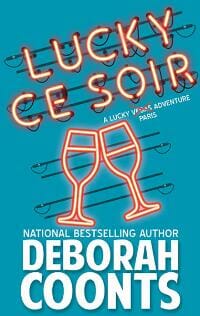
TP: Interesting and appealing.
Donna Olson submitted The Queen Of Thorns designed by Donna J.A. Olson.

TP: Too many images and too many different fonts in one place never look good. The images could be combined a little bit better and the text isn’t very readable. Sometimes less really means more.
Eli Celata submitted High Summons designed by Book Covers Art. “Urban fantasy with dark themes reflected in red/oranges and grays.”
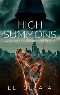
TP: A very well balanced cover design. Appealing and interesting.
G J Ogden submitted Life After The Fall designed by germancreative. “The idea was to blend a more traditional post-apocalyptic style (reds/orange) with the blue of the following book, The Planetsider (an award winner itself). So that it looks like the PA genre, but is in-theme with the other books.”

TP: An attention-grabbing cover with great typography. Very genre-appropriate.
Gregory Phipps submitted The Hermit of Carmel designed by Laura Boyle. “The imagery of the silhouette of a golfer, with an infill of a mist-shrouded forest reflected a picture of the protagonist as a secretive figure who occasionally emerges from the woods. The crisp, white background accentuates a sense of solitude and loneliness the hermit represents.”

TP: The background image is very expressive and the title isn’t very visible and prominent because of it. The author name should be positioned somewhere else, where it would be more visible and/or the golfer image could be a bit smaller. Other than that, interesting.
ileso DMC submitted The Request For Lambency designed by ileso DMC. “The cover design represents the prologue.”

TP: A very beautiful background. Given that the background image allows it, the title should be placed differently. The cover lacks a bit of balance between the image and the typography.
James Bailey submitted Dispatches from a Tourist Trap designed by Dane at Ebook Launch. “This is the 2nd book in the series and keeps the feel of the 1st cover. It’s a humorous YA book, about a teen who moves to live with his grandparents in a Bavarian-themed village, and does at one point don lederhosen, reluctantly.”

TP: I love the typography in this one, however, somehow I don’t see the connection between the image and the colors and fonts of the title and author name. Without the image the cover would look very appealing.
James Egan submitted Blood from a Stone designed by James T. Egan of Bookfly Design.
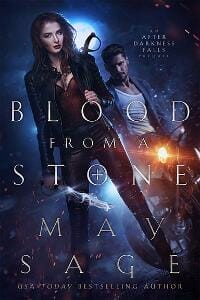
TP: Amazing colors and font choice. As I said before, I’m not a fan of “edge-to-edge” typography (but that’s just me). In this case I would rather see the title and author name written with a narrower tracking of the characters and more space around the text, because the background looks amazing. Even like this it is still a great cover!
James Egan submitted A Modest Independence designed by James T. Egan of Bookfly Design.

TP: A beautiful and well-structured cover design.
James Egan submitted Charleston’s Daughter designed by James T. Egan of Bookfly Design.

TP: So simple and so beautiful. Amazing image treatment. ★
Jeanne Marcella submitted The Demon Lord of California designed by Deranged Doctor Design. “The cover image showcases the psychical traits and ability of the two main characters. The spiral clock is a portal to other times and other worlds, and the wings reveal a unique heritage.”

TP: An amazingly combined cover design. All elements are in the right place. Very appealing and beautiful. ★
Judith Deborah submitted Rosalind designed by Kathleen Lynch. “The designer was inspired by a reference in the book to a dress worn by the lead character: “…the green silk of her dress was clinging to her body like paint.””
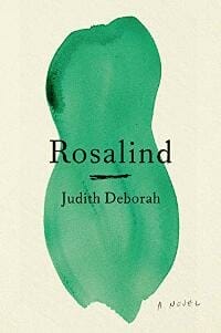
TP: The cover design looks very interesting and I would be very intrigued to find out what the connection between the paint stroke and the title is.
Kenneth Vickery submitted Bolas Buys designed by sam Blight.

TP: The main thing that bothers me here is the fact that I’m not sure what I’m looking at while observing this background image.
KJ Waters submitted Stealing Time designed by Blondie’s Custom Book Covers. “The storyline is time travel set in a hurricane so we used a roman numeral clock representing the time period she goes back to with the #’s in reverse order. The palm trees blowing dramatically and the clock hands made of lightning add further clues to the storyline.”

TP: A good cover design where everything is in its place.
Kristen Walker submitted A Flight of Marewings designed by Daniela Marquez.

TP: The cover looks a bit too crowded. It would probably look better if the designer would stick to one font and one color.
LIsa Lickel submitted Parhelion designed by Rodney Schroeter. “The image was taken by Dan Ankele, titled “Praise.” I was looking for a freshness, an appreciation of a new world under a new sun, and thought the figure unusual in his long coat; familiar, yet subtly otherworldly.”

TP: I really like the idea behind this designs, but I would like to see a different font for the title and author name.
Melanie Weiss submitted Spoken designed by Benjamin Scott. “I am getting many compliments on my cover image, which is a microphone poem as a word cloud within the title, Spoken.”
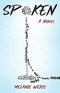
TP: The microphone poem is very interesting. The designer should have played with the typography (a little bit more) to make the whole cover coherent.
Michael Ross submitted The Wand Chronicles:Elfistra the Sorceress designed by Magdalena Adić. “The main image is that of the Sorceress, Elfistra. I had specific requirements that involved the black scaly look of her skin. In the background I also wanted her side-kick called Mandaz.”

TP: The imagery used in this cover is very powerful and therefore the typography should be plainer. This way the title isn’t really readable and you get lost in the intensity of both elements.
Mike Hatch submitted The Dumb Class: Boomer Junior High designed by Ryan Plummer. “Turquoise was a popular color for school lockers back in the 1960s. The pastel pink book title is swooshed onto the turquoise locker in the graffiti style of the day. The cover locker number: I-812, is an inside joke for readers.”

TP: Very appealing and interesting.
Noah Michael submitted The Nexus Mirror designed by Ivan Cakic. “Action-packed, yet simple. An ominous, thrilling, font (masquerouge), with the sun rising just beyond the words, creating a cinematic effect as the title glimmers in the sunlight.”

TP: A beautiful cover design. ★
Roy Lieberman submitted Relay designed by Roy Lieberman. “I love the fact that seen from a different angle, objects change their meaning. The cover is a prime example of that. It depicts a huge dump-truck speeding across a dirt terrain. The reader later discovers that the truck is as big as a toy truck and the terrain is, in fact, a cabinet of drawers.”

TP: A nice illustration. The author name is pretty hard to read.
Sabrina Bedford submitted Faustine designed by Sabrina Bedford. “The cover artwork is an original oil painting I made for the book. It illustrates a crucial moment in the story, but also speaks to the overall nature of the book – whimsical, mysterious, lonesome, and magical. The Futura font is manipulated. Thank you!”

TP: I really love the oil painting and the cover overall looks very beautiful. ★
Sandy Day submitted An Empty Nest designed by Sandy Day. “I’m new to designing my own book covers. Once I found the font for this one the rest of the design fell into place.”
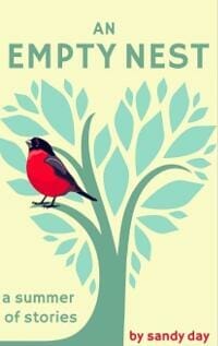
TP: A nice cover design, but I would like the colors to pop more. The artwork makes the cover look a bit too crowded.
stephanie anderson submitted My Life as Kelsey designed by stephanie anderson. “Vector Graphics (Freelancer.com) illustrated the b/w drawing. The cover designer colorized the black and white illustration and combined it with the background (banana leaves) and fonts (Adelline and Mrs. Eaves). The banana leaves is related to an element in the book.”

TP: A nice cover illustration. The title would be more visible if it was written in a brighter font.
Tex DeJésus submitted In Verse designed by Tex DeJésus. “With the black and white, right side up and upside down profiles of a him and a her, this cover design invokes the play on words embodied in the title of the novel.”

TP: I can see what the idea of the cover design was, but maybe even too much. The cover design is crowded with random elements. My suggestion is to give the reader hints with the cover design without being too direct.
Vinay Shankar submitted Primrose’s Curse: A Fairy Tale of an Audacious Girl designed by Vinay Shankar.
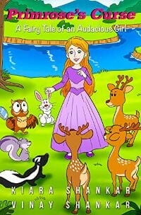
TP: At first sight the only thing you see is the background art. The title should be much more prominent and in a different color.
Nonfiction Covers
Alan James Hesse submitted Charles Darwin and the Theory of Natural Selection designed by Alan James Hesse. “I designed this cover in an attempt to reflect both the physical, geographical significance and nature of the book story’s main location as well as the transcendental impact that location had on Charles Darwin and his legacy, which forever changed our understanding of life on Earth.”

TP: The title and author name are hard to read. I would always recommend to use professionally done, minimalistic artwork for such books.
Christopher Hearn submitted C: Answering Common Questions Concerning Christianity designed by Gijo Tirado. “Thank you!”

TP: The message behind this cover is spot on, I would only recommend to use the same colors that are already used in the background graphics or images, so that added elements blend in better. It would also be good to have only one or two fonts and styles in one cover.
Holly Worton submitted If Trees Could Talk: Life Lessons from the Wisdom of the Woods designed by 123 Go!.

TP: Such a powerful cover design. Everything you need to know and see is visible at first sight. Very nice. ★
Ian Anderson submitted 398 DIY Tips, Tricks and Techniques designed by Ian Anderson. “Made with paint.net. Pallet-wood background with a piece of paper for the text (re-coloured orange). The offset allowed different tools to fan out, creating interest. Fonts: Number is Baloo, DIY is Stencil and text is Bahnschrift. Goal: to be instantly recognizable as a DIY book.”

TP: I really like this cover design because it is so nicely structured. The only thing I don’t like is the usage of too many different fonts.
Krystal Kolnik submitted Lessons from the Frogs I’ve Kissed designed by Krystal Kolnik. “My cover certainly sticks out like a sore thumb, and screams to be noticed! And as it is my true story, it helps that the illustration looks like me too :) -+ the yellow glasses!”

TP: The title looks ok with this script font, but the author name isn’t readable because of its size. I would always recommend to write only one part of the title in a larger script font, and the rest in a sans serif font. The author name and the subtitle should be more visible and readable.
Seffie Wells submitted Your Baby’s First Year: Month by Month Developmental Stages designed by Seffie Wells, MSc. “The psychological impact of colour on an individual’s mindset is well documented. I applied this to the design of the cover, to benefit the reader. Parenting is messy and exhausting, so when parents read my book they’re momentarily alleviated from the chaos of parenthood.”

TP: A nice and clear title and subtitle treatment. The text at the bottom would probably be more prominent if it was white. Overall, a nice cover.
Tamian Wood submitted Forming the Church in the Modern World designed by Tamian Wood. “The client, Paulist Press, asked that I find a unique image of the Vatican to feature as the focal point. The image is of the staircase at the Vatican. Originally a black/white, I colourized it to give it some drama.”

TP: A really nice cover, however, I wish the text in the middle of the cover was centred and more balanced.
Well, that’s it for this month. I hope you found it interesting, and that you’ll share with other people interested in self-publishing.
Use the share buttons below to Tweet it, Share it on Facebook, Link to it!
Our next awards post will be on June 24, 2019. Deadline for submissions will be May 31, 2019. Don’t miss it! Here are all the links you’ll need:
- The original announcement post
- E-book Cover Design Awards web page
- Click here to submit your e-book cover (See New Submission limits)
- Follow @JFBookman on Twitter for news about the E-book Cover Design Awards
- Check out past e-Book Cover Design award winners on Pinterest
- Subscribe to The Book Designer Blog
- Badge design by Derek Murphy

