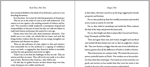
Have you ever thought about negative space? And no, I don’t mean some metaphysical concept of matter and anti-matter. When book designers talk about “negative space” they are talking primarily about unprinted areas of the page. Any areas that are left blank might be called negative space.
You might wonder how you can design with something that, in a sense, doesn’t exist. If you design it, is it still blank?
In typographic design, only two things exist on the page: type and unprinted paper. The unprinted, “negative” space offers its own zones of influence over the book design.
Although it’s not practical to give a design education in a blog post, if you know something about negative space I bet you’ll look at books and the way they are designed very differently. And these are all lessons you can use if you decide to design your own book. So here goes:
5 Ways Negative Space Affects Book Design
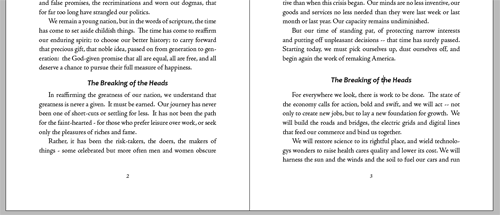
- Creating more emphasis around subheads. A simple example of the use of negative space to give more emphasis is to see what happens when you increase the amount of space around a subhead. You can do this with “space before” and “space after” commands. The extra space will cause the subhead to have more emphasis than it had before. Since it’s more isolated, it attracts more attention.
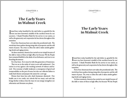
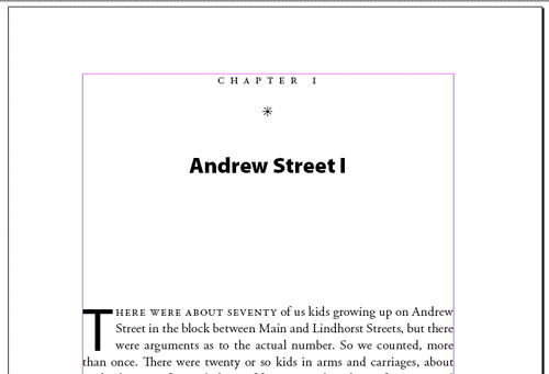
- Heightening the drama of chapter openers. Some books seem to require more drama in the chapter opening pages. Perhaps the subject is dramatic in itself, or the book is very dense and the designer wants to give the reader a rest between chapters. There is no better way to create drama on chapter opening pages than to use a dramatic or interesting typeface and give it a third to a half a page of blank paper for contrast.
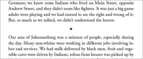
- Breaking the action for a pause or scene shift. This is the purpose of the text break, the subject of 8 Solutions to the Text Break Dilemma. The insertion of even one line space can have a big effect on the flow of the narrative. Authors of both fiction and nonfiction use these text breaks to insert a “stop” in the flow of the text. As the book designer, you can achieve this effect in many ways, but each of them requires the addition of “negative space.”
- Orienting the basic type column on the page. Maybe the most basic use of negative space in book design is the page margins. When we set the margins for the book page, we simultaneously describe both the positive space—where the type and other page elements like folios and running heads are—and the negative space—everything that’s not “used.” Page margins have a huge effect on the overall look of the page, and how easy the book is to hold and to handle.
- Setting the space between the type lines. The space between lines—leading—is probably the smallest manipulation of negative space on the book page. Leading is one of the 3 keys to a beautiful book page. Experimenting with the amount of space between lines of type can yield remarkable differences in overall appearance of the page, its readability and how “open” it feels to the reader. Longer lines of type need more space between them, and almost any book design can be made more readable by increasing the leading.
So although book pages look pretty simple, there are a lot of elements that make books more or less pleasant to handle and to read. Paying attention to negative space on the book page is one way you can control the overall color, contrast and emphasis given to different typographic elements. Book designers are adept at manipulating negative space, and with a little practice you will be too.
Takeaway: Learning to give different elements of the book page more or less emphasis depends on intelligent use of “negative space.”
Image licensed under a Creative Commons Attribution 3.0 License, original work copyright by schani, https://www.flickr.com/photos/schani/

