As the technology we use to manufacture books changes, designers responsible for creating those books adapt. Sometimes slowly. Sometimes reluctantly. But they adapt, because the new technology will eventually supplant the old technology.
Today most books are still printed by offset lithography, and any print run over about 1,000 units will benefit from the more mature, ink and paper way we’ve been printing for a long time. Digital technology, the automated ink and toner method of reproduction, is far less expensive for very short runs. Anyone who has studied the history of technological transitions can see that eventually offset printing will die off and some form of digital imaging will replace it.
For now, we have to know how to design for both technologies, because our books—and sometimes the very same book—are produced on both.
What Lightning Source’s Digital Printing Can’t Do
Recently I sent a book for proofing to Lightning Source for setup and proofing. In designing the cover, I used a technique I’ve often used before, taking a color from the cover, which has a white background, and using it for the spine and the back cover. I find this pretty attractive, and I like the way the color crisply meets the white background right at the corner of the spine. At the time I wasn’t sure how the book would be printed, but I didn’t give it another thought.
In the meantime I had several discussions with a client and the reps at Lightning Source because the client wasn’t happy with how the type on his spine looked. The rep explained that with the digital “presses” they used, they could not guarantee the image might move. How much? As much as 1/16″.
Doesn’t sound like much, does it? Except that the human eye is very sensitive to pattern disruptions. Things that look “off” are picked up by many people easily and immediately. In the days when we created our reproduction artwork on a light table with a T-square, lining things up, making everything perfectly “square” was an exacting job. All that disappeared with the advent of software tools that are always perfectly aligned. But what about the real world? When your design hits the machines that will produce an actual, real live book?
The Return of the Proof
When the proof came back, I was quite surprised. Here’s what the spine looked like:
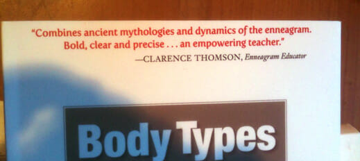
Instead of a crisp corner, the spine background color looks like it’s slipped down a bit. Turns out the entire cover is rotated about 1/16″, which results in the rather messy looking spine you see here. But that wasn’t all that happened when the whole cover got skewed. Here’s another shot:
You can see that when the book rotated out of square, the quoted type in red, which had been running close to the edge of the book, emphasizes the crooked cut along the top of the book. From halfway across the room, it looks like a mistake. That’s the power of 1/16″
Designing For Reality
Since there was nothing I could do about the equipment producing this book, I had to adapt. There was really only one way to solve the spine problem, and that was to completely eliminate the color, therefore eliminating the precise join of color and white at the corner of the spine. Okay, white cover. For the red type at the top, the solution was to move it much farther away from the edge. Having more white between the type and the cut edge would mitigate any errors, since the long line of type wouldn’t be acting like a ruler, showing the defective trim in all its glory. Here’s the final cover:

Make sure your designer knows how your book will be produced. Even a small change can sometimes make a large difference. You’ve put a lot of time and care into creating your book. Make sure the cover looks just as good as it can.


