When you think of the slasher genre, what comes to mind? For most people, it will be the classic films of the genre such as Halloween or Friday the 13th. Of course, in recent years, the tropes and expectations of the genre have been played with by knowing interpretations such as the Scream series. Despite the popularity of slasher movies, slasher books tend to receive a lot less recognition.
It’s kind of strange that slasher movies are enduringly popular while slasher books tend to fly under the radar. After all, horror books in general are consistently popular. Horror authors such as Stephen King are some of the best sellers out there.
So, to right this wrong, we’ve gathered together a list of some of the best slasher books out there. Whether you enjoy these as the fun scary reads they are, or go further and take some design tips from them for your book, we hope you enjoy this rundown!
Here are some of the best slasher books for horror design inspiration:
Clown in a Cornfield by Adam Cesare
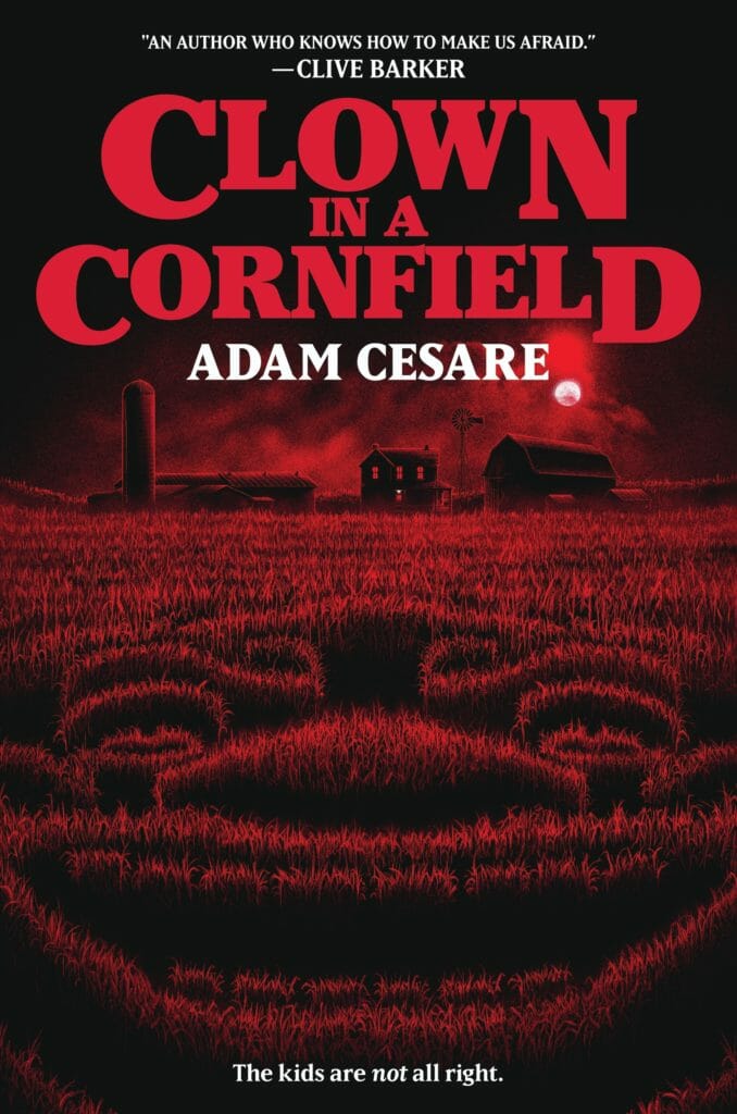
The title alone meant we had to feature Clown in a Cornfield by Adam Cesare at the very top of this list. So many people seem to have a genuine fear of clowns. We imagine this has only been made worse by the presence of clowns in iconic works of horror such as It by Stephen King. If you plan on creating your work of creepy horror, you could do a lot worse than take tips from this book cover.
The Clown in a Cornfield cover doesn’t try to do too much, but what it does do, it does brilliantly. Let’s start with the color scheme. The dark red and black are instantly evocative of horror and classic tales of terror. The font used for the title is old-school and kind of reminds me of Stranger Things. The graphic itself is clever, showing a cornfield in the shape of a clown. Finally, the subtitle is amusing and as far as blurbs go, having one by Clive Barker is about as good as it gets for horror authors.
Red Station by Kenzie Jennings
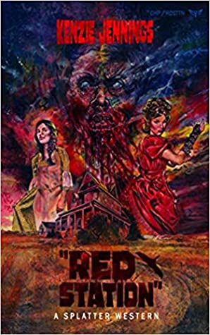
Often, hitting the nail on the head when it comes to creating a horror novel that creeps out readers and receives great reviews is all down to fulfilling the expectations of genre fans. Horror itself is quite a broad genre and often the most rabid fans can be found in the more obscure subgenres. Enter Red Station, a splatter western novel by Kenzie Jennings.
If I’m a fan of horror-themed western novels, there are certain expectations I need to be met by a book for me to walk away satisfied. The cover of Red Station goes a long way toward meeting them. The presence of a lonely house and two classically-clad women goes a long way to establishing the content of the book. Also, to make sure readers know they are in for a spooky experience, the color palette does a lot of the heavy lifting, as does the utterly terrifying entity pictured top and center of the cover page. Finally, the author’s name is displayed in a font and color that denotes horror at the very top of the book cover.
My Sister, The Serial Killer by Oyinkan Braithwaite

If you take a moment to stop and consider what makes the slasher genre a distinct style of horror, what comes to mind? Most often, slasher tales revolve around a serial killer picking off a group of victims, often within a confined location such as a town or campsite. This killer is often masked and has some kind of gimmick. Ultimately, at its simplest, the slasher genre can be seen as a genre focusing on fictional serial killers.
My Sister, The Serial Killer provides a darkly comic twist on the classic slasher novel formula by featuring an unexpected killer. Whereas most slasher killers tend to be white dudes in creepy masks, this book features a black female serial killer whose identity is known from the start. This book cover is a masterful example of how to subvert genre expectations with an unexpected main cover graphic that still pays homage to the main tropes through the image reflected in the sunglasses.
Survive The Night by Riley Sager
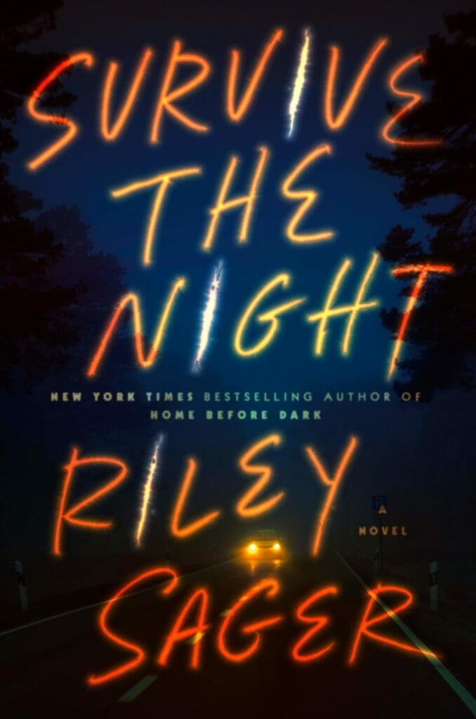
Most slasher books are a journey of survival in a metaphorical sense. Survive The Night by Riley Sager takes the concept of a survival journey and makes it a lot more literal. Picture being on a cross-country road trip with someone you initially trust but come to suspect may well be a serial killer. That’s exactly the situation explored in this work of slasher horror by Sager.
So what design lessons can we take from the Survive The Night book cover? The first aspect of the cover that stands out is its powerful simplicity. The cover is uncluttered, using only a simple, faded background image as well as five large-sized words (the title and author name). There is some smaller text but it’s hardly noticeable compared to the main words. A hint of the plot’s content is shown in the image of a car driving down the road, and the mood is conveyed through the darkness of the image. Finally, the slasher genre is referenced through the letter i found in the title and author’s name consisting of a slash that light shines through.
Tastes Like Candy: A Slasher Novel by Ivy Tholen

Ivy Tholen wanted the reader to be in no doubt whatsoever as to what genre Tastes Like Candy is, going so far as to subtitle the book ‘a slasher novel’. As you’d hope from such a title, Tholen’s novel is one for slasher tale purists, drawing upon all the tropes and conventions that fans of slasher horror have come to know and love.
The book cover for Tastes Like Candy is a fantastic example of how authors can draw upon the conventions of horror design while still playing around with them and using them to hint at the contents of the story itself. For example, the font used for both the title and author name is very much within the realm of classic horror novels, but the colors are far from it. The vivid pink color is not one typically associated with the horror genre. However, when you realize that the book takes place at a carnival, the candy floss image and the color used with it make a lot more sense.
My Heart is a Chainsaw by Stephen Graham Jones
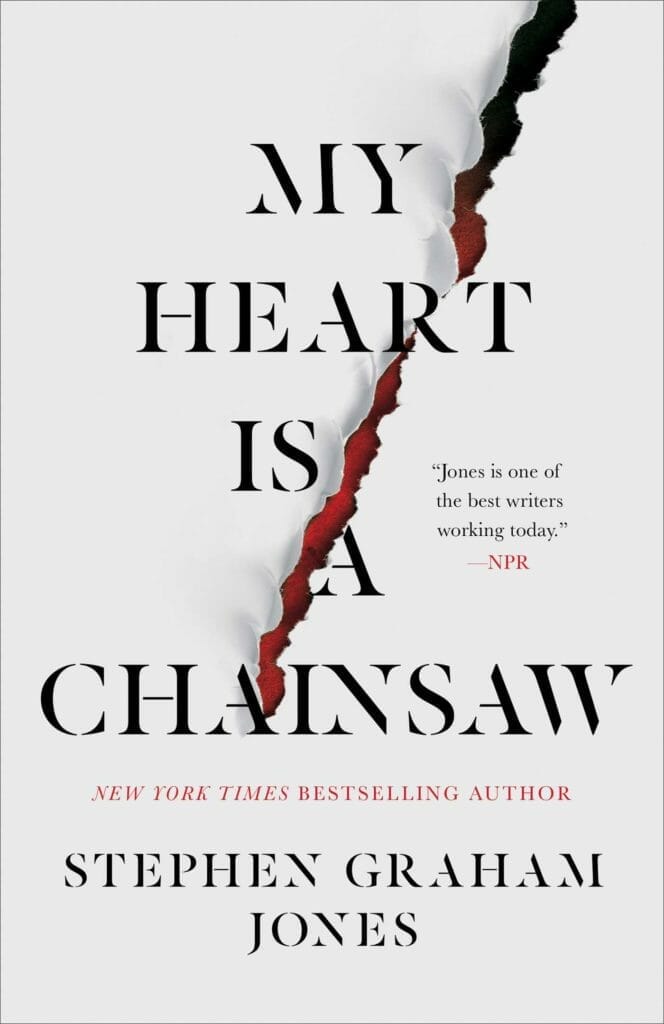
My Heart is a Chainsaw is a slasher novel for horror purists. Just as the Scream series of films is packed with references to horror movies, the protagonist of this tale is very clued up on information related to the horror genre. This level of detail will add a level of depth and enjoyment for readers who are similarly able to recall even the most minor details of works of horror.
One interesting thing about the My Heart is a Chainsaw book cover is its simplicity. The vast majority of the design is in no way indicative of a work of horror of any kind, let alone that of the slasher subgenre. For example, the main background color and the choice of font are very conservative and indicate more of a work of classic fiction than one of horror. However, the red slash tearing open the cover diagonally both shows the horror genre and also symbolizes the terror laying just beneath the most mundane of ordinary situations.
Camp Slasher by Dan Padavona
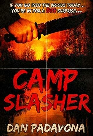
Sometimes, the most effective horror books are so confident in their ability to give readers what they want that they don’t make any secret of their genre. Camp Slasher is a perfect example. The slasher genre is featured right there in the title. On top of that, camps are a classic horror location, ever since Friday the 13th’s iconic Camp Crystal Lake. So titling your book Camp Slasher is about as in-your-face as it gets.
But what can we learn from the Camp Slasher book cover? Just like the title, the book cover makes it abundantly clear that fans know what they are in for. The cover images of a wooded campground and a hand holding a serrated knife show that this is a classic tale of slasher fiction that respects the genre’s conventions. The book’s tagline plays around with the classic kid’s rhyme while also alluding to the conventional slasher tale the book tells.
Next Step
Need help crafting your book cover? This resource can help:


