


When the Pantone Color Insititute set out to merge culture and color in 1999, who knew the explosive impact that creating the Pantone Color of the Year would have across all industries, including book publishing?
Wherever you sit on the creativity spectrum, it’s hard not to get swept into the gravitational pull of color that allows us to express everything from how we feel to how we want to make others feel.
As a writer, you may talk about the warm chestnuts and vivid reds of autumn that spark nostalgic feelings from childhood or the dark greys of a cold and rainy winter day that weigh heavily on a heart broken too many times.
For the book cover designer, color can express the feeling of a story that’s about to unfold before the reader ever opens the pages of the book. From the bold, striking primary colors of a thriller or mystery to the bright, welcoming pastels of romance or historical fiction, the presence or absence of color makes us feel something.
Below We'll Consider:
The History of Pantone Color of the Year
In 1999, the Pantone Color Institute sought to take a closer look at the intersection of culture and color, so it introduced the Pantone Color of the Year. It was a way for creatives across all industries to explore how different colors could impact the expression of their brand, customer engagement, and the culture that color created. Having a single color to reflect on for an entire year created a multi-industry dialogue around color that couldn't have happened any other way.
On the Pantone website, you will find the bold statement,
AT PANTONE COLOR INSTITUTE, WE UNITE THE SCIENCE AND EMOTION OF COLOR
Imagine, an institute that focuses solely on analyzing color and people’s responses to it. It makes sense that they would partner with companies around the world to help them with their branding.
The Pantone Color Institute earned the right to be considered the foremost authority on color theory because of its tireless effort over the years to showcase how color can impact a business when it is applied strategically. They've proven that color is more than just an afterthought. Color can be the starting point of any project.
The original Pantone company which started as part of an advertising agency in the early 50’s, eventually developed a complex color-matching system that ensured that the colors designers used in their projects were the same colors printed onto the final product. This technology eliminated many of the designer woes associated with color inconsistencies between printers.
Used by companies like Adobe as well as printers, graphic designers, and fashion designers, Pantone has become the go-to source for color forecasting, color psychology, branding, and more.
The Pantone Color of the Year is an opportunity for creatives from all categories to celebrate color in a unified and cohesive way.

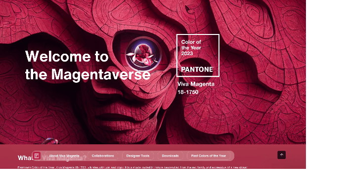
The 2023 Color of the Year—Viva Magenta!
The 2023 Pantone Color of the Year, Viva Magenta. The Pantone website describes the color as:
Viva Magenta 18-1750, vibrates with vim and vigor. It is a shade rooted in nature descending from the red family and expressive of a new signal of strength. Viva Magenta is brave and fearless, and a pulsating color whose exuberance promotes a joyous and optimistic celebration, writing a new narrative.
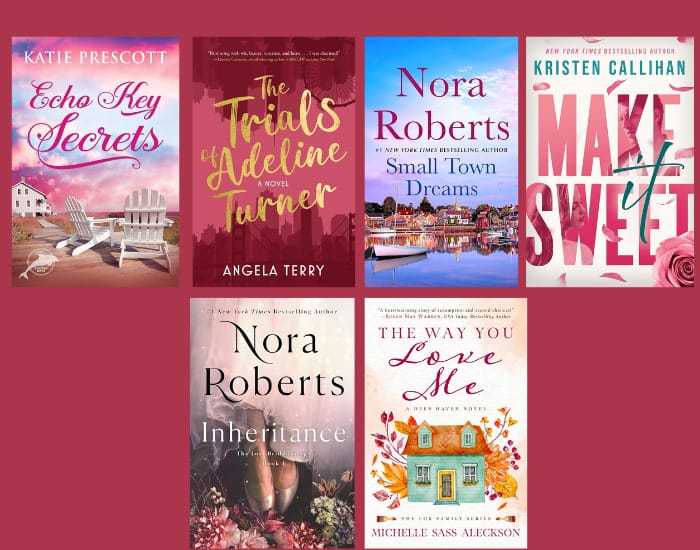
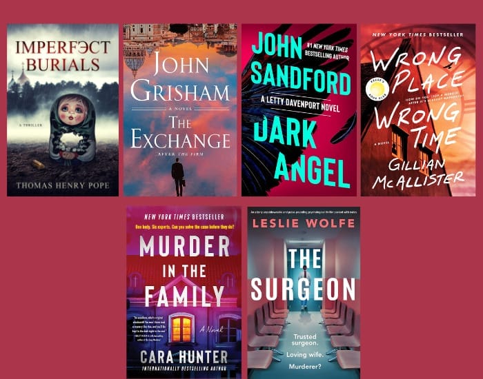
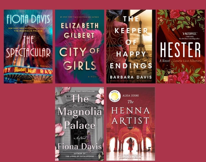
Book Cover Example of 2023 Pantone Color of the Year
While it is true that genres have certain design expectations, a single color can move across all genres if used thoughtfully. The following examples of the Pantone Color of the Year are grouped by genre. Pay close attention to how the use of Viva Magenta shifts between covers. Some designers use broad strokes, while others use only hints of the vibrant color, but all of these examples, whether recent or years past, are worth paying close attention to.
Romance
The 2023 Pantone Color of the Year is the perfect fit for traditional romance book covers. It is warm, inviting, and offers a delicate balance between passionate and demure.
Thriller/Mystery/Suspense
Traditional book cover design in the thriller, mystery, and suspense categories, typically focuses on bold colors and high contrast. The covers below offer traditional and outside-the-box use of this year's color.
Literary Fiction
Literary fiction book cover designs are often as creatively random as the stories they convey. It's visually satisfying to see covers that embrace color fully or subtract it to make a statement like the ones below.
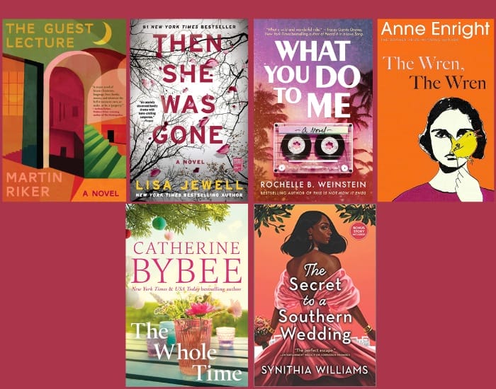
Family Life Fiction
Similar to literary fiction, family life fiction can also be a random mixture of creative styles based on a genre that doesn't specifically define cover expectations. The selected covers below show the high contrast between design styles and the use of the Viva Magenta color.
Integrating the Pantone Color of the Year into Your Book Cover Design
Genre and story should always trump trends when it comes to book design. Book trends like clothing fads can be fun while they last, but can easily date the look of your book and require a redesign later down the line. However, if you can incorporate the Pantone Color of the Year into your design in a way that feels natural and appropriate for your book’s theme, then go for it!
The end goal of a great book cover design is always about how it makes the reader feel. The cover begins telling the story before the reader gets to the first page.
Even if the year’s Pantone color isn’t a good fit for your book, seeing all of the inspiring designs could be a jumping-off point for your book’s cover, or if you’re not in a hurry, you can wait to see what the 2024 Pantone Color of the Year has in store.
