Welcome to the e-Book Cover Design Awards. This edition is for submissions during September, 2020.
This month we received:
35 covers in the Fiction category
7 covers in the Nonfiction category
Guest Judge
 We are once again pleased to welcome Tanja Prokop to The Book Designer as a guest judge this month. Tanja was born in Germany, but lives and was raised in Croatia. Her three beautiful daughters and her amazing husband are her biggest inspiration in life. She has an MA degree in German language and literature and philosophy. A few years ago she started her own design company and became a professional book cover designer. She designs covers, and is constantly creating new visual experiences for her clients. Tanja is also a multiple winner of various book cover design contests and has created thousands of covers. You can find her pre-made covers at Book Design Templates, or visit her site at www.bookcoverworld.com.
Comments, Award Winners, and Gold Stars
I’ve added comments (TP: ) to many of the entries, but not all. Remember that the aim of these posts is educational, and by submitting you are inviting comments, commendations, and constructive criticism.
Thanks to everyone who participated. I hope you enjoy these as much as I did. Please leave a comment to let me know which are your favorites or, if you disagree, let me know why.
Although there is only winner in each category, other covers that were considered for the award or which stood out in some exemplary way, are indicated with a gold star: ★
Award winners and Gold-Starred covers also win the right to display our badges on their websites, so don’t forget to get your badge to get a little more attention for the work you’ve put into your book.
Also please note that we are now linking winning covers to their sales page on Amazon or Smashwords.
Now, without any further ado, here are the winners of this month’s e-Book Cover Design Awards.
e-Book Cover Design Award Winner for September 2020 in Fiction
James Egan submitted Black Tie Required designed by James T. Egan of Bookfly Design.


TP: I love, love, love everything about this cover! Amazing work!
e-Book Cover Design Award Winner for September 2020 in Nonfiction
Jordan Barnes submitted One Hit Away: A Memoir of Recovery designed by Jordan Barnes. “This image conveys the immediacy of opiate addiction, and the urgency for escape and recovery. The bold colors, a flash of warning and blood, capture the eyes, drawing the reader into the chaotic landscape of confusion and smoke. The subject is faceless, as this is not only one man’s burden to bear.”

TP: Amazing! The illustration is beautiful and the combination of the imagery and typography is spot on!
Fiction Covers
Alexis Johnson submitted The Seventh Year Trials designed by Maria Spada.

TP: A beautiful cover design with amazing typography. Beautiful! ★
Amari Utomo submitted Tidal designed by Amari Utomo. “The poetic, deliberately water-less image and large sans-serif font were to demonstrate both the power and breadth of tidal systems, and to indicate how humanity may run aground, given climate change.”

TP: This is a very interesting cover design. The image itself allows a lot of room to play with the title, so I would say that his is the only thing I miss here. The typography is too simple in a way.
C.D. Watson submitted Apocalypse Weird designed by Christine Savoie, Bayou Cover Designs.

TP: A very appealing design with strong design elements. Nice job!
Caroline Walken submitted In Hiding designed by Talia from Book Cover Kingdom. “In Hiding began as a 1500 word short story entry, once it was selected for publication I returned to the keyboard to complete the saga. Bookcover Kingdom took my synopsis and some random images I used as motivation. From those few scraps, Talia created this eye catching cover.”

TP: A nice cover design that could have a more popping title, maybe. I would also suggest a stronger font for the author’s name.
Christopher Kezelos submitted The Sasquatch of Jackson Farm designed by George Evangelista. “The cover image of the Sasquatch was designed by George Evangelista. The logo, copy, and layout were produced by one of the co-authors, Christopher Kezelos. The logo is a comprised of StringFellows and Bizon fonts, with extra leaf and flower flourishes added separately.”

TP: Such a nice cover design. I really love the image and the title accompanies it well.
Colleen tice submitted Broken Spirit Beautiful Heart designed by Colleen tice. “Broken Spirit Beautiful Heart’ s cover represent the main character’ s struggle of forgiving her childhood abuse.”

TP: I have to say that the images are working amazingly well together but the typography is completely unreadable in a thumbnail size. With a strong typography approach, this cover would be a winner.
Dawn Bates submitted Moana designed by Jerry Lampson. “Moana gazes directly at the reader, presenting as a universal female archetype who, despite her traumatic journey still projects undiminished strength and compassion. Principal typeface: TT Moons contains both masculine & feminine characteristics while being strong, clear and readable.”

TP: This cover is very well structured where all important elements are visible and prominent. The cover, however, looks more as if it was a poster. All in all, a great design.
Ebook Launch submitted August Origins designed by Ebook Launch.

TP: Strong typography and well chosen colors.
Ebook Launch submitted A Brief History of Several Boyfriends designed by Ebook Launch.

TP: A great cover design. I love the typography treatment!
Ebook Launch submitted The Lonely Bones of Cycle Jones designed by Ebook Launch.

TP: The whole cover is amazingly structured and very nicely designed. Great work! ★
Elle Madison submitted Of Thorns and Beauty designed by Covers by Combs. “The darker hues and edges for a gritty tone to a classic retelling. Silhouette instead of face because character is always hiding in shadows. Clouds around castle symbolize encroaching evil.”

TP: A beautiful cover design!
Estelle Grace Tudor submitted Octavia Bloom and the Missing Key designed by 100 Covers. “The cover relates to the fairy door Octavia discovers and of the key she has to find in order to go through the door into Fairy Land to complete her quest. The scroll and ornate lettering fits the fairytale/fantasy theme well.”
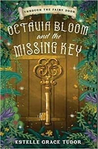
TP: Very genre-appropriate and well designed.
Gesine Schulz submitted Punsch, Plätzchen & Pistolen designed by James. “”Punch, Cookies & Pistols: Xmas crime stories from cozy to cheerful” is roughly the translation of the German title of my collection of short crime stories. When I discovered this premade cover on James’ website I immediately bought it because it captures the mood of the book.”

TP: The whole designs is consistent with every element in it’s right place. The title of the book sounds very interesting and the design will definitely help the sales of this book. Sehr gut!
Glen Dahlgren submitted The Child of Chaos designed by Glen Dahlgren/Cindy Wentzell. “I wanted to make sure the cover “made a promise that the book could keep.” It is an actual scene from the climax, and the dice are not metaphors (of course, the CHAOS letters are not literal in the story). The characters and colors are all from the actual scene. I hope you like it!”

TP: This cover is very genre-appropriate and appealing. I just think that the title should be more emphasized. All in all a great cover design.
Helen Vdovychenko submitted Striker designed by MiblArt.

TP: I really love the typography treatment here. Amazingly well done! ★
J. Scott Coatsworth submitted The Shoreless sea designed by J. Scott Coatsworth/Kelley York – Sleepy Fox Designs. “The cover is a metaphorical version of the generation ship in the story, and the tree is an important part of the third part of the story, representing renewal and the choice of a different path for mankind.”

TP: The background image is amazing! I can see what the designer wanted to achieve with the title, but because of the different spacing between the letters, the title isn’t balanced. If only the title was differently structured, this cover would be a winner!
James Egan submitted Breaking Gods designed by James T. Egan of Bookfly Design.

TP: Another great cover design. The images and the typography are spot on!
James Egan submitted The Nine designed by James T. Egan of Bookfly Design.

TP: A dynamic, appealing and professionally designed book cover. Very well done! ★
James Egan submitted Fair as a Star designed by James T. Egan of Bookfly Design.

TP: When a designer knows what he is doing, then such covers happen. Genre-appropriate and beautiful! Great job!
Jovana DDD submitted Magic Uncorked designed by Dragana from Deranged Doctor Design. “Fantasy book cover design, Midlife Magic Cocktail Club Book 1”

TP: A nice cover design with appealing typography. Nice work!
Jovana DDD submitted Bewitching Bitters designed by Dragana from Deranged Doctor Design. “Fantasy book cover design, Midlife Magic Cocktail Club Book 2”

TP: A very interesting book series with good and recognizable design elements.
Jovana DDD submitted Crumbling World designed by Milo from Deranged Doctor Design. “Post-Apocalyptic book cover design, Surviving the End Book 1”

TP: Strong colors and great typography. Very well done!
Jovana DDD submitted Fallen World designed by Milo from Deranged Doctor Design. “Post-Apocalyptic book cover design, Surviving the End Book 2”

TP: It isn’t always easy to create book series designs, but Milo really has a doctoral degree when it comes to this. Great work!
Jovana DDD submitted New World designed by Milo from Deranged Doctor Design. “Post-Apocalyptic book cover design, Surviving the End Book 3”

TP: Beautiful work!
Jovana DDD submitted The Idea Man designed by Marushka from Deranged Doctor Design. “Thriller book cover design, The Idea Man Trilogy Book 1”

TP: The whole series design is very appealing, but not overemphasized. It is spot on!
Jovana DDD submitted The Marked Man designed by Marushka from Deranged Doctor Design. “Thriller book cover design, The Idea Man Trilogy Book 2”

TP: Very well done!
Jovana DDD submitted The True Man designed by Marushka from Deranged Doctor Design. “Thriller book cover design, The Idea Man Trilogy Book 3”

TP: This is my favourite cover design in the series. They are all very beautiful as single covers, but as a series, they look amazing! ★
K.D. Ritchie submitted Fallen Academy Year One designed by Story Wrappers.

TP: The cover design contains all important elements for a successful cover design and good sales. Great work!
Karri Klawiter submitted Heir of the Curse designed by Karri Klawiter.
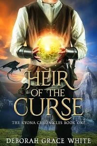
TP: Nice typography and imagery. Beautiful.
KD Ritchie submitted The Vigilante’s Magic designed by Story Wrappers.

TP: A nicely balanced cover design. The combination of silver and red looks great.
KD Ritchie submitted American Witch designed by Story Wrappers.

TP: A really well done cover design.
Michael Angel submitted The Devil’s Noose (Plague Walker Medical Thrillers Book 1) designed by Deranged Doctor Design. “Curious to see if you find this an image that’s effective at bringing in readers to a medical thriller!”

TP: A great combination of colors and fonts.
Simon Markusson submitted The Untoward designed by Nabin Karna. “A man seeks to evade his fate. A nebulous color palette, stark silhouettes, mists and shadows illustrate that the path will not be straight. The use of space as well as vast scale surrounding the figure conveys the insignificance of mortals next to the powers that be.”

TP: Beautiful work!
Timothy Browne submitted The Gene designed by Brett Pflugrath.

TP: Very simple and strong. Maybe the subtitle would look a little bit better, if it wasn’t so close to the title. But that is just a small suggestion, other than that, very well done!
Nonfiction Covers
Ebook Launch submitted Bursting With Happiness designed by Ebook Launch.

TP: A very nicely balanced cover design. Great work.
Karine Kala submitted Riche de vie designed by Elian. “The colorful cover represents the colorful experiences I had in my life. The design represents the inner reflexions and realizations about life I describe in the book.”

TP: The image is very nice, but I think that a bit more work should be invested in the title treatment.
Kkmal Hamouda submitted Recreational Mathematics designed by Kkmal Hamouda. “The final design of a book cover. It represents the material inside and beauty of non-fiction new mathematics. An important attractive fields of Recreational Mathematics.”

TP: The color combination doesn’t work well together. The title should be more emphasized and the actual mathematical operations on the cover should be minimal. This should be appealing while explaining what the book is about. Simpler colors and a professional approach would do the trick.
Kyle Houston submitted Patchwork Junkie designed by Lance Buckley. “The images used are either pictures from my past, symbolic things or relevance to the setting of the book. Enjoy”

TP: A great cover design! Very well done! ★
Martin Sawa submitted The Other Side of Success designed by Paul Barrett.

TP: I really love the colors and the appeal of this cover, however, when you want to avoid to cover an image with the typography, then a different kind of justification would probably work better. This way the title looks a bit shifted. ★
Sabìnah Adewole submitted A Child’s Journey Through Poetry Hobbies Skills Talents Volume 2 designed by Freelancer.com.

TP: An interesting cover design, even though I would love to see a more professional approach here.
Wageedah Salie submitted The Microchip Revolution designed by Wageedah Salie.

TP: I have to say that this is a really nice looking cover design. Nice work.
Well, that’s it for this month. I hope you found it interesting, and that you’ll share with other people interested in self-publishing.
Use the share buttons below to Tweet it, Share it on Facebook, Link to it!
Our next awards post will be on November 30, 2020. Deadline for submissions will be October 31, 2020. Don’t miss it! Here are all the links you’ll need:
- The original announcement post
- E-book Cover Design Awards web page
- Click here to submit your e-book cover (See New Submission limits)
- Follow @JFBookman on Twitter for news about the E-book Cover Design Awards
- Check out past e-Book Cover Design award winners on Pinterest
- Subscribe to The Book Designer Blog
- Badge design by Derek Murphy


