

By Joel Friedlander
Welcome to the e-Book Cover Design Awards. This edition is for submissions during September, 2019.
This month we received:
40 covers in the Fiction category
9 covers in the Nonfiction category
Guest Judge
 We are pleased to welcome Dan Van Oss to The Book Designer as a guest judge this month. Dan has been doing commercial digital design for over 20 years. He’s the founder of CoverMint Design, which has designed over 1000 indie author covers to date. He’s also the author of the new book One Click Cover: The Insider’s Guide to Book Covers that Convert. He lives in Iowa with his wife and a Golden Retriever who grunts when you rub his ears.
Comments, Award Winners, and Gold Stars
I’ve added comments (DVO: ) to many of the entries, but not all. Remember that the aim of these posts is educational, and by submitting you are inviting comments, commendations, and constructive criticism.
Thanks to everyone who participated. I hope you enjoy these as much as I did. Please leave a comment to let me know which are your favorites or, if you disagree, let me know why.
Although there is only winner in each category, other covers that were considered for the award or which stood out in some exemplary way, are indicated with a gold star: ★
Award winners and Gold-Starred covers also win the right to display our badges on their websites, so don’t forget to get your badge to get a little more attention for the work you’ve put into your book.
Also please note that we are now linking winning covers to their sales page on Amazon or Smashwords.
Now, without any further ado, here are the winners of this month’s e-Book Cover Design Awards.

e-Book Cover Design Award Winner for September 2019 in Fiction
Hampton Lamoureux submitted The Phoenix Stone designed by Hampton Lamoureux.
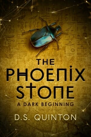
DVO: Many good elements here, starting with the eye-catching focal image of the blue beetle contrasted with the gold background. Attention was made to make sure each letter of the title had a purpose. Lots of details help round out the effect, such as the hieroglyphs in the background, the subtle use of embossing in the title and author fonts, and the hints of technology in the dots and lines of the border.
e-Book Cover Design Award Winner for September 2019 in Nonfiction
Sonia Frontera submitted Solve the Divorce Dilemma: Do You Keep Your Husband or Do You Post Him on Craigslist? designed by Mariah Sinclair. “This cover has a humorous touch to mirror the tongue-in-cheek title and convey that the book provides a light touch on a heavy subject. The cover designer used pop art to add levity to the design and make it intriguing and fun.”

DVO: The pop art feel is well done, from the characters to the halftone patterned background. Humorous books do tend to have longer titles, which makes it a challenge to not crowd the cover with words. I might have dropped either one of the subtitles in order to provide more white space.
Fiction Covers
AD Starrling submitted Damage Report designed by 17 Studio Book Design.

DVO: The focal image and font easily identify the genre, and as do the contrasting colors of the title and background. I may have used the same gold color in the author font. Bumping the character up a little toward the top and reducing the line height of the title would allow for more exposure of that nice image.
Alexandra Brandt submitted The Book of Betrayal designed by Alexandra Brandt. “Book 5 in a contemporary fantasy series around an oracular bookstore. The covers all use real leather book images as foundations. The aim was to use shards of metal and a hint of creeping corruption as central elements without veering into horror territory.”

DVO: A nice, simple design with good font choices which fit well with the target genre. Although I understand the reasoning for it, I feel the light border detracts somewhat from the main image at the center. A fantasy-style frame might work a little better to help solidify the genre.
Ana Grigoriu-Voicu submitted In Sight of the Mountain designed by Ana Grigoriu-Voicu. “The cover design is made up of more than 20 different images, the character alone being a combination of 8 different images, some of which are custom studio shots (not stock images).”

DVO: A nicely balanced cover with good coloring, although the lightness and size of the title get slightly lost over the white snow of the mountain. Understanding how difficult it is to blend multiple images together, the woman and the dock seem less well-blended than the other elements. I’m also uncertain of the genre, though from the woman’s dress it seems to be a period piece.
Andrew Leon Hudson submitted Archipelago designed by Jorge Jacinto, Holly Caelum Heisey, Andrew Leon Hudson. “The Archipelago logo was commisioned from writer/artist Holly Caelum Heisey, the cover art from digital artist Jorge Jacinto, and the general ebook and PoD design work was by Andrew Leon Hudson.”

DVO: A strong cover with a nice cinematic look, especially in the treatment of the multiple authors. The combination of the tentacle graphic surrounding the title and the image below give a strong indication as to what this story is about. Nice balance as well with darkness at the bottom to light in the center. I might like to see the title slightly larger to give it more weight. ★
Anne Miles submitted Sorrowfish designed by Anne C. Miles. “This cover features an enchanted lute, tunebells and a Caprice (formless ghost). It is done as a collage with a spider’s web for the Spinners and a magical glow. My main font is Exocet.”

DVO: The title font is eye-catching and communicates well the genre, but the multiple elements in the center give a vague sense to the cover. Perhaps a focus on one of the elements (the ghost might help define the genre the best) and more light/dark contrast would help catch the eye better.
Ashley Mitchell submitted Carry Me Along designed by Ashley Mitchell. “My cover is a part of my ever growing photography collection. This photo is from a hidden hiking path just outside of Greenville, ME. It is so remote that we met a mother bear and cubs right after this photo was taken.”

DVO: The cover does indicate what the book will be about, but the placement of the title and pale and somewhat mismatched colors give it a disjointed feel. A different font for the title and a darker background behind it as well as a descriptive subtitle might help define the purpose of the book better.
Cortez Law III submitted SHADOW DOCTORS designed by queen_graphics.

DVO: The spooky and evocative faces and hands define the genre very well, although the choice of the blue-gray for the rest of the cover seems a little flat. The title font is a good choice but perhaps white over a darker gray would bring a darkness to the cover that would help emphasize both the main image as well as the genre.
Crystal Estell submitted A Not So Immaculate Conception designed by Crystal Estell. “I designed my own ebook covers.”

DVO: The illustrated style and subtitle strongly indicate the genre, although the multiple color and font choices for the title, subtitle and author are a little distracting. Possibly a darker pink-purple for the top and bottom and two colors for the fonts would help better focus the eye on the center image.
Crystal Estell submitted Love and Fast-Pitch designed by Crystal Estell.

DVO: Again, the genre is fairly well stated, but the use of multiple font styles and colors seems distracting. The ball and glove are a cute touch, but tend to draw my eye away from the couple.
Darja DDD submitted The Greatest Good designed by Marushka from Deranged Doctor Design. “Thriller design, A Garrison Chase Thriller”

DVO: A good cover; the grunge and colors tell us the genre quickly, as does the silhouette of the moving man. I might increase the size of the title slightly to give it more weight than the author name, as well as try of thicker and less-condensed font.
Darja DDD submitted Apprentice of Magic designed by Milo from Deranged Doctor Design. “Romantic Fantasy book cover design by Milo, Deranged Doctor Design,The Fairy Tale Enchantress Book 1”

Darja DDD submitted Curse of Magic designed by Milo from Deranged Doctor Design. “Romantic Fantasy book cover design,The Fairy Tale Enchantress Book 2”

DVO: Two well-designed covers that strongly communicate both the genre and the overall series. Nice use of simple, contrasting colors between the model’s dress and the magic swirls, as well as solid fantasy backgrounds that add to the feel. The title font and the elements around them also are solid for the genre, although they feel a little crowded and thin. ★
Darja DDD submitted Fed Up designed by Marushka from Deranged Doctor Design.

DVO: A well done romance cover especially with a lot of elements to balance. I like the placement of the author over the scripted title, although I’d like to see some other options for the title font that are a little clearer. Nice use of blues, whites and golds for the main colors.
Darja DDD submitted Shadowfall designed by Milo from Deranged Doctor Design. “Science Fiction, Horror book cover design, Shadows Book One”

Darja DDD submitted Shadowsiege designed by Milo from Deranged Doctor Design. “Science Fiction, Horror book cover design, Shadows Book Two”

Darja DDD submitted Shadowstrike designed by Milo from Deranged Doctor Design. “Science Fiction, Horror book cover design, Shadows Book Three”

DVO: A solid cover series that strongly communicates both sci-fi and horror through its choice of imagery. This shows what can be done with limited colors but good light/dark contrast as well as the balance of a larger top and smaller bottom image divided by the title. Long titles are difficult to give weight to, but the addition of light streaks above and below the title help draw more attention to it.
Edmund de Wight submitted Tonight, On Ghost Discovery designed by Edmund de Wight.

DVO: The main image and colors strongly depict the genre but I’d like to see more emphasis on it rather than the title, which is covering more of it than I prefer. I’d also like to see a consistent and more genre appropriate typeface in all caps for the title.
Elizabeth Bell submitted Necessary Sins designed by James T. Egan. “My protagonist is a Catholic priest who falls in mutual love with an adult parishioner. I was nervous this cover might send the wrong message. But James captured the tone perfectly. The setting, Charleston, SC, is famous for its gardens and wrought iron, which I use as symbols in my novel.”

DVO: A beautiful cover which has many of the elements of a strong cover: a thought-provoking main image, elegantly crafted details in the title section, muted and well-balanced colors, all expertly blended into a genre-specific cover. ★
G Ogden submitted The Contingency designed by germancreative. “This is the first of a four-part series.”

DVO: A solid unmistakable sci-fi cover which covers many of the basics for the genre: spaceships, contrasting teal and orange, and nice movement from dark to light. I might like to see a lighter, more stylized title but it is always tricky working with longer words. ★
Gesine Schulz submitted Die Frau für alle Fälle designed by Chiara Cattaruzzi. “This pre-made cover seemed just right for my collection of light-hearted crime stories featuring a sought-after cleaning lady & struggling private eye whose shabby office was furnished in the 1950s. The handprints relate to both of her occupations. (I chose the fonts, so any mistake there is mine.)”

DVO: For a premade cover there are many elements to like. Minimal yet eye-catching graphic elements and a good contrast of yellow and red. Normally using Courier as the main font would be a no-no, but if the intent is to evoke a typewritten set of memoirs it works here. Some enhancements might include adding a paper texture to the whole and experimenting with a different font in all caps.
Hampton Lamoureux submitted To Kill a Witch designed by Hampton Lamoureux.

DVO: Another strong use of balancing two images split by the title, with orange and teal providing color contrast. A solid, uncluttered cover with a well-crafted title font.
Hampton Lamoureux submitted The Shadow Witch designed by Hampton Lamoureux.

DVO: Great use of light/dark contrast helps focus the eye on the main character. The gold and red colors throughout help blend the whole cover together. The addition of the thorns as a top border is nice touch.
Heather Austin submitted Of Rioters & Royals designed by Heather Austin. “The central focus on eyes is because the magic system in the book is dependent on eye color. The main character in the story has silver eyes and can evaporate into mist, hence the misty swirls around the eyes.”

DVO: The eyes provide a quick focal point for the cover. The illustrated feel of the cover would sit well with middle grade fantasy, but if the story is more YA or adult fantasy I feel the use of photos would work better. The title font is nicely creative but the subtitle and author font is also a little hard to read in its thinness.
Jake Corinthian submitted Obsesiones y Reflejos designed by Jake Corinthian. “Inspired by H.R. Giger.”

DVO: Good use of contrast and symmetry help this cover, but I’m not sure if the target genre is sci-fi, fantasy, or horror. Adding some other elements or changing the title font might help better define the genre.
Jefferson Smith submitted A Plague of Peskies designed by Jefferson Smith. “I work in a genre of fantasy that I call “grindark.” The world itself is rather dark and gritty, but the situations verge toward the comic – at least, on the surface. But for the first 3 episodes, my covers sang those notes of darkness too loudly and didn’t deliver the grin. I think this one does.”

DVO: The illustration is well done and does provide an element of humor but it’s also slightly confusing at first glance because of all the characters. As an episodic cover it does have a nice magazine cover feel.
Jonathan Gunson submitted Goggles: The Bear Who Dreamed Of Flying designed by Jonathan Gunson & Richard Robinson. “This ‘cinematic’, dream-like cover, with its summer cloud-scape is designed to captivate children’s imagination. It mirrors all the magic and promise of the title graphic – a small teddy bear with a very BIG dream, he wants to fly.”

DVO: A beautifully illustrated cover that makes good use of the horizontal style of many children’s books. I might have put the subtitle all on one line in order to make more room for either illustration or the title to be larger.
Joy E. Rancatore submitted Any Good Thing designed by Rachael Ritchey. “The designer used images taken by the author which relate to part of the story as inspiration for the colors and tone of the cover. She chose a combination of fonts—Bentham and Lovers Quarrel.”

DVO: A nicely laid out image with well-placed title and author name. The subtle detail of the sun flare through the window along with the muted colors and soft overall feel hint at an introspective story. ★
Karin McBride-Chenoweth submitted Beyond the Moon, Sky and Stars designed by Book Cover Zone. “The little angel on the front cover was by illustrator Amy Carpenter.”

DVO: The overall feel is playful and whimsical, although I feel the cover could be better balanced by sliding the entire illustration down a bit so that there is less of the empty light space of the clouds and more room for the title and other elements at the top. The title font’s style fits well but I’d like to see more customization and closeness of the word placement to make it less stiff as well as help it better match the homemade style of the illustration.
Michele DeFilippo submitted Unearthing the Dawn designed by Michele DeFilippo.

DVO: Strong color contrast create a strong sense of balance. I especially like the subtle blues and purples of the center which contrast well with the yellow-gold of the title. The way the flock of birds center the cover shows how small details can really bring a cover together.
Peter Rendell submitted Samantha’s Journey into Real Magic Part 2 designed by Peter Rendell and Ian Keiller. “DAZ 3D and Fireworks. Model is Sophia. The pose is Namaste, Lotus. Lighting effects were added in DAZ 3D. The original was constructed as a meditation pose, i.e. nothing sexual, just a beautiful form. The highlight was the tattoo. The bikini was added to comply with Smashwords T&Cs.”

DVO: The image is certainly eye-catching but it seems more suitable for an erotica story than fantasy or even non-fiction. The lack of connection with the title, subtitle and author name also give the cover an amateur feel.
Regina Johnson submitted Artistic Love In The Psych Ward designed by Diana TC.

DVO: The two character images are well-placed an posed but the overall cover seems flat if this is a fantasy cover. Adding more contrast overall as well as a lighting effect behind the characters might help. The paint splotches are a nice touch although a little distracting because of all the colors. Well-done with the title fonts and flourishes, however.
S. Kaeth submitted Windward designed by David Brasgalla. “We were looking to capture the spirit of the story in the illustration, as a throwback to classic SFF with a feeling of movement and flight.”

DVO: The basic illustration does indeed remind me of a classic fantasy cover with nicely drawn and posed characters. The elements are all here but the overall image feels flat, with more light/dark contrast a possible help. I’d also like to see a stronger and more stylized font for the title.
Sara Hill submitted Ameekial Abomination designed by S. F. Hill.

DVO: Because of the specific imagery I feel the author is trying to communicate too much with this cover. I would concentrate on the woman with the wings as the most evocative image and make her larger, the barn smaller, and the lightning-filled sky darker. The title stylization and font are also difficult to read but a darker background may help with that.
Sara Secora submitted Untoward Awakening designed by Abigail Diaz. “I was a long time fan of Abigail Diaz’s work when I noticed her commissions opened. I thought, well I should just see if she would be interested in working on my book cover. Turns out that she was more than interested! She was as thrilled about the concept as I was.”

DVO: The cover definitely has an arresting illustration which has a fantasy-horror vibe to it, although I’m not sure if that is the target genre for the book. The details and thinness in the title font, although solidly in the fantasy world, make the title difficult to read.
Stewart Hoffman submitted George Pringate’s Last Hurrah designed by Stewart Hoffman. “The image on the cover is described in chapter 1. George Pringate has died, and his “Pearly Gate” is the door to his favorite restaurant, Denny’s. This is an action/comedy/drama.”

DVO: This cover is simple and effective, but the lack of color make it feel more like a nonfiction book than fiction with a humorous bent. Adding a blue sky instead of the clouds or some other, more whimsical elements might help.
Susan Bacon Dynerman submitted The History Teacher designed by Taylor Martin, Design Positive. “The image—a puzzle with imbedded headlines—reflects the book’s content. It’s an intricate plot incorporating news stories and events from the 1940s and 1970s. Bold colors, drawn from mid-20th century poster art, say U.S. of A. And the title font suggests the era and the newspaper-related theme.”

DVO: Good choice of font styles and placement, with a solid central image that complements the title. The red and blue division help give a better sense of balance than a single color.
Tamara Trainor submitted The Valteran Ascension (A Paradox of Time Book 1) designed by Mara Amberly (pen name). “This book is time travel science-fiction, and I’d best describe it as soft science-fiction or science-fantasy.”
")
DVO: Strong sci-fi elements and lighting help communicate the genre of the book quickly. Considering the challenge of the length of the words in the title I would have considered testing a narrower sci-fi font to bump up the size, as well as some inclusion of the background blue into the main character to help better blend the cover together.
William Mitchell submitted Lingua Daemoniorum designed by William Mitchell. “This is a Victorian-era horror story set in South America, in the ruins of an ancient civilisation. The style of the cover is meant to look like old Victorian engraving, and the title font is Trattatello.”

DVO: The basic image may have worked with some subtle tinting, but the font choices for both the title and author name give the cover an amateurish feel.
William Mitchell submitted The Levelling designed by William Mitchell. “This is a horror story with a jungle setting and an aviation theme, all of which contributed to the cover image. I used a combination of free-to-use images with my own additions and editing. The title font is Futura Medium.”

DVO: Eyes are always a great choice for a focal image and the addition of the beach scene is a great touch. The curve of the eyelid, although intriguing, seems a little unnatural, and the cover may have been more effective with some color gradations rather than the monotone blue.
Nonfiction Covers
Dave Rear submitted Britain: The Unauthorised Biography designed by Guus Floor.

DVO: The Union Jack in the background lets us know immediately the subject matter of the book, and the subtitle and author name on the placards are a nice touch, although I’m unsure whether this is a more humorous historical take or a serious one.
Jeffry Glover submitted 9 Lively Cat Tales designed by Mary Bausman. “The cover playfully illustrates the opening rhyming tale, Cat Bath: “Ever give your cat a bath? My, cats love it so!” The bright colors reflect the lighthearted and whimsical character of the book.”

DVO: A fun and whimsical illustration defines this cover and the colors definitely suit the genre. I feel that the blue gradient behind the title distracts from the blue of the tub and would best be left white, and the title may have one too many font styles.
Jeremy Richter submitted Stop Putting Out Fires designed by Cary Chu.

DVO: Although the title is catchy it doesn’t immediately indicate that the book is about the law profession, so I’d like to see the main image carry that weight a little more. The multiple arms are indeed busy but with so many details it takes a while to figure out what’s going on. A solid color for the background might also be a simple addition that would catch the eye better than white.
Kevin Cherry submitted Virtue of Cain designed by Kevin M. Cherry Sr.. “Title-virtue & excellent handwriting. Blue backgrnd-virtue and the Union. Map shows birthplace, plantation in Cambridge top right & adult home in Edgefield bottom left. Cover balancing at the bottom to represent the political-social equality he fought for during his life.”

DVO: Using photos of actual persons for biographies is always a little tricky, as the photos themselves are usual pretty grainy and a challenge to blend into a cover. Although there are some nice elements here, I think combining them using vintage elements such as photo frames, paper, and the like might have balanced the cover better.
Michele DeFilippo submitted Waiting to Hear “Momma”: A Mother’s Memoir designed by Michele DeFilippo.

DVO: The strong focal image of the baby’s footprints is further accented with the pink-red color, immediately communicating what this book will be about. However, since there are few other elements on the cover, the fonts need to carry more weight, and I feel that the choice of multiple colors and styles weakens the cover.
Michele DeFilippo submitted A Family Caregiver’s Guide designed by Michele DeFilippo.

DVO: A simple yet effective approach to a difficult topic to depict visually. As with a lot of nonfiction, font choice and placement are very important. I might have chosen a thicker font for the title to provide more weight, and I don’t know that I would have accented “caregiver” with a different color, but overall a solid cover.
Patricia Parsons submitted Life is Terminal:A Doctor’s Common Sense Guide for Making it to the End designed by Patricia Parsons. “No one lives forever. LIFE IS TERMINAL. The cover design for Dr. Parsons’ book reflects the black and white of the finality of death after life with the red slash of the dying ECG graph. “The End” reflects the ending of a film. The starkness in general suggests the time to face stark realities.”

DVO: The ECG graph as the focal point of the cover is fairly effective and the right-aligned title does balance it well, but the movie-style lettering choice for “The End” seems disjointed and distracting, especially considering the subject matter. I would have kept the subtitle together on one line without the ellipses.
Wageedah Salie submitted The Power of Hypnobirthing designed by Wageedah Salie – One Story Creative.

DVO: The main image does a great job of communicating the subject, and the matching colors and tone in the text blends the cover together well. Nice choice of fonts, sizing, and placement for the title, although I would have moved the author name to the bottom so that it doesn’t cover the main image.
Well, that’s it for this month. I hope you found it interesting, and that you’ll share with other people interested in self-publishing.
Use the share buttons below to Tweet it, Share it on Facebook, Link to it!
Our next awards post will be on November 25, 2019. Deadline for submissions will be October 31, 2019. Don’t miss it! Here are all the links you’ll need:
- The original announcement post
- E-book Cover Design Awards web page
- Click here to submit your e-book cover (See New Submission limits)
- Follow @JFBookman on Twitter for news about the E-book Cover Design Awards
- Check out past e-Book Cover Design award winners on Pinterest
- Subscribe to The Book Designer Blog
- Badge design by Derek Murphy
