

By Joel Friedlander
Welcome to the e-Book Cover Design Awards. This edition is for submissions during July, 2019.
This month we received:
48 covers in the Fiction category
8 covers in the Nonfiction category
Guest Judge
 We are once again pleased to welcome Tanja Prokop to The Book Designer as a guest judge this month. Tanja was born in Germany, but lives and was raised in Croatia. Her three beautiful daughters and her amazing husband are her biggest inspiration in life. She has an MA degree in German language and literature and philosophy. A few years ago she started her own design company and became a professional book cover designer. She designs covers, and is constantly creating new visual experiences for her clients. Tanja is also a multiple winner of various book cover design contests and has created thousands of covers. You can find her pre-made covers at Book Design Templates, or visit her site at www.bookcoverworld.com.
Comments, Award Winners, and Gold Stars
I’ve added comments (TP: ) to many of the entries, but not all. Remember that the aim of these posts is educational, and by submitting you are inviting comments, commendations, and constructive criticism.
Thanks to everyone who participated. I hope you enjoy these as much as I did. Please leave a comment to let me know which are your favorites or, if you disagree, let me know why.
Although there is only winner in each category, other covers that were considered for the award or which stood out in some exemplary way, are indicated with a gold star: ★
Award winners and Gold-Starred covers also win the right to display our badges on their websites, so don’t forget to get your badge to get a little more attention for the work you’ve put into your book.
Also please note that we are now linking winning covers to their sales page on Amazon or Smashwords.
Now, without any further ado, here are the winners of this month’s e-Book Cover Design Awards.

e-Book Cover Design Award Winner for July 2019 in Fiction
David Scidmore submitted Dellia designed by JD Smith with image by Elena Dudina. “Elena Dudina did the original cover and the image is her design. I had JD Smith use that image as the basis of her cover design. Both deserve credit.”
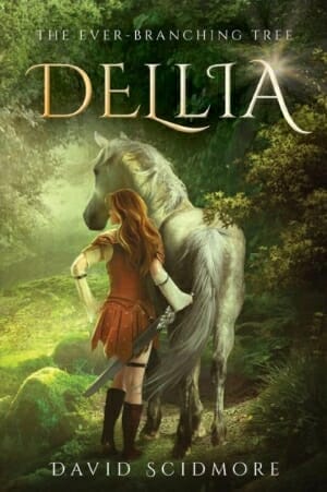
TP: While going through the cover designs, this cover caught my eye, immediately. Sometimes, it’s the combination of elements and the well-balanced coloring that makes a cover a winning design. In my opinion, this is a true winner. Even though I’m not a fan of this font, I truly love the image and typography combination. So nicely balanced. Beautiful work. Great job designers!
e-Book Cover Design Award Winner for July 2019 in Nonfiction
Teddi Black submitted FBI: Myths and Misconceptions designed by Teddi Black.
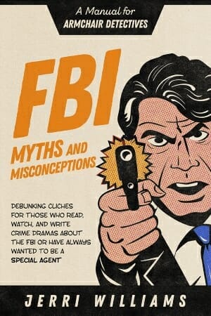
TP: Very appealing with great typography treatment. Enough for me to declare it as the winner! Beautiful work.
Fiction Covers
Alexandra Brandt submitted Charred Roots designed by Alexandra Brandt. “Sixth book in epic fantasy series. Tricky to make it look cool when the requested central element is “mushrooms” and it has to look good with a pink feather! Setting is jungle with a lot of water and caves, so I tried to suggest that a bit too.”

TP: The designer has done an amazing job here. I’m well aware of the challenges that a designer is facing when certain elements need to be incorporated into the design. Great typography treatment. Very well done altogether!
Alexandra Brandt submitted The Book of Lies designed by Alexandra Brandt. “Latest in contemporary fantasy series revolving around a bookstore, where I use photos of actual leather book covers in the designs. “Lies” is such a short word I had to adjust a lot of things to make the space work–including mashing two fonts together to create a satisfactory “L.””

TP: A very appealing and eye-catching cover design.
Christopher Gray submitted Demon in a Jazz Bar designed by Christopher A. Gray, Tom Edwards. “I wanted a cover that was subtle, where a person might have to look twice to see the demon. I also wanted to emphasize that much of the action takes place in a jazz bar. Those two main elements should promise the reader an intriguing take on the Fantasy genre.”

TP: The image used in the cover is very clever and isn’t too crowded. The only thing I would change on this cover is the typography treatment. The designer should have played around with the title a bit more.
Cortez Law III submitted EVIL REALMS designed by queen_graphics.

TP: Very strong imagery, very appealing. I would never suggest using the same color for both background and text treatment. If you want to make it subtle, fade out the text and make it more transparent, rather than unreadable. Given that this is the author name, I think it should be more prominent. Overall a very nice cover!
Darja DDD submitted Warm Montana Home designed by Marushka from Deranged Doctor Design. “Contemporary Romance book cover design, A Moose Hollow Novel Book 1”

TP: Again, nice colors and title treatment. Well done. ★
Darja DDD submitted Bright Montana Home designed by Marushka from Deranged Doctor Design. “Contemporary Romance book cover design, A Moose Hollow Novel Book 2”

TP: I am a true fan of such color combinations. One is simply drawn to take a more detailed look and read this book. Great work!
Darja DDD submitted Fatal Fortune designed by Marushka from Deranged Doctor Design. “Mystery, Thriller & Suspense book cover design, A Dr Pippa Durrant Mystery Book 1”

TP: Interesting and appealing.
Darja DDD submitted Fatal Flowers designed by Marushka from Deranged Doctor Design. “Mystery, Thriller & Suspense book cover design, A Dr Pippa Durrant Mystery Book 2”

TP: Nice color balance. The only thing I don’t like that much is the “edge to edge” typography, that doesn’t make a statement by being this large. But other than that, very good.
Darja DDD submitted Fatal Finale designed by Marushka from Deranged Doctor Design. “Mystery, Thriller & Suspense book cover design, A Dr Pippa Durrant Mystery Book 3”

TP: The whole series is very well done. Keeping everything recognizable can be a challenge sometimes.
Darja DDD submitted The Age of Embers designed by Milo from Deranged Doctor Design. “Post-Apocalyptic cover design, A Post-Apocalyptic Survival Thriller Book 1”

TP: Another great series design with very recognizable elements and great image treatment.
Darja DDD submitted The Age of Hysteria designed by Milo from Deranged Doctor Design. “Post-Apocalyptic cover design, A Post-Apocalyptic Survival Thriller Book 2”

TP: This is, in my opinion, the best cover design in the series, just because the imagery is the most appealing of all. Nice title treatment!
Darja DDD submitted The Age of Reprisal designed by Milo from Deranged Doctor Design. “Post-Apocalyptic cover design, A Post-Apocalyptic Survival Thriller Book 3”

TP: When looking at these covers, you can’t miss the “professional touch” that they all have. So, all in all, great job!
Derek Shupert submitted Dead State: Catalyst designed by Derek Shupert.

TP: This is another cover design that I couldn’t take my eyes off. I love the colors and typography treatment. A very strong image, accompanied with such a suiting title. Amazing work! ★
Derek Shupert submitted Dead State: Executioner designed by Derek Shupert.

TP: Another amazing cover. Every element is in its right place. Professional and appealing!
E.D. Long submitted Scry ‘M’ For Murder: A Magical Mystery Noir designed by Casey Parkhurst. “Casey, my cover designer, took the idea of using elements of fantasy, noir, and pulp detectives and combined them with the silhouette-style art that I love! The use of shadows and just the right touch of color was more than I’d hoped for and can’t wait to work with Casey in the future!”

TP: I really like the idea behind this cover. The image is also very interesting. What I would love to change here, is the typography. I’m sure that the cover could pop by using a different font. Also, try not to mix too many different fonts at once.
Ebook Launch submitted Corporate Truth designed by Ebook Launch.

TP: Again, a great series design! I don’t ever expect anything less from Ebook Launch, but amazing work and this is how they prove my point, every time. Amazin image treatment, wonderful title treatment. Altogether, a professional, well-done series design!
Ebook Launch submitted Criminal Truth designed by Ebook Launch.

TP: In my opinion, the best of all three. I truly love these colors and imagery. Beautiful work! ★
Ebook Launch submitted Fractured Truth designed by Ebook Launch.

TP: Beautiful cover! Amazing work!
Ebook Launch submitted A Bloodline’s Echo designed by Ebook Launch.

TP: Beautiful typography treatment! Nicely balanced. Amazing!
Eldritch Black submitted The Pirates of Penn Cove designed by Eldritch Black.

TP: I really love this illustration. I think that this cover looks amazing all together!
Esteban Sosa submitted I Saved the World and I’m Only in 4th Grade! designed by Esteban Sosa. “Supporting a story created by a ten-year-old about a diverse group of friends, meant designing a cover that would appeal equally to young boys and girls. The color scheme includes both masculine and feminine colors.”

TP: Nice theme. I would only love to see vivid colors given that is should appeal to a younger audience. Maybe black isn’t the best color to emphasize the title on such a background.
Heidi Sutherlin submitted Buckled Down designed by Heidi Sutherlin.

TP: This cover design is nice, however, nothing on this cover says “mystery” but the subtitle. If the title was a bit stronger, maybe the cover would be more appealing to the targeted audience.
Heidi Sutherlin submitted Lichgates designed by S.M. Boyce.

TP: Even though it is very appealing to me, this cover design is a bit too crowded. The title font is pretty heavy and other elements should then be simple and clean so that it can stand out more.
Heidi Sutherlin submitted Fulcrum of the Citadel designed by Heidi Sutherlin.

TP: A nicely balanced cover design. I would only suggest not to use too many blending effects. Sometimes the best thing you can do is to keep the textual parts as plain as possible.
James Erbe submitted VULPECULA designed by James Erbe.

TP: This cover is definitely appealing, but it needs a professional touch. The image is a bit blurry, but the elements are pretty balanced. The cover could use a bit more centering of the textual elements and it needs a professional touch to appeal a serious audience.
John McLain submitted THE ROAD TO REVEILLE designed by John McLain. “Story is a stark tale of winter survival in Wyoming’s Wind River mountains. I chose black & white image to reflect that. It’s a dramatic story so I chose a strong, dramatic font – ChunkFive. Thank you.”

TP: >Darkness can also be created with a bit more color. I would add some clouds or more dramatic textures, rather than just making the cover black and white. But this is just my opinion. This way it is dark but isn’t that appealing.
Justin Zyla submitted Twisting in Headstands and Heavy Drinking designed by Erin Marie Mackey.

TP: I really love the typography treatment here. Nice work. ★
Karl Drinkwater submitted Chasing Solace designed by Matt Kadish.

TP: A well balanced and genre-appropriate cover design.
Levi Frazier submitted MAN UP designed by Shelia Bell.

TP: The title treatment is really nice! I like the cover overall.
Mark Montgomery submitted The Lightning Field designed by Mark James Montgomery. “This book cover is largely monochromatic but still manages to be dramatic, even striking, if you’ll permit the pun. The typography utilizes a handsome serifed style called Cantata One, found on Shutterstock.”

TP: The image is very dramatic and nice, but the typography needs professional treatment.
Mary Ann Clarke submitted The Art of Enchantment designed by Gabrielle Prendergast. “First in the series of romantic women’s fiction, set in Tuscany.”

TP: Given that it’s a series design, I would recommend using the same style for the title treatment. Other than that, a nice cover design.
Mary Ann Clarke submitted A Forged Affair designed by Gabrielle Prendergast. “Second in a series of romantic women’s fiction, set in the south of France.”

TP: Beautiful colors and everything is nicely balanced.
Melissa Ivanco submitted Destined designed by Melissa Ivanco. “The cover depicts the four main characters of the book in a twilit forest, which is where the majority of the novel’s action takes place. I chose a color palette of greens and purples to create a more mystical atmosphere as the book is loosely inspired by Slavic mythology and folklore.”

TP: Given that the illustration is this colorful and detailed, I would recommend a font that is very simple yet prominent.
Nathan Keys submitted The Epic of Marindel: Chosen designed by Sharon Marta. “The cover of The Epic of Marindel: Chosen is designed to convey the mystery and adventure surrounding the eponymous Kingdom of Marindel, a semi-aquatic elven kingdom that once existed on the back of a giant sea turtle.”

TP: A very beautiful title treatment. The colors work very well together.
Phillipa Nefri Clark submitted Colony designed by Steam Power Studios. “Colony is the first of eight short paranormal suspense stories in Doctor Grok’s Peculiar Shop series. Each cover keeps the theme of his pop-up shop with different color schemes.”

TP: Given that the title is shorter here, it is better visible, however, I always recommend having some “white space” around all textual parts.
Phillipa Nefri Clark submitted Table for Two designed by Steam Power Studios. “Table for Two is the second of eight short paranormal suspense stories in Doctor Grok’s Peculiar Shop series.”

TP: For this series design, I would recommend a bit heavier font for the title. I think that the idea is good, but it could be even better.
Phillipa Nefri Clark submitted Wishing Well designed by Steam Power Studios. “Wishing Well is the third of eight short paranormal suspense stories in Doctor Grok’s Peculiar Shop series.”

TP: The most balanced cover design in the series.
Rachael Lucas submitted A Ship In The Sand designed by Carson Lucas. “This is a picture of the ship Thunderwake, who is found on a distant desert planet, giving the main character a chance to escape.”

TP: I am not a fan of such illustrations, but when you do use them, then you need to make the cover pop with another element. If the title was in a different color, the cover would pop more.
Rhonda Smiley submitted Monty and the Monster designed by Ebook Launch.

TP: Beautiful title treatment! Simple and very genre-appropriate.
Richard Burke submitted Assassin’s Web designed by Michelle Arzu. 
TP: Really nice typography treatment. I would only reduce the size of the image, to create a better balance.
Robert Wang submitted The Opium Lord’s Daughter designed by Anne Marie Singer. “The three things on the cover are an opium pipe, the site of a battle, and the eponymous “Opium Lord’s Daughter.” Fun fact: the woman on the cover is one of my daughters!”

TP: The imagery is very beautiful. The title could be a bit more visible and eye-catching.
Rochelle Bradley submitted More Than a Fantasy designed by Double J Book Graphics.

TP: The upper part of the cover looks very nice. Avoid stretching fonts and placing text into too small text boxes. The author name should be more visible.
Scott Finlay submitted A Fatal Exception designed by Yasmin Finlay. “With the graffiti it shows the darker side of city life. It has a technical font to give it a futuristic appearance, but it has an oldschool noir look too by depicting the main character, inspired by classic hardboiled detective stories. The graphic is based on an image of Humphrey Bogart.”

TP: When you have a graffiti wall image, then it would be great to keep the same style when creating the title. There are various graffiti fonts that would fit nicely.
Scott Prior submitted The Aventures Of A Mouse Called Meadow designed by M Hughes (artwork) & S Prior (titles).

TP: The mouse illustration is very cute, however, the title treatment and the author name are hard to read. With a professional touch, it could be a really beautiful cover design.
Shane Drummy submitted Never Nerida designed by James T. Egan (Bookfly Design).

TP: I was completely overwhelmed with the simplicity and appeal of this cover design. Amazing! Great job! ★
SL Beaumont submitted Shadow of Doubt designed by Warren Design.

TP: A very nice and deep cover art. I really enjoyed looking at it and as a reader, I would definitely be interested to read what the book is about.
Tim Barber submitted A Stitch In Time designed by Dissect Designs. “The brief was something to reflect the character’s journey in WW2 London, but no war imagery. I chose this muted, almost sepia tone along with the models clothing to show the period. I felt the font choice gives it that modern twist as this is a re-release.”

TP: The imagery is really nicely balanced and beautiful, but I think the title need a bit more work.
Nonfiction Covers
Cathi Stevenson submitted The Blues designed by Cathi Stevenson. “The image was provided by the author and is of her husband, musician Walter Trout, with a bit of treatment and brush work.”

TP: Eye-catching but simple. Nice work!
Ebook Launch submitted All Kinds of Jokes for All Kinds of Folks designed by Ebook Launch.

TP: Spot on, simple and clean.
Heidi Sutherlin submitted The Other Side of the Table designed by Heidi Sutherlin.

TP: I really like the idea and the image is very suggestive. Everything works well together, but the title. It needs a bit more work to make it a great cover design.
Heidi Sutherlin submitted Attitude Overhaul designed by Heidi Sutherlin.

TP: Appealing and well balanced. Be careful with placing text into too small text boxes. There should always be more space around the text. That way it looks much better and the imagery allows you to take more space for the author name.
Heidi Sutherlin submitted Gaymers – The Differene a ‘Y’ Makes designed by Heidi Sutherlin.

TP: I really like the suggestiveness of the cover design. Nice work! ★
Ishah Whipple submitted Heart’s Flow designed by Janet (JayJay) Jackson. “I’m a self published author and was blessed to have an amazing designer to help with the cover of my first book.”

TP: Beautiful cover design. It doesn’t, however, contain non-fictional design elements and readers could be confused by that.
Wageedah Salie submitted 50 Years of Pain designed by Wageedah Salie – One Story Creative. “.Symon has an established Self-Help brand and his deep love for old b&w silent movies inspires his imagery throughout his visual branding. So we built on that making sure that the title is legible in thumbnail which was also a client requirement”

TP: Appealing and thought through. Nice work.
Well, that’s it for this month. I hope you found it interesting, and that you’ll share with other people interested in self-publishing.
Use the share buttons below to Tweet it, Share it on Facebook, Link to it!
Our next awards post will be on September 30, 2019. Deadline for submissions will be August 31, 2019. Don’t miss it! Here are all the links you’ll need:
- The original announcement post
- E-book Cover Design Awards web page
- Click here to submit your e-book cover (See New Submission limits)
- Follow @JFBookman on Twitter for news about the E-book Cover Design Awards
- Check out past e-Book Cover Design award winners on Pinterest
- Subscribe to The Book Designer Blog
- Badge design by Derek Murphy
