

By Joel Friedlander
Welcome to the e-Book Cover Design Awards. This edition is for submissions during May, 2019.
This month we received:
47 covers in the Fiction category
6 covers in the Nonfiction category
Guest Judge
 We are once again pleased to welcome Tanja Prokop to The Book Designer as a guest judge this month. Tanja was born in Germany, but lives and was raised in Croatia. Her three beautiful daughters and her amazing husband are her biggest inspiration in life. She has an MA degree in German language and literature and philosophy. A few years ago she started her own design company and became a professional book cover designer. She designs covers, and is constantly creating new visual experiences for her clients. Tanja is also a multiple winner of various book cover design contests and has created thousands of covers. You can find her pre-made covers at Book Design Templates, or visit her site at www.bookcoverworld.com.
Comments, Award Winners, and Gold Stars
I’ve added comments (TP: ) to many of the entries, but not all. Remember that the aim of these posts is educational, and by submitting you are inviting comments, commendations, and constructive criticism.
Thanks to everyone who participated. I hope you enjoy these as much as I did. Please leave a comment to let me know which are your favorites or, if you disagree, let me know why.
Although there is only winner in each category, other covers that were considered for the award or which stood out in some exemplary way, are indicated with a gold star: ★
Award winners and Gold-Starred covers also win the right to display our badges on their websites, so don’t forget to get your badge to get a little more attention for the work you’ve put into your book.
Also please note that we are now linking winning covers to their sales page on Amazon or Smashwords.
Now, without any further ado, here are the winners of this month’s e-Book Cover Design Awards.

e-Book Cover Design Award Winner for May 2019 in Fiction
Ihor Tureha submitted Sands of Eppla designed by MiblArt.
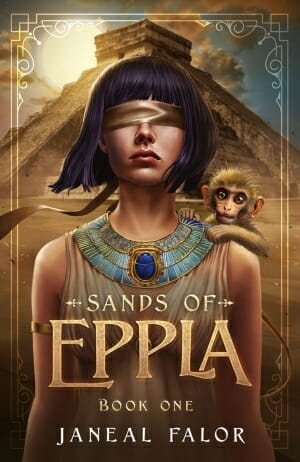
TP: Love at first sight. I really love every aspect of this beautiful cover design. Amazing colors, illustrations and typography. A true winner.
e-Book Cover Design Award Winner for May 2019 in Nonfiction
Gloria Squitiro submitted May Cause Drowsiness and Blurred Vision: The Side Effects of Bravery designed by Ian Koviak. “Thank you for considering my book!”
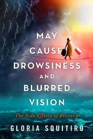
TP: A very beautiful cover design. Well done!
Fiction Covers
Alexandra Brandt submitted The Book of Secrets designed by Alexandra Brandt. “Book 1 of a contemporary fantasy series redesign centered around an oracular bookstore. The visual theme reflects the look of physical books (i.e. embossed or ink effects) and I tried to keep the typeface(s) “magical” but contemporary.”

TP: I really like this color combination. Interesting title treatment. I would, however, change the font for the subtitle, because it is pretty hard to read.
Alexandra Brandt submitted The Book of Mayhem designed by Alexandra Brandt. “Contemporary fantasy has Lovecraftian elements and some death but is not actually horror, so I tried to steer away from anything overtly dark/horror, and only hint at the deaths in the book with an “inky” effect. Did this succeed? Part of a series redesign that is themed around books (so meta!)”

TP: Another nice cover design. Eye-catching and appealing.
Amala Benny submitted Follow Me designed by Mayflower Studio. “I really loved working on this cover. The model here is a mix of three different models plus a fair bit of digital painting. This one is among my favourites I have done.”

TP: I think that the image is amazing, the fonts are well picked, but for some reason it’s impossible to read anything on this cover.
Angie Vancise submitted Cry of an Osprey designed by Angie Vancise. “I painted this cover to reflect the opening and ending chapters in my book.I used purples and pinks to attract attention and put the reader at ease but having the figure in silhouette creates a bit of a mystery and sadness that is worth exploring.”

TP: All in all, well balanced, but the text at the top should be better placed.
Bjørn Larssen submitted Storytellers designed by Bjørn Larssen. “Storytellers is a historical fiction novel set in Iceland, largely in a small, remote house – as pictured. Period fonts (late 19th/early 20th century) didn’t work with a modern HQ image ruined by sepia colour palette or filters, so I paired the Born Ready typeface with Baskerville.”

TP: A very well chosen image. Everything is in the right place. Very nice!
C M Bethell submitted THE BREACH Book One – Devon designed by 100 cover. “Set in Seattle, thus the skyline. The designer created the symbol in the title.”

TP: I’m not a fan of using too many images at once, but this designer managed to pull it off without making the cover too crowned. The typography is also well done.
Carol Pulitzer submitted Little Theater designed by Carol Pulitzer. “Yellow, my least favorite color, somehow worked. Title is Futura PT_Extra Bold, subtitle, Futura PT_Heavy, and name set in Canterbury Sans Medium_Swash. Significance:I always wanted my hair to look like this.”

TP: A nicely designed cover. Unusual and therefore very interesting.
Dan Van Oss submitted The Cartel Takedown designed by Covermint Design.

TP: Very appealing and nicely designed. Good work!
Darja DDD submitted Wunderkinds designed by Milo from Deranged Doctor Design. “Sword & Sorcery Fantasy book cover design, The Secret Seven 1”

TP: A very well designed cover series.
Darja DDD submitted Stormdaughter designed by Milo from Deranged Doctor Design. “Sword & Sorcery Fantasy book cover design, The Secret Seven 2”

TP: I really like the colors in this design, very well done.
Darja DDD submitted Fellowships designed by Milo from Deranged Doctor Design. “Sword & Sorcery Fantasy book cover design, The Secret Seven 3”

TP: This is my favorite cover design in the series. Even though they all look very nice, this one appeals to me the most.
Darja DDD submitted The Longest Night designed by Milo from Deranged Doctor Design. “Post-Apocalyptic Science Fiction book cover design, Enter Darkness Book 1”

TP: I’m not sure that I have ever seen a bad design from this designer. I really like the typography treatment. ★
Darja DDD submitted Dead Of Winter designed by Milo from Deranged Doctor Design. “Post-Apocalyptic Science Fiction book cover design, Enter Darkness Book 2”

TP: Again, another amazing cover design. I really like the image in this one.
Darja DDD submitted First Light designed by Milo from Deranged Doctor Design. “Post-Apocalyptic Science Fiction book cover design, Enter Darkness Book 5”

TP: Very appealing and professional looking.
Darja DDD submitted Trust In Love designed by Marushka from Deranged Doctor Design. “Contemporary Romance book cover design”

TP: A beautiful cover. Nice colors.
David Grigg submitted Lily Campbell’s Secret designed by David Grigg. “Cover uses a contemporary painting to depict the suffering of a young woman whose husband returns injured from WWI. Bodoni font used to suggest period.”

TP: A well balanced and solid cover.
Diana Ani Stokely submitted The Wedding Crasher designed by Diana Ani Stokely. “I was thinking of a bride’s bouquet, a torn photograph, a sense of threat. I particularly like the touch of purple in the thistle flower, as it complements the goldenrod yellow of the subtitle and author names.”

TP: I think that with a little bit more engagement, this cover would look much better.
Ezekial Wojtkowiak submitted Dormancy designed by Ilse Gort. “Fantasy novels often feature white, straight male protagonists. Dormancy’s protagonist isn’t, and I didn’t want it to be dismissed. In a genre dominated by archaic standards, I wanted to put the protagonist right on the cover, where people couldn’t ignore him.”

TP: The image used on this cover is fantastic, but the title should be created more appealing and definitely not in the same color as the background. The typography got completely lost and isn’t visible.
Forrest Johnson submitted A Foreign Shore: The Company of Women designed by Tania Kerins.

TP: The image is completely in focus leaving no spotlight for the title. Even though the image is very important, it is too dominant.
Hampton Lamoureux submitted Clearcut designed by Hampton Lamoureux.

TP: A very beautiful cover design. I love the typography treatment. ★
Hampton Lamoureux submitted Rainier’s Republic designed by Hampton Lamoureux.

TP: Again an amazing cover design by a very talented cover artist. Nice colors and image treatment.
Hampton Lamoureux submitted Enchantment designed by Hampton Lamoureux.

TP: A beautiful cover design, however, the subtext could be a little bit more vivid.
ileso DMC submitted The Request For Lambency designed by ileso DMC. “The cover design represents the prologue.”

TP: A beautiful image, but very plain typography.
JD Lasica submitted Catch and Kill designed by Damonza. “The best covers are sometimes the simplest. The artist incorporated my directions for a megayacht on fire, a smoky sky, a tropical vibe and the two protagonists on the run. Most important, the image and typography tell you it’s an action thriller at a glance.”

TP: Very eye-catching and appealing. Nice work!
Jim Barber submitted Plowed Fields designed by Jane Hill. “My designer captured the heart of the book. Where I literally saw a field and horizon, she envisioned beauty, depth and possibility. Her design transformed a simple plowed field into an elegant, yet realistic, sense of time and place that will stay with the reader long after the book is finished.”

TP: A very nice image and good text placement.
Jodi Auborn submitted Matthias: The Ghost of Salvation Point designed by James (AKA Humble Nations) at GoOnWrite. “The pirate flag, old books, and silhouettes of the sailboat and lighthouse represent different themes of this children’s novel. I wanted the cover to have a mysterious and ghostly feel, yet also convey the carefree spirit of a childhood summer vacation.”

TP: Again a cover design that I love from the top to the bottom. Beautiful! ★
Jordon Greene submitted A Mark on My Soul designed by Jordon Greene / Robert Webb. “The cover image is an original painting made specifically for A Mark on My Soul by Lincolnton, NC artist Robert Webb.”

TP: I love this painting and this cover design. Very, very nice! ★
José María Bravo submitted Sombras y ceniza designed by José María Bravo. “Cover art illustration by Zsofia Dankova.”

TP: A great cover art. Everything is very well placed and designed.
JoyceMajor Joyce Major submitted The Orangutan Rescue Gang designed by Steve Mead. “The image of 3 kids and a baby orangutan escaping to the rainforest set in the colors of an orangutan and the rainforest speak for themselves.”

TP: A very nice cover design.
Korinthia Klein submitted Seducing Cat designed by Karen Anne Klein. “The scarlet origami cat references the name of the main character, her husband’s hobby of making things out of paper, and adultery. The crumpled page behind it is a piece of writing alluded to in the novel.”

TP: Very interesting and appealing, but could use a bit more work.
Kristina Kelly submitted Trials of the Innermost designed by Gabe Wilson. “This cover features three of the six main characters within the novel and one of their two animal companions.”

TP: The cover would probably look a bit better, if the cover was less crowded.
Mark Reid submitted Bond of a Dragon designed by Mark from AuthorPackages. “The author wanted a dramatic fantasy cover with rich colours, signifying the bond between his main character and the dragon.”

TP: A very beautiful cover design. ★
Melissa Addey submitted A String of Silver Beads designed by Streetlight Graphics. “A work of historical fiction centred around a young woman who disguises herself as a Berber trader, hence the use of camels and the girl’s half-hidden face.”

TP: Beautiful colors. The typography could use a bit more engagement.
Melissa Addey submitted None Such as She designed by Streetlight Graphics. “The blurb quotes a 12th-century text saying that this is the woman for whom Marrakech was built, hence old Moroccan buildings in the background.”

TP: Again, same problem as on the previous cover design. The typography should be better.
Melissa Addey submitted The Garden of Perfect Brightness designed by Streetlight Graphics. “The ‘garden’ in the title is very key to the plot, hence the use of a floral background for the two characters. The lead male character is a reluctant priest and so we tried to find a pose which hinted at the religious aspect without it being too strong.”

TP: I’m not a fan of covers with too many characters on them. This font looks very well when only one word is emphasized, but when it’s used like this, it is a little bit all over the place.
Monika Naidoo submitted Where Sleeping Lies Lie designed by Monika Naidoo. “The story is a modern day mystery wrapped around a historical fiction. Both time periods are represented by the black and white back ground and the contrasting yellow leaf. The view over the bridge symbolizes the MC’s journey into the past as she searches for the truth.”

TP: The image is very beautiful, however, the typography needs a lot of work.
Mutch Katsonga submitted Beyond The Spiral Gates designed by Austin Macauley Publishers. “The cover represents the setting in which the plot unfolds. The font was intended to show the gritty nature of the story.”

TP: The font definitely is gritty as stated in the description, but it is also very uneven and could be better placed.
Mutch Katsonga submitted The Melancholy History Of Mayfly designed by Mutch Katsonga. “The image relates to where the protagonist’s environment and the font alludes to the medieval,spiritual aspects of the story.”

TP: The image per se looks fine, however, the title treatment is very confusing and unreadable. The author name is very small and completely unreadable.
Paul Fox submitted Sea-Change designed by Author.

TP: All images are stretched and the cover looks very amateurish.
Phillipa Nefri Clark submitted Martha designed by Steam Power Studios. “The font connects all five in the series together. I asked for a vintage feel and slightly uncertain-of-the-future imagery.”

TP: A nice cover overall, but it would be good to make sure the subtitle is readable.
Ross Winkler submitted A Warrior’s Sacrifice designed by Jake Clark. “I wanted combat elements on the cover to root the book within the Military Sci-Fi genre. The foreground character and his shattered helmet was to inform the reader that in addition to physical combat, I would focus the emotional toll of war.”

TP: Strong colors and great title treatment.
Roxanne Sackville submitted Drago’s Destiny designed by Bianca Sommerland. “The colors chosen were to resonate a distant planet in another galaxy and my characters chosen based on their warrior appeal. They looked battle ready which this novel oozed.”

TP: Strong imagery. The typography needs a lot more engagement. This shade of red and such a dark background work poorly together. I recommend a careful usage of bevels and blending options.
SarahMyria Carter submitted Hera’s Doom designed by SarahMyriaCarter. “The dagger is Hera’s blue dagger, that she uses at the end in the final battle”

TP: I can tell that the idea of the cover concept was good. I assume that the cover was supposed to have a golden frame, but it is partially visible and the center of the author name isn’t readable. Besides that, the cover really looks appealing.
Simon Markusson submitted The Unchosen: Book One of The Queen Beyond designed by Standout Books. “I have to admit that I can sit for minutes just staring at this cover. I love the autumn color palette and the way the woman’s eyes draw you in. Also the feelings of frailty and loneliness that the rider gives rise to–while at the same time establishing a sense of purpose.”

TP: A beautiful cover! Very nice title treatment. ★
Taylor Hobbs submitted Sonder Village designed by Debbie Taylor. “The scallop shell featured is the symbol for the Camino de Santiago, a pilgrimage path through northern Spain.”

TP: Even though the colors are very beautiful, the text is almost unreadable.
Victoria Corva submitted Books & Bone designed by Anna Pazyniuk (artist), Victoria Corva (Text art). “I love the tiny details hidden in the art, including the details on her pack, the book she’s holding, the skulls on her bracelet, the skulls in the green magic, the bodies in the shelves on the walls, etc.”

TP: A very well balanced and genre-appropriate cover design.
Nonfiction Covers
Bryant Lusk submitted Osteoporosis & Osteopenia: Vitamin Therapy for Stronger Bones designed by Cherie Foxley. “If you look closely, you will find that Cherie drew bones inside of the mannequin’s limbs to represent the power of my natural approach to treating the bone-disease, osteoporosis. She also included a “heartbeat” graph to represent the theme of my book series, which is called SHARE THE HEALTH.”

TP: Nice usage of imagery that represents the essence of the book.
Mark Reid submitted Pop Culture Magick designed by Mark from AuthorPackages. “Taylor wanted an eye-catching cover for his non-fiction book that screamed pop culture, with bold colours that would draw the reader in.”

TP: Given that this is a non-fiction book, it might be sending out the wrong message. However, the design is definitely eye-catching.
Richard White submitted Shattered Glass designed by Richard White. “Shattered Glass is a book of dark poetry in memory of students author Richard White went to school with, that lost their fight with depression, or their fight with drug abuse. Shattered Glass explores themes of mental health, depression, anxiety, PTSD, drug addiction, and suicide.”

TP: I’m not a fan of outlined text. It could use a little bit more work.
Shwetha H S submitted Blues Brewery: melancholy at its best designed by rawpixel.com. “Blue colour is associated with melancholy, the source of inspiration for my poems in my book Blues Brewery. As to the cup of black coffee, we sometimes brew coffee to drink it and ward away melancholy. The white in the background and flowers denote me. Shwetha means white in Sanskrit.”

TP: A nicely balanced cover design.
Ukpeme Okon submitted The Values String: A book on Transitional Life, Compelling Fulfillment, and Profound Peace. designed by Marko Markovic. “Fonts: Title white-Times New Roman, in white circle – Bradley Hand ITC, subtitle is Minion Pro italic. Color is orange: 50magenta and 100 yellow. Orange resonates with messages of joy, vibrancy, creativity, balance, good health, encouragement, determination, resilience, etc., in The Values String.”

TP: I really like the idea behind this design. I would suggest never to use so many fonts in one design. ★
Well, that’s it for this month. I hope you found it interesting, and that you’ll share with other people interested in self-publishing.
Use the share buttons below to Tweet it, Share it on Facebook, Link to it!
Our next awards post will be on July 29, 2019. Deadline for submissions will be June 30, 2019. Don’t miss it! Here are all the links you’ll need:
- The original announcement post
- E-book Cover Design Awards web page
- Click here to submit your e-book cover (See New Submission limits)
- Follow @JFBookman on Twitter for news about the E-book Cover Design Awards
- Check out past e-Book Cover Design award winners on Pinterest
- Subscribe to The Book Designer Blog
- Badge design by Derek Murphy
