


By Joel Friedlander
Welcome to the e-Book Cover Design Awards. This edition is for submissions during February, 2019.
This month we received:
45 covers in the Fiction category
15 covers in the Nonfiction category
Comments, Award Winners, and Gold Stars
I’ve added comments (JF: ) to many of the entries, but not all. Remember that the aim of these posts is educational, and by submitting you are inviting comments, commendations, and constructive criticism.
Thanks to everyone who participated. I hope you enjoy these as much as I did. Please leave a comment to let me know which are your favorites or, if you disagree, let me know why.
Although there is only winner in each category, other covers that were considered for the award or which stood out in some exemplary way, are indicated with a gold star: ★
Award winners and Gold-Starred covers also win the right to display our badges on their websites, so don’t forget to get your badge to get a little more attention for the work you’ve put into your book.
Also please note that we are now linking winning covers to their sales page on Amazon or Smashwords.
Now, without any further ado, here are the winners of this month’s e-Book Cover Design Awards.

e-Book Cover Design Award Winner for February 2019 in Fiction
Hampton Lamoureux submitted The Terrorist designed by Hampton Lamoureux.
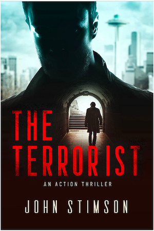
JF: A clever and effective design for this action thriller. Somehow we know there will be double-crosses and surprises along the way, and the image makes us think we will encounter “double agents” too.
e-Book Cover Design Award Winner for February 2019 in Nonfiction
Evan Kail submitted Ubered: My Life As A Rideshare Driver designed by Future Frame Productions. “UBERED is a nonfiction memoir from an eclectic Minnesotan driver with a warped sense of humor. The cover – the author’s hand handcuffed to the steering wheel- is a metaphor for what it’s like to be an Uber/Lyft driver.”

JF: We get the message in this vibrant, energetic design with well-placed copy using an appropriate typeface. Well done.
Fiction Covers
Alexa Whitewolf submitted Avalon Dreams designed by Y. Nikolova at Ammonia Book Covers. “The image/cover indicates the duality of the Lady of the Lake’s life – her past in Camelot vs her modern life. The color palette was designed by my cover artist to pop among the large variety of fantasy covers out there.”

JF: The palette is good, but the composition is awkward and out of balance, and I believe the capitals with flourishes used in the title are really intended to be used one at a time.
Alexa Whitewolf submitted First to Fall designed by Y. Nikolova at Ammonia Book Covers.

JF: This one is better, creating a focus on the protagonist, but the various elements are not always working together.
Alexa Whitewolf submitted Relics of the Underworld designed by Y. Nikolova at Ammonia Book Covers.

JF: Best of the three (see 2 above) where all the elements have been fully integrated into a complex and interesting message. Classic typography rounds it out.
Andrew Harvey submitted Nightfall designed by Andrew J Harvey. “The cover reflects the Alternate History and SteamPunk genres of the book with the title’s typeface (LHF Old Abe Regular) chosen to emphasise the period the story is set in. The background (Red Square in Moscow (1801) by Fedor Alekseev) is used across all three books in the Trilogy.”

JF: Pretty effective for this genre by relying on the strong period artwork and an appropriate font, although the title should stand out more than it does here, where it looks like it was pushed to the top by the illustration.
Brett Yates submitted Teen Sex Tragedy designed by Quinn Wang.

JF: I’ve been staring at this “cover” for a while, wondering what the author and/or designer were trying to accomplish, and I’m still stumped.
Chris Norbury submitted Straight River designed by Carl Graves. “Farm scene because much of the book takes place in southern MN farm country. Noose because a death involved hanging. Curved river suggests all is not as it seems (contrast with the ironic title: Straight River). Partial silhouette of the man hints he’s in control from above–a puppetmaster. He is.”

JF: A very effective thriller cover with expert image compositing, good use of color contrasts, and emphatic typography.
DA Ferg submitted Angel Without a Shadow designed by DA FERG.

JF: The full-on self-published look.
Darja DDD submitted The Rat Collector designed by Milo from Deranged Doctor Design. “Post-Apocalyptic book cover design, Age of End Book 1”

JF: This series (see 2 following) makes a great impact with clear signals about its post-apocalyptic theme, an intriguing emblem, and scenes to draw us into the story.
Darja DDD submitted Kings and Crowns designed by Milo from Deranged Doctor Design. “Post-Apocalyptic book cover design, Age of End Book 2”

Darja DDD submitted Vigo’s Lament designed by Milo from Deranged Doctor Design. “Post-Apocalyptic book cover design, Age of End Book 3”

Darja DDD submitted The Hold Intangible designed by Milo from Deranged Doctor Design. “Paranormal & Urban Fantasy cover design, Fort Weird Book 1”

JF: This elegant series design (see 1 following) is a great contrast to the series just above. Here the emphatic type treatments are replaced by more flowing, classic fonts. The color shifts, atmospheric environments and highlighted characters all come together to great effect.
Darja DDD submitted The Thirst Eternal designed by Milo from Deranged Doctor Design. “Paranormal & Urban Fantasy cover design, Fort Weird Book 2”

Darja DDD submitted Unlikely Friends designed by Marushka from Deranged Doctor Design. “Coming of Age book cover design”

JF: The loosey-goosey style seems well suited to this market.
David Petrie submitted Party Hard (Pixel Dust: Book One) designed by David Petrie and Richard Sashigane. “The book is about video games, fun, and epic action. It revolves around a party of adventurers. The color purple was used heavily to follow with the mixing of red and blue, which represent the transformation of one of the characters. This is the emotional focus of the story. Thanks!”
")
JF: Great result, with an impactful title treatment and lots of energy and action. ★
Debbi Mack submitted Identity Crisis designed by Stewart Williams.

JF: Cool and sophisticated, with an interesting way to emphasize to the viewer the gun in her hand.
Demi Bom submitted King of Pawns designed by Demi Bom.

JF: Interesting concept, not sure if this cover has the impact intended. One thing that would help is moving the author name away from the complex, type-and-illustration title treatment.
Hampton Lamoureux submitted The Invisible Heiress designed by Hampton Lamoureux.

JF: An interested way to combine two images, with the chateau tucked into the woman’s dress. Overall it has a somewhat murky appearance despite the obvious professionalism on display here.
Hampton Lamoureux submitted The Supremacy Witch designed by Hampton Lamoureux.

JF: A beautiful and beautifully detailed and textured design that draws us into the intrigue of this attractive character with the tattoo on her neck. Excellent typography helps, too! ★
Ihor Tureha submitted Histaff: Skeleton in Space Book designed by MiblArt. “Illustrated Sci-Fi cover design shows the space with neon colors and a lot of slime over the main characters.”

JF: Very cool illustration, not sure if the title is showing up as well as it ought to.
J.A. Kazimer submitted CUFFED: A Detective Goldie Locks Mystery designed by Julie Kazimer.

JF: Although this cover has some good elements, it fails to include the author’s name, and there’s no way we would connect a big curly head of blonde hair with a detective story.
Jeff Fenton submitted Meredith Walker and the Censor’s Key designed by Roger Despi.

JF: A carefully controlled, well executed cover. (The book looks odd, though, in this context, doesn’t it?) ★
Justin Swapp Swapp submitted The Shadow’s Servant designed by Aurthur Wang.

JF: Visually strong, and the title treatment has great style and impact. You would commonly see this type of font used for Westerns, but it works really well here.
Kelly Mahoney submitted Princess of Sky, Earth, Fire and Water designed by Damonza. “The cover reflects the empowerment theme in the novel. The graphic depicts a character in motion, surrounded by key elements of nature. The color choices were designed to highlight the facial features of the character, while depicting the raw energy of elemental magic.”

JF: A terrific cover with both stillness—the woman who has paused in her battle—and energy, communicated by the furious background. Putting the title in the lower half highlights the illustration.
Kelly Martin submitted The Corporate Bitch designed by Kelly Martin. “The author didn’t want a face on the cover. I liked the position of the legs and the color of the shoes. I chose a subtle background and color to show off the red shoes. I kept the fonts clean and simple. The “R” mirrors the movement of her crossed legs. Thank you!”

JF: Very clean and sexy look, but I wonder if people won’t assume this book is mostly about sex, not office politics. Also mildly curious about what happened to the last period in “J.J.R”.
Kelly Martin submitted Death at the Lake designed by Kelly Martin. “The author wanted a painterly feel. I chose a font that reminded me of a tarot card. I kept the focus on the girl holding the Death Card and created a background that framed her.”

JF: Beautifully done, although I’m not certain that the palm frond “framing”
Kimolisa Mings submitted Into The Black Widow’s Web designed by Kimolisa Mings. “It is a private eye murder mystery set in a Caribbean island 50 years in the future. I chose this web because of the blue-ish green in it that hints to the technology elements of the book. I will be frank that I’m not too happy with the font, but 80% is good enough for me.”

JF: Kimolisa, I agree. The image has a lot of potential, but the cover won’t reach that potential without better typography.
Lance Buckley submitted The Sentient designed by Lance Buckley Design. “The antagonist is a girl who uses a special suit to access and control her telepathic abilities. I wanted the cover to have a very simple composition that would still grab the viewer’s attention.”

JF: A solid sci-fi cover that clearly communicates important themes and story elements in a stylish way. Nicely done. ★
Laurie Ryan submitted Survival designed by Bethany Maines. “The sun and trees relate to the central premise-earth needs help. The heroine is searching for that way to help, hence her looking off into the distance.”

JF: All the light areas make it look unfinished, and the type is pretty confused.
Lisa Gery submitted The Persistence of Vision designed by Lisa Gery. “The blue hat on the cover is the gift that one character gives another near the climax of the book and proves that a bribe was taken. It becomes a symbol of the secrets and betrayal in their marriage. The prologue and epilogue both take place in the cemetery.”

JF: The cover is not helped by the very weak typography, so there’s no real “brand” to this book.
Marc Jedel submitted Uncle and Ants: A Silicon Valley Mystery (Book 1) designed by Keri Knutson. “The bright colors, sun & palm tree images match this humorous, cozy mystery set in Silicon Valley. The bright yellow VW Beetle also matches the color palette. An accident with the car (or was it on purpose?) kicks off the story. The title is FirepowerBB font & author name uses Nexa Black font.”
")
JF: Cute art that’s appropriate for this genre, although some of the elements seem out of whack.
Matt Turner submitted The Good Men designed by Rafido. “Image displays the central theme of the book: the past and the present in conflict.”

JF: Graphically interesting and a good representation of the theme, although the historical element here (the helmet) is very dominant compared to the modern ones.
Michael Munz submitted Zeus Is Undead: This One Has Zombies designed by Greg Simanson.

JF: The comic-like style and really strong title really make this cover pop.
Molly McCluskey-Shipman submitted Festeva’s Holiday Cheer designed by Molly McCluskey-Shipman. “I wanted a book background that was reminiscent of a winter color palette but subdued enough that Festeva was the main focus; cute and inviting so children would want to know more about her.”

JF: Cute, would like to see the title stand out a bit more.
Patrick Samphire submitted Thornbound designed by Patrick Samphire. “Original art by Leesha Hannigan. This is the second volume in a fantasy series set in an alternative 19th century England.”

JF: Another example of an evocative illustration that really demands better type treatments instead of what we have here, which almost looks like an afterthought.
Paul Aertker submitted Posthumous designed by Pintado. “Pintado captures the apex of the novel as funeral flower petals float away with the release of the protagonist’s mom’s ashes.”

JF: A beautiful composition well executed, but blighted by the ineffective and useless “Spark” award sticker. The title font is too weak and without any real character.
Rachel McCollin submitted A House Divided designed by Rachel McCollin. “This is a British political thriller based in Westminster. I wanted to make the setting and genre clear, and chose this image for the contrasting colours and the dark clouds that hint at the events of the book.”

JF: It works.
Robin Helm submitted More to Love designed by Damonza. “I chose the red dress, coat, and bonnet, which was important in the plot, against a winter Regency background. Damonza caught the feeling of joy I wanted in the perfect setting. They presented several fonts and model poses, and I did a readers’ poll to select the most appealing.”

JF: Absolutely lovely and right on point for this genre. ★
rochelle Bradley submitted The Double D Ranch designed by Double J Book Graphics. “It is set in Texas hence the bluebonnet flowers. It is a romantic comedy where the men read romance novels.”

JF: Whatever else it has going for it, this cover is marred by the big blank space right in the center. Why?
Shirley Gilmore submitted Bucky and the Lukefahr Ladies: Songs of Three designed by Shirley Gilmore. “The fractal swirl represents the colorful cloud referred to in the book that is a portal to the other dimension. The Hittite cuneiform script is part of the inscription from the Hollow Stone in the book. The little red and green blobs represent the other-dimensional Anarianu in the book”

JF: Without doubt the first cover I’ve ever seen with Hittite cuneiform script on it. Cover in general looks way too busy to me.
Sonora Taylor submitted Without Condition designed by Doug Puller. “This is the cover of my second novel, “Without Condition.” It’s in black-and-white except for a few key details. It’s entirely illustrated.”

JF: Illustrating the entire cover can give it a high degree of integration and can really express the artist’s work purely. In this case, the dark red type on black background is not a good decision (see the last 100 editions of these awards); the lettering is quite good; but the overall effect of the cover is pretty depressing and monochromatic.
Susan Count submitted Mary’s Song designed by Anthony Puttee. “Artist is the well know, Ruth Sanderson. Book is Juvenile Fiction.”

JF: A lovely cover for this book aimed at children with an interest in horses, and seems to know exactly what these readers are looking for. However, as a series design (see the 2 following) there are inconsistencies between the covers, and none so great as the use of a realistic illustration on one of the covers, a cover that’s more abstract, and one somewhere in between. To create the kind of consistency we like to see in series, it’s probably better to pick the approach that works best, then make all the covers stick to that.
Susan Count submitted Selah’s Painted Dream designed by Anthony Puttee. “The artist was Elena Shved from Russia. Book is Juvenile Fiction. Thank you for consider it… I can’t take any credit for it. Curtsies go to Elena and Anthony.”

Susan Count submitted Selah’s Sweet Dream designed by Anthony Puttee. “Artist is Melissa Gates”

Susie Murphy submitted A Class Entwined designed by Design for Writers. “A Class Entwined is the second book in the historical fiction series A Matter of Class, so it was important to maintain design consistency from the first book A Class Apart.”

JF: Gorgeous typography and a carefully controlled composition set the tone for this book’s offer. Uses both the back-to-us heroine and a highlight at the center to focus our attention to the spot the designer has chosen.
Nonfiction Covers
Belinda Pollard submitted Beta Reader Superhero Writer’s Handbook designed by Belinda Pollard. “A superhero-ish font was chosen for the series title, a typewriter font for the specific book, which is a consistent treatment on others to come in this series. The print cover has a plain white background, but for the ebook some shading was added to help define the edges of the cover.”

JF: Good font choice and a clever move to add the background tint. It works.
C. Hope Clark submitted Writing Contests with Hope designed by Shaila Abdullah. “We chose the cover in keeping with the website brand of FundsforWriters. Contests is one of FundsforWriters’ areas of expertise, so we wanted to have the initial recognition to be a reminder, each of the other.”

JF: I especially liked the color choices and the fresh, modern look to this design.
Cathi Stevenson submitted How to Avoid the Medical Tiger Trap and Get Your Life Back! designed by Cathi Stevenson. “Simple cover with a lot of text and a striking image that grabs the reader’s attention.”

JF: How can you not like that tiger? Very effectively communicates the “promise” of the book with an arresting graphic.
Chance Edric submitted Wrecklessly Absurd designed by Go On Write. “This is book two in my nonfiction trilogy. I tried to convey some continuity with my previous first book cover. Yet this stands out as it’s own project.”

JF: Lots of details that help reinforce the comedic quality of the book, although the wood slat background is pretty random.
Dawn Carrington submitted The Remarkable Housewives of the Bible designed by Elaina Lee and Hope Smith. “The image was hand drawn by Hope Smith, and the cover was assembled and created by Elaina Lee.”

JF: The illustration is lovely, but the whole cover looks like a print book cover that’s been reduced for the ebook, and in the case of this kind of design, it just doesn’t work. The characters and type have all become too small, almost to insignificance, and that’s a shame.
DIANE DEWITT HALL submitted Where True Love is designed by Suzanne DeWitt Hall. 
JF: The design for this devotional revolves around its focus on the cross, and that’s perfect.
Dima Ghawi submitted Breaking Vases: Shattering Limitations and Daring to Thrive designed by Jessica O’Connor.

JF: Very pleasing, although I don’t think the title needs to overlap the ribbon image which, by the way, is a great way to signal that the book has to do with Middle Eastern culture.
Evan Kail submitted UBERED 2 designed by Kerry Dikken. “This a sequel to Evan Kail’s UBERED: My Life As A Rideshare Driver. In this cover, we see Evan’s hands cuffed to the wheel- a metaphor for what it’s like to drive for Uber and Lyft. In the first cover, only 1 hand was cuffed. This, being a sequel, features both hands.”

Johansel Estrella submitted The Young Adult Life: A Young Soul In the Heart of the Bronx designed by Johansel Estrella. “It was a design my friend made of a city background so I decided to use it fo my book and I added instagram textures, So I got creative with that.”

JF: Pretty confusing.
Michael Lanfield submitted Return to the Gentle Sea: For the Love That Lives in Everyone designed by Michael Lanfield. “The cover is a simple and a book that is required reading for everyone.The image of the sea turtle is perfect for it. I chose an easy look and nice colour graphics. Eye-catching.”

JF: Another word for it might be “ho-hum.” Not much visual excitement, especially considering you have the entire oceanic world to use.
Naushad Huda submitted Drive Through Napa designed by Kathy Lajvardi. “The design direction was to be minimal, use a primary bright color and use modern, bold aesthetics. The half bottle has a small car that is driving through the vineyards of Napa. 16 sets of lines rep the 16 wine regions in Napa. Curve of bottle is mimicked in sub-head”

JF: Great and clever corporate design that, despite the skill that obviously went into it, does not look much like a book cover.
simon avery submitted The Fifth Vital Sign: Master Your Cycles & Optimize Your Fertility designed by I Do Book Covers.

JF: Just about flawless. The color and photo work both as images and as metaphors for the book’s subject matter. ★
Suzanne DeWitt Hall submitted TRANSFIGURED designed by Suzanne DeWitt Hall. “Transfigured is a 40-day journey through scripture for gender-queer and transgender people. The cover is designed to show a journey of change and growth.”

JF: It’s lovely and expresses the idea well, but I wonder if the whole composition is a bit too quiet to attract the attention it deserves? It’s a crowded market out there.
T Dilley submitted The Promise designed by ThemeScape Digital Design.

Well, that’s it for this month. I hope you found it interesting, and that you’ll share with other people interested in self-publishing.
Use the share buttons below to Tweet it, Share it on Facebook, Link to it!
Our next awards post will be on April 29, 2019. Deadline for submissions will be March 31, 2019. Don’t miss it! Here are all the links you’ll need:
- The original announcement post
- E-book Cover Design Awards web page
- Click here to submit your e-book cover (See New Submission limits)
- Follow @JFBookman on Twitter for news about the E-book Cover Design Awards
- Check out past e-Book Cover Design award winners on Pinterest
- Subscribe to The Book Designer Blog
- Badge design by Derek Murphy
