

Welcome to the e-Book Cover Design Awards. This edition is for submissions during December, 2018.
This month we received:
51 covers in the Fiction category
10 covers in the Nonfiction category
Comments, Award Winners, and Gold Stars
I’ve added comments (JF: ) to many of the entries, but not all. Remember that the aim of these posts is educational, and by submitting you are inviting comments, commendations, and constructive criticism.
Thanks to everyone who participated. I hope you enjoy these as much as I did. Please leave a comment to let me know which are your favorites or, if you disagree, let me know why.
Although there is only winner in each category, other covers that were considered for the award or which stood out in some exemplary way, are indicated with a gold star: ★
Award winners and Gold-Starred covers also win the right to display our badges on their websites, so don’t forget to get your badge to get a little more attention for the work you’ve put into your book.
Also please note that we are now linking winning covers to their sales page on Amazon or Smashwords.
Now, without any further ado, here are the winners of this month’s e-Book Cover Design Awards.

e-Book Cover Design Award Winner for December 2018 in Fiction
Dan Van Oss submitted The Door Between Worlds designed by Dan Van Oss.
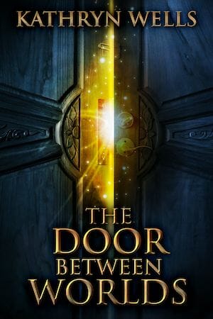

JF: A masterful design full of magic and promise. The bold title style and crossing diagonals help point us where the designer wants us to focus.
e-Book Cover Design Award Winner for December 2018 in Nonfiction
Ebook Launch submitted Stalingrad designed by Ebook Launch.

JF: Exciting, full of story, and artfully designed to lead us through the imagery and ideas represented on the cover.
Fiction Covers
Alan Parkinson submitted Troll Life designed by Alan Parkinson. “The cover follows the theme of my previous novels with a bold palette, hints to elements of the story and the same title font. The can on the cover directly references the cover of previous novel, Idle Threats.”

JF: Artless and ineffective as a book cover.
Alex Langley submitted Etty Steele Vampire Hunter designed by Damonza.

JF: A delightful and highly focused cover with atmosphere. ★
Amala Benny submitted Destiny Expires designed by Amala Benny.

JF: Attractive, but obviously the blurbs have disappeared at this size, emphasizing the print origins of this cover.
Andres Cruciani submitted The Father designed by Bia Andrade. “I’ve been writing for 15 years (have an MFA in fiction from The New School) and finally decided to self publish. The cover assignment was this: Something eye-catching, simple, and crisp. The beginning of the book takes place near the ocean, so I picture dark waters.”

JF: Terrific use of pattern as both background and focus of this cover, with a title font that perfectly complements the art. ★
Angie Gallion submitted Off the Dark Ledge designed by Beech House Books. “I used Athelas for the Author Name and for the first three words of the title. The word LEDGE is AdornsEngraved. The image was made available by Logan Art, Gerd Altmann and Pixabay.com”

JF: An arresting image, but the typography seems confused and in some places difficult to decipher. Might be better off without the red “Dark.”
Boris Sanders submitted Code: Revelation designed by Julianne Campagnac. “The book is set in a futuristic environment and hacker activity is a core of the story. The objective of the image and color palette were to give the cover a cyberpunk touch.”

JF: The Matrix-like background gives a strong signal, but the hooded figure is curiously awkward.
CIRCO team submitted The Pre-programming designed by SOBpublishing. “Author’s pen name is “B.L.A. & G.B. Gabbler.””

JF: Is it Vulcan? Or is it Laocoön? Does it matter? No idea what this cover is supposed to convey.
Damian Rentoule submitted The Silence of Azul designed by Damian Rentoule. “The idea that footprints sink beneath the sand, not disappearing, but remaining as a record of the person’s passing, is important in the novel, as is the global travels of the displaced people. The image captures these ideas with simplicity.”

JF: The footprint is instantly identifiable and makes us wonder what it has to do with the story.
Dan Van Oss submitted The Fargoer designed by Dan Van Oss.

JF: This cover shows lots of story cues to lure the reader.
Dan Van Oss submitted The Legacy Of The Marshall Cousins designed by Dan Van Oss.

JF: Lots of beautiful detail and texture and visuals like the crossed swords show the kind of story we’ll get from this book.
Daniel White submitted Longshot Island: Face Forward designed by Daniel Scott White. “One picture of ripped paper put on top another picture of the map. Rip into those stories! Traditional box that all Longshot Press book use. Titles have gotten bigger as thumbnails are now popular.”

JF: Larger title definitely helps here, and the ruled box is something of a “branding” device.
Darja DDD submitted Lightwave: The Sisters of Cygnus designed by Milo from Deranged Doctor Design. “Science Fiction book cover design, Folding Space Series Book 2”

JF: Lots of drama from this pro-level genre cover.
Darja DDD submitted Cyclone designed by Marushka from Deranged Doctor Design. “Romantic Suspense book cover design, A Linear Tactical Romantic Suspense Standalone”

JF: This highly effective series design (see 2 following) relies on the intimate character engagement, strong typography, and atmospherics like the landscape and the color shifts.
Darja DDD submitted Eagle designed by Marushka from Deranged Doctor Design. “Romantic Suspense book cover design, A Linear Tactical Romantic Suspense Standalone”

Darja DDD submitted Shamrock designed by Marushka from Deranged Doctor Design. “Romantic Suspense book cover design, A Linear Tactical Romantic Suspense Standalone”

Darja DDD submitted Summer Magic designed by Milo from Deranged Doctor Design. “Paranormal & Urban Fantasy cover design, The Thorne Witches Book 1”

JF: Using the seasons and an emphasis on the central figure, this series (see 2 following) will appeal strongly to genre readers.
Darja DDD submitted Autumn Magic designed by Milo from Deranged Doctor Design. “Paranormal & Urban Fantasy cover design, The Thorne Witches Book 2”

Darja DDD submitted Spring Magic designed by Milo from Deranged Doctor Design. “Paranormal & Urban Fantasy cover design, The Thorne Witches Book 4”

david dixson submitted The Event (The Survivors Book One) designed by daviddixson.
")
JF: An exciting cover that features a sci-fi attack rendered in cool tones with appropriate typography.
David Madison submitted Ms. Spinster’s Novel Grammar designed by Adam Wayne. “Ms. Spinster’s Novel Grammar is a hybrid creation: a work of nonfiction (a comprehensive grammar) inside a work of fiction (a novel). The cover symbolically reflects its humorous tone.”

JF: Love the concept and visual style, but it’s really a shame when you can’t even decipher the title and the blocks of type with different purposes seem to be colliding.
Deborah Bradseth submitted The Trace designed by Tugboat Design.

JF: An effective visual metaphor combined with stylish, emphatic typography really works.
Ebook Launch submitted Love is Enough designed by Ebook Launch.

JF: Adept use of focus and genre “symbols” to sell this story.
Ebook Launch submitted Off-Label designed by Ebook Launch.

JF: There’s a lot of information in this apparently simple composition, and the transformations implied in the artwork just adds to its intrigue.
Ebook Launch submitted A Song of Three Spirits designed by Ebook Launch.

JF: Strongly evokes Christmas cards, but there’s some visual confusion between the white title type and the white filagree it runs right into.
Evan Kail submitted Wolf in the Jungle designed by David Kuettel. “The cover image features the novel’s villain- Von Schwangau, a disgraced U-boat captain whose face was seared off in a steam accident. As we see him, he’s hunting for the novel’s heroes- Nesher Unit- a band of Jewish American Nazi hunters. They’ve journeyed to the Amazon in search of escaped Nazis.”

JF: Quite a premise! Cover packs a punch, although I’d like to see more of Von Shwangau and less trees. ★
Francis Moss Moss submitted Losing Normal designed by Jose Ramirez & Barbara Rainess.

JF: Interesting illustration, too monochromatic.
Gail Hamilton submitted The Tomorrow Country designed by Carl Wiens. “Strong colours designed to catch the eye in thumbnail sizes and convey the idea of a child emigrating from London to the North America.”

JF: Nice use of the silhouette to provide “depth” and a strong title helps too.
Holly Ostara submitted Also in Gloaming designed by Holly Ostara.

JF: Selling solely on atmospherics, but doing a pretty good job of it, helped by a colorful font choice.
Jared Green submitted Famously Dead designed by Catherine Clarke. “There is a poker motif throughout this crime thriller. The cover depicts the dark association with gambling which is at the centre of the story. The bullet hole in the card and the suits cascading down the page like blood paint a picture that is both subtle yet sinister.”

JF: The titanic type overshadows the visual, but that’s not necessarily a bad thing. You only really need one card to stand out to make the point.
Jeff Brown submitted Wards and Wonders designed by Jeff Brown. “This cover illustrates one of the main characters from behind and depicts the area just outside of the main city. The author described the area as a beautiful river with large trees and stone houses built through them.”

JF: Alluring fantasy cover that emphasizes a gorgeous environment. The ornate title treatment adds to the appeal. ★
Jonny Lynch submitted A Perfect Stone designed by Jonny Lynch. “I designed the cover of A Perfect Stone to best represent the time and place of war-torn Greece in 1948. The stark black silhouette of the ‘stone thrower’ against the muted natural colours are designed to represent the repressed memory of the protagonist rushing back into consciousness.”

JF: Artful and deadly effective at putting us into the scene as it unfolds. Well done. ★
L. R. Pendleton submitted The Bold Trail. A Samuel Garrison Western designed by Judy Bullard. “As I often do, I gave my designer an idea of what I wanted. Part of the design is a painting by Charles Russell (1914, public domain) and I asked by designer to take part of that image and change it to a river and CA mountains in the background with a blue sky. Very pleased with how it turned out.”

JF: Love the style, artwork, and typography, but I do wish the central character (and his horse!) stood out more.
Lauren Connolly submitted You Only Need One designed by Okay Creations. “Since You Only Need One is a dual-perspective contemporary romance set in Philadelphia, I asked my cover designer if we could incorporate an image of both characters on the cover while also portraying a city-feel. I believe she did a lovely job.”

JF: I agree, checks all the boxes.
Laurie Loveman submitted Memories designed by Ben Bolt. “Firefighting and horses in the 1930s are themes of the Firehouse Family series”

JF: The firehouse appears to be the hero.
Liam Fitzgerald submitted Jentis Curse designed by Liam Fitzgerald. “A red ethereal look was created for this romance with a supernatural twist. The beautiful title font is Carrig Pro by Paulo Goode.”

JF: It works visually, although I would not take this at first glance for a romance, more of an adventure/fantasy story.
Linda Pendleton submitted Copp in Deep, A Joe Copp Thriller designed by Judy Bullard. “One of six books in a series.”

JF: “Clever character name of the month” for Joe Copp? Stylish elements, assuming the silhouette on top is going to be repeated in subsequent titles.
Linda Pendleton submitted Willing to Kill, Don Pendleton The Executioner Short Story designed by Judy Bullard. “Design idea by Linda Pendleton, design by Judy Bullard. The background is of state park where story scenes take place.”

JF: The title font seems weak.
Linda Rae Sande submitted Stella of Akrotiri: Deminon designed by Fiona Jayde Creative. “For a story about Immortals set in 200 BC Greece, we needed a design that was fantastical but dramatic as well. The fonts convey the Greco-Roman setting, and the warm color palette helps achieve the overall feeling of the book.”

JF: Beautiful and effective, tells you everything you wat to know. Not sure I would agree about the fonts, mostly what we have is carved capitals and books written by scribes from the Greeks and Romans. “Fonts” got started in late 15th century.
Monique Piscaer Bailey submitted Love… Without Words designed by Monique Piscaer Bailey. “The inside illustrations are on a ‘grid paper’ background. I wanted the cover to look like a book that would hold that type of interior. I merged an old vintage feel with modern, Kawaai chibi Characters. Using a paperclip to hold their image, seemed the perfect solution”

JF: Artful, but the cover is so low contrast that it tends to fade in importance.
Phillipa Nefri Clark submitted The Secrets of Palmerston House designed by Steam Power Studios. “Three elements link this cover to the first two books in the series: the key, red ribbon, and boat.”

JF: A beautiful and detailed illustration, would be better if you didn’t have to struggle to read it. Love those cards!
Rebecca Belliston submitted Heart of Red, Blood of Blue designed by Rebecca Belliston. “This medieval story is about a girl named Gisela, daughter of a king, and born an albino. The swirls on the crown are to hint at her white hair.”

JF: Simple but stylish, with sensitive typography. Can provide great “branding” if this becomes a series. ★
S.K. Randolph.com submitted The UnFolding Collection One designed by S.K. Randolph. “Illustrated Fantasy Fiction series. Covers and illustrations by myself. I took the photograph of the raven in a cove in southeast Alaska where I spend the summers at anchor writing and photographing nature.”

JF: Great photos on all 3 (see 2 following) and good covers. You might try modifying the tone of the title.
S.K. Randolph submitted The UnFolding Collection Two designed by S.K. Randolph. “I took the photograph of the heron in my favorite cove in southeast Alaska where I spend the summers at anchor writing on my houseboat.”

S.K. Randolph submitted The UnFolding Collection Three designed by S.K. Randolph. “I took the picture of the eagle in my favorite remote Alaskan cove where I spend the summers at anchor writing on my houseboat.”

Sam Neumann submitted Frost designed by Sam Neumann. “Design for a dark and personal psychological thriller.”

JF: Strong and appealing.
Samuel Liske submitted Luna and Sol designed by Samuel Liske. “The cover of the book represents the cosmology of the cult. They believe that our Universe is surrounded by a place of total chaos and pure information, known as the Hyperdimension. The warped part of the image represents the complicated Hyperdimension, while the focal point represents our Universe.”

JF: Communicates almost nothing and doesn’t really look like a book cover.
Sara Eatough submitted Alpha: Misfit’s Rise designed by Sara Eatough. “The background image is a darkened pathway showing Billie, the main character, “rising” from her misfit status. As a misfit she’s been ignored, hence the silhouette, but the “magic” swirling around shows she’s a force to be reckoned with. It might mask her true identity and power though.”

JF: A good idea, but the execution is way too murky and the poor color choice for the title exacerbates the problem.
Shirani Rajapakse submitted I Exist. Therefore I Am designed by Hayley Faye. “”I Exist. Therefore I Am” is a short story collection about women in India. The female gender symbol with bruises, at the bottom of a river depicts the despair women undergo and the torment of abuse, even as infants. The water symbolizes both womb and death with red symbolizing blood.”

JF: Title = strong. Typography = confusing. Visual = huh?
Suzanna Linton submitted Secret Burdens; Book 3 of the Stories of Lorst designed by Fiona Jayde Media. “I wanted the cover to have a mysterious feel to it because a mystery is the central conflict of the plot. That’s why there’s fog and a blurred figure Also, I wanted a blue and silver color scheme to reflect the colors worn by the Seer’s Guard. The main character is Captain of the Seer’s Guard.”

V. A. Givens submitted Sealed with a Twist designed by Damonza. “I wanted the image to convey the story of two people’s destinies intertwining under the control of a mystical force.”

JF: The beautiful illustration makes the point, and the symmetrical composition and classic type choices add to the effect.
Nonfiction Covers
Becky Paroz Becky Paroz submitted Words of Bek designed by Chrome ‘n’ Silver Photography. “I wanted something simple, elegant and eye-catching, with the subtle suggestion of peeling back layers in order to discover the person underneath society’s expectations. The colours were muted so as to maximise focus on the key words on the cover.”

JF: Workable cover visually, but no information at all about the fact that this is a “how-to on mentoring yourself.”
Chris Hare submitted From Homework HELL to Help! A Parent’s Guide to 75 Solutions to Help Kids Save Time and Stress Less Using Project Management Techniques designed by Vila Design. “The book served my needs perfectly, as I was looking for a design with bold, complementary colors that targeted parents and children with the right balance of youthful imagery and a text treatment that telegraphed going from a negative to a positive place in my readers’ minds.”

JF: “Torn paper” has a strong attraction for designers. Although this cover is perfectly adequate and relies more on the copy to sell the book, better type choices would have made that copy more powerful.
Denise Gaskins submitted 70+ Things To Do with a Hundred Chart: Number, Shape, and Logic Activities from Preschool to Middle School designed by Denise Gaskins. “The second Playful Math Singles book. I loved this playground image because I think it communicates both an educational focus and playful attitude. The fonts are Corda Light (which ties this series to my earlier math books) and Kenyan Coffee. (Because what writer can resist coffee?)”

JF: Great image, and a good job making sure the type isn’t obscured by the background. ★
Denise Gaskins submitted Word Problems from Literature: An Introduction to Bar Model Diagrams designed by Denise Gaskins. “The first book in my Playful Math Singles series. I don’t think I’ve submitted it before, so I’m putting it up with the new one for comparison. The images for the covers in this series are all quite different, but the rectangular banner and fonts (Corda and Kenyan Coffee) tie the books together.”

JF: Less successful than the cover above. Although the book image is attractive and speaks to the “magic” of literature, the hard contrast in the fonts of the title adds a discordant note.
Ebook Launch submitted Mortgage Meltdown designed by Ebook Launch.

JF: Metaphorical magic as the symbolic house turns into syrup. Every note on this cover works together, making a strong unified statement focused on the image. ★
Eric Lorenzen submitted Martyrs’ Prayers designed by Eric Lorenzen. “Our desire was for a cover that felt classical as opposed to simply medieval. Book was originally published in early 90s with a rather plain cover. Author came to Reader Hill for this new edition. Cover artwork uses “The Stoning of St Stephen” by Annibale Carracci, painted in 1603-4.”

JF: While there are many things to like in this design, and a good idea to highlight Madeleine L’Engle, I think it’s a mistake to obscure the most important part of the image with an element that could be much more discreet. Try enlarging the important part of the image.
Leonard Cachola submitted Cancer, Death, God, and Love designed by Leonard M Cachola. “I wanted a thundercloud image that was ominous and foreboding, yet warm and inviting. The ground was cropped out to unsettle and unground the viewer, much as one who goes through the experiences in the title. The bold type was chosen to match the bold words of the title.”

JF: Unmistakably self-published, from the awkward image compositing to the wildly inappropriate font choice. Maybe hire one of the excellent designers you see here every month?
Sean Culey submitted Transition Point: From Steam to the Singularity designed by Houston Sharp (Artist – I designed it, he realised it). “The cover is an interpretation of the Roman god Janus, the god of beginnings and transitions. Janus’s two heads are represented by James Watt, the inventor of the steam engine that powered the industrial age; and an android representing the forthcoming artificial-intelligence age, the singularity.”

JF: An arresting visual metaphor with lots of appeal, but the title ranging from black to white looks awkward and distracts from your message.
Terri Lyon submitted What’s On Your Sign? How to focus your passion and change the world designed by JP Luna. “The book is about helping people get focused for activism, so the designer shot a photo of a desk littered with rejected protest signs, to convey a problem in getting focused. The title is a minimalist protest sign, to convey that the book will help the activist get focused.”

JF: It makes your point, although the composition could be improved mainly by making the title “sign” larger and perhaps putting it at an angle to capture some of the energy implicit in street protests.
Well, that’s it for this month. I hope you found it interesting, and that you’ll share with other people interested in self-publishing.
Use the share buttons below to Tweet it, Share it on Facebook, Link to it!
Our next awards post will be on February 25, 2019. Deadline for submissions will be January 31, 2019. Don’t miss it! Here are all the links you’ll need:
- The original announcement post
- E-book Cover Design Awards web page
- Click here to submit your e-book cover (See New Submission limits)
- Follow @JFBookman on Twitter for news about the E-book Cover Design Awards
- Check out past e-Book Cover Design award winners on Pinterest
- Subscribe to The Book Designer Blog
- Badge design by Derek Murphy
