


By Joel Friedlander
Welcome to the e-Book Cover Design Awards. This edition is for submissions during February, 2018.
This month we received:
59 covers in the Fiction category
15 covers in the Nonfiction category
Comments, Award Winners, and Gold Stars
I’ve added comments (JF: ) to many of the entries, but not all. Remember that the aim of these posts is educational, and by submitting you are inviting comments, commendations, and constructive criticism.
Thanks to everyone who participated. I hope you enjoy these as much as I did. Please leave a comment to let me know which are your favorites or, if you disagree, let me know why.
Although there is only winner in each category, other covers that were considered for the award or which stood out in some exemplary way, are indicated with a gold star: ★
Award winners and Gold-Starred covers also win the right to display our badges on their websites, so don’t forget to get your badge to get a little more attention for the work you’ve put into your book.
Also please note that we are now linking winning covers to their sales page on Amazon or Smashwords.
Now, without any further ado, here are the winners of this month’s e-Book Cover Design Awards.

e-Book Cover Design Award Winner for February 2018 in Fiction
Dan Van Oss submitted Quantum State designed by Dan Van Oss.


JF: Great stock art that’s both spooky and chilling, repurposed with solid type styling and lovely textural elements, all combining to draw us into the book.
e-Book Cover Design Award Winner for February 2018 in Nonfiction
Ebook Launch submitted The Flash Diet: A Complete 14-Day Rapid Weight Loss Program designed by Ebook Launch.
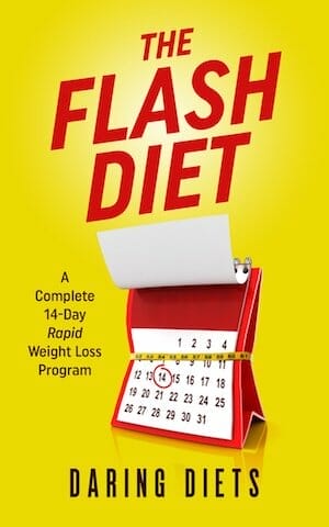
JF: This cover has the “Pow!” factor working for it, grabbing our attention and signaling its exact subject matter through clever yet simple graphics. A winner.
Fiction Covers
A.R. Williams submitted The Untamed Sword designed by A.R. Williams.

JF: That is one bizarre looking guy you have on your cover.
Aimee Coveney submitted Anaconda Vice designed by Aimee Coveney – Bookollective. “A fantastic thriller cover to work on – we love the contrasting bold title, which balances perfectly with the author’s name, and also the grimy road which adds texture and atmosphere.”

JF: Well said, and it’s nicely done, although I’m not a big fan of very tight letterspacing like this because it does make the type just a bit harder to read.
Aimee Coveney submitted The Namarielle designed by Aimee Coveney – Bookollective. “A fantastic YA Fantasy cover to work on with the author. We particularly like the reflection to show the two characteristics of the character – her in her fantasy city and the hunting warrior in the forest.”

JF: Interesting strategy to have what amounts to two subtitles, but the overall look is lovely
Angelina Kerner submitted Deity’s Soulmate designed by Evgeniya Gromilina. “The cover was originally drawn on a cell phone by hand.”

JF: Interesting but irrelevant to the outside observer, to whom this looks more like a sketch for a Tarot card.
Ann Simas submitted Black Moon Rising designed by Ann Simas. “Black Moon Rising involves a blue moon, so I thought it would be fun to take a picture of the blue moon that occurred in July 2015 to use on the cover. I kept the design simple for maximum impact.”

JF: Workable if a bit heavy. Not sure what purpose all the “crackling” on the title serves.
Anne George submitted Love and Mutiny: Tales from British India designed by Anne George. “I designed my cover using Adobe stock resources. Thank you for the opportunity to enter this contest.”
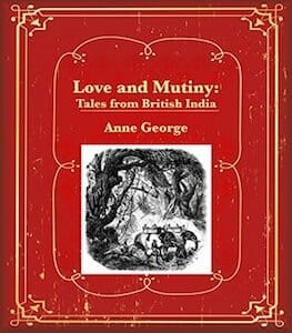
JF: I like the old book look, but the picture in black and white doesn’t fit well, and it’s too small to see clearly. The title is also underwhelming.
Anne Rouen submitted Guardian Angel designed by Felicity Matthews. “Guardian Angel is a historical fiction romance & adventure novel set in World War II France. The cover shows the key protagonists, Nicolas de Beaulieu and Natalie Watson. They escape Paris to join the resistance in the south of France at Nicolas’s family chateau-background images represent locations”

JF: Adding the top image made the background confusing, unnecessarily. Readers don’t know about the story yet, so having a clear message is much more important than trying to represent locations in the story. The author’s name looks like it was shoehorned into that corner.
Ben Ellis submitted Broken Branches designed by Emery Greer.

JF: Dramatic surrealism that works.
C M Power submitted Perfectly Able designed by CM Power. “I designed this myself using stock imagery and the Ebook cover app.”

JF: It’s a nice layout, but please go back and make the title stand out from the background, it’s disappearing. While you’re at it, use a different font for the subtitle, it’s so compressed it’s hard to read.
Carmen Amato submitted The Hidden light of Mexico City designed by Laurel & Croton. “Political thriller THE HIDDEN LIGHT OF MEXICO CITY’s new cover features Mexico City’s famous Angel of Independence statue. El Ángel towers over Paseo de la Reforma, the city’s main artery and route to the book’s many action scenes. The red, white and green color scheme reflects Mexico’s flag.”

JF: Strong typography and a dramatic image power this cover.
Dan Van Oss submitted Operation: Zodiac designed by Dan Van Oss.

JF: A skillful and exciting sci-fi cover that promises lots of action. ★
Dan Van Oss submitted Accidental Archaeologist designed by Dan Van Oss.

JF: Beautifully combines mystery and atmosphere, a winning combination.
Daniel Phalen submitted Eden’s Bride designed by Damonza. “Damonza’s artist faced a difficult task in depicting a subject from an arcane historical era, 3200 BC Sumer, while rendering a cobra authentically, choosing an appropriate font, and putting the whole together in a visually balanced, dramatic fashion. I am delighted and I hope you are too.”

JF: Well, as they say, that’s why they make the big bucks. This is an effective combination of two scenes, with the bottom illustration locating us in a sweeping landscape, and the top giving us an insight into the story.
Darja DDD submitted Extinction Code designed by Milo from Deranged Doctor Design. “Science Fiction book cover design by Milo from Deranged Doctor Design, Ancient Origins Series Book 1”

JF: A strong cover, but note that the combined images here don’t balance as well as “Eden’s Bride” above.
Darja DDD submitted The Rejected Wife designed by Marushka from Deranged Doctor Design. “Contemporary Romance cover design by Marushka from Deranged Doctor Design”

JF: Interesting use of color to separate the two figures.
David Pennington submitted Gravity’s Loop designed by Kit Foster.

JF: Solid sci-fi cover with an arresting visual. ★
DeAndre West submitted The Women In The Black Dress designed by DeAndre West.

JF: This cover—designed by the author—fails to mention the author’s name, and while it’s a good concept it would need much better execution to reach its full potential.
Deborah Coonts submitted Lucky in Love designed by Glendon of Streetlight Graphics.

JF: Charming, but the balance seems off and I suspect it’s because the three elements are basically all the same weight/value.
Dianne Frost submitted The Physics of Leaving (Lumen Cove #2) designed by Dianne Frost.
")
JF: A competent design, but I have to say it doesn’t appear that either of them is “leaving.”
DJ Edwardson submitted The Last Motley designed by Kirk DuPounce, DogEaredDesign. “I knew this unusual character would make for a visually striking cover, but Kirk DuPounce, the cover designer added so much more with the lettering, texturing, and lighting. I’m extremely pleased with how it turned out.”

JF: Eye-stopping and intriguing. ★
Don DeBon submitted Heart Of The Machine designed by Don DeBon.

JF: An obviously amateur production with a murky image and awkward typography.
Dusty Grein submitted The Sleeping Giant designed by Dusty Grein. “My first novel, and my first commercial cover.”

JF: An obviously amateur production with the “pasted together” look and awkward typography.
Earl T. Roske submitted Last Wave designed by Andy Carter. “The idea is to illustrate how insignificant an individual human is to the world at large. This ties in with the story which follows two of the last people on Earth. Andy was asked to help with the cover design after I’d seen his piece, “It’s Hot Out,” which I thought conveyed similar emotions.”

JF: A terrific illustration that (unintentionally?) creates a link between the seaside scene and the word “Wave” in the title.
Ebook Launch submitted Insanity designed by Ebook Launch.

JF: The disturbing effect of this cover is heightened by the slightly out of focus type and the incomprehensible image.
Ebook Launch submitted The Father of Flesh designed by Ebook Launch.

JF: If you wanted your cover to represent a nightmare, this cover nails it.
Elizabeth Dunlap submitted Aero Part 1: Hero of Portopolis designed by Elizabeth Dunlap. “The powerful superhero, Aero, stands proud on this cover, ready to face the storm.”

JF: She looks determined, and despite the fact that she dominates the cover, the author/designer has given us a hint to the setting and the presence of some magic, too.
Elizabeth Dunlap submitted Knight of the Hunted designed by Elizabeth Dunlap. “On this beautiful cover, you get a glimpse of the heroine, Lisbeth, with her black curls, red lips, and pale vampire skin.”

JF: A lovely cover that’s part of a series. The heroine is striking, if looking a bit bemused, and the atmosphere is enhanced by the careful use of color. ★
Elizabeth Grey submitted Just Friends designed by Elizabeth Grey. “My book is a contemporary romantic comedy (British chick-lit) set in London, with a smart and witty heroine.”

JF: Does the job, and while the illustration is basic, the title type strikes just the right note.
Gloria Gonsalves submitted Lamellia: The Kingdom of Mushrooms designed by Thomas Ludwig. “This is a prequel and the sequel is submitted already. The cover art is illustrated by Nikki Ng’ombe. A friend, Thomas Ludwig, designed the book cover using the provided art.”

JF: Both of these covers (see below) have interesting illustrations, but the “box within a box” look leads to a pretty static look. The treatment of the series title has a strong logo-type look.
Gloria Gonsalves submitted Lamellia: The Wicked Queen designed by Thomas Ludwig. “The cover art is illustrated by Katerina Brunot. A friend, Thomas Ludwig, designed the book cover using the provided art.”

Heather Martin submitted Fuchsia Parade: One Woman’s Quest for Sex, Love and Redemption designed by Peter and Caroline O’Connor. “The designer stated this after providing initial design: “I think it works really well with the watercolour effect, as it almost hints that the story refers to events happening in the past brought up through the subconscious mind.””
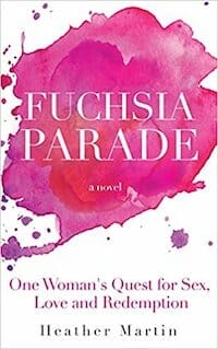
JF: A very expressive cover with great balance between the imagery and the typography.
Jack Geurts submitted The Fire and the Forge designed by Jack Geurts.

JF: Good idea, needs some help to make the image and the type “read” better.
James Murdo submitted Gil’s World designed by James Murdo. “Hi, The cover of Gil’s World has been designed to reflect the presence of a mysterious “infection” (no spoilers!) around the planet. The “infection” highlights the planet against the dark background of space. Thanks, James”

JF: It works pretty well although a different title treatment would have unified the cover better and would not have left that “blank” dark space floating above it.
Jan O’Hara submitted Cold and Hottie designed by Jan O’Hara.

JF: Cute, and its appeal is obvious.
Jennifer Rackham submitted Jupiter’s Perigee designed by Jennifer Rackham. “Selection of poems relating to Jupiter getting closer to earth and how it affects different characters and their emotions.”

JF: Attractive and idiosyncratic.
Katie Birks submitted The Blood of Princes designed by Katie Birks. “Historical fiction cover design for The Craft of Kings series, book two.”

JF: The designer has created covers that are obviously related for this series without turning them into “templates”. The economy of the designs helps them communicate, with not too many elements, picking those that are emblematic of the story and its era. ★
Katie Birks submitted Scars from the Past designed by Katie Birks. “Historical fiction cover design for The Craft of Kings series, book one.”

L.M. Sorrell submitted Broken Blue designed by Deranged Doctor Design. “I couldn’t quite believe it when DDD sent me the proposal for their interpretation of Broken Blue. This cover perfectly portrays the heart, soul, beauty, and dark atmosphere of Broken Blue. I couldn’t have wished for a better cover for my debut.”

JF: Congratulations. It’s an exciting cover with clues to the story, a great focusing device in that ring of fire, and a stylish title treatment.
Laura Duffy submitted The Tremble of Love designed by Laura Duffy.

JF: A beautiful and sensitive treatment that might get lost in the postage-stamp sized covers we see online.
Lauren Faulkenberry submitted A Tycoon’s Rush designed by Lauren Faulkenberry. “This is the second book in Avery Laval’s Sin City Tycoons series. It’s a contemporary romance with a feisty heroine, so we wanted it to have a seductive, yet edgy feel.”

Mark Ellero submitted Un brindisi a Venezia designed by Mark Ellero. “An italian romance novel set in Venice, Italy, Retaggi Series Book 1.”

JF: A strong photo background, but does it really say “romance”?
Mark Ellero submitted Una suite a Venezia designed by Mark Ellero. “An italian romance novel set in Venice, Italy, Retaggi Series Book 2.”

JF: A little better, since there’s an association of gondolas with romance, but now the title is starting to disappear into the background.
Mark Spano submitted Midland Club designed by Jeff.

JF: Interesting illustration style.
Martin Turnbull submitted City of Myths designed by Daniel Yeager, Nu-Image Design. “This novel takes place in Hollywood, whose greatest symbol is the Hollywood sign. My story examines the underbelly of life in Hollywood, so the unpainted back side of the “H” with its scaffolding and weeds seemed a great way to telegraph that to the reader.”

JF: Good concept and illustration, but the title needs work.
Matty Dalrymple submitted Rock Paper Scissors designed by Juan Padron. “I was so pleased with the cover that Juan Padron designed for “Rock Paper Scissors”–he perfectly captured the sense of danger and intrigue that the story conveys. I especially appreciated how he subtly reflected the title in the design elements.”

JF: Artful and arresting. Is it a woman from the back, or an opening in that stone wall?
Melissa Stevens submitted Savage Beauty designed by Melissa Stevens. “The author wanted to convey a darkness in her fairytale retelling of Sleeping Beauty, with roses a constant theme.”

JF: Style seems just right for a fairytale, but the title looks crammed between the roses and thorns.
Miika Hannila submitted The 11th Percent designed by Dan Van Oss.

JF: An expert job at creating atmosphere, combined with pro-level typography.
Nikki Stern submitted The Former Assassin designed by Diana Ani Stokley. “The cool colors of a map of the earth with a bit of inevitable blood spatter: the perfect cover for a suspense thriller about a globe-trotting former assassin who tries to retire, only to learn that her former boss wants her dead.”

JF: The font choice for the title is weak.
Ophelia Rue submitted Eclipse designed by Ophelia Rue. “I wanted to convey beauty in a bleak and lonely environment.”

JF: Visually, it looks like a book of poetry.
Patricia Leppo submitted The Drummer’s Call designed by Patricia Leppo. “The Drummer’s Call is about a boy who travels back in time and enlists as a Union drummer during the Civil War.”

JF: Interesting idea, but the execution is a bit of a mess.
Rhiannon Gilmore submitted Prophecy Girl designed by Rhiannon Gilmore.

JF: Indecipherable, can’t read the subtitle, and half the title looks like it was added at the end.
Ruth Rathband submitted Siege of the Northland designed by Helen Macpherson of Raspberry Creative Type. “When I commissioned Heather to design my book cover I wanted her to feel free to create whatever the synopsis, blurb and a couple of paragraphs describing the main protagonist, suggested to her… She captured Jesyka and the tone of the book brilliantly! I feel that Heather’s work is first rate.”

JF: Looks good, but it would be even better if the title had more contrast with the background.
Sarah Mendivel submitted Sam’s Theory designed by Sarah Mendivel.

JF: The self-published look. No idea what the story is or why it might be of interest.
Sharon Connell submitted A Very Present Help designed by Miriam E. Rue. “After writing tale, I decided to make sure the cover connected with the story. Something that stood out. I also wanted the reader to question, is the shadowed man the “Help” or the villain. The reader will have to decide. I came up with the design and gave my illustrator my ideas.”

JF: The “pasted-on” look, very weak typography, and principals so removed from us they are irrelevant.
Sharon Connell submitted His Perfect Love designed by Miriam E. Rue. “The book cover was designed to reflect the symbol in the story. I sent some pictures and my ideas to my illustrator and she did the rest. I was tired of the same old covers for romantic suspense. This is from a scene near the end of the book as the heroine thinks about God’s love.”

JF: Amateurish design approach that ignores the number one responsibility of any fiction cover: instantly signal its genre.
Simon Chapman submitted Exhumation designed by Adam Edwards. “The viewer is meant to be looking through a stone portal which borders the front cover, into the book. The protagonist is struggling to fight an obscure and unknown antagonist, who appears throughout the book.”

JF: Any visual appeal is overridden by the inappropriate font, better suited to 3-word newspaper names.
Thomas M. Barron submitted Bocas designed by Artwork David Powell, Colors/layout Toby Petersen. “The artwork and fonts I licensed from David Powell. He deserves a lot of credit! Thank you.”

JF: It can be good to “zig” when everyone else is “zagging” but have you really given anyone a reason to pick up the book?
VANESSA MENDOZZI submitted Evening’s land designed by VANESSA MENDOZZI.

JF: Great illustration idea for this gothic thriller, although the line under “P.Z.” is bothersome, and the title type is so attenuated it risks getting lost against the background illustration.
Nonfiction Covers
Ebook Launch submitted College To Job: 8 Steps To Career At World’s Best Companies As a Fresh Graduate designed by Ebook Launch.

JF: Visually clear and effective with strong typography, but I can’t escape the feeling that the subtitle was written by someone only partially familiar with English.
Erin Geil submitted Podunk Moon designed by Images- bought on dreamstime Fonts- Free on Canva. “I’m a forever lover of TBAS, and liked the similar font and colors, felt they worked well with the tone of my darker poetry book/novel excerpt. And I like the mysterious, simplicity of it.”

JF: I have no idea what TBAS is, but I think simplifying the background image would give the cover more impact.
Gisela Hausmann submitted NAKED TRUTHS About Getting Book Reviews 2018 designed by GISELA HAUSMANN. “Always updating this book to current Amazon guidelines, this time I changed the cover and went with a modern look.”

JF: Were you tempted to use a naked figure? It looks like the various elements were placed randomly. But hey, this book will sell itself anyway.
Jean Gill submitted With Double Blade designed by Jean Gill.

JF: Pretty cool, with interesting visual amusements, but I wish the title wasn’t the weakest part of the cover.
Mara M. Zimmerman submitted How to Meditate and Why designed by Mara M. Zimmerman.

JF: I understand wanting a minimalist cover for a book on meditation, but not one that’s so lacking in impact that it essentially disappears.
Matt Taylor submitted 101 Creative Dates: ideas, tips, and personal experiences from the life of a hopeless romantic designed by Matt Taylor. “I did the design myself. I had several options that I created, and poll after poll with friends, family, and random people on facebook, it finally came down to this one and another design. I ultimately picked this one. Very open to comments, critic, etc.”

JF: I guess you’d have to decide whether lying in a field is “creative,” but the cover works well, and you did a good job with the type. You might adjust the color of the yellow sneaker so it doesn’t bleed into the flowers, which is a bit distracting.
Michelle Balge submitted A Way Out: A Memoir of Conquering Depression and Social Anxiety designed by Jennifer Zemanek. “The main message of A Way Out is hope, and I wanted this to be expressed through the cover. The blue petals are symbolic of teardrops, and the flower overall represents the beauty that can come out of pain.”

JF: Beautiful and expressive, a lovely solution for this cover. ★ j
Mohy Omar submitted Monument of Ink designed by Mohy Omar. “I’ve taken a copy of something my ex has written me and just added it there onto a white backdrop. I’m an indie writer with very basic designing skills sadly, but i’m happy with the final result.”

Nancy Shugart submitted Prove Them Wrong: Be the One to Make It Happen designed by Kathi Dunn. “The image of the maze on the front cover beautifully symbolizes the everyday barriers we encounter throughout our lives. Get ready to soar to great heights as exemplified by the clouds above the maze of doubt and fear.”

JF: Love the way the designer has gotten rid of distractions and guided us right to the point they book is designed to address. A strong concept with equally strong art and type = win! ★
Nicolas Windpassinger submitted Digitize or Die designed by Maxime Zoffoli.

JF: A creative and effective print book cover that hasn’t survived reduction to this small size all that well.
RICHARD TODD submitted THE GOLF RULES – Stroke Play designed by RICHARD E TODD. “Golf themed focusing on the rules and learning them through stories of others break them.”

JF: Both the gratuitous “effects” on the title and the red flag peeking out are unnecessary distractions in an otherwise workable cover design that knows who its readers are.
Rita Toews submitted The Tough Mamas Guide to Survival designed by Rita Toews.

JF: Kind of brutal from a design point of view. Am I the only one who sees a pretty strange sexual message in the placement of those shoes??
Sheila Ferguson submitted Journey Back to Me designed by Lynne Holton.

JF: An evocative, symbolic cover for this very personal self-help book that will draw readers in. ★
Stella Budrikis submitted Susan: Convict’s daughter, soldier’s wife, nobody’s fool designed by Katie Stewart. “”Susan” is the story of Susan Mason, born in Adelaide in 1848 to Irish parents. She lived a colourful life on the streets of Adelaide before marrying a British soldier. The cover image is taken from a painting by S.T. Gill and shows Rundle Street in Adelaide in 1845″

JF: Attractive, with a strong historical message from the period painting. The author name needs more contrast with the background, and although this approach is a bit generic (does it matter what kind of story it is?), but the cover is well put together.
Well, that’s it for this month. I hope you found it interesting, and that you’ll share with other people interested in self-publishing.
Use the share buttons below to Tweet it, Share it on Facebook, Plus-1 it on Google+, Link to it!
Our next awards post will be on April 29, 2018. Deadline for submissions will be March 31, 2018. Don’t miss it! Here are all the links you’ll need:
- The original announcement post
- E-book Cover Design Awards web page
- Click here to submit your e-book cover (See New Submission limits)
- Follow @JFBookman on Twitter for news about the E-book Cover Design Awards
- Check out past e-Book Cover Design award winners on Pinterest
- Subscribe to The Book Designer Blog
- Badge design by Derek Murphy
