

Welcome to the e-Book Cover Design Awards. This edition is for submissions during October, 2017.
This month we received:
99 covers in the Fiction category
34 covers in the Nonfiction category
Comments, Award Winners, and Gold Stars
I’ve added comments (JF: ) to many of the entries, but not all. Remember that the aim of these posts is educational, and by submitting you are inviting comments, commendations, and constructive criticism.
Thanks to everyone who participated. I hope you enjoy these as much as I did. Please leave a comment to let me know which are your favorites or, if you disagree, let me know why.
Although there is only winner in each category, other covers that were considered for the award or which stood out in some exemplary way, are indicated with a gold star: ★
Award winners and Gold-Starred covers also win the right to display our badges on their websites, so don’t forget to get your badge to get a little more attention for the work you’ve put into your book.
Also please note that we are now linking winning covers to their sales page on Amazon or Smashwords.
Now, without any further ado, here are the winners of this month’s e-Book Cover Design Awards.

e-Book Cover Design Award Winner for October 2017 in Fiction
Sasha- 99Designs submitted A Man with One of Those Faces designed by Emir Orucevic. “The book cover for an Irish crime thriller with strong comedic twist about a small-time conman who gets mistaken for someone else because he has “one of those faces”. The design plays around with the theme of lost identity using distinct comical flavour through asymmetrical font faces.”
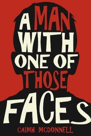

JF: Approaching perfection by perfectly embodying the themes of the book in the graphic image and title on the cover. Also consider the impact made by not showing a face, and the artful use of type, figure, and ground.
e-Book Cover Design Award Winner for October 2017 in Nonfiction
Hollie Shirley submitted What to Expect when youre Not Expecting designed by Tim Pritchard. “For this book, I wanted to make sure that the cover art was something fresh and new, and basically, not depressing! Infertility is a hard subject to talk about and I feel that the cover art for this book represents it perfectly, without being too melancholic of a tone.”
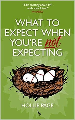

JF: Handles the subject clearly and with a bit of amusement and a loose illustration style that adds to its attractiveness
Fiction Covers
Adina Chiles submitted The Deadly Seven: A Hollow Hunger designed by Steven Novak.

JF: A well thought-out and effective cover.
Anita Moore submitted The Battle For The Four Realms: Dragon Bone designed by Anita Dugan-Moore. “This is the first book in a new fantasy series. The design on the cover depicts a pendant the main character wears.”

JF: The pendant is beautiful; the typography and layout are weak.
Anna-Marie Abell submitted Holy Crap! The World is Ending!: How a Trip to the Bookstore Led to Sex with an Alien and the Destruction of Earth designed by Anna-Marie Abell.

JF: The illustration is fun, and the title is, too, but the layout demonstrates the difficulty of working with a very long title: subtitle. And what’s that asterisk doing on the title?
Annie Arcane submitted In a Flash: The Wounded Hero Collection designed by Annie Arcane. “This ain’t my best cover design-wise, but I noticed that topless male covers (and their sexy models) were receiving some heat so I thought I’d give those misunderstood buggers a little love, eh? ^_~ Seriously, though, fantabulous site! Thanks a bunch!! x”

JF: You’ll find out with this one. Sexy type treatment, too.
Annie Arcane submitted Beautiful Confusion (Pride and Honor, Book 0.5) designed by Annie Arcane.
")
JF: These two make an interesting series, although I’m not a fan of the extreme lighting effects on the title, which limit legibility and don’t really add anything of their own.
Annie Arcane submitted Beautiful Surrender (Pride and Honor, Book 4) designed by Annie Arcane. “This is a cover I designed for my friend to match her pre-existing series”
")
Barry Nugent submitted Forgotten Warriors designed by Barry Nugent. “I really wanted this cover to show Steph Connisbee (the character on the cover) to look like a professional soldier who had been to hell and back.”

JF: I don’t think you quite got there, sorry.
Beth Martin submitted Quality DNA designed by Beth Martin. “Quality DNA is a science fiction novel. I wanted a cover which would make people look twice.”

JF: Pretty good job for an author-designer, and it is arresting.
Brhi Stokes submitted Caligation designed by Brhi Stokes.

JF: I like the focus the circular element gives to the cover, and with the dark landscape an interesting title typography, it works.
C.L. Hoang submitted Once upon a Mulberry Field designed by Derek Murphy. “I selected all the individual components in the pictures (the girl, the field and lake, the sunset, chopper, and mountains, then Derek put them all together in the composite picture and selected the fonts for the title and author’s name.”

JF: It’s challenging to combine disparate elements like these and have them combine into a clear message, but I think you’ve carried it off. The images immediately spoke of Vietnam and the conflict there, although I’m mystified by the font choice for the title because it seems to have no connection to the topic or the era, and it’s odd to see the word “a” capitalized in a title.
C.S. Patton submitted Seed designed by C.S. Patton.

JF: Effective, would have preferred a font for the title more in line with the implications of the tools.
Cailee Francis submitted A Masquerade in Time (The Fae Souls Book 1) designed by Cailee Francis. “My book is a lesbian fantasy romance, and the name I used with my submission is my pen name. Thanks. :)”
")
JF: A lovely cover with lots of emotion, but with too much going on. Although the mask element at the bottom is pretty, does it really add anything?
Candice Brown Elliott submitted All The Stars Are Suns designed by candice brown. “The book’s main protagonist is shown on the cover, looking up at the stars, as she does in the opening sequence of the story, in wonder and longing.”

JF: Good use of a stock photo and adept typography make this cover stand out.
Caylen D. Smith submitted A Thief’s Game designed by Daneila Owergoor. “A card game, a beautifully crafted dagger, and a women’s archery arm guard. My cover designer brought my ideas to life perfectly, telling the story of beauty and danger.”

JF: A beautiful illustration, too bad the typography doesn’t hold up. The title is too small and the author’s name is very hard to read.
Chris Africa submitted The Elf and the Amulet designed by Peter Thorpe, Olivia Africa, Chris Africa. “The original cover concept was created by my daughter, Olivia (age 11), and me. Peter Thorpe took our concept and polished it substantially. I hope you love it!”

JF: I like it just fine, and I’m sure your fans will, too. To nitpick (after all, the purpose of this article) I believe the cover would balance better if the vertical space was more appropriately arranged. For instance, there’s no good reason for the bottom margin to be so large in relation to the top and to the space between the pendulum and the title.
Christina Pilz submitted Oliver & Jack: In London Towne designed by James Egan. “This is the sixth and final book in the Oliver & Jack series. James visually linked this cover to the previous five, adapting the layout of the previous covers with the more upbeat and happy tones of book six.”

JF: Another beautifully drawn period cover. All of the books in this series remind me of a woman’s cameo, and the typography is exceptional.
Christine Dillon submitted Grace in Strange Disguise designed by Joy Lankshear. “This novel is contemporary Christian fiction.”

JF: Perfectly targeted to the intended market, sophisticated but with a light touch. Could you find a different spot for the “Book 1”? ★
Clay Rivers submitted Christmas Is: Mischief and Merriment in Manhattan designed by Clay Rivers. “This comedy is set in Manhattan during the Christmas holidays. The iconic Rockefeller Center Christmas tree is the most recognizable landmark in NYC during the holiday season. Also, a pivotal moment in the story takes place underneath it. This energetic and graphic approach was an novel solution.”

Cortez Law III submitted SERIAL RITES designed by Fantasia Frog Designs.

JF: Way too many textures and elements. For instance, the effect on the title doesn’t really add much to the cover and competes with the textures in the background.
Dan Van Oss submitted Denial (Girl Undercover Book Two) designed by Dan Van Oss.
")
JF: Strong elements clearly communicate the tension in the story and draw us in.
Dan Van Oss submitted No Justice designed by Dan Van Oss.

JF: Some very strong parts to this cover (love that figure with the flashlight; it’s impossible to not look at it) but overall it’s visually confusing.
Daniel Leigh-Brown submitted I’ll Never See That Cloud Again designed by Dan Leigh-Brown. “With Felipe’s beautiful images I was spoiled for choice when it came to the front cover. Then I figured an adventure built around the wonders of a child’s imagination couldn’t be summed up any better than riding an airship up among the clouds. I flipped the chosen image and everything fitted nicely!”
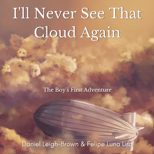
JF: A beautiful image that could have used a stronger type treatment.
Darja DDD submitted Skipping Stones designed by Marushka from Deranged Doctor Design. “Historical Romance cover design by Marushka from Deranged Doctor Design”

JF: A strong historical romance cover that combines character and setting with a custom type treatment to good effect.
Darja DDD submitted A Shot In The Dark designed by Marushka from Deranged Doctor Design. “Romance cover design by Marushka from Deranged Doctor Design, Dark Series Book 1”

JF: Very effective series design that highlights romantic interaction and motorcycle action. The dark palette emphasizes the “Dark Series” theme.
Darja DDD submitted Into The Light designed by Marushka from Deranged Doctor Design. “Romance cover design by Marushka from Deranged Doctor Design, Dark Series Book 2”

Darja DDD submitted Death of a Dead Man designed by Kitten from Deranged Doctor Design. “Cozy Mystery, Thriller & Suspense cover design by Kitten from Deranged Doctor Design, Juniper Grove Cozy Mystery series, Book1”

JF: The two-dimensional look suits these books well, not sure if the wooden sign title treatment is strong enough to balance the rest of the covers.
Darja DDD submitted At Death’s Door designed by Kitten from Deranged Doctor Design. “Cozy Mystery, Thriller & Suspense cover design by Kitten from Deranged Doctor Design, Juniper Grove Cozy Mystery series Book3”

Darja DDD submitted Death of a Santa designed by Kitten from Deranged Doctor Design. “Cozy Mystery, Thriller & Suspense cover design by Kitten from Deranged Doctor Design, Juniper Grove Cozy Mystery series Book4”

Darja DDD submitted No Direction Home designed by Milo from Deranged Doctor Design. “Post-Apocalyptic Science Fiction cover design by Milo from Deranged Doctor Design, The No Direction Home Series , Book 1”

JF: Another strong series design that emphasizes action and story, using the “back to us” characters to pull us into the scene.
Darja DDD submitted Eastwood designed by Milo from Deranged Doctor Design. “Post-Apocalyptic Science Fiction cover design by Milo from Deranged Doctor Design, The No Direction Home Series , Book 2”

Darja DDD submitted On The Edge designed by Milo from Deranged Doctor Design. “Post-Apocalyptic Science Fiction cover design by Milo from Deranged Doctor Design, The No Direction Home Series , Book 3”

Darja DDD submitted Tombyards & Butterflies designed by Milo from Deranged Doctor Design. “Science Fiction, Action cover design by Milo from Deranged Doctor Design, Montague & Strong Case Files series, Book 1”

JF: Strong colors, typography, background texture, and illustration for this series design, although the interactions between the characters seem a bit awkward. The third title adds a third character and a bit of confusion about how these people are supposed to relate to each other.
Darja DDD submitted Full Moon Howl designed by Milo from Deranged Doctor Design. “Science Fiction, Action cover design by Milo from Deranged Doctor Design, Montague & Strong Case Files series, Book 2”

Darja DDD submitted Blood is Thicker designed by Milo from Deranged Doctor Design. “Science Fiction, Action cover design by Milo from Deranged Doctor Design, Montague & Strong Case Files series, Book 3”

E. Christopher Clark submitted Missing Mr. Wingfield designed by E. Christopher Clark.

JF: Economical, yet memorable.
Earl T. Roske submitted Tale of the Music-Thief designed by Aubrey Watt. “Aubrey Watt approached me on Reddit when I was sharing my amateurish attempt to design my own book cover. She had learned I was a new dad and had no job. She did the cover gratis. I had hoped to envoke the darkness of the mysterious thief and a sense of music. I think she did it perfectly.”

JF: You’re a lucky man, she gave you a cover that captures an air of mystery while making a great impact. ★ s
Evelyne Contant submitted The Moonstone , Enchantment book 1 designed by Boudesign.

JF: Interesting series design, might have benefitted from more readable type, especially for the titles, but the focus on both covers is good.
Evelyne Contant submitted Atlantis , Enchantment book 2 designed by Boudesign.

Frankie Bow submitted The Nakamura Letters designed by Hawaiian Heritage Press. “The Nakamura Letters is part of The Professor Molly Mysteries, but it’s a bit of a departure from the series. It’s a mystery novelette told entirely in emails from Professor Molly’s best friend Dr. Emma Nakamura. The cover straightforwardly shows Emma typing; her device shows the author name.”

JF: Matches the other covers in this series. The different illustration styles all used together are problematic.
Gino Cox submitted Ice Cold designed by Gino Cox. “The title Ice Cold, a neo-noir thriller, refers to a contract assassin named Ice and his dispassionate demeanor, and to a night club planned by the Thai ex-wife of an Italian-American gangster, where beers will be served ice-cold, not lukewarm and chilled/diluted with ice, as at most Thai bars.”

JF: I get it, but it has the unmistakable “self-published” look.
Hollis Thompson submitted Affinities designed by Hollis Thompson. “Made with Paintshop Pro X9 and stock imagery from Fotolia. And a little filter work from Snapseed on iOS to tweak the pallet.”

JF: The arresting image is the best part of this cover. Good idea to try to avoid vertical type, it adds a significant distraction to browsers.
James Egan submitted Curtain Call designed by James T. Egan of Bookfly Design.

JF: The broken glass effect dominates everything else on the cover, so the impact will rely on the sharp-edged image.
James Egan submitted Boom Girl designed by James T. Egan of Bookfly Design.

JF: A fun and exciting cover for this basketball/fantasy novel.
James Egan submitted Serial Killer Z designed by James T. Egan of Bookfly Design.

JF: A terrific presentation for this thriller, from the slices in the textured background to the iconic “Z”, the solitary figure, and the “splatters,” each of which is a part of the overall effect. ★
Janine Pestel submitted The Bucktown Babies designed by Cover Mint.

JF: A solid job.
Jennifer S. Alderson submitted The Lover’s Portrait: An Art Mystery designed by James of GoOnWrite.com. “This cover was actually a pre-made I found on GoOnWrite.com while searching for a book designer. However, it is as if James designed it for the book: the wallpaper, frame and even stenciled font conjure up the historical setting and missing portrait central to the plot.”

Joan Dempsey submitted This Is How It Begins, A Novel designed by Damonza. “The “orange woman” conjures a political firestorm, arson, and WWII firebombing, and her bag and backward gaze symbolizes the burden of a 70-year old secret. The ghosted American flag represents freedom of speech and religion, and paint splashed on canvas indicates the centrality of art in the novel.”

JF: Yes, but despite all those cues—which only you understand—the cover succeeds because it communicates a sense of mystery and intrigue due to its clean and contemporary design.
Judith Simpasa submitted The Prisms of Sarsen designed by Swann Books.

JF: Very pretty, but with all the room on the cover, was it really a good idea to jam the woman’s face under the title type? I think not.
Kari Trumbo submitted To Honor and Cherish designed by Evelyne Labelle. “Evelyne is a fairly new artist, but her work is so amazing. I was so proud of this cover, I had to submit it.”

JF: Even though I usually try to discourage using 3 different type styles in one title, overall it’s delicate and attractive.
Kelly Stock submitted Accacia’s Curse designed by Arizona Tape.

JF: Moody and effective.
Kelly Stock submitted The Soul Guide designed by Charlie of Sapphire Designs.

JF: Most of the type is disappearing into the illustration.
Kimbra Swain submitted Abomination designed by Hampton Lemoureux. “Hampton and I endeavored to make this Urban Fantasy cover imply the genre without overt visualization. We also wanted to show the faces of the characters, because we were lucky enough to find excellent stock models, but avoid the “romance” novel implications.”

JF: But putting two attractive people on the cover naturally leads to thoughts of romance… Nice use of the symbol to add import to the background.
KM Paradice submitted The Chronicles of the Sons of None – Connor designed by Kristen at Astrea Creative. ” The book concept is built around something very ancient, very intriguing, very enticing. Astrea has communicated these concepts very effectively with the columns, the lighting, the entrance to this structure that draws you in, luring you, tugging at your senses, begging you to have a look inside.”

JF: Intriguing, with an interesting illustration style.
Kristi Saare Duarte submitted The Transmigrant designed by Alexander von Ness. ” A somewhat controversial novel about Jesus traveling through Asia while studying Hinduism and Buddhism. I wanted the cover to convey the physical and internal journey and the spiritual aspect of the story. It also had to show this was not your traditional Jesus. Nessgraphica did an amazing job. ”

JF: It’s a lovely and evocative image, although I’m not sure there’s anything to let me know the divine nature of the protagonist, and I’m not a fan of the “Trans” part of the title.
Laura Greenwood submitted Chasing Aledwen designed by Arizona Tape.

JF: The brilliance of the illustration and stylish typography set this cover apart.
Lauren Brown submitted Behind The Pines designed by Cinyee Chiu.

JF: Perfectly spare and atmospheric, well done. ★
Laurie Jameson submitted The Waystation designed by Anna Marie Abell.

JF: Rather murky.
Leila Dewji submitted Hypnosis: A Return to The Past designed by Rachel Lawston. “We wanted to create something that reflected the Portuguese seaside setting but also gave the feel of literary fiction with something mystical at play.”

Mark Edgar Stephens submitted The Very Best Christmas Tree EVER! designed by Mark Edgar Stephens. “I created this cover design using online tools and help from the Create Space/Amazon Cover Creator.”

JF: If you intend to be a commercial publisher (i.e. sell books) I strongly advise you to hire one of the excellent professionals whose work you see here.
Mark Reid submitted Fenmarsh designed by Mark at AuthorPackages. “The author wanted to convey the damp, marshy, and misty world, as well as include one of the central artefacts from the book. In the end, we went with the magical Bogstone and its inner light. In the mist we have a very (deliberately) subtle nod to the March of Progress featuring marsh creatures.”

JF: An artful cover that promises lots of excitement, and I particularly liked the tone established by the title treatment.
Mark Reid submitted The Incarnadine Thread designed by Mark at AuthorPackages.com. “Our client wanted something that reflected her genre but gave a mild hint of something ominous in the past. She also asked that red notes be used to signify the tragedy in her story.”

JF: A competent design that never quite achieves a unified result due to some discomfort in the layout of elements. The winding path, though, is very effective at focusing us on the woman and leading un into the story.
Mark Reid submitted Animal Instinct designed by Mark at AuthorPackages. “The author wanted to avoid the trappings of the vampire-based covers, with no blood, biting, or gaping mouths. Instead we focused on her protagonist’s arrival in the city, using the title to hint at fangs, the gloomy moonlight to show the underworld aspect, and the tagline to tie in the blood.”

JF: The eerie tone is what’s most pronounced about this good-looking cover.
Mark Reid submitted Mystic Princess designed by Mark at AuthorPackages. ” Kelli had no specific idea in mind, but when she mentioned that the protagonist “spends a lot of the book travelling to the Mystic City, a safe haven for mystics that is hidden deep in the woods”, I wanted to capture the beginning of her journey. Ornaments were included for future series theming.”

JF: It works. Doorways are also great focusing devices, as you can see here.
Mark Reid submitted Catfish designed by Mark at AuthorPackages. “Madelyn had a very specific concept in mind in terms of the era, characters, location, and feel. While it was tough to source the assets required to build the characters (as well as remove twenty years, and a beard from the man), we were able to meet her exact requirements.”

JF: Although it has a lot going for it, the whole cover comes across as oddly passive and not quite believable.
Matt Hill submitted Lost Solace designed by Matt Hill. “In Lost Solace, Opal is a cool badass who for much of the novel wears a beaten up suit of space armour that’s loaded with surprises. Karl wanted to have her front-of-stage on the cover, showing off her calm, no-nonsense personality while suggesting the cold harshness of the adventure ahead.”

JF: Focusing on the heroine brings a strong human element to a genre usually dominated by technology. Artful use of colors, particularly the electric blue, help tie it all together. ★
Matt Hill submitted Sparks: An Electric Anthology designed by Matt Hill. ” This collection of short horror stories all have the theme of electricity. Burdizzo Books wanted a cover to communicate the theme and genre in a style similar to an old public service announcement. Hence the exploding electricity pylon and thunderous skies! ”

JF: Dramatic and right on target.
Matt Sinclair submitted Lost Wings designed by Sarah Tregay. “For this urban fantasy, we wanted to convey its San Francisco setting, a dark sense of menace, and angel’s wings. Overall, I’m pleased with the result as is the author.”

JF: It works.
melisa ruscsak submitted The New Reign designed by melisa ruscsak.

JF: Hard to decipher; no color control; type is hard to read.
Michael Dirk Thalmann submitted Static: Androids, Cyborgs, War & a Homicidal Baboon designed by Vincent Griffin. “This cover depicts a scene from the book after the Lunar Colonies, as well as the Earth’s surface, have suffered catastrophic bombings”

JF: I’m a fan of black and white covers, but I’m not sure this one works. Although the bottom half has great contrast and interest, the rest looks washed out and lacks impact.
Michael Evans submitted Control Freakz designed by Lance (Palmetto Publishing Group).

JF: Succeeds by paring down a dystopian cover to its essentials, with a clever type trick in the title “Z”.
Michael Gallagher submitted Diamond Rain designed by Michael Gallagher.

JF: Amateurish; colors illogically taking over the cover; ineffective composition.
Patricia Furstenberg submitted Joyful Trouble designed by The Book Khaleesi.

JF: Hard to go wrong with a cute dog, and I like the playful title. Just wish the designer had put more effort into making the dog’s hat look more natural and not so pasted-on.
Philip Blows submitted James and the Rainy Day designed by Gareth Lucas. “James and the Rainy Day is a book about where a boy’s imagination can take him, with just a little bit of help from his mother. The beautiful cover which the super-talented Gareth Lucas designed for me captures both the sense of adventure and the fun nature of the story.”

JF: Absolutely delightful illustration and concept, with the boy and the boat in full motion. Even title on the sail is lovely and helps the whole cover present one, coordinated message. ★
Preston Fleming submitted Maid of Baikal designed by Richard Trask.

JF: Nicely done but rather static.
Raine Baushke submitted Mystery in Montmartre designed by Joseph Brancik. “My cover places the reader in Montmartre/Paris with a photo of Sacré Coeur, the Eiffel tower in proper perspective. Intervening Paris is faded out. The painting informs the reader of the Parisian attorney’s mindset. The model resembles a woman he met in the U.S. as a teenager. A search ensues. ”

JF: Expert image combining, and both illustrations are quite good. The top image of a woman from underwater is maybe a bit too complex, with the ornate frame and odd perspecitve, to work well here, and the compressed type is pretty extreme.
Ray Lamboy submitted Moral Hazard designed by Damonza. “This cover combines two stock photos, one with a “ghost mannequin”/”hollow man” effect. The building in the background is a significant element in the story.”

JF: Makes its point, and the type is well done.
Renee Gauthier submitted Christmas Miracle in July designed by R.M. Gauthier.

JF: The many nice details in this cover are overcome by the ineffective composition and bizarre color choices.
Richard Sullivan submitted The First Ward IV: His Lips Forgot The Taste Of Truth designed by Richard Sullivan. “The First Ward novel series’ principal character’s menacing face epitomizes his personality and actions.”

JF: A strong photo and poetic title largely obscured by the way-too-prominent series identifier which is probably the least important element on the cover.
Robert Borg a.k.a. Louise Roberts submitted Dragoon Serenade designed by Dusktildawn designs. “The cover covers the 4 main aspects of the e-book: The heroine, the location [France], the historical content [Swastika], and Resistance Fighters [machine gun].”

JF: Visually chaotic.
Robert Deason submitted Super Shy designed by jeshart. “This is a revised cover of my first novel. I selected jeshart on fiverr.com to design covers for my next two novels. Then, I asked him to redesign this one so it would look compatible with the sequels.”

JF: Is she really. . . walking on the wall?
Robert Gilbert submitted Trans Tasmin designed by Robert Gilbert. “The cover features Raukawa Tuhura, a Trans actress who played the lead role in a professional public reading of the play. The photograph is used with her permission. The photo design and editing was done using an online photo editing service.”

JF: With such an attractive character, it might have worked better to zoom in, allowing us to interact a bit better. The image has an Instagram-my look, not necessarily a bad thing, and the type seems like a default.
Rosemary Kind submitted New York Orphan designed by Katie W. Stewart. “The cover gives a wonderful flavour of the story, bringing together several key components as well as providing an indication of the atmosphere.”

JF: Approaching perfection by perfectly embodying the themes of the book in the graphic image and title on the cover. Also consider the impact made by not showing a face, and the artful use of type, figure, and ground.
Sasha- 99Designs submitted Mock my Words designed by Leonardo Gonzalez. ” An original illustration for a genre-melding novel cover about a Chinese literary genius at an important crossroads in life. The cover design drew inspiration from the bold, 1970s vintage-style book covers to showcase the many defining aspects of the protagonist’s story in a clear but comical way.”

JF: The strong framing device, amusing illustration and clever title all make this cover stand out. ★
Sasha- 99Designs submitted Princess the Cat versus Snarl the Coyote designed by Gottl Dorottya. “Whimsical, hand-drawn style of illustration for an endearing children’s book about the misadventures of a cat and a dog.”

JF: Lovely illustration and a good cover for its audience, but I’m not a fan of breaking the title into three disparate parts.
Sasha- 99Designs submitted In The Middle designed by Andrea Orlic. ” The story of a girl who moves into a small town and somehow gets involved with the local residents’ disappearances needs a mysterious yet eye-catching cover. The side-angle image of a girl hints at the female protagonist, and extensive tree roots superimposed on her clues in on the mystery to solve. ”

JF: A subtle cover that succeeds because the central spotlight provides enough contrast to make the more muted images make sense.
Sasha- 99Designs submitted Stunde Null: Ultimatum designed by Andrej Rudolf Semnic. “This thriller about a man avenging the death of his father needed a book cover that conveys its dark and foreboding mood. The dark color theme hints at the mystery the protagonist must solve in the story.”

JF: It does have mystery and impactful type, but the real mystery is what are we looking at? I have no idea, maybe a gas mask? Too obscure to know.
Sasha- 99Designs submitted Deadfall designed by Emir Orucevic. “A new vintage-style book cover for a sci-fi thriller about superhumans. Adding texture to the font of the book title against the red background helps convey a dark and gritty anti-hero tale.”

JF: A deadly effective graphic cover that shows how an economy of means can lead to a cover with real impact. The cleverly inverted “A” adds a unique twist.
Skye MacKinnon submitted Winter Princess designed by Arizona Tape.

Stephanie Sobchak submitted Unending Hunger designed by Stephanie Sobchak.

JF: Well executed and squarely aimed at readers of this genre.
Susannah Nix submitted Remedial Rocket Science designed by Ebook Launch.

Well laid-out, artful type, and an attractive heroine make this cover just right for romantic comedy.
Tanja Prokop Bookcoverworld submitted One Way Out designed by Tanja Prokop.

JF: Creepy and menacing, emphasizing the appeal of the story.
Tanja Prokop Bookcoverworld submitted Absturz ins Leben designed by Tanja Prokop.

JF: Artful although the silhouettes get a little lost in the dramatic scene.
Tanja Prokop Bookcoverworld submitted Geliebter Macho designed by Tanja Prokop.

JF: Expertly done, but I wonder if the imagery would have been more prominent without the “glitz” on the title type.
Tanja Prokop Bookcoverworld submitted
Ominous:Borders:Coffee designed by Tanja Prokop.

JF: There’s a lot of artistry in this unusual cover, from the image combining to the odd orthography of the title. Does it all work? It does seem to represent the book well.
Tanja Prokop Bookcoverworld submitted Nineteen Eighty Two designed by Tanja Prokop.

JF: Some interesting art, but the whole doesn’t come together and lacks impact.
Timothy Browne submitted Maya Hope designed by Suzanne Fyhrie Parrott. “Part of the story takes place in Guatemala where the main character (Nicklaus Hart, MD) searches for answers after his best friend was murdered at the base of a Maya temple.”

JF: Stylish, although the tree looming in from the right seems extraneous. If you wanted to show “jungle” you would need a lot more foliage.
Zoella Rose submitted Sati designed by Zoella Rose.

JF: Atmospheric and complex, this cover works well. Is the title “SatI” or “Sati”? Hard to tell.
Nonfiction Covers
Alvinya Key submitted Love or the Illusions of Love designed by Ciley Carrington.

JF: Weak and ineffective. Needs a border around it to prevent “bleeding” onto white web pages.
Brian Stubbs submitted A Mental Health Survival Guide: How to Manage the Severities of Multi-Mental Health Diagnosis designed by Steve Fata.

JF: Incomprehensible unless you, too, associate weeds with mental illness. Needs a border around it to prevent “bleeding” onto white web pages.
Cathi Stevenson submitted Planet Ben designed by Cathi Stevenson / BookCoverExpress.com. “Trying to find a fresh way to convey narcissism was a challenge, but the speech bubbles seemed perfect and weren’t being used much on books back in 2014 when I did this cover. I needed an older model, so I ended up using my husband’s forehead wrinkles on a stock image (don’t tell him. ;) ).”

JF: It works, and best use of thought bubbles award for sure.
Curtiss Witt submitted Gaming to Innovate – The Innovation Game: How to Leverage Gamification to Unleash the Breakthrough Beast in Your Organization and Create an Unstoppable Innovative Culture designed by Steve Fata.

JF: A subtitle that’s almost a mini-course in high flying keyword stuffing. Good concept on the design, weakened by the gratuitous and distracting effects on the title, along with the obvious fact that the “chart” makes no sense whatsoever.
Daniel Prince submitted Choose Life designed by Abdel. “Step inside the realms of long-term family travellers, worldschoolers and digital nomads.”

JF: A good graphic that completely buries the key appeal of the book (“tips for family travel”) and combines it with an off-topic title.
David Almeida submitted Decision Diagnosis: Seven Antidotes to Decision Procrastination designed by Steve Fata.

JF: Interesting idea, the line around the title type degrades the image.
David E. Gates submitted Access Denied designed by David E. Gates. “The background is an array of DNA coding – this is the crux of the discovered lie within the story. The representation of an adult and child’s hand, signifying attachment and love, is a powerful image of the relationship between the father and daughter featured in the events as told within.”

JF: It’s important to understand that to the viewer, the background isn’t “DN coding” because only you know that. It’s lines of incomprehensible digits and letters. The two hands is a clever and symbolic graphic, but the cover as a whole comes across as very amateurish.
Debbie Miller submitted Move or Improve?: The Baby Boomers’ Guide to Housing Options and How to Choose What’s Right for You designed by Steve Fata.

JF: Once again, a layout that completely subsumes the real message of the cover and the book (“The baby boomer’s guide to housing options”) beneath far less meaningful (and discoverable) language and images.
Dirk Loon submitted The Secret of Influence: Mastering the Art of Inspirational Leadership! designed by Steve Fata.

JF: Influence… over books? Typography is clean and effective.
Eamon Rooney submitted Get Naked : How to Create a Business You Love through Radical Transparency designed by Steve Fata.

JF: A clever pitch for this business book.
Ed Kinsey submitted The 5 Money Myths: Time Tested Money Principals For A Retirement You Can Bank On designed by Steve Fata.

JF: Mines familiar territory and does it well. A good solution for a type-only cover that emphasizes the authority of its contents.
Frederic Martini submitted Betrayed designed by Brandi Doane McCann.

Greg Thredgold submitted The Depression Miracle: Seven Keys to Shattering the Chains of Anxiety, Depression, and the Unfulfilled Life designed by Steve Fata.

JF: A solid, if static, nonfiction cover that enforces the theme of alienation.
Jason Blake submitted 10 Things I Learned Living on an Island designed by Damonza.

JF: Clever visual combines with expert type handling to create a really well-targeted cover. ★
Jennifer Newcomb Marine submitted How Fear is Kicking Your Creativity’s Ass: Why It Matters & What to Do About It designed by Jennifer Newcomb Marine. “I searched high and low for an image that would create a vicarious experience for the viewer and fell in love with this one.”

JF: There are some spacing problems in your type block, which is otherwise good looking. Not sure that the image communicates anything about overcoming fear in service of creativity, but it does capture some of the moment of creation itself.
John Smith submitted The Authentic Man: A Guide to Happiness and Purpose designed by Steve Fata.

JF: The version on this book’s sales page sports a large and meaningless “Best Seller” badge but I guess they took it off for this contest?
Kashonia Carnegie submitted Raising Love Consciousness: Together We Can Change the World designed by Chris Bull. “The book is based on the current RISE in feminine energy, hence the need for a fresh, clean, gentle appearance, with the RISING moon (symbol of the feminine) & the tree indicative of the potential for growth and change as a result. The white cover & black spine as per Dave Chilton’s advice.”

JF: With these strong themes, it seems you could have developed a much more dynamic visual message instead of this whisper campaign. (We don’t judge spines since this is an ebook cover design competition.)
Kenny Chapman submitted In-Home Sales Acceleration : How to Create Raving Fans, Increase Sales, and Improve your Online Reputation in 30 Days or Less designed by Steve Fata.

JF: Cool graphics make this book stand out. Needs a border for web page display. ★
Kevin Harrington submitted Put a Shark in Your Tank designed by Steve Fata.

Mark Lumia submitted Thinking Outside the Money Box: Simple Steps To Increase Retirement Income, Reduce Taxes And Protect Your Nest Egg designed by Steve Fata.

Mark Tosoni submitted Six Figure Commission Sales Secrets: Access Your Highest Potential, Eliminate Your Competitors, and Generate Big, Fat Paychecks! designed by Steve Fata.

JF: Is that an Earth shot in the background? Professional grade typography makes this cover work.
Marty Hill submitted The Professional’s Guide to Technical Ministry designed by Melinda Martin. “The Professional’s Guide to Technical Ministry is about tech, but also people and doing ministry. Melinda captured this well on the cover by showing the tech booth with the silhouette of the operator, along with the praise team leading the worship ministry, leaving plenty of space for readable text.”

JF: Nicely done, although it seems too dark at this size.
Matt Hill submitted Habits that Ruin your Technical Team designed by Matt Hill. “Marcus wanted an eye-catching cover that would suggest the chaos that results from a badly managed team, while also conveying the humorous style of his writing. The cartoon “fight cloud” and bold colour scheme ticked all the boxes and he loved it.”

JF: I love it too, because it graphically communicates the theme of the book with humor and style. ★
Mitch Russo submitted The Invisible Organization: How Ingenious CEOs Are Creating Thriving, Virtual Companies designed by Steve Fata.

JF: That’s a pretty big challenge, to visually show an “invisible” organization, so we should give some slack for using the circuits/org chart graphic, which is anything but invisible.
Mitchell Batavia submitted Wisdom from a Chair: Thirty Years of Quadriplegia designed by Mitchell Batavia. “The memoir is about the life of Andrew Batavia, a disability activist who fought for the rights of people with disabilities and wrote US regulations for the American Disabilities Act of 1990.”

JF: The classic self-published look.
Rina Flanagan submitted Africa, my Africa. designed by Maria (Rina) Flanagan. “I purchased use of the original image from Stockfresh, and used Paint to make it into a cover fitting the correct dimensions for Amazon e-book covers.”

JF: The simplicity and directness of this cover work in its favor, which shows it’s not the tools you use, but the vision you have, that’s most important. ★
Rita Ferraro submitted SAVE YOUR LIFE A GUIDE TO DETOXIFICATION FOR 21ST CENTURY ILLNESSES designed by Steve Fata.

JF: Obviously professional, although I’m not sure a dead bird is a strong draw. And there’s that inane “Best Seller” badge again. Authors should be told that using badges like this, rather than helping their book, will mark it as a bit phony and a bit tawdry.
Rob Nixon submitted The Perfect Firm : Your Playbook For Building A Perfect Accounting Business designed by Rob Nixon.

JF: Looks like the cover of a thriller, not an accounting book.
Robert McFarland submitted Dear Boss: What Your Employees Wish You Knew designed by steve fata.

JF: Simple and effective.
Robert Rolih submitted The Million Dollar Decision: Get Out of the Rigged Game of Investing and Add a Million to Your Net Worth designed by Steve Fata.

Ruby Mabry submitted Moments of Inspiration: Thought provoking insights to uplift, impact and inspire designed by Steve Fata.

JF: A genuinely good cover cheapened by that irrelevant and useless “Best Seller” badge.
S. A. Soule submitted The Writer’s Guide to Character Emotion designed by SwoonWorthy Book Covers. “Thank you for your consideration!”

JF: The title treatment isn’t bad; the rest of the cover is a communications disaster. Not how to create an effective nonfiction cover. And did you see the variant on the “Best Seller” badge?
Tyler Lloyd submitted Service Disrupted: My Peace Corps Story designed by Tyler Lloyd. “Service Disrupted is a memoir of my two years serving as a Peace Corps Volunteer in Burkina Faso, Africa (represented by the baobab tree) and testing positive for HIV (the red stripe).”

JF: A strong cover nicely put together. You might want to add a border or find some other way to keep the bottom from “bleeding” onto white web pages.
Well, that’s it for this month. I hope you found it interesting, and that you’ll share with other people interested in self-publishing.
Use the share buttons below to Tweet it, Share it on Facebook, Plus-1 it on Google+, Link to it!
Our next awards post will be on December 24, 2017. Deadline for submissions will be November 30, 2017. Don’t miss it! Here are all the links you’ll need:
- The original announcement post
- E-book Cover Design Awards web page
- Click here to submit your e-book cover
- Follow @JFBookman on Twitter for news about the E-book Cover Design Awards
- Check out past e-Book Cover Design award winners on Pinterest
- Subscribe to The Book Designer Blog
- Badge design by Derek Murphy
