

Welcome to the e-Book Cover Design Awards. This edition is for submissions during September, 2016.
This month we received:
112 covers in the Fiction category
12 covers in the Nonfiction category
Comments, Award Winners, and Gold Stars
I’ve added comments (JF: ) to many of the entries, but not all. Remember that the aim of these posts is educational, and by submitting you are inviting comments, commendations, and constructive criticism.
Thanks to everyone who participated. I hope you enjoy these as much as I did. Please leave a comment to let me know which are your favorites or, if you disagree, let me know why.
Although there is only winner in each category, other covers that were considered for the award or which stood out in some exemplary way, are indicated with a gold star: ★
Award winners and Gold-Starred covers also win the right to display our badges on their websites, so don’t forget to get your badge to get a little more attention for the work you’ve put into your book.
Also please note that we are now linking winning covers to their sales page on Amazon or Smashwords.
Now, without any further ado, here are the winners of this month’s e-Book Cover Design Awards.

e-Book Cover Design Award Winner for September 2016 in Fiction
Dahttps://ebooklaunch.com/ebook-cover-design/?ref=2″ target=”_blank”>EbookLaunch.com.
JF: The delightful concept and illustration style are just right for this comic novel.

e-Book Cover Design Award Winner for September 2016 in Nonfiction
Peter Turchin submitted Ultrasociety: How 10,000 Years of War Made Humans the Greatest Cooperators on Earth designed by Marta Dec. “Human beings are nature’s greatest team players. Ultrasociety tells the story of how humanity evolved from the first scattered bands of foragers to communities of hundreds of millions of individuals, capable of sending people into space. (Thus the image of “weaving together.”)”

JF: Beautiful imagery and well balanced, strong typography make this cover one of the cleanest and most effective at getting its point across.
Fiction Covers
280 Steps submitted Gunshine State designed by Eder Rengifo.

JF: A strong, graphic cover that reaches out and grabs the viewer. Fonts go perfectly with the style of the cover, and the simplified design adds to the impact.
280 Steps submitted Boondoggle designed by Eder Rengifo.

JF: Nice layout, way too murky for me.
280 Steps submitted Under the Carib Sun designed by Eder Rengifo.

JF: Series design with the same bold style as in this designers other covers. Both use the same strong typography and story elements to attract readers.
280 Steps submitted Under the Dixie Moon designed by Eder Rengifo.

A Aithal submitted Beyond The Milky Way designed by Darshini.

JF: I’m not going to try to make sense of the heavenly objects, but I think the perspective effect on the title is overdone.
A.M. Rycroft submitted Into the Darkness designed by A.M. Rycroft. “I am not a fan of character covers, because I feel like they limit the reader’s imagination about what the characters look like. When I redesigned the cover for the second edition, I went for eerie, dark, and an abstraction of the evil at the center of the story.”

JF: Good idea, and it works, but the overworked title is distracting from your efforts.
Aaron Gisler submitted The Adventures of Jimmy Jimmy Boo designed by Eden Miller. “I am a special education teacher in Rogers, AR. My aide, Eden Miller loved the storyline of The Adventures of Jimmy Jimmy Boo and was inspired to illustrate my debut book.”

JF: You might be able to make use of the primitive illustration style if the typography wasn’t so weak and the cover was designed to integrate all the elements.
Aidan J. Reid submitted Sigil designed by designforwriters.com.

JF: Very atmospheric. Notice the implied sight line and color coordination between the moon and the title, with the subtitle, which sets the scene for the story, right where you can’t avoid it.
Aleksandra Galert submitted A Dagger’s Song designed by Aleksandra Galert.

An Indian submitted India Was One designed by Darshini.

JF: Looks like a good concept, but the execution leaves a lot to be desired.
Andrea Collins submitted Immortal Lovers The Ultimate Sacrifice: A Novel designed by Paramita Bhattacharjee.

JF: The design is good. The birds distract more than they add, since the woman with her mask are detailed and textured, and I might note that we usually design these types of covers with the person looking to our right, where the book opens, not to the left, where it’s bound.
Andrea Waltz submitted Onyx Webb: Book One designed by Richard Fenton & Trent Goodbaudy.

JF: I like the skill that went into this cover, but in the end it fails because it’s hard to decipher the visuals, the type doesn’t need all the ornamentation that’s just competing with the rest of the cover, and there’s so much texture a lot of the type is hard to read.
Anne Roberts submitted The Twisted Diary: Revelations designed by Scarlett Rugers.

JF: Simple is good! Would be even better if the green title stood out a bit more from the green background.
Brian Bodan submitted The Reluctant Disciple designed by Laura Gordon.

JF: Although “simple is good,” to quote someone I know well, here the type has been condensed way too much and the result is a weak title. Instead, look for a typeface that was designed as a condensed font. There are many.
Bridget McKenna submitted The Rico Boys designed by Bridget McKenna. “For a novel about a couple of young wannabe Mafiosi living in their mother’s basement in New Jersey, my client and I wanted a cover that said both “organized crime” and “terminal immaturity.””

JF: Nice idea, but watch out for that red on black type, and for inadvertently creating a “negative” space, defined by the space between the guns, but not filled with anything.
Caylen D. Smith submitted Imperfect Hearts designed by Daniela Owergoor. “Water and the orb are major themes in the story and I thought it was important to incorporate them into the cover design. I didn’t want to have a clear blue ocean because traveling the seas isn’t always the smoothest course – just like life.”

JF: Mysterious and nicely balanced.
Cherita Smith submitted Deadly Beauties designed by Cherita Smith. “Since my YA paranormal is written in a more “literary” style and is dark in a subtle, creepy way, I wanted the cover to reflect that so people wouldn’t be surprised or disappointed by the lack of action or romance when they read it. Also, I wanted to keep it simple since I’m not an actual designer.”
JF: The visual is good, your title is disappearing against the background, and the top of the front cover is not usually used for category designations, they go on the back cover.

Christina E. Pilz submitted Oliver & Jack: On The Isle Of Dogs designed by Bookfly Design. “This book is the fifth in the Oliver & Jack series, and James visually linked it to the previous four, adapting the layout of the previous covers with the more vivid tones of book five.”

JF: It’s been a pleasure to see these covers here over the months, and this one is just as good as previous versions. The careful and detailed typography is beautifully matched with the illustration that quite deftly draws us into the story and down that street while also supplying interesting detail on the shelves, all suffused with that honey-warm light.
Christopher DiRusso submitted Something Wicked designed by Chris DiRusso. “I used my own picture and Createspace’s Cover Creator to make this cover.”

Craig Lea Gordon submitted Hypercage designed by Craig Lea Gordon. “With three twists in 40 pages, this was a particularly difficult cover to convey the overall theme and genre. In the end, I went for an abstracted concept composited from two stock images. Hopefully I’ve pulled off something that looks professional and intriguing to Cyberpunk readers.”

JF: Good job, and that composited image is pretty exciting! Notable as a very good author-designed cover.
Damon Freeman submitted Stranded designed by Damonza.com.

JF: A wonderfully cinematic cover that sucks us right into the story and the environment in which it’s set. Looks a bit like a movie poster, and there’s nothing wrong with that. ★
Damon Freeman submitted Sick To Death designed by Damonza.com.

JF: Great example of how design and ingenuity can make effective book covers without a lot of fuss. Expresses the concept of the novel very well. ★
Damon Freeman submitted Bonita Faye designed by Damonza.com.

JF: It only takes a few well-chosen visual cues to let you know what kind of story you’ll find inside.
Damon Freeman submitted Mage Slave designed by Damonza.com.

JF: Solid fantasy cover with lots of personality.
Dane Low submitted The Harbinger designed by EbookLaunch.com.

JF: A strong story-based cover that poses a lot of intriguing questions, like who are those people on the right and why are they going towards the city when everyone is trying to get out? The title treatment and background texture all add to the effect. ★
Dane Low submitted Black Tom designed by EbookLaunch.com.

Dane Low submitted Skin designed by EbookLaunch.com.

JF: A cool photo that draws your attention, and I like the way it appears that the mouth is screaming “Book One!”
Darja DDD submitted Child Of The State designed by Kitten from Deranged Doctor Design. “Cover design for Crime, Mystery, Thriller & Suspense book”

JF: Another effective series design using all the visual and typographic cues to say “thriller.”
Darja DDD submitted The Candidate’s Daughter designed by Kitten from Deranged Doctor Design. “Cover design for Crime, Mystery, Thriller & Suspense book”

Darja DDD submitted Broken Love designed by Marushka from Deranged Doctor Design. “Cover design for New Adult, Romance book, Love Stings Series Book 1”

JF: Again, the designers show that they know what romance readers are looking for, and the use of a distinctive type treatment for the title creates a strong series branding.
Darja DDD submitted Secret Love designed by Marushka from Deranged Doctor Design. “Cover design for New Adult, Romance book, Love Stings Series Book 2”

Darja DDD submitted The Company Store designed by Milo from Deranged Doctor Design. “Cover design for Urban Fiction, Post- Apocalyptic book”

JF: Many nice design elements, but overall too much and too “hot” to come together well.
Darja DDD submitted Eko designed by Milo from Deranged Doctor Design. “Cover design for Fantasy, Paranormal & Urban book”

JF: Focused but a bit cold.
Darja DDD submitted Evangeline and the Alchemist designed by Milo from Deranged Doctor Design. “Cover design for Steampunk, Science&Fiction, Fantasy book, The Antics of Evangeline Series, Book 1”

JF: Both of these steampunk covers work well, with interesting scenes, good use of a highlight to draw our attention to the leading lady, and distinctive type, although the ornamentation of the title seems gratuitous.
Darja DDD submitted Evangeline and the Bunyip designed by Milo from Deranged Doctor Design. “Cover design for Steampunk, Science&Fiction, Fantasy book, The Antics of Evangeline Series, Book 2”

Darja DDD submitted Behold, Darkness and Sorrow designed by Milo from Deranged Doctor Design. “Cover design for Dystopian, Action, Post-Apocalyptic book, Seven Cows, Ugly and Gaunt series, Book 1”

Darja DDD submitted Ichabod designed by Milo from Deranged Doctor Design. “Cover design for Dystopian, Action, Post-Apocalyptic book, Seven Cows, Ugly and Gaunt series, Book 2”

JF: A strong series design that highlights the alienated hero by using both the landscape and the angled title to focus on his figure, while supplying more story with the urban skyline in the background.
Darja DDD submitted Ghost Carrier designed by Kitten from Deranged Doctor Design. “Cover design for Thriller, Mystery book”

JF: Strong and intriguing, although it looks sci-fi-ish.
Dawné Dominique submitted The Widow designed by Dawné Dominique. “The author provided this photograph to Dawné Dominique and asked for something suspenseful, edgy and sexy. This was the end result.”

JF: Nicely done, although it does leave me wondering what all that small type says.
Dawné Dominique submitted Timor Phoenix designed by Dawné Dominique. “Submission is on behalf of the author, who has since passed away. David asked for a particular ship and to work my magic. Sadly, he never had an opportunity to see his cover art. His family did and insisted the book be published as David’s final legacy. I was honored to work with him.”

JF: Thanks for relating the story behind this book.
Dawné Dominique submitted The Last Vampire designed by Dawné Dominique.

JF: This one’s a bit of a mess, with visuals that don’t seem to relate, a distracting award seal, and type that’s been unnaturally squished.
Deanna Cabinian submitted One Night designed by Distortion Design. “I asked my designer to evoke the charming tone of the book and the Hawaiian setting. I also sent him several covers of contemporary YA novels as inspiration.”

JF: Looks like a winner to me, and I love the graphic look, simplified palette, and strong type.
Deborah Coonts submitted Lucky Stiff designed by Andy Brown.

JF: Cute idea, needs better type.
Dina Santorelli submitted Baby Bailino designed by Natanya Wheeler. “For the sequel to BABY GRAND, I was looking for a cover design that had a more literal interpretation.”

JF: Slick and effective, with expert type, and a shock from the combination of guns and baby items.
Duncan Robinson submitted Classic Ghost Stories designed by Martyn Couldridge. “The artist has cleverly captured the spirit of the short stories in this anthology and expressed it in this cover, which suggests both mystery and something just a little sinister.”

E.J Bennett submitted Secrets of the mind designed by E.J Bennett. “Secrets of the mind is about a girl who as life-like nightmares every time she sleeps she is tormented by men with red eyes, her nightmares quickly become reality and the men with red eyes are waiting around every corner.”

JF: Spooky.
Elizabeth Hardie submitted Ghetto Dogs designed by Elizabeth Hardie. “Ghetto Dogs is a biracial love story seen through the violent prism of urban dogfighting and drug dealing.”

JF: Considering the book has love, violence, dgurs, and urban dogfighting, this cover—mostly just black—is surprisingly void of any of the color or action that those things imply.
Ginger Marin submitted Adventures in Avalon: An Offbeat & Quirky Adult Bedtime Story designed by Jeanine Henning.

JF: If it’s really for adults, why does it look like it’s for children?
Ginny Clyde submitted Graveyard Rose designed by Ginny Clyde. “I created my own cover using MS Word. I am a frugal writer and did not have the fund to hire a professional for my very first book. I watched a lot of videos from other authors and designers to learn as much as I could about cover designing. It’s not too shabby, is it?”

JF: It looks like exactly what it is.
H S Rivney submitted Paradox: The Alien Genome designed by Author. “The DNA of a half human child is the cure to an epidemic on Earth. Designers couldn’t quite get what I wanted, but I found this image, bought it, made some minor changes, used a Sci Fi font and adopted the black cover to allow for legibility and impact of the center imag”

JF: An interesting image, but the cover looks more “assembled” than designed.
Heather Godfrey submitted The Shadow Prison designed by Tugboat Design. “This newly released book is the second installment in The Chosen Chronicles. This features the main character and one of his powers, the ability to control the earth, particularly trees. The antagonist has the ability to control storms, hence the lightning. The necklace is where he gets his power.”

JF: Attractive and expertly done.
Heather McIntyre submitted Something’s Fishy at Ash Lake designed by Heather McIntyre. “This is a children’s mystery title, aimed at 10-12 year olds. The bright colours engage children and the camping scene sets up the book’s location at a summer camp.”

JF: Love the colors and the illustration, but I wish the title was easier to read.
Holly Heisey submitted Sky and Dew designed by Holly Heisey.

JF: A beautifully composed and carefully layered image combines with appropriate type to make a lovely cover.
Holly Heisey submitted Avendui 5ive designed by Holly Heisey.

JF: A challenging title to work with. The illustration is very strong, but I urge authors to not put things like “award winning author” or “best selling author” on your covers. If you can’t name the award or source of your bestsellerdom, leave it off.
Holly Heisey submitted Blood Diamond designed by Holly Heisey.

Jade Amaretto submitted Control designed by Jade Amaretto. “I chose this image because I felt it reflected well on the themes of the book. Same with the title font.”

JF: Well, it’s not subtle, I’ll give you that.
James Egan submitted The Castle Doctrine designed by James T. Egan of Bookfly Design.

JF: A fantastic cover for this title in a lengthy dark fantasy series. The nightmarish image “reaching” for the title, the odd flying bugs, and the cool tones conspire to make an unforgettable cover. ★
James Egan submitted The Young Blood designed by James T. Egan of Bookfly Design.

JF: Another series cover, this one a series of Victorian romances. The classical treatment of these covers along with beautiful, intimate artwork and expert typography really make an impact that’s more literary than many of the genre covers on the market today.
James Egan submitted Tracker designed by James T. Egan of Bookfly Design.
![]()
![]()
jeff mason submitted Changes the coming of age in the South during the Vietnam War designed by jeanine henning.

JF: Confusing images and unreadable type don’t make good book covers.
Jenn Crowell submitted Necessary Madness designed by Damonza. “Damonza did an absolutely gorgeous job of nailing the women’s fiction genre for my ebook cover. I discovered his work via your cover award contest, too — many thanks!”

JF: Happy to help out. This cover makes us want to answer the question “What’s happening here?” and that’s a very good thing.
Jennifer Allis Provost submitted The Virgin Queen designed by Veronica V. Jones. “Agawam”

JF: The figures in this drawing look posed, not like they are in the midst of action, and the title has been pushed aside, partly illegible. (Agawam is a town in Massachusetts, as far as I know.)
Jeremy Thomas Fox submitted Storm Bringer: A Bureau 7 novella designed by Jeremy Thomas Fox. “This is the first in a planned series of novels and novellas. I’m seeking to give a series look to the covers. I’ve noted from your previous comments that figures walking away from us draws the reader into the book. A forest during a storm features heavily in the story.”

JF: Thanks for actually reading these notes! If you’re planning a whole series, I strongly urge you to hire a professional to at least design the “framework” for you (especially the type), you’ll be happier with the results because they will look less like amateur productions.
Jessica Veter submitted Six designed by Robert Wakefield. “I told my talented graphic designer: “You know how you feel when you’re having a hellish day and then your dog puts her head in your lap?”, and also that I wanted “the dog’s desire for freedom and family to be expressed”. He said: “Yeah, I can that.” Did he ever!”

JF: I beg to differ. This is a weak cover with imagery that doesn’t really make sense. If you want to show someone with a dog’s head in her lap, show that.
John Cater submitted Pi Day Doomsday designed by Jesh Designs.

JF: For this image and title, I would expect much stronger typography.
John Cater submitted Sea Station Umbra designed by Jesh Designs. “A sci-fi thriller set at a 1000 meters under the Pacific Ocean, it keeps you under pressure until the very end.”

JF: It communicates your story premise.
Jonni Anderson submitted HIM designed by Scott Jones.

JF: Generic one word titles can have a negative impact on your book’s discoverability, but I do like the way this cover uses an extended title to establish the theme of the book, and the interesting visual treatment.
Karen Walker submitted Murder in White Lace designed by Clarissa Yeo. “This is a cozy mystery, and I think the cover lets you know it will be a fun, lighthearted read.”

JF: Yep. The designer knows exactly what’s wanted in this genre.
Kathy Kulig submitted Secret Destiny designed by Syneca -Original Syn. “It’s a sexy, contemporary romance. Set in a Spanish style mansion on the coast of South Florida. The cover highlights a romantic couple, the setting and a sexy woman. The other two books in the series have a similar design. Thanks for doing this!”

JF: Distinctive 3-part layout with very professional finish, but I would warn against making browsers process so much imagery, awhile downplaying the text.
Kim O’Toole submitted LIFE EDITED designed by Kim O’Toole. “The cover art is actually of living cells as viewed using a phase contrast microscope – relevant to the story.”

JF: Maybe that’s why it looks more like nonfiction. The title is very weak, almost like an afterthought.
Kim Streible submitted The Butterfly and the Moonbeam designed by Clarissa Yeo. “Young adult, coming of age novel.”

JF: There’s a lot to like on this cover, but in the end it doesn’t work for me entirely due to the manner in which the butterflies have obscured the woman’s face, it just looks like a mistake. Maybe that’s me.
Laura VanArendonk Baugh submitted Bait designed by Laura VanArendonk Baugh. “My goal was to have a legible, high-contrast thumbnail and some mood to the overall imagery. Quite a lot of test audience thought a mermaid story must necessarily be a romance, so I wanted to make the dark fantasy/thriller genre clear. (Thanks for all your fantastic information to the community!”

JF: Mission accomplished. Keeping things simple helps to create an impact.
Lynne Constantine submitted The Veritas Deception designed by Rachel Bostwick. “There is a plot line in the book dealing with ancient relics – the coins symbolize that , and the map reflects ancient history in the book. The crosses in the t’s also play into the story line.”

JF: Makes its points but, with the space available, not sure why the title isn’t stronger.
M.J. Schiller submitted HOMETOWN HEARTACHE designed by Steven Novak. “I needed an image capturing both the warmer side of the couple’s relationship–growing up together as neighbors, dating in high school, running into each other years later–and the darker subjects of the book–physical, sexual, emotional abuse. It needed an element of suspense and enduring love.”

JF: I think you nailed it. Very affecting, and all the elements on the cover are beautifully integrated. A winner. ★
M.J. Schiller submitted THE HEART TEACHES BEST designed by Steven Novak. “It needed to capture both the suspense and romantic elements. Hero is a police detective and it is set in Los Angeles and has a scene where they are in the hills, overlooking L.A.’s lights.”

JF: A good if routine cover, with an unnecessarily weak title font choice.
Mariah Sinclair submitted The Long Patrol designed by Mariah Sinclair. “This historical novel is about fighting the Japanese during WWII. Author’s only request was that the cover wouldn’t be confused with the European part of WWII, that it was clear this book was about fighting the Japanese in the jungle. Mission accomplished, in my opinion.”

JF: Crystal clear, especially with that flag in the background. Nicely composed, also.
Marilyn Turk submitted Rebel Light designed by Rick Loe. “I love the cover because it depicts the story so well. The protagonist is standing on a widow’s walk looking across the water to the lighthouse. The year is 1861, so her clothes are appropriate for that era. I also asked him to darken it enough so that the light in the lighthouse would be on.”

JF: Static and overall, uninteresting. The line in the top right corner is also distracting from the title.
Martin Crawford submitted Oasis (Pivoncia Poi Book 1) designed by Kevin Lee.
")
JF: Nice textures and allusions suited to YA fantasy, an invitation to “open the book.”
Mary Ann Cherry submitted The Pistol designed by Mary Ann Cherry.

JF: Needs to be composed better, this layout lacks impact. There have to be hundreds of ways of combining flag, guns, and text that would be more exciting for the viewer.
Mary Ann Cherry submitted The Other designed by Mary Ann CHerry.

JF: Cyborgs and… a feather? I don’t get it, and the type doesn’t seem to match the subject.
Mary Smathers submitted Fertile Soil: Stories of the California Dream designed by Jess van der Westhuizen. “Jess, my book designer, and I were trying to go for a hint of an old fashioned photo album look on the cover for my book which is short stories of varied Californians and their experiences, from the Gold Rush to today. California’s landscape, history and diverse residents are featured in the book.”

JF: Your subject matter sure sounds exciting, but the cover is static and lacks impact.
Megan Crewe submitted A Mortal Song designed by Carlos Quevedo. “I wanted a cover that would appeal to teen and adult fantasy fans alike, and that would feature my sword-wielding Japanese heroine prominently and accurately (no whitewashing here!). So pleased with Carlos’ work.”

JF: It’s quite good, but note that all the “fanciness” in the title distracts from the young woman, it doesn’t add anything.
Mike Dupont submitted The Crackerjacks designed by Mike Dupont. “Three crackerjack miners find an unknown gold vein and face a world of illicit gold trading. The contrast between the gleaming gold brick and dark liquid was used for visual impact and to add an element of mystery.”

JF: I agree that it’s a dramatic image, but it takes more than that to make a cover. Maybe get a designer to do the type and layout for you.
Mike Reeves-McMillan submitted Auckland Allies 3: Unsafe Harbour designed by Chris Howard. “Chris had the difficult task of showing a 300-metre magical avatar of New Zealand standing on Auckland Harbour, and I’m pleased with what he came up with.”

JF: I think he did a good job, the illustration carries the weight of the story.
Mouse Diver-Dudfield submitted The Sleeper’s Dance: A Horror Novella designed by Pouakai Books.

Nath Jones submitted Radar Road: the Best of On Impulse designed by Gin Y. Havard. “Thank you so much for putting this contest together. Gin, the designer, has put up with me for five solid years working on many technical aspects of production of the On Impulse series. I’m grateful to be able to submit her work for review on its own merits.”

Nichole Greene submitted JILL designed by N.L. Greene.
JF: Collections and anthologies always present a design challenge. While this design is graceful, it looks more suited to a paperback than an ebook because at small sizes it will be hard to make out, and overall it doesn’t have much impact or convey much information for the reader.

JF: Inchoate.
P J Whittlesea submitted Loreless designed by Monique Wijbrands. “We went through several phases in the design. The book is about Australian Aboriginals and is set in the desert. Initially Monique created a painting of tracks in a desert landscape, then a dot painting of an eye and finally a more simplistic approach inspired by the covers of Haruki Murakami.”

JF: Interesting and graphically strong approach. The design maintains just enough of the style you see in the details of aboriginal paintings to make its point.
Paula Altenburg submitted His Spy at NIght designed by Syd Gill. “Syd Gill did an amazing job of capturing the tone of the story and the characters.”

JF: Yes, it’s obviously well done, but I do think the title is lacking contrast, perhaps because of the color combined with the big stroke contrast that typifies this type of font.
Rain Arlender submitted The Essence of Life designed by Ádám Faniszló. “When Aurora is left jobless she finds a strange ad in the paper. Being the only person to respond to it, she is given the job immediately. Her task is to walk in the field wearing a giant pair of Wellington boots.”

JF: Brilliant in the apparent simplicity of the approach combined with a sophisticated sensibility. The title/author type treatment is delightful. ★
S.N. Deinscheiss submitted WUWPOO designed by S.N. Deinscheiss.

JF: Unmistakably self-designed and self-published, and not in a good way.
Sally Bradley submitted Homestands designed by Jenny from Seedlings Design Studio. “Homestands is romantic women’s fiction, and I wanted a cover that said more than genre romance, that hinted at the relationship struggles the book is about. Jenny took my idea of lights at twilight and captured a beautiful image that also has a feel of story to it. Very, very happy with her work.”

JF: And so you should be, it’s gorgeous, and I love the way the device of the hanging lights creates an environment in which the couple can relate. ★
Sarah Page submitted Iffy Magic: Confessions of a Faux Fairy Godmother designed by Audrey Bagley. “Cover blends the coloration of a real Pearl Morpho butterfly with cloth fairy wings.”

JF: The iridescent colors work, but I wish the type had more style.
Sarah Potter submitted Noah Padgett and the Dog-People designed by Victor Potter. “The two images used for this cover were stock illustrations from Shutterstock and Dreamstime. The moon reflected in the lake is related to a dramatic scene towards the end of the novel. The image of a dog dressed in a suit was used to indicate that the story is not about standard dogs.”

JF: Pasting one image onto another image just makes the production look amateurish, and the weak typography isn’t helping, although the background is strong.
Steven Hayward submitted Jammed Up designed by Steven Hayward. “This is my own design on the novella Jammed Up, a prequel to my debut in the Debt Goes Bad series, Mickey Take. I chose a snapshot from a single scene in the book and hoped to capture a sinister element from this psychological thriller with the suggestion of blood on Tarmac amid flashing blue lights”

JF: Even before I read your description, I knew it was your own design. You might rethink your approach and hire one of the awesome professionals whose covers you see here.
Steven Hayward submitted Mickey Take designed by Steven Hayward. “This is my debut novel, and the first in the Debt Goes Bad series. There are three elements relating to the story: blue eyes, photo film and a shadowy figure. I used two perforations in the image of unrolled 35mm stock to suggest headlights shining towards the silhouetted figure in the foreground.”

JF: This one is better, but still looks like it was assembled from parts.
Sylvia Frost submitted Miri: A Paranormal Romance designed by Sylvia Frost.

JF: Beautiful, but it comes across more as straight romance, hard to see where the “paranormal” element is here.
Sylvia Frost submitted The Passage designed by Sylvia Frost.

JF: Deeply evocative, almost poetic in its ability to move emotion due to the wonderful photo and careful typography employed by the designer. ★
Sylvia Frost submitted The Clockwork Dragon designed by Sylvia Frost.

JF: A bit confused and off balance.
Tammy Seidick submitted The Girl Ne Needs designed by Tammy Seidick. “Designed under contract to Kensington Publishing. Thanks for reviewing!”

JF: Expertly done, checks all the boxes and has an almost melancholy feel to it, maybe due to the “Kodachrome” coloration. Too bad about that big ugly logo in the corner, but what can you do?
Tia Tormen submitted Hidden Design, the Prophecy designed by Tia Tormen. “The Hidden Design symbol was hand drawn by author CK Stone. Tia Tormen designed the wallpaper from the original artwork. The cover art (room, sofa, lighting) was created by an architectural designer, Jeffrey baravarian. Collaborative effort by all!”

JF: I can see lots of work went into this cover, some of it very fine, but I’m baffled by the sofa-with-wallpaper imagery for this supernatural thriller, especially when you consider the visual images suggested by “…combines suspense and intrigue with the fantastic and the erotic…”
Tiffany Palmer submitted Death on Windmill Way (Hamptons Murder Mystery Book One) designed by Jill Dehaan. “Windmill is a cozy mystery in the tradition of Agatha Christie, and we wanted a cover that was both artful and evoked a sense of small town coziness.”
")
JF: The artwork is superb, I just wonder if it isn’t all a bit too mild for a murder mystery, even a “cozy” one.
Tim Spencer submitted Neither Here Nor There designed by Tim Spencer. “The protagonist stands between Heaven and Hell as a “peace officer”.”

JF: Maybe a Photoshop experiment gone wrong?
Tobey Alexander submitted Origins Of The Magdon: Valley Of The Kings designed by Tobey Alexander. “Many thanks for your consideration.”

JF: The strong illustration style has a lot of promise, but the type can’t keep up, it almost looks like a scholarly treatise.
Tristan Vick submitted BITTEN: Resurrection designed by Tristan Vick.

JF: I like the strong graphic style, and the girl with the knife sure captures our attention. But why use four different typefaces for the four elements?
Tyra Tanner submitted The Dark I See designed by Tyra Tanner. “This cover is for a YA sci fi novel about a girl who sees a world inside of the Internet that no one else sees. The Girl of Blue Petals featured on the cover is from that world.”

JF: Nice effort, but I think the girl is too hard to see on the black background and there’s probably a better, more cohesive solution for the title.
Vila Design submitted The Secret Library designed by Tatiana Vila. “A mythical, golden library hidden in the middle of the Amazon.”

JF: Nice idea, but I think it would have been better with just 2 images and a stronger title treatment.
Vila Design submitted Progenitor designed by Tatiana Vila.

JF: Exciting and creepy all at the same time.
W.R. Gingell submitted Masque designed by Seedlings Design Studio.

JF: Beautiful detail and texture, along with dramatic lighting make this delightful cover stand out.
Will Martin submitted After Church Mysteries designed by Christa Holland at Paper and Sage. “In the author’s opinion, Christa captured the book’s premise of a donut loving retired minister become private eye (with a trusty dog helper) beautifully.”

JF: Cute, although there seem to be a lot of items on the table, probably too many. Sets the stage nicely for what looks to be an amusing tale.
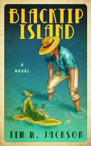
Nonfiction Covers
Alison Buehler submitted Rethinking Women’s Health designed by Dane Low. “Dane Lowe captured exactly the theme I wanted to convey for Rethinking Women’s Health. I get more comments on my cover than I ever imagined. I would like him to be recognized for his brilliant work. Thank you, Alison Buehler”

JF: A good cover—like this one—that encapsulates the message of the book, can be a huge asset in the marketplace. The imagery here speaks directly to the subject, and the restrained but elegant typography helps make the point without getting in the way. ★
Christopher McPherson submitted The James Murray Mysteries Companion designed by Matt Hinrichs. “An encyclopaedia of sorts for the readers of the five novels in the “James Murray Mysteries” series set in 1930s Los Angeles. My cover designer suggested a bulletin-board effect, as if the fictional writer James Murray had been pinning ideas for his novels.”

JF: Good design, but the title is disappearing a bit against the background.
Christopher Spinney submitted Heroin Addiction: The Addiction Guide for the Amateur designed by Christopher Spinney. “I know it is a simple cover, but I find that it works for me. I designed it using the Create Space cover designer. The picture is a field of poppies.”

JF: I totally get that, but what’s important is that we don’t design these covers to please the author; they are designed to attract readers, and this one has little appeal.
Dane Low submitted Betrayal of One’s Family and One’s Country designed by EbookLaunch.com.

JF: Expertly designed, but that angle makes my head hurt.
Kathryn Danylko submitted Whispers in the Windstorm designed by CJ McDaniel. “Since the book is written as a journal, I wanted the cover to look somewhat like a journal – thus the stitching and the cursive font for the title. Although originally I did not want a pink ribbon to symbolize breast cancer (too cliche), I liked when the designer made an unraveled pink ribbon.”

JF: The pink ribbon is still noticeably symbolic, but it has been handled very sensitively.
Kenneth Carlson submitted GET OUT OF MY WAY! The Annoyed Commuter’s Handbook designed by Kenneth Carlson.

JF: The title pretty much says it all, and carries all the weight, on this cover for a humorous rave about commuting.
Kerry Wekelo submitted If It Does Not Grow Say No: Eatable Activities for Kids designed by Al Wekelo. “My father took all the pictures for the book to include the cover photograph. It was a beautiful way to creatively bond with him.”

JF: The photo could use some decent type to really turn this into an appealing book cover.
Mindy Shelton submitted Spouses who Murder designed by Mindy M. Shelton. “This is the 5th and final in a true crime series. Your previous advice has been incorporated into this book cover. Almost a ‘saved the best for last’, but truly believe this is the most effective yet. Thank you for your feedback!”

Richard Haight submitted The Unbound Soul: Applied Spirituality designed by florencio ares jr. “Florencio was incredibly perceptive of the intent of my book. I wanted to get the feeling of practical spirituality in the cover, and I think he accomplished that very well by incorporating a cityscape to contrast the mountains in a yin/yang opposite style eye that broadcasts the idea of awareness.”

JF: An exciting cover with an image that is grounded in the real world while pointing to a spiritual aspiration. Well targeted to the spiritual market. ★
Rick Holland submitted Aftermath: A Granddaughter’s Story of Legacy, Healing & Hope designed by Rick Holland. “The author and I chose a scrapbook style cover to intimate a sensitive review of memories and past events. The pictures are of the author and her family.”

JF: Well done, although the title seems to be whispering.
Ruby G Ash submitted I, Vagina designed by Sophemi. “I just wanted a simple design that wasn’t too ‘in your face’ considering the book’s title, but I also wanted it to convey the slightly tongue-in-cheek and humorous aspect of the book’s content. I hope the subject isn’t too inappropriate.”

JF: I think you hit exactly the right tone, and you definitely have the “title of the month.” There’s nothing inappropriate about sex or sex education, and the lighthearted graphic style is perfect. (And thanks for a tongue-in-cheek author name, too.)
Well, that’s it for this month. I hope you found it interesting, and that you’ll share with other people interested in self-publishing.
Use the share buttons below to Tweet it, Share it on Facebook, Plus-1 it on Google+, Link to it!
Our next awards post will be on November 21, 2016. Deadline for submissions will be October 31, 2016. Don’t miss it! Here are all the links you’ll need:
- The original announcement post
- E-book Cover Design Awards web page
- Click here to submit your e-book cover
- Follow @JFBookman on Twitter for news about the E-book Cover Design Awards
- Check out past e-Book Cover Design award winners on Pinterest
- Subscribe to The Book Designer Blog
- Badge design by Derek Murphy
