

Welcome to the e-Book Cover Design Awards. This edition is for submissions during June, 2016.
This month we received:
104 covers in the Fiction category
17 covers in the Nonfiction category
Comments, Award Winners, and Gold Stars
I’ve added comments (JF: ) to many of the entries, but not all. Remember that the aim of these posts is educational, and by submitting you are inviting comments, commendations, and constructive criticism.
Thanks to everyone who participated. I hope you enjoy these as much as I did. Please leave a comment to let me know which are your favorites or, if you disagree, let me know why.
Although there is only winner in each category, other covers that were considered for the award or which stood out in some exemplary way, are indicated with a gold star: ★
Award winners and Gold-Starred covers also win the right to display our badges on their websites, so don’t forget to get your badge to get a little more attention for the work you’ve put into your book.
Also please note that we are now linking winning covers to their sales page on Amazon or Smashwords.
Now, without any further ado, here are the winners of this month’s e-Book Cover Design Awards.

e-Book Cover Design Award Winner for June 2016 in Fiction
Damon Freeman submitted For I Could Lift My Finger and Black Out the Sun designed by Damonza.com


JF: An exciting, dramatic, and almost mythic cover. All the perspective lines converge on the backlit boy, creating a strong cover that, along with the title and it’s equally epic treatment, will move people to “pick up” this book.
e-Book Cover Design Award Winner for June 2016 in Nonfiction
Teddi Black submitted Coffee Cherry Cocoa Pod designed by Teddi Black
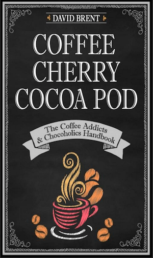
JF: Wow, this cover is almost as good as the combination of chocolate and coffee. (Have I told you about the Mocha Caramels I make? Lots of chocolate, lots of espresso. Mmmmm.) Brilliant choices of type fonts, layout, and detail that all go to enhance the effect. The plain illustration style is also attractive, and I have to admit to you that I’ve already purchased this book.
Fiction Covers
Aidan Reid submitted Spectrum designed by Goonwrite

JF: A really attractive sci-fi cover that uses the contrast between black and white and the spectrum colors to great effect and with perfect congruence with the title. ★
Alicia Rades submitted Inspired by Frost designed by Clarissa Yeo

JF: A strong cover that leverages the gaze of the attractive woman to draw us in. I like the very careful work the designer did on the typography here, but find the “bubble” shape a little distracting.
Alisa Kester submitted Breathing Ghosts designed by Alisa Kester.”This is an atmospheric novel of ghost hunters and time travel.”

JF: Nice job on this atmospheric cover, with a clever touch, but the author name needs much better typography.
Amelia Smith submitted The Defenders’ Apprentice designed by Amelia Smith.”This is the first book of a trilogy.”

JF: A good composition, but the colors aren’t right.
Andrew Buckley submitted Hair in All the Wrong Places designed by Month9Books. “The cover features the main character from the book trying to cover his terrible secret . . .”

Aurora Springer submitted Super Starrella designed by Aurora Springer.”The winged horse is Starrella’s animal partner.”

JF: Starrella is looking for help. She doesn’t like looking like she was pasted onto another photo with a horse’s tail sticking in her ear. Hire a pro.
Bob MajiriOghene Etemiku submitted Mamud and the Moringa Tree designed by Bob MajiriOghene Communications.”Climate change and the symbiotic relationship between man and nature is what this cover tries to capture”

JF: I love the simplicity of the illustration, but the title type is confusing and ineffective.
CatchphraseDan . submitted Monkfish Maggie and the Bungalow Stairs designed by Berg Norcross

JF: You can tell a lot of skill went into this cover, but I find it visually chaotic, with the illustration doing a poor job of representing the drama of the staircase, and that doesn’t help move your message.
Christopher Ruz submitted Weary designed by S.A. Hunt

JF: Effective, but the type looks out of balance compared to the image.
Claire Luana submitted Moonburner designed by MJC Imageworks. “Moonburner is set in fantasy world reminiscent of medieval Japan, which is featured prominently in the cover art.”

JF: Very stylish, and I like the way the image works to draw us into the story by directing our gaze toward the building and the mysterious symbol floating in front of it.
Courtney Shockey submitted Children of Darkness designed by Marisa Shor, Cover Me Darling

JF: An eerie and striking cover, but I can’t help but think the unusual title type would stand out more if the author’s name had been typeset in a quieter font.
Craig Gordon submitted Transmit designed by Craig Lea Gordon.”I wanted to create a cover with a bright and striking look, that quickly and easily defined the genre, and hinted at the epic journey ahead. And because it’s a free short story that I giveaway, I needed to do it on a budget. So against all better judgement, I designed it myself.”

JF: Given all that, I think you succeeded.
Cuishan He submitted Bigger the Secrets: Greater the Passion designed by Cuishan He.”Because everybody used a pic or a Photoshop edited pic for a book cover, and because i love doing craft, so I decided to make a delicately hand-made cover then took a photo of it.”

JF: Love the idea of a handmade cover, unfortunately this one has ended up with little contrast on the top half, and a lot of distracting texture in the bottom.
Damon Freeman submitted Struck designed by Damonza.com

JF: Amazing depth in this illustration and, combined with the lovely typography, a solid cover using the “back turned to you” meme.
Damon Freeman submitted Death Sung Softly designed by Damonza.com

JF: Another solid, exciting thriller cover from this designer. What’s instructive, readers, is what this cover and the one above teach about font selection. These covers are very similar in the elements they use and even the colors. A big part of the very different signals we receive from them is due to the radically different fonts used. Your designer needs to understand this as well as Damon and many of our other great designers who show their work here do. The covers that follow by the same author extend the “branding” of his books as contemporary action thrillers.
Damon Freeman submitted Drifter: Part 3 designed by Damonza.com

Damon Freeman submitted The Grave Man designed by Damonza.com

Damon Freeman submitted A Secret Muse designed by Damonza.com

JF: Another attractive cover with a dramatic title treatment. It almost looks like the designer is trying to break the “fourth wall,” the implied “screen” behind which we see these mysterious scenes. Lovely.
Dane Low submitted The Fallen Angel Hunters designed by Ebook Launch

JF: The tremendous energy in this cover comes from its blazing colors and the dynamic illustration.
Dane Low submitted Asylum in Paradise designed by Ebook Launch

JF: A nice variation on the under water motif, here with the addition of a subtle “wave” running through the title type.
Dane Low submitted Chasing Thunderclap designed by Ebook Launch

JF: Nice illustrations style and colors, but the title looks like it ought to be stronger.
Dane Low submitted Forever A Dragon designed by Ebook Launch

JF: Just as lovely as the earlier books in the same series, with beautiful detail and careful type.
Dane Low submitted Portals and Poison designed by Ebook Launch

JF: Some beautiful details here, and I especially liked the “tab” used for the series information.
Darren Beyer submitted Casimir Bridge designed by Stephen Youll (Art) – Darren Beyer (Layout)

JF: A solid sci-fi cover with great art and strong type, sure to appeal to fans.
David Gates submitted The Roots of Evil designed by David E. Gates

JF: Dull and ineffective.
David King submitted Norton Out Of Time: A Sci Fi Spy Adventure Thriller designed by David King

JF: Decent attempt, but it doesn’t come together and there’s little hint of the sci-fi nature of the book.
David Kudler submitted Risuko: A Kunoichi Tale designed by James Egan. “In addition to the manuscript, I shared a lot of information with Jim about colors in the book, about themes and moods. I also sent a bunch of images, as well as a bunch of links to covers that I did and did not like. He came up with this knock-out.”

JF: All that work paid off. A sensitive yet dynamic cover for this YA novel, the careful color details and hand lettering perfectly complement the figure of the young girl that effortlessly captures our attention. ★
Doug Howery submitted The Grass Sweeper God designed by Mario Nevado. “I contacted my e-book cover designer in Madrid, Spain. We had a great working relationship. I feel like he is a friend. He allowed me to suggest the idea of the cover. Through photo manipulation, digital artistry, etc., he created the beautiful & thought provoking book design that you see.”

JF: Although the illustration is skillful it’s difficult to make out, and the title is “missing in action.”
Elizabeth Wafler submitted In Robin’s Nest designed by Artist, Alice Vargo.”I commissioned artist Alice Vargo to create a painting for the cover. We have had a flood of compliments on Alice’s work and the beauty of the cover. It would be such an honor for “our book” to be awarded. Thank you for your consideration.”

JF: A lovely cover with a delicate feeling and an emotional appeal. I particularly liked the use of italic capitals for the title. We used to advise against this, but here it works beautifully.
Ellie Douglas submitted Zombie Dogs designed by MDbookcovers. “My ebook needed the perfect cover to show what it was about, just as much as the title. Zombie dogs, needed an aggressive, angry dog, that looked like a real Zombie, so I hunted, and I searched endlessly, until I found the right cover.”

JF: Keep looking.
Ellie Holmes submitted The Flower Seller designed by Berni Stevens. “I wanted something bold, bright and eye catching for my debut novel as I knew that as an indie author the cover needed to stand out from the crowd and Berni Stevens certainly delivered. We have both received a lot of positive comments so far. Interested to see what you think…”

JF: Gorgeous colors, and the woman walking away from us invites us into the story. Focused and effective.
F.E. Hubert submitted Dark Temple designed by Marieke de Jong

Gayle Carline submitted A More Deadly Union designed by Joe Felipe

JF: Looks like pieces assembled from a kit.
Genevra Thorne submitted The Enchanted designed by Samantha Quinn.

JF: A stylish fellow, but the cover is oddly unfocused, and the type is too hard to read.
Gledé Kabongo submitted Game of Fear designed by Najla Qamber Designs

JF: A powerful cover that makes use of strong illustration and even stronger typography to make a sizable impact. Notice how this ebook cover is taller and narrower than the typical 1:1.5 ratio. ★
Gledé Kabongo submitted Swan Deception designed by Najla Qamber Designs

JF: Another strong genre cover with a tractor-beam gaze. Not a fan of the distressed half of the title, however.
Gregory Marlow submitted Jerry Is Not A Robot designed by Gregory Marlow.”Thank you.”

JF: Good concept, the type needs work.
Jack Arbor submitted Cat & Mouse, A Max Austin Novella designed by Damonza. “Max is both in danger, and in love, all with the same woman. In one hand, the gun represents the danger. His other hand, and his look, convey affection. Thank you for your review.”

JF: A cover with lots of story and, once again, the people are shown walking away from the viewer in an attempt to draw us into the action.
Jack Arbor submitted The Russian Assassin, A Max Austin Thriller designed by Damonza. “The story is about a man’s struggle to save his family from extinction and his own journey into surrogate fatherhood. I wanted to show the juxtaposition between the danger (the gun) and the child he may ultimately become a father to. Thanks for your review.”

JF: You can see all the same elements here
Jack Caldwell submitted Bourbon Street Nights: Volume One of Crescent City designed by Ellen Pickels.”Ellen blurred the figures in the foreground of the image to give a sense of movement, while leaving the colored lights in focus, which adds to the beauty of the cover.”

JF: Chaotic typography over a too-busy background does not strike me as very effective.
Jack Caldwell submitted Elysian Dreams: Volume Two of Crescent City designed by Ellen Pickels.”This is a shot of City Park in New Orleans, near one of the many lagoons. Many visitors never see this lovely side of the Crescent City.”

JF: This one works better due to the more constrained colors, but the title type still gives me headaches.
Jack Caldwell submitted Ruin and Renewal: Volume Three o of Crescent City designed by Ellen Pickels.”Ellen used “St. Louis Cathedral” (c) dndavis, and added the threatening clouds.”

JF: You see, the problem is that these two fonts used in the title don’t go together at all, they are working in different directions.
Jack Caldwell submitted The Companion of His Future Life designed by Ellen Pickels

JF: A nice idea, although the woman looks like she’s been confined by the type.
Jack Caldwell submitted The Plains of Chalmette: a Story of Crescent City designed by Ellen Pickels.”Ellen used a portion of “Battle of New Orleans” by Dennis Malone Carter (1856).”

Jaidis Shaw submitted Destiny Awaits designed by Emma Michaels

JF: A lot of lovely touches on this cover, although the title is a bit hard to read and it would be more effective for a book with a lot of romance for the characters to be relating to each other.
James Egan submitted I Call Myself Coca Joe designed by James T. Egan of Bookfly Design

JF: A very strong cover that uses typography to emphatically make its point. The angled image and expert color handling all help. ★
James Egan submitted Queen of the Night designed by James T. Egan of Bookfly Design

JF: An absolutely beautiful, detailed, highly textured design with expert typography. Notice the subtle images showing in the background. ★
James Egan submitted Good Grieving designed by James T. Egan of Bookfly Design

JF: An elegant look for this book of poetry. And the composition has allowed the designer to use a quieter type treatment, suitable for the subject.
James Miller submitted Untangling Claire designed by Damon Freeman. “Untangling Claire is a tale of love against the odds … a sensitive glimpse into the lives of two emotionally fragile people who, through a series of letters, cautiously find their way to authentic love.”

JF: A sensitive and appropriate design.
James Roby submitted Caribbean Knights designed by James Roby.”Created by overlapping multiple image to depict the mystery of Nellie along with her beauty and the sea’s. Images from canva.com”

JF: When a professional combines images like this, they don’t end up with a boat flattening a woman’s head.
Jerry Aubin submitted Landfall: The Ship Series // Book One designed by Bryan McNeal.”The book is about a giant, generational starship (the Ship) that was built on top of an asteroid and has been traveling the universe for 5,000 years. The cover shows the Ship approaching a planet.”

JF: Cool, although the title could have been a bit larger.
Jim Cronin submitted Hegira designed by Solstice Publishing

JF: Unfortunately the big silver seal makes it almost impossible to properly evaluate this cover.
Joshua Jadon submitted The Boat House Secret designed by Joshua Jadon

JF: A well constructed cover with lots of story elements to interest us. Note how the building is highlighted by the type arrangement.
Karl Drinkwater submitted Harvest Festival designed by Karl Drinkwater.”Part of a wraparound cover; style to match my other new book, They Move Below. I needed to capture the theme (horror at harvest time) without giving away the real threat/mystery (spoiler: aliens who use blue lights to stun humans for body part harvesting).”

JF: Looks just right.
Katy Haye submitted Rising Tides designed by Jane Dixon-Smith. “Jane Dixon-Smith has (imo) done another superb design job, creating a fabulous, atmospheric cover for my YA novel.”

JF: I don’t see any signs of “YA” but I agree that this strong cover will make an impact.
Kim DDD submitted Trust Me designed by Marushka from DDD. “Book cover design for Crafts & Hobbies, Love & Romance book”

JF: Whoa, that’s one beautiful dog. Who doesn’t like that?
Kim DDD submitted The Requiem Red designed by Kitten from DDD. “Book cover design for Mystery Suspense book”

JF: Another solid genre cover, and notice how the designer has arranged the art to highlight the woman’s head.
Kim DDD submitted October Rain designed by Milo from DDD. “Book cover design for Dystopia, Science Fiction & Fantasy book”

JF: An exciting cover that promises lots of action, and that’s enhanced by the color choices.
Kim DDD submitted Canticum Tenebris designed by Milo from DDD. “Book cover design for Science Fiction & Fantasy book, Wrath of the Old Gods Series, Book 2”

JF: Yet another great genre cover, this one with some impressive typography that helps to set the tone.
Kim DDD submitted Into The Fire designed by Milo from DDD. “Book cover design for Young Adult, Paranormal, Urban Fantasy book, Into The Fire Trilogy, Book 1”

JF: A lovely and stylish series design, where the young woman’s melancholy look, the fire at the bottom, and the interesting title treatment hold all the books together.
Kim DDD submitted Out Of The Ashes designed by Milo from DDD. “Book cover design for Young Adult, Paranormal, Urban Fantasy book, Into The Fire Trilogy, Book 2”

Kim DDD submitted Up In Flames designed by Milo from DDD. “Book cover design for Young Adult, Paranormal, Urban Fantasy book, Into The Fire Trilogy, Book 3”

Kim DDD submitted Beguiling Shadows designed by Kitten from DDD. “Book cover design for Magical Realism, Magic, Poetry book”

JF: A bit overwrought for a book of poetry.
Kim DDD submitted Realm of the Death Cult designed by Milo from DDD. “Book cover design for Mythology, Fantasy, Fairy Tales book, The Realm Jumpers Series, Book 1”

JF: A series design that relies on changing colors and the small icon within the emblem for each title.
Kim DDD submitted Realm of the Snake People designed by Milo from DDD. “Book cover design for Mythology, Fantasy, Fairy Tales book, The Realm Jumpers Series, Book 2”

Kim DDD submitted Spider’s Web designed by Marushka from DDD. “Book cover design for Thriller Mystery Suspense Murder book, A Police Procedural Novel, Glenmore Park Mystery Series, Book 01”

JF: Solid. Note how the background has been manipulated to allow the title to really stand out.
Kristin Coley submitted Chasing Colt designed by Kristin Coley.”I wanted to show a strong athlete but also the uncertainty of the man.”

JF: I think you’ve succeeded at that, but the positioning of the type and the font shift for “Cole” don’t work well, they only emphasize the fellow’s rear end, when we really should be concentrating on his face and posture.
Kristin Coley submitted Finding Ford designed by Kristin Coley.”I wanted a bright cover that clearly indicated the primary topic of the novel.”

JF: Sorry, it’s very weak, both visually and typographically.
L.C. Ireland submitted Fatal Heir designed by L.C. Ireland.”The cover artwork was done by the incredibly talented Fariza Dzatalin, who I contacted through deviantART. I did the cover designing and formatting myself using her incredible artwork.”

JF: Well, incredible artists should produce incredible art, right? Nice job, and I enjoyed the sense of drama in the illustration.
Leslie Lee Sanders submitted Darkness Eternal designed by Karri Klawiter. “Karri created a mirror image of a city that represents an underground sanctuary in a dystopian world, that can also elicit feelings of deception, which carries the idea that there is more going on than what one sees. The LGBT theme is represented with the inclusion of the characters on the cover.”

JF: Some very nice touches, including that mirror image.
Lia Rees submitted Merely This and Nothing More: Edgar Allan Poe Goes Punk designed by Lia Rees

JF: A clever cover, but it would have been good to see either all the author’s name, or the name “Writerpunk” or some way to identify the book. There are also metadata mismatches evident on the book’s Amazon sales page, and they should be corrected.
Lowell Press submitted The Kingdom of the Sun and Moon designed by Michael Rohani, Design for Books. “Thanks for the opportunity.”

JF: What a charming little mouse. A carefully designed cover, but again, the title could have been more emphatic, balancing Mr. Mouse a bit better.
Lynda Corrado submitted I am Alive, A christmas Trees Journey designed by Lynda Corrado. “Simple design, yet using color to attract the reader”

JF: Very weak, with almost no “design” evident anywhere.
Manu Herbstein submitted Ama, a Story of the Atlantic Slave Trade designed by Manu Herbstein.”The background is based on a photograph by Matthew Kosloksi.”

JF: Good example of a cover with no “hook” at all. Why are we supposed to be interested in this photo? No reason I can see.
Manu Herbstein submitted The Boy who Spat in Sargrenti’s Eye designed by Manu Herbstein.”The Boy who Spat in Sargrenti’s Eye is an historical novel set in the form of a diary, an extract of which is shown in the background. The foreground image is of a solid gold mask (looted from Asante by the British in 1874) which is central to the story.”

JF: The mask is great; the rest, no so much. You need to either 1) learn cover design, or (more likely) 2) hire a professional.
Martin Richmond submitted The Trapdoor to Murder designed by Sara Wylde

JF: Amateurish.
Melanie Tomlin submitted Angel’s Messiah designed by Melanie Tomlin

JF: Nice job, highlights the young girl well.
Michael G. Munz submitted Zeus Is Dead: A Monstrously Inconvenient Adventure designed by Greg Simanson

JF: Amusing and expertly done, everything is designed to intrigue us and capture our attention, from the off-kilter type to that devilish cat.
Michael Golvach submitted Missing Pieces designed by Bookstylings. “The model for the cover did an exclusive photoshoot for this!”

miss mae submitted Catch Me If You Can designed by Miss Mae. “Not sure what I’m supposed to put here without saying something about the plot. There is a hurricane (therefore, the image of a storm in the ocean) and a lighthouse is pivotal. The plot revolves around a game CD, thus the reason for the title being placed against the black background.”

JF: Not sure this works well, the little black box has rendered the title both hard to read and somewhat irrelevant.
miss mae submitted Dove Island designed by Miss Mae. “Since I can’t discuss the plot, I’ll let the cover speak for itself. :)”

Natasha Snow submitted The Mediator designed by Natasha Snow

JF: A cover with a strong impact, and the way the type is bunched at the center lets the image shine.
Natasha Snow submitted Te Quiero designed by Natasha Snow

JF: An absolutely gorgeous cover in an unusual style that has a strong emotional pull for this gay romance. ★
Nathan Toronto submitted Rise of Ahrik designed by Nancy Wride. “I’m a first time author and Nancy is a great photographer but a first time cover designer, so this cover was an adventure. At first I had a hard time communicating my concept, then I made a last-minute change to the cover image (credit: model Timo Kohlenberg), but I really like what Nancy produced.”

JF: A good idea, but the odd combination of images and lack of contrast in the title don’t work well.
Oscar Hutson submitted The Hunt for the Rajput Princess designed by Oscar Hutson

JF: Obviously the work of an amateur, and I don’t think that’s going to help you.
Patrick Samphire submitted The Dinosaur Hunters designed by Patrick Samphire. “I self-published this novella to accompany my traditionally-published novel, SECRETS OF THE DRAGON TOMB. My aim with the cover was to give the feeling of adventure and fun.”

JF: Excellent job, it definitely communicates excitement and action. And I particularly liked the way the title pops but is fully integrated into the design. Pro tip: you don’t need the word “by,” everyone will know that’s the author’s name.
Paul Kemner submitted A Wrecking Bar, a Chocolate Bar, and a Ka Offering for Na-Nefer-Ka-Ptah designed by Britt A. Williams. “To illustrate peril and fun, we used an anime/chibi style for this magic vs tech time travel story, set in ancient Egypt. Font is Santana, for something exotic but readable. The back cover is a detail, with a stereotypical anime ‘mean grandmother’ figure, as the ba-ghost of the magician’s wife.”

JF: Leading in the “title of the month” category, but the visual is way too busy and the title doesn’t balance well with the image.
Randall Davis submitted DARK FLAMES RISING designed by BRANDY BRAHAM /RANDALL DAVIS

JF: If you look closely, it’s impossible to figure out what’s going on in this illustration.
Randy Attwood submitted The Fat Cat designed by Kirk Buster.”Kansas City graphic designer Kirk Buster came up with this wonderful cover for The Fat Cat, a noir mystery.”

JF: It’s graphically strong, but my question would be, does it really communicate the story?
Rebecca Chastain submitted Secret of the Gargoyles designed by Yocla Designs

JF: Some expert typography here, and a good layout, although that redhead doesn’t look like a gargoyle, does she?
Rena Hoberman submitted Tales In The Headlights: A Switchback Stories Collection designed by Cover Quill

JF: Creates a great sense of mystery and fear. Note again how this type of layout, bringing all the type into the center, naturally creates two image areas, which the designer makes full use of.
Rick Holland submitted Red Diamonds designed by Rick Holland. “Genre: A sort of James Patterson / Lincoln Child suspense novel.”

JF: Clear and to the point. The canal scene is particularly attractive.
Robert Ryan submitted Dracula Lives designed by Natasha Snow. “I sent Natasha a very rough mockup, telling her I wanted a very spooky castle, ideally jutting up on a finger of rock, with lightning bombarding it as though against the evil within, and if possible sinister eyes peering through a window or in there somewhere, and this is what she came up with.”

JF: It’s great to see a designer using the power of black and white, and I think that will make it stand out as much as the menacing eyes and spooky, lightning-struck castle.
Rosalinda Morgan submitted The Iron Butterfly designed by vikncharlie of Fiverr.”The e-book is about a young mother in the Philippines and her intense devotion to her nine young children after she lost her husband and her iron determination to succeed in business to be able to keep and support her children. She always wears her native dress, a long gown with butterfly sleeves.”

JF: Interesting image, the title is very weak.
S.C. Eston submitted The Burden of the Protector designed by Tom Edwards. “This was my first experience working on a cover. The idea of going with original art was daunting, but Tom’s professionalism made the process easy. He explained what he needed, took the crazy idea I sent and after a few exchanges presented the final version you see here.”

JF: A strong cover that uses the circle as a focusing device (plus the turned-away-from-you figure) to draw us into the story.
Scott Rezer submitted Land of the Two Rivers: A Novel of Shinar designed by Author.” For the second book in my Children of Ararat series I wanted a cover that continued the vibrant color scheme branding of the first book with its icy cobalt blue, but in this case using the brilliant orange of a sunset sky. With its bold font titling, the cover displays the distinctive look I wanted!”

Stephanie Baumgartner submitted Love Song (Liebeslied) (Captive Heart Trilogy, #1) designed by Daniela Colleo. “Love Song is WWII fiction.”
 (Captive Heart Trilogy, #1)")
JF: A lovely cover that’s asking that shadowy newspaper headline to do all the work of placing this novel in its historic era. Still lovely, thought.
Sunanda Chatterjee submitted Shadowed Promise designed by The Killion Group. “The cover was meant to convey the story of an exotic woman’s story from Bombay to Los Angeles.”

Teddi Black submitted A Mosaic of Grace designed by Teddi Black

JF: The designer has come up with an appropriate and effective cover playing off the “mosaic” theme in the title. The “i” in Mosaic looks odd, though, doesn’t it?
Teddi Black submitted The Chaos designed by Teddi Black. “Thirteen images, over 50 layers, and probably the most fun I ever had designing a cover.”

JF: The amazing depth and detail of the illustration really carries this atmospheric cover which, once again, exploits the “walking away from us” meme.
Timandra Whitecastle submitted Touch of Iron designed by Tommy Arnold – artwork and Bookflydesign – title.

JF: A fantastic collaboration, obviously, since you’ve ended up with a powerful and evocative cover, and both the type and image help with that effect. ★
Valorie Lord submitted Seven Miles Deep – Chantrea designed by Miia Kajaani. “I had the cover in mind but couldn’t draw it, so I hired my husband’s niece, Miia Kajaani, who managed to capture exactly what I envisioned – mysterious light at an incredible depth (seven miles deep), a touch of humor indicated by the little fish face, the boy’s awe at what he sees… Thank you!”

JF: A cover that promises an exciting adventure, and that’s great. The fish face is so small no one will see it (before they buy the book) and the boy’s face, which should be the focus of this cover, is not much easier to find.
Zara West submitted Beneath the Skin designed by
Angela Anderson

JF: Expertly presented cover for a romantic thriller, and note the careful and way the type has been used to both hold the design together and reinforce its message.
Nonfiction Covers
Alexander Lawrence submitted Leviathan’s Ruse, Vol. 1: The Comprehensive Guide to the Battle Between Good and Evil designed by Alexander Lawrence.

JF: A strong cover for this discussion of good and evil.
CatchphraseDan . submitted GoFishFriday: The Art Book designed by CatchphraseDan.

JF: Delightful and idiosyncratic cover for this book of card art, look how it stands apart from the other covers around it.
David Gates submitted Access Denied designed by David E. Gates

JF: A very creative concept, but an ineffective and awkward execution.
David King submitted Gold, Frankincense and Myrrh: 3 Great Gifts designed by David King

JF: Very little impact.
Dustin Renwick submitted Beyond the Gray Leaf: The Life and Poems of J.P. Irvine designed by Whitney Fenzel.”Irvine published much of his work in newspapers in the late 1800s, and the cover features a cutout of the front page from one of those papers. The title is a play on the only book he published in his life, “The Green Leaf and the Gray.””

JF: A clean design. For some reason the combination of gray and orange isn’t very pleasing, but that could just be me.
Frances Caballo submitted Social Media in 30 Minutes a Day designed by Kit Foster. “I’d love to know your thoughts, Joel, on this book cover.”

JF: Even though we’ve seen social media icons on keycaps before, it still makes a strong visual point. The only improvement I can see is to make the title stronger so it stand out more, particularly at smaller sizes.
Frederick Espiritu submitted The Path to Awesomeness designed by Frederick Espiritu.”The inspiration behind the cover design is to give an appeal to the reader as if it was a long-lost manuscript or manual on how to become super human; much like finding a scroll containing the secrets of a kung-fu master.”

JF: That’s interesting, because although I think this is a good, attention-getting and appropriate cover for this book, I see absolutely no sign of a “long-lost manuscript or manual on how to become super human” or a scroll.
Joan-Yvette Campbell submitted In Search of Respect and Equality designed by Joan-Yvette Campbell. “The cover design depicts the silhouette of two Black women. One silhouette symbolizes slave women depicted in the book. The other silhouette represents the remaining women noted in the book who were free from slavery during the 19th century in the United States and European colonies.”

JF: Low impact and overall a weak design. What are those bars at the top and bottom for?
Kody Christiansen submitted Hollywood Heartbreak | New York Dreams designed by Bill a.k.a. PrintMediaAU.”Bill was lovely to work with and his design came out amazing! Every time people see my book the first thing they say is how beautiful the cover is! I am honored that he did such a great job at telling my story in his art!”

JF: An expert job, with great type handling and an arresting image that will stop browsers. ★
Lawrence Drake submitted Red Boots Rebel designed by Noelle Wood. “This cover embodies the essence of the book. One has to look closely for the sub-title. That is done on purpose. Hopefully, it speaks for itself.”

JF: The “secret” subtitle is a pretty cool device, as long as people notice it. I like this cover, it’s warm colors and the “hero shot” of the boots, but wish the title was larger and more assertive. ★
Lisa Miller submitted Godly Inspirations for the Troubled Soul designed by Lisa C. Miller.”The cover is peaceful. Trees usually bring a smile to everyone and this one has several images of beautiful trees on it.”

JF: You have the right idea, but this is a good exemplar of a cover with no “hook” and nothing to interest a casual browser. Obviously self-published.
Lisa Miller submitted Inspirations from Heaven’s Gate designed by Lisa Miller.”There is a beautiful golden heavenly gate. It looks very welcoming.”

JF: This one is a lot better, at least we might be intrigued by the gate opening, but the title needs help.
Mindy M. Shelton submitted From birth to death: Mommies who Murder designed by Mindy M. Shelton.”This is the first of five research books on true crime. Mommies who murder, children who murder, serial murderers, siblings who murder, and spouses who murder make up the series. Each has the same weapon on a textbook-like cover for branding purposes.”

JF: You want a strong design like this for a series of books about murderers. I wonder about the strong pattern that was laid over the whole cover, it’s distracting without adding anything. And I can’t think of a good reason to shift the color for the word “Murder.”
Rick Schultz submitted Untold Tales From The Bush Leagues: A Behind The Scenes Look Into Minor League Baseball, From The Broadcasters Who Called The Action designed by Rick Schultz.”This covered was designed with the help of a freelance third party. I wanted to combine the baseball theme with the broadcasting angle. Overall, the covered accurately sets the tone for the content of the book. Thanks!”

JF: Nice job, it’s clean and contains the visual cues that will alert people to the nature of the content.
Steven Case submitted 3 EASY STEPS TO QUIT SMOKING: Stop Smoking Easy, Quickly And Permanently The Natural Way designed by Steven Case.

JF: Good idea compromised by the brutal treatment of the title type.
Teddi Black submitted The American Revolution designed by Teddi Black

JF: Interesting use of a silhouette for most of the cover, which is very dramatic against the ghosted flag background.
Well, that’s it for this month. I hope you found it interesting, and that you’ll share with other people interested in self-publishing.
Use the share buttons below to Tweet it, Share it on Facebook, Plus-1 it on Google+, Link to it!
Our next awards post will be on August 22, 2016. Deadline for submissions will be July 31, 2016. Don’t miss it! Here are all the links you’ll need:
- The original announcement post
- E-book Cover Design Awards web page
- Click here to submit your e-book cover
- Follow @JFBookman on Twitter for news about the E-book Cover Design Awards
- Check out past e-Book Cover Design award winners on Pinterest
- Subscribe to The Book Designer Blog
- Badge design by Derek Murphy
