• Self-Publishing
  • Author Blogging
  • Sitemap
  • Fonts/Typography

The Book Designer

Practical advice to help build better books

  • Home
  • About
  • Articles
  • Contact
  • Shop
Home » The Art of Illusion: Creating Book Cover Art for Joanna Penn’s Pentecost

The Art of Illusion: Creating Book Cover Art for Joanna Penn’s Pentecost

by Joel Friedlander on November 4, 2010 17 Comments


I just got finished taping a video interview with Joanna Penn of The Creative Penn blog. In it Joanna revealed the winner of the poll she conducted on her blog last week to pick the final design for the cover of her upcoming thriller, Pentecost.

When she conducted the poll I blogged about the way she involved her community in the decision-making process, and got a tremendous response with over 500 votes cast for the four covers. In the interview we talked about the process of designing book covers and how, through progressive steps, we come to a final design.

The process is very collaborative. I rely on the authors and publishers I work with to indicate the direction they feel is most appropriate for the book.

If you read that article, or the one on Joanna’s blog, you might want to check out the video. It runs 12 minutes and Joanna has put some of the other cover ideas that didn’t make it as far as the poll into the video. Here’s a link:

Book Cover Design: The Process Explained

Peeling the Onion

Several people commented about the backgound image and how atmospheric the cover is. Creating these effects is an interesting but sometimes laborious process. They don’t just happen by themselves.

I’m going to show you how this cover image was created from bits and pieces of artwork, and how it came together into the image you see on the finished cover.

This artwork was created in Adobe Photoshop, part of Adobe’s Creative Suite. It’s the best image-manipulation software I’ve ever worked with. It seems you can do just about anything in Photoshop if you have the patience.

This artwork was created out of 11 separate layers. Here’s how it was built, starting at the bottom.

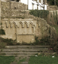
The first piece of art that forms the basis of the cover is a photograph I collected from Flickr using its Creative Commons licensing search. This allows us to find artwork that has been licensed for commercial use as long as we credit the originator.

book cover design for self publishers

I’m not sure what stopped me about this photo, but I really liked the archways in the old ruined wall, and set it aside for later use. This image became the basis for many designs.

I then added gradients of black to both the top and bottom of the image, to create more atmosphere and a central focus to the cover:

book cover design for self publishers

When this gradient wasn’t quite enough, I later added another lighter gray gradient to further deepen the shadow effect at the top of the image:

book cover design for self-publishers

Now that I had the atmospheric look I wanted, it was time to add the “column of fire.” This element came from a section near the end of the book. It’s pretty exciting and I don’t want to ruin the story for you, so that’s all I’m going to say.

I hired a wonderful Photoshop artist, Alodia Bautista, to create the detailed and intricate artwork that I would use to create the effect I was looking for. Here’s the main column:

book cover design for self publishers

Alodia then created 5 more layers, each with bits of flame, smoke and sparks. These layers were used to wrap around, behind and in front of the title typography, creating an integration of art and type. This is what all 5 layers together look like:

book cover design for self publishers

Next the title went in. Having the type on its own layer allowed me to experiment with different effects by shuffling the type between the various detail layers of flames.

book cover design for self-publishers

Using Photoshop’s powerful blending modes, each layer could be carefully combined with layers beneath it. The complete, composite image bring it all together:

book cover design for self publishers

The resulting image was flattened and moved to Adobe InDesign for final layout. Here I added the rest of the type to the bottom of the cover, and cropped the image to fit the book’s trim size. Here’s the final result:

book cover design for self publishers

Part of the fun of doing these covers is working with clients and friends like Joanna. She is a great client because she imposed no restrictions at the beginning of the project, but was able to emphatically say what she liked, and what she didn’t like. This gives the designer the guidance needed for effective collaboration. I think this cover shows the results of that process.

I can’t wait to do the interior.

Filed Under: Cover Design, Samples, Self-Publishing Tagged With: adobe photoshop, book design, cover design, Joanna Penn, photoshop layers, self publishing

journal marketing

Comments

  1. Skip Prichard says

    January 5, 2013 at 6:59 am

    Joel, John Richardson reminded me of your great blog after I posted the “best book covers of 2012”. This is a terrific post, and I’m sharing it with some design students. I love seeing each layer come to life.

    Reply
    • Joel Friedlander says

      January 5, 2013 at 2:28 pm

      Thanks, Skip. That was a great collection of covers you put together, and readers who haven’t seen it should check it out here: Great Book Covers of 2012

      I just posted this week a cover evolution post, and you might enjoy the big ebook cover design contest we run every month, too.

      Reply
  2. Yesenia Vargas says

    May 30, 2012 at 8:59 pm

    Just wanted to say that the cover is amazing! You are very talented!

    Reply
  3. Simon Royle says

    January 28, 2011 at 9:23 pm

    One other thing I think is important is to test how it will look in black and white or rather the gray scale that Kindle will be. When readers search for a book on Kindle they will see an image about 60 pixels high and 40 wide.

    I think the format used here should work well, my only concern would be the flames…

    Reply
    • Joel Friedlander says

      January 28, 2011 at 9:48 pm

      Great tip, thanks for that Simon. We do have a rendering of the flame in black and white that’s used on the inside and it translated well. But checking it on the device would be the best test.

      Reply
  4. Rima says

    November 8, 2010 at 10:41 am

    Joel,

    Wow, thanks for this post. I’ve made my own ebook covers in Photoshop, but have no idea how to translate it into a print cover. Yours is actually the closest thing to a tutorial I’ve seen. Do you know of more?

    Reply
    • Joel Friedlander says

      November 8, 2010 at 10:48 am

      Rima,

      Glad you got something from this. There are a ton of Photoshop tutorial sites on the net where you can get specific help on procedures or effects. I use the training videos at Lynda.com when I have questions. The big difference is translating your screen-resolution artwork into 300 dpi files for printing. While it’s easy to start at 300 dpi and then downsample for an ebook cover, it can be challenging or impossible to go the other way, so you have to plan this from the beginning. If you have specific questions Rima, leave them in the comments and I’ll see if I can help.

      Reply
      • Rima says

        November 8, 2010 at 11:02 am

        Joel – I see. I have some experience with Photoshop for the Web, but none for print. At what point in the process do you switch to InDesign? And are there specific templates you use?

        Thanks for the response!

        Reply
        • Joel Friedlander says

          November 8, 2010 at 12:58 pm

          Rima, this cover, like many, was developed in Photoshop. The final images was flattened and saved as a TIFF file which was then placed in InDesign. The cover is done in InDesign according to the printer’s layout template, and most printers provide either an actual file to use or a PDF with dimensions clearly marked for assembling all the parts of the cover. In this case, the cover won’t be finished for a while, but when it’s ready I will move the artwork onto a printer’s template and add the back cover, spine, bleeds, etc.

          Reply
          • Rima says

            November 8, 2010 at 3:09 pm

            Joel –

            Thanks so much. You are a wealth of great info! I’ll be reading…

  5. Paul M. Carhart says

    November 5, 2010 at 3:54 pm

    Joel,

    Great article, as always. As an old Photoshop pro, it’s nice to see how others combine their puzzle pieces to come up with a great cover.

    Reply
    • Joel Friedlander says

      November 5, 2010 at 4:18 pm

      Thanks, Paul. This wasn’t a very complex job as far as Photoshop is concerned, but it’s neat to give readers a “peek behind the curtain.” Thanks for stopping by.

      Reply
  6. Joanna Penn says

    November 5, 2010 at 2:56 pm

    Thanks so much Joel for helping me with this cover. It has turned out to be better than I could have hoped for! A combination of your ideas, my thoughts and a wonderful audience who contributed to picking the best option. Your improvements make it a stand out cover. I look forward to holding a copy of it next year.
    Thanks, Joanna

    Reply
    • Joel Friedlander says

      November 5, 2010 at 3:11 pm

      Joanna, it’s been a pleasure working on this project with you and I believe it will be a success when it comes out next year.

      Reply
  7. Maggie says

    November 4, 2010 at 6:40 am

    Great cover, Joel, and it was very interesting to see how you constructed it. By the way, it was my favorite of the four presented on your previous post about this project.

    Reply
    • Joel Friedlander says

      November 4, 2010 at 10:34 am

      Hey thanks, Maggie. We actually looked at quite a few covers before Joanna picked the 4 in her article, and 3 of those were basically a “wall of flames” so this one definitely had the best balance.

      Reply

Trackbacks

  1. Tweets that mention The Art of Illusion: Creating Book Cover Art for Joanna Penn’s Pentecost — The Book Designer -- Topsy.com says:
    November 4, 2010 at 2:27 pm

    […] This post was mentioned on Twitter by Joanna Penn and Joanna Penn, Joel Friedlander. Joel Friedlander said: The Art of Illusion: Creating Book Cover Art for Pentecost by @thecreativepenn | http://ht.ly/34bZV […]

    Reply

Leave a Reply Cancel reply

Your email address will not be published. Required fields are marked *

This site uses Akismet to reduce spam. Learn how your comment data is processed.

Join Me & Subscribe!

  • Facebook
  • Instagram
  • LinkedIn
  • Pinterest
  • Twitter
  • YouTube

Topics

  • Audiobooks
  • Author Blogging 101
  • Book Construction Blueprint
  • Book Design
  • Book Printing
  • Book Production
  • Book Reviews
  • Contributing Writers
  • Cover Design
  • E-Books & Readers
  • Editorial
  • Guest Posts
  • Interior Design
  • Interviews
  • Journey of a Book
  • Legal Issues
  • Marketing
  • Podcasts
  • Project Focus
  • Reports
  • Reviews
  • Samples
  • Self Publishing Basics
  • Self-Publishing
  • Social Media
  • Training
  • Video
  • Webinars
  • Writing
  • Home
  • About
  • Articles
  • Contact
  • Shop
  • Self-Publishing
  • Author Blogging
  • Sitemap
  • Fonts/Typography
Terms of Service
Privacy Policy
Comment Policy
Guest Author Guidelines
Why?
"Writers change the world one reader at a time. But you can't change the world with a book that's still on your hard drive or in a box under your bed. This blog exists to help you get that book into people's hands."
—Joel Friedlander

Copyright Marin Bookworks © 2021

For permission to reprint articles from this site, please contact [email protected]

Marin Bookworks 369-B Third Street #572 San Rafael, CA 94901