

I have to say that watching today’s launch by Apple of the new iPad was quite entertaining.
I picked Gizmodo which had a team of four or five people live blogging from the hall and taking photos of the visuals Steve Jobs was using in his presentation. You really have to admire not only the showmanship of these launches, but the way Apple has the whole package thought out before they go public.
As you might have expected, the iPad is sexy, hip, fast, gorgeous, and possibly game-changing in the way the iPod and iTunes store changed the music business.
But rather than dive into the “gee-whiz” technology that will be the latest and greatest thing for the next few months (my iPhone 3GS suddenly looks like the second coolest hardware now), I wanted to take a look at the ebook reading software, at least in this early release.
Fonts and “Typesetting”
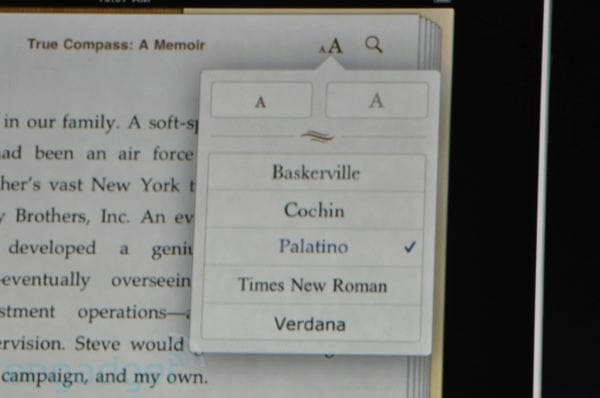
Here’s a photo that came out of the launch that shows the font menu in the e-reader program. It’s interesting on a few levels.
First, note the fonts included here. We don’t know how the iPad will deal with fonts embedded in the ePub files it will use for books, but other readers using ePub often ignore the fonts embedded in the files, from what I understand. The fonts on this menu are an odd lot:
- Baskerville—a good long document font, widely used today.
- Cochin—a lovely display font that would be very hard to read in text for long.
- Palatino—a beautiful oldstyle text font utterly ruined by the overexposure of being included in every single “desktop publishing” program, font list and operating system starting 25 years ago.
- Times Roman—a wonderful font for newspapers and office reports.
- Verdana—a san-serif font specifically designed for display on screens, used widely online.
But look at the piece of a page you can see behind the font menu. You’ll see big “rivers” of blank paper running through the type. Apparently, the miraculous iPad doesn’t hyphenate or justify text any better than the existing e-readers, that is to say, quite poorly. No real typesetter could have produced copy this bad, because they would have been fired long ago.
It’s Almost Like Reality TV
It’s also interesting that the designers at Apple have taken the idea of making the expeirience “book-like” to an entirely new level. They’ve put a “book cover with a book jacket” behind the “book” and created very realistic looking “pages” that diminish as you read through the book.
Here’s a 55-second video that gives you more information about the how this e-reader was imagined:
You probably noticed around the 30-second mark the round of applause. It was for the terrific animation of turning “pages.” I laughed so hard when I saw this I almost stained my keyboard. The audience appreciates how skillfully the programmers have imitated an ancient artifact—the printed book—with their code.
Of course, you also noticed that the “back” of all the “pages” are blank, so it’s not all that realistic. You almost have to remind yourself that you are looking at an amazing, digital representation of a real physical object, and not a photo of the object itself. In essence, one reads a picture of a book, not a book itself.
Book Publishing, or Text Publishing, or Media Publishing?
Look, this is an amazing device, and it may well have a huge impact on publishing. We just don’t know yet. The allure of “books” with links to video, maps, sound files, GPS coordinates is strong. One can be absolutely certain we will start seeing products like this for the iPad in the very near future.
The anticipation for this digital switch is palpable. Here’s what Dev Ganesan, President and CEO of Aptara, an e-book conversion and digital publishing company, had to say on the Digital Book World site:
Today’s content consumers are voracious digital omnivores, desiring to feed on all types of electronic content — from Twitter tweets to YouTube videos, from iPhone apps to Facebook updates, from mp3s to eBooks. Yet traditional publishers, particularly trade book publishers, are not prepared to serve digitally savvy audiences the variety of electronic products they demand. That’s because their production processes are traditionally rooted in outdated print publishing practices that are severely inadequate for tackling today’s publishing challenges.
I suppose it was the “outdated print publishing practices” with its lovely alliteration that stopped me. When I finish this article, I will get up from my desk as usual, pick up the copy of The American Book of the Dead that I’m reading, and head for bed for a good read. I’m not sure which part of that scenario is “outdated” but I plan to enjoy myself.
Tomorrow I’ll go back to the interior designs I’m working on for the three books I have in hand at the moment. One is a lovely inspirational photography book, another is a useful self-help book, and the third is a memoir of a Vietnam veteran. Each has a unique and interesting quality, something I hope to evoke with the designs. For better or worse, they will be printed on real paper in fonts that the reader will not be able to switch for Palatino or Cochin. The design will remain an intrinsic part of the book.
We are at a change time in publishing. We can marvel at the transformations happening around us while still appreciating the cultural history that has landed us in this place, at this time.
What do you think of it all?
