

Many ebook readers—and not just us typography nerds and designers, either—have complained about the limited font set provided with the major e-readers.
Considering the vast sums that have been spent on developing these devices, it's always seemed odd to me that they would trumpet their e-reading devices and commitment to book readers, then ship a product that aims to fulfill these promises... but only in one of these fonts:
- Baskerville
- Caecilia
- Georgia
- Helvetica
- Palatino
I've typeset books in Baskerville, but there's Baskerville, then there's Baskerville, a sturdy face with high stroke contrast and lovely long serifs, not the weak-tea version on the Kindle.
Now Amazon has put some work into upgrading both the font selection on its Kindle devices and apps, but also on other areas of typography that Kindle has historically fallen down on.
The rollout of these features seems to be happening slowly along Amazon's product line, and it's hard to tell which devices have received which upgrades.
On Amazon's own site for the new Kindle PaperWhite, they list 5 new features:
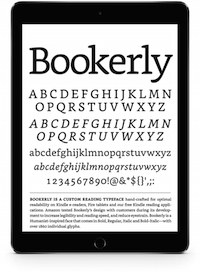
- Bookerly, a brand new font designed especially for the Kindle—the font has been gradually introduced since December 2014
- Hyphenation and improved spacing—introducing hyphenation alone will improve the look of almost every Kindle ebook, eliminating the unseemly and distracting big white spaces in the middle of lines that couldn't be justified any better
- Improved character placement—kerning and ligatures will now allow more print-like typographic features, although nicely kerned letter pairs won't help a line with big white spaces in it
- Improved page layout—drop caps and better positioning of text and images will make Kindle pages more book-like
- Large font adaptations—customizing the margins, columns, indents, nested lists, borders, and drop caps to keep the page easy to read.
Amazon's page lists the last four of these innovations as "coming soon," although some writers report having seen the upgrades on their own devices.
I had no trouble selecting Bookerly from the font list on my iPhone 6 Kindle App, but font selection was no where to be seen in the Kindle App for Mac I downloaded today on my Mac Book Air running Yosemite.
More About the Bookerly Font
I like Bookerly, and I think the designers met the design brief for a font that would display well on screens of all sizes and that would create an easier reading environment for their millions of avid ebook readers.
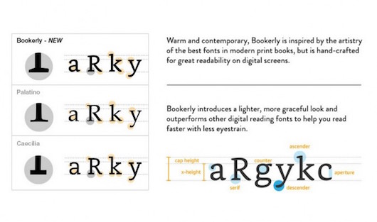 Caecilia has some of the same characteristics of the slab serif Bookerly, but the new font is far more graceful and even on the type line.
The font it reminds me of the most, and one I've used in the books I design, is Adobe's Chaparral, designed by Carol Twombly and released in 2000.
In both cases you can see traces of humanistic font design in the slightly swelling strokes and the chunky unbracketed serifs that aren't completely right angles, like the serifs you would see on a traditional slab serif font like Rockwell.
These fonts run the risk of being a bit boring, but the sturdy design really helps Bookerly stand up to very small sizes, and that's a good thing to have when designing text publications for digital display.
Maybe more than anything else, it's gratifying to think that the designers at Amazon are thinking about improving the design cabailities of their e-readers, and all these improvements will be a most welcome start.
What do you think of Bookerly? Had you noticed your Kindle had a new font? Let me know in the comments.
Resource links
To dig into the changes happening in the Kindle typography world, check out these articles.
- Kindle Paperwhite 2015: tech specs, comparisons, pics, and more by Piotr Kowalczk on EBookFriendly
- The Kindle Finally Gets Typography That Doesn't Suck by John Brownlee on FastCoDesign
- Type Detail page for Bookerly
- What Are the Unique Features of Amazon's Bookerly Typeface? by Thomas Phinney of FontLab
- Amazon's Kindle PaperWhite New Features
