• Skip to primary navigation
  • Skip to main content
  • Skip to primary sidebar
  • Skip to footer
  • Self-Publishing
  • Author Blogging
  • Sitemap
  • Fonts/Typography

The Book Designer

Practical advice to help build better books

by selfpublishing.com

COACHING


PUBLISHING


WRITING


PRODUCTION


FREELANCE


WRITING JOBS

  • Home
  • About
  • Articles
  • Contact
  • Shop
You are here: Home / Book Design / Review: The Anatomy of Type by Stephen Coles

Review: The Anatomy of Type by Stephen Coles

by Joel Friedlander on January 30, 2013 10 Comments

Are you one of those people who is fascinated by typefaces? Since the days of desktop publishing, personal computers have come with a variety of fonts, and along with those fonts an interest in typography has become a passion for many.

book designThere are many great websites and blogs devoted to the typographic arts, not least of which are Typographica and FontsInUse, both run by typographer and writer Stephen Coles.

Now Coles has published a new book, a beautiful and useful hardcover from Harper Design, an imprint of Harper Collins.

The Anatomy of Type: A Graphic Guide to 100 Typefaces is a treat for any typophile.

As the press material says,

“Obsessively organized into … group classifications, this unique compendium explores 100 typefaces in loving detail, and contains enough information—from the quirky to the factual—to turn anyone into a font geek.

The full character set from each typeface is shown, and the best letters for identification are enlarged and annotated, revealing key features, anatomical details, and the finer, often overlooked elements of type design.

Containing in-depth information on everything from the designer and foundry, the year of release, and the different weights and styles available, The Anatomy of Type is more than a reference guide to the intricacies of type design.

Ever wonder how Clarendon, Didot, and Centaur came to be? Or why Gil Sans proportionally resembles olds-style serif faces, despite its inconsistent weight stress? Or who “pirated” the first font” The Anatomy of Type provides answers to these questions, and so much more…”

The design of this book, by Tony Seddon, shows the typefaces, divided into 15 categories, beautifully. Throughout the book color, size, typefaces and graphics are used intelligently and with great care on each spread.

The result allows you to simply enjoy the amazing variety of letterforms that are so similar, yet so different.

Each typeface has a paragraph about its history that includes suggested uses. First you get an illustrated primer on the anatomy of type:

book design

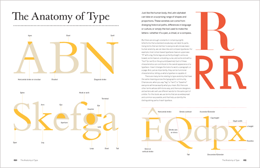
Coles then introduces his 15 classifications. For instance, serif faces are divided into Humanist, Transitional, Rational, and Contemporary. Each has historical roots and subtleties you can learn to spot from the excellent illustrations.

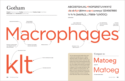
Then it’s on to the main body of the book, 100 2-page spreads that show each of the typefaces in detail. It’s great fun to see Coles spell out the details that make one typeface different from other, similar ones, and the book is always clear.

Here’s the spread on Gotham:

book design

What’s not to like?

Any lover of type will appreciate and learn from this book. And it’s a great gift for that type geek in your life.

As a book designer, The Anatomy of Type is appealing but incomplete. Although this is an aesthetically pleasing and informative book, typefaces don’t exist all by themselves, as they are shown here. Each is a member of a family of weights and styles.

I kept wondering what the italics for these typefaces looked like. That’s a critical component of choosing type for books; we need at least a roman and an italic, and you can’t commit to one without the other.

But that’s a small quibble when it comes to a book as useful, fun and informative as this one is.

Note that I’ve warned you it’s very easy to get lost in these beautiful pages, only to find you’ve just spent an hour comparing the shapes of the serifs on all your favorite typefaces.

Data

The Anatomy of Type: A Graphic Guide to 100 Typefaces
By Stephen Coles, design by Tony Seddon
Harper Design
256 pages, 7-3/8″ x 9-5/8″ Hardcover
ISBN: 978-0-06-220312-0
$25.99

Links to Amazon use my affiliate code.

Filed Under: Book Design, Book Reviews Tagged With: book design, book review, Stephen Coles, typography

journal marketing

Reader Interactions

Comments

  1. Emilia M Williams says

    October 7, 2020 at 7:05 am

    Great book. wanted it for ages, was finally given it as a gift for my birthday, and also another book called ‘The Geometry of Type’ as they seemed to be a good pai

    Reply
  2. Tony Seddon says

    January 31, 2013 at 1:21 am

    Thanks for your generous comments about the book Joel. It was a real labour of love and I spent many hours staring at the spreads fretting over kerning and layout, but it was one of the most enjoyable and rewarding projects that I’ve been involved in during my 20-odd years in publishing and book design. Stephen’s knowledge of typefaces and type design is second to none.

    Your comment about the omission of additional weights of each face is interesting and I agree with Stephen when he says that a follow up could provide an opportunity to dive deeper into individual font families. I think with this publication it was much more about the detail rather than the provision of a typeface sampler (and there are a lot of those available in print and online) but another title could of course provide a completely different functionality. Let’s hope the opportunity arises!

    Reply
  3. Stephen Coles says

    January 30, 2013 at 12:18 pm

    By the way, for those who have the book, I’m maintaining a companion site at http://typeanatomy.com It may also be helpful for those who want to know more about the book before they buy

    Reply
  4. michael n marcus says

    January 30, 2013 at 7:51 am

    I’ve had the book for a month and have been slowly savoring it. I have to think that the number of hard-core type geeks is very small, and it’s wonderful that Stephen and Harper Design are willing to cater to us.

    The book appeals to the touch as well as the eye. The jacket material is so sensual it’s almost erotic. Ooh!

    I find it interesting that this book, and another six or more books I bought recently about typography or graphic design, are ALL set flush-left/rag-right. Is this the future of typography?

    While I love the look of good full-justified text (and work hard to achieve it), e-readers provide horrid justified text. I’d prefer rag-right to ugly.

    Michael N. Marcus
    http://www.CreateBetterBooks.com

    Reply
    • Joel Friedlander says

      January 30, 2013 at 9:27 am

      Michael, this book will sell in all the art schools and university books stores as well, that’s where a lot of the market is.

      Rag right composition is common in books on art, architecture and design, so it’s not surprising to find it here.

      Reply
  5. chris says

    January 30, 2013 at 6:47 am

    Once you learn about kerning, you’ll never look at advertisements or business signs the same way. Kerning problems will jump out at you.

    Reply
    • Joel Friedlander says

      January 30, 2013 at 9:25 am

      Chris, I think you can see from the spreads the care that went into this book. And I completely agree about kerning. Did you catch Lincoln? I was struck by the bad letterspacing on the title, but it’s hard to say whether this was an intentional allusion to the (rather bad) typography of the time, or simply inattention on the part of the title designers.

      Reply
  6. Jo Michaels says

    January 30, 2013 at 6:14 am

    *DROOL* With as many design books as I have on my shelves, I still want THIS one. Thanks for sharing, Joel! WRITE ON!

    Reply
  7. Stephen Coles says

    January 30, 2013 at 2:05 am

    Thanks for the review, Joel. I’m glad you enjoyed the book.

    Typefaces don’t exist all by themselves, as they are shown here. Each is a member of a family of weights and styles.

    I agree completely. This title focuses on the core style of each family and focus on the micro details, but if I ever have the opportunity to do a follow-up I’d like to dive into complete families and text settings.

    Reply
    • Joel Friedlander says

      January 30, 2013 at 9:23 am

      Stephen, thanks for a wonderful addition to the library of typography. Your book explains the details of letterforms and how to spot the differences between designs and classes of typefaces better than any other book that I know. I hope you get a chance to do that follow up!

      Reply

Leave a Reply Cancel reply

Your email address will not be published. Required fields are marked *

This site uses Akismet to reduce spam. Learn how your comment data is processed.

Primary Sidebar

Get the Advanced Publishing Kit

Topics

  • Audiobooks
  • Author Blogging 101
  • Book Construction Blueprint
  • Book Design
  • Book Printing
  • Book Production
  • Book Reviews
  • Cameras
  • Contributing Writers
  • Cover Design
  • E-Books & Readers
  • Editorial
  • Guest Posts
  • Interior Design
  • Interviews
  • Journey of a Book
  • Legal Issues
  • Marketing
  • Podcasts
  • Project Focus
  • Reports
  • Reviews
  • Samples
  • Self Publishing Basics
  • Self-Publishing
  • Social Media
  • Training
  • Video
  • Webinars
  • Writing
Self Publishing Platform
Self Publishing School

COACHING

Self Publishing

PUBLISHING

The Write Life

WRITING

The Book Designer

PRODUCTION

Make a Living Writing

FREELANCE

Freelance Writers Den

WRITING JOBS

Footer

  • Home
  • About
  • Articles
  • Contact
  • Shop
  • Self-Publishing
  • Author Blogging
  • Sitemap
  • Fonts/Typography
Terms of Service
Privacy Policy
Comment Policy
Guest Author Guidelines
Why?
"Writers change the world one reader at a time. But you can't change the world with a book that's still on your hard drive or in a box under your bed. This blog exists to help you get that book into people's hands."
—Joel Friedlander

Copyright Self Publishing School All Rights Reserved. © 2022