


There’s no denying that Taylor Swift has become a force of nature with her Eras Tour this year. There are even reports that her tour, along with Beyoncé’s, have been large contributors to keeping the US economy out of a recession.
So what does this have to do with self-publishing? We’re going to take a look at some of the Taylor Swift album covers throughout the years and what authors can learn from them when it comes to book cover design. After all, album covers and book covers aren’t all that different in their purpose.
Here's what authors can learn from a selection of Taylor Swift album covers:
Update: Is Taylor Going Literary?
At the 2024 Grammy awards, Swift announced her newest album, set to release in mid-April. The album title, The Tortured Poets Department, hints at more literary thematic elements. Here's the new album cover, which was released immediately following the awards show:

Swift psyched out many fans by changing her social media profile images to black and white, leading them to believe that she was set to announce a “Taylor’s Version” of Reputation, so the brand new studio album came as a surprise. The cover image is somewhat reminiscent of Folklore (in that it’s black and white with a soft focus), but with a decidedly sexier tone.
Authors can learn from this in a couple of different ways. First, building up hype and keeping fans guessing can be an excellent way to garner more attention for an upcoming release. Hinting at a new version of Reputations, which was what many fans already expected, and then launching an entirely new album was a surprising move.
Second, making an announcement like this at a big event where fans are already sure to be watching makes it immediately take off on social media. But where Swift’s most dedicated fans would be watching for a release announcement anyway, making the announcement at the Grammy’s ensured a lot of her casual fans were also tuned in or would hear about the news almost immediately.

Taylor’s Versions Album Covers
If you’re not a Swifty, you might not be familiar with the fact that Swift has been re-recording her first few albums and releasing them as “Taylor’s Versions.” Her original record label was purchased by Scooter Braun in 2019 and then later the masters for her first six albums were sold to Shamrock Holdings.
This highlights an issue that authors may run into. If you sign with a publishing company for your books, those companies own the rights to produce and distribute your work. In most cases, publishing contracts tie up all of your rights: print, ebook, audiobook, and even the rights to films or video games.
Most publishing contracts lay out a certain royalty that authors will get on any of those formats, but they often take authors out of the negotiation process when selling rights. In many instances, authors have little to no control over what happens to their books once they’ve signed with a publisher. Publishers can even decide to stop printing or distributing your book and there’s almost nothing you can do about it.
How many times have you seen a film adaptation of a book you loved only to be sorely disappointed? Don’t blame the author. They generally have little to no influence over how a film is made from their work.
Taylor Swift’s contract, thankfully, allowed her to re-record her own music, even though she has no control over the original masters. And that’s exactly what she’s been doing.
For self-published authors, the equivalent would be publishing an “Author’s Preferred Text” edition of their books (such as Neil Gaiman did with American Gods). Sometimes the first version that gets published isn’t necessarily the one that the author is happy with upon reflection. Maybe an editor was too heavy-handed. Maybe they cut pages to keep costs down. Maybe the author has simply realized that they cut a scene or two that left plot holes.
In any of those cases, releasing a second version of the book can be a great way to rectify those situations. Creating a variation on the cover work so that readers know that this version is different from the original is an excellent way to make these new editions stand out.
Take a look at the differences between the original version of 1989 and compare it to Taylor’s Version of 1989:

Both versions have a similar 80s vintage vibe to them. They both have frames that make them look like an old photo (a Polaroid on the record label version, and something similar to 110 film on Taylor’s Version). They both use handwritten typefaces. But that’s where the similarities end for the most part.
Another good example of how Taylor’s Version album covers differ from the originals is the cover for Fearless. The original US version was very polished in a neutral color palette. The Taylor’s Version of Fearless has a more free-spirited, relaxed feel to it, but keeps the same neutral color palette.

Keeping similar stylistic choices between different editions of the same book is a good idea so that readers can recognize the books as related.
Midnights Special Editions
The Taylor Swift album covers for Midnights weren’t the only special thing about these editions. While there were CD and digital editions of the albums released, there were also a number of vinyl editions available, each with a different color palette and most with different photos on their covers.
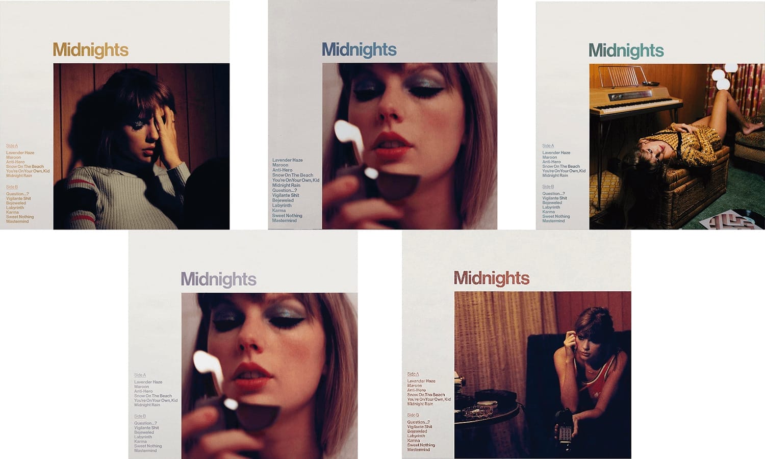
The four primary special editions of the vinyl have an added bonus: they can be put together to form a working clock, encouraging fans to purchase all four (the four versions for the clock are: Jade Green, Blood Moon, Mahogany, and Blue Marble).

Self-published authors have done similar things with their books. It’s a great way to create collector’s editions for super fans. One recent example is the two different cover versions for the Magnolia Parks books: one from the publisher and one from the author. Some fans will opt to buy one version or the other, while other fans will buy both, even though the content inside is the same.
Taylor Swift went even further with the Midnights special editions, though. There’s also the 3am edition of Midnights, which contains an extra seven tracks. And there’s The Til Dawn Edition, which features the 3am bonus tracks as well as three additional tracks.
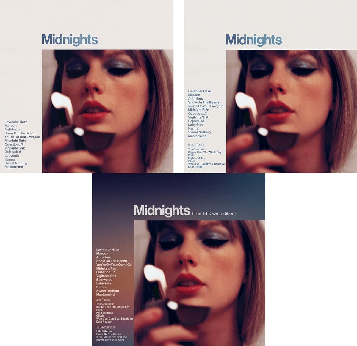
There’s an additional lesson that self-published authors can learn from these Taylor Swift album covers and special editions, though: beware of fans deciding that too many versions of essentially the same thing might just be a cash grab. Multiple versions of 1989 were released on vinyl, along with even more versions of Midnights. And while some fans ate it up, there has definitely been some backlash.
Design Lessons from Specific Taylor Swift Album Covers
While the above lessons from the various editions of Taylor Swift album covers are important, we can also look at individual covers from a design perspective.
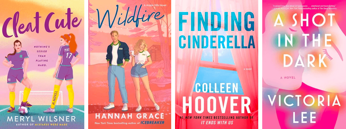
Let’s start with the album cover for Lover. This was Taylor’s first album released after she left Big Machine Records, and was released by Republic Records. The album cover for Lover is bright and gives an optimistic feeling. The pastel clouds also give the cover a dreamy quality.

Take a look at a few book covers with similar aesthetics below:
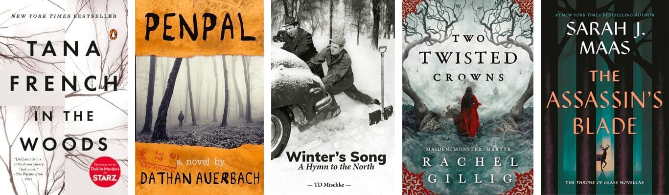
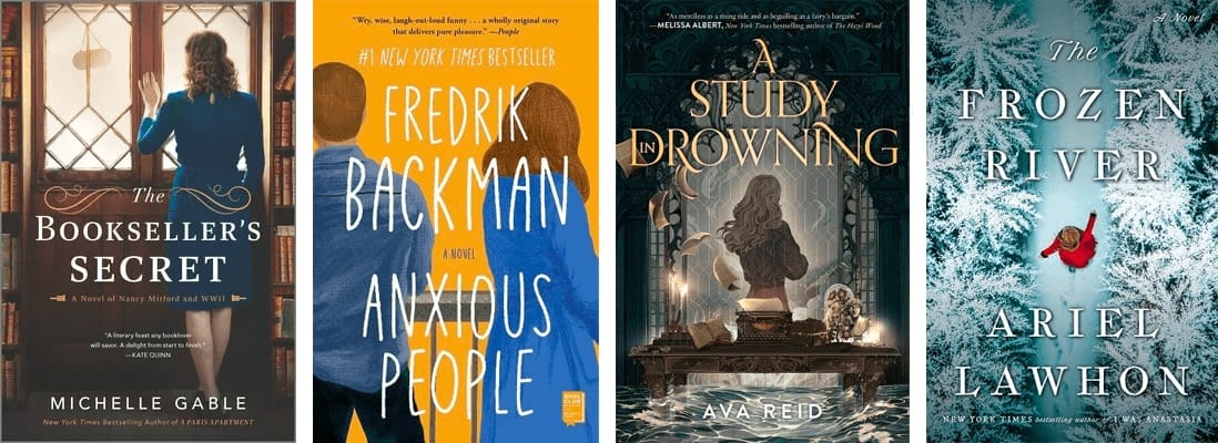
Next, we’ll look at the album cover for Folklore. This cover uses a black and white image of Taylor standing in the forest, small compared to her surroundings.

Unsurprisingly, there aren’t a ton of book covers that are exclusively black and white. That said, there are covers that use similar imagery, including the sense of scale and tree elements. Check out these book covers for reference:
Evermore, Swift’s ninth studio album, was released in 2020. The cover is simple: it’s an image of Taylor’s back from mid-arm up, with her signature blond hair in a long braid and wearing a flannel shirt. There’s a sense of mystery to the cover, even though her fans will immediately recognize her.

Book covers in a wide variety of genres can use similar imagery to evoke a sense of mystery in potential readers. Hiding the face of the main character can also help readers picture themselves within the story. Check out these examples, and note that there’s more than one way to hide a character’s face:
Finally, let’s take a look at the original version of Reputation, released in 2017, her final album with Big Machine Records. The album cover artwork for Reputation was a big departure from her previous albums, with a much more raw look and typographic details that mimic newspaper print. (This was released after the conflict between Swift and Kanye West and Kim Kardashian had mostly died down.)

Let’s take a look at some book covers with similar typographic elements:
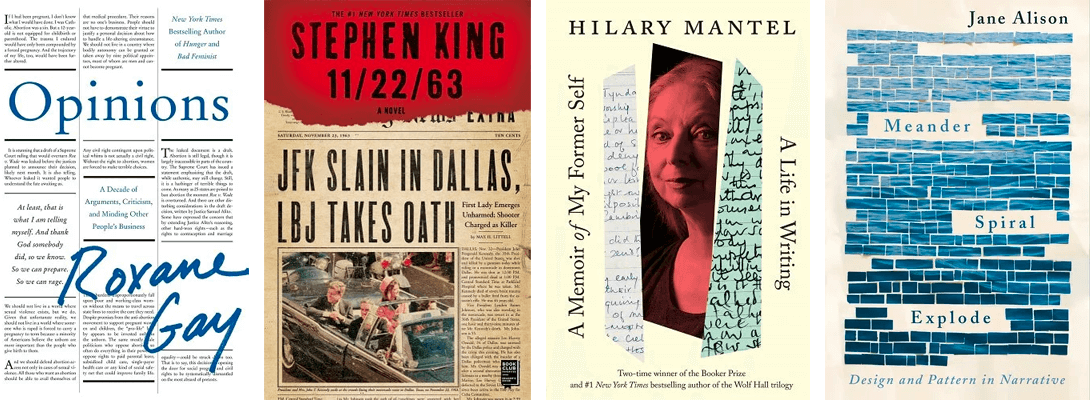
Some of the covers above use newspaper-style type, while another uses parts of handwritten letters. And then there’s the one that gives the impression of a page that has had its text censored out, leaving only the title and author name behind.
Takeaways from Taylor Swift Album Covers for Book Cover Designers
Whether you’re designing a book cover for the standard version of your own book (or working with a designer to do so) or you’re creating a collector’s edition of your book, you can learn from the designers behind Taylor Swift’s album covers.
First, consider your target audience. Who are your readers and what kind of cover will appeal to them?
Second, do you have a big enough audience to warrant releasing special editions of your books? While special editions can be fun to create, if they don’t sell, you may be wasting your time and money. (Spend that time and money on further marketing the regular edition of your book!)
And third, be careful not to go overboard with special versions or collector’s editions. While your super fans may love them, you may alienate other fans if you go too far.
With such a remarkable history of thoughtful album covers, it's obvious that if there is ever a Taylor Swift book in the future, designing a great cover that engages fans won't be an issue.
