Case Study: Courage and Croissants: Inspiring Joyful Living, A Story and Life Guidebook, by Suzanne Saxe-Roux, Ed.D. and Jean P. Roux, Ph.D.
Design brief: Create a hybrid book design for a manuscript that is two-thirds narrative, and one-third a sort of self-help guidebook for achieving a more joyful life.
Constraints: The book would be a trade paper original, but the authors, noted coaches who had radically changed their lifestyle by moving to France, wanted a book that could compete with books from major publishers.
Raw material: The authors submitted a well-organized and professionally-edited manuscript of approximately 79,000 words. There was such a disparity between the two parts of the book it was obvious they would need separate but related typographic treatments. The authors also had an oil painting done by their daughter that they wanted to use if at all possible.
Production goal: The production began under the assumption that the authors would use Lightning Source as a print on demand supplier for their newly-formed St. Rémy Press. This was modified later in the process.
Challenge: Come up with a way to combine the disparate parts of the manuscript and package the book in an attractive look that would be inviting to readers and reflective of the joyful nature of the authors’ message.
A Hybrid Production All the Way
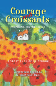
The authors came to me as a referral and we hit it off right away. They didn’t have much of a preconceived idea of what the book should look like, but wanted something that was easy to read and attractive. And they had the painting by their daughter, Zoé-Pascale.I started developing a number of cover ideas, including some that used the painting. I liked the painting as a point of focus for the book because it embodied the story the authors had to tell, and it was in itself a joyous and colorful piece of work.
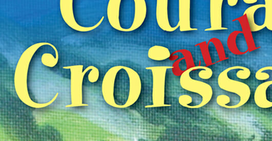
Through a number of iterations the cover eventually became a canvas itself for a detail of the painting, and we ended up with a cover that maximized the colorful nature of the painting, pairing it with a slightly whimsical type treatment for the title of the book. After balancing out the other elements, including what looked like 2 subtitles, we all agreed happily on the final version.
The main challenge with the book as far as I was concerned was dealing with the split personality of the text. This seemed like a book that may have been a tough sell to a traditional publisher because it is really two books in one, a true hybrid.
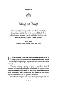
Looking for a way to lighten the pages and add a decorative element to the chapter openings that would help tie the book together, I extracted the little cottages from the oil painting and combined some elements from a couple of them to come up with a grayscale graphic for the title pages.
Using this with the script typeface Angelina created an airy and charming chapter opener:
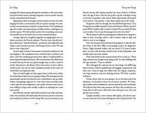
The spreads that followed in the first part of the book—the memoir—followed the lead of the chapter opener. The body is set in Adobe Jenson Pro.
And Now to the Other Book
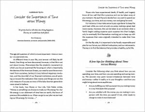
The last third of Courage and Croissants is a structured guidebook with suggestions, lists of activities and other highly formatted material. The strategy here was to use Angelina again, as well as the same page elements in the folios and running heads to keep the two parts of the book connected, but switch to Candara, a san serif typeface for the text to signal the difference in the kind of material being presented.
Here’s what the pages look like:
And a Hybrid Production, Too
When production was nearing an end, and the authors realized the book was receiving a lot of positive response from advance copies printed at 48hrbooks.com, they decided to ramp up their publicity and review efforts.
Instead of relying on Lightning Source for an offset run, I arranged a print run at Thomson-Shore, one of the best short-run book printers in the country. They came in with an aggressive price and we decided to finish the covers with a matte laminate.
I did this for two reasons. First, I thought the book would be more attractive and more pleasant to handle with the matte laminated cover. Second, this is a finishing option that isn’t available through print on demand suppliers. Since the book wouldn’t have the tell-tale barcode on the last page either, the finish would subtly signal to anyone who knows books that this was not “just another PoD self-publisher.”
After the print run is exhausted, the authors will revert to Lightning Source to fill online orders.
Conclusion
Courage and Croissants is a well-written, captivating and educational story. Although it has only just been launched, the effort, time and investment the authors have put into the book are starting to pay off.
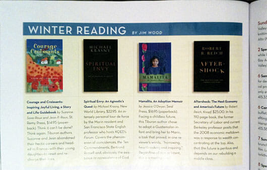
Today we received a copy of the plush Marin Magazine, a beautiful lifestyle and real estate-oriented monthly that showcases lovely writing and items of local interest.
There, in the “Winter Reading” column, was Courage and Croissants.
The book is shown with titles from New World Library, Seal Press (a long-time indie publisher of women’s writing) and Alfred A. Knopf. You can see that only one of these books was designed with small, online thumbnails in mind, and it’s not the one from the big publishers. Two of these covers are almost unreadable even in the magazine.
Getting selected from the thousands of books available for this kind of treatment is a type of proof that self-published books, produced in collaboration with publishing professionals, can indeed go toe to toe with books from big publishers. Although we can’t match their distribution, our books are actually superior in some ways.
It was a pleasure working on this project, and it looks like it’s off to a terrific start in the marketplace. It ended up a hybrid not only in content, but in the means of production as well. I predict a lot of success for these authors.
Data
Buy Courage and Croissants on Amazon (affiliate link)
The authors’ Healthy Joyful Living website
ISBN: 978-0-9826909-0-1
Size: 5.5″ x 8.5″, 328 pages
Price: $14.95
Typography, book layout and graphics in Adobe InDesign and Photoshop.
Typeset in Adobe Jenson Pro, Angelina and Candara

