Case Study: Opening the Gates of the Heart: A Journey of Healing, text and photos by Carolyn CJ Jones
Design brief: Use the author’s prototype book as an inspiration for a book design and manage a cost-effective production of a hardcover full-color book.
Constraints: Production costs had to be held within reason to allow for profit at retail. The author wanted a good quality production that would convey her inspirational message. And it had to be retail quality to justify the necessary cover price.
Raw material: Author Carolyn CJ Jones had matched short prose pieces describing her own journey with expressive photos of gates at some of the houses and estates in the area.
Production goal: Offset printing was required to produce the book. It needed a printer that could produce the right quality at a good price.
Challenge: Create a book that would really communicate the heartfelt words and images and invite buyers to participate in the journey.
Solutions and Consequences
This was a terrific project with a wonderful author. Carolyn, a fellow member of the Bay Area Independent Publishers Association (BAIPA), had created a prototype at a copy shop which she used to pitch publishers. When she decided to self-publish, the book was already finalized and the layout settled.
As we went through the process, Carolyn’s creative drive was evident, as she fine tuned both details of the book design and the text itself, always seeking to improve the final product.
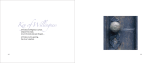
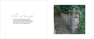
Each spread in the book had one of Carolyn’s photos on the right, faced by a page of text with a title on the left. This unvarying arrangement, combined with the severe rectangles of the open 8″ x 9.5″ spread and the sharp edges of the color photos against the white paper, seemed to cry out for an element that would play against them.
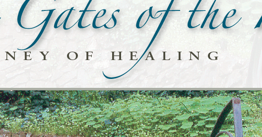
The solution came in the font Carolyn had picked for her cover, Hermann Zapf‘s Zapfino, an elegant script typeface perhaps best suited to invitations and social stationary. I had never used it in a book before. But the more I played with it, experimenting with some extreme tracking settings, and exploring the many alternate characters included in the font, the more I liked it.
Zapfino in the end is what gives the book its flair. While I wanted to keep the text in black so it wasn’t competing with the color photographs, the Zapfino titles were another matter. Here color proved critical to the design. I settled on a tinted blue color, cut back from the original to a pale mauve. This allowed the long tails of Zapfino to trail over the body of the type, yet not interrupt readability.
Here are some spreads from the book:
Advance Copies Through Blurb
Once the book was finalized we were able to upload the files to Blurb and get a proof in a few days. We then corrected the files and Carolyn used softcovers for Advance Reader copies and hardcovers as prototypes for marketing purposes. Although the Blurb copies are expensive on a per unit basis, they are very good looking and efficient. We were able to have books in hand while the actual press run was taking place in China and using up 2 months in production and shipping.
Cover Design
After developing several cover designs with radically different typography, Carolyn settled on a spruced-up version of the cover she had designed for her original copy shop models. That was fine with me, because it made for a beautiful book. Using the foliage from her cover image as a textured background, I repeated the treatment of the Zapfino from inside the book, draping it’s graceful descenders through the subtitle, but running the color in its full value. The roman face to accompany Zapfino is Arno Pro.
Conclusion
Although Carolyn’s book had a rocky trip through production, and eventually ended up with a different printer than it started at, the final product is beautiful. It has already won an Honorable Mention in the Spirituality category from the New York 2010 Book Festival and an Honorable Mention in Photography/Art at the San Francisco 2010 Book Festival.
A true collaboration between designer and author/artist, it seems destined to inspire people for years to come.
Data
Buy Opening the Gates of the Heart: A Journey of Healing on Amazon (affiliate link)
Carolyn CJ Jones’ website
ISBN: 978-0-9826352-0-9
Size: 8″ x 9.5″, 96 pages
Price: $29.95
Typography, book layout and graphics in Adobe InDesign and Photoshop.
Typeset in Candara and Zapfino with Arno Pro


