

Book publisher logos are a part of the self-publishing process that are often overlooked. However, logos are an integral part of marketing and alerting readers to the credibility of your book. While logos may seem like a simplistic piece of art, they are much more important than we often realize.
If you’re going to self-publish, creating a book publisher logo makes your book appear more professional and more in line with what large publishing houses offer. While something as small as a logo on the spine of a book might seem inconsequential, its absence can be a subtle, subconscious cue to readers that there’s something off about the book.
Self-published books already sometimes get a bad rap for not being held to the same standards as legacy-published books, so it’s important to do everything in your power to create a high-quality offering. Designing a logo for your imprint is just one factor in creating a more professional book. But where do you start? What common characteristics do book publisher logos share, if any?
In this article on book publisher logos, you’ll find:
What Are Publisher Logos?
Book publisher logos are emblems that represent the brand of the publisher. Publisher logos help identify one company from the next. They act as an easily recognizable icon that categorizes books according to the publisher.
Every book that a publisher puts into the marketplace will have a publisher logo. You will often find book publisher logos on the title page of a book and frequently on the book’s spine as well.
A publisher logo helps people place the book with the publisher with a simple glance at the spine. It acts as a finishing touch to the product. And a book without a logo on the spine can look like it’s missing something, especially to seasoned readers.
One of the first pages of the book, often called a colophon or copyright page, is full of details like:
- Copyright
- Publication information
- Legal disclaimers
Back when scribes wrote every copy of every book by hand, they used this section to make little notes about how tough it was to transcribe a text by hand. In fact, the word colophon is actually from Greek via Latin and originally meant “finishing touch.”
With this in mind, the next important question to ask is if authors should make their own book publisher logos. If you choose to self-publish rather than traditionally publish, should you add your own finishing touch to your book?
Should You Make Your Own?
If you want to give your book the best chance of selling, creating your own publisher logo is an important step in the process. Book publisher logos are an important part of marketing. After all, branding is what differentiates your book from all others before a reader ever turns to page one.
The more detail you put into your author brand, branding your book, and marketing this brand to your potential readers, the better chance you have for selling copies.
Creating your own publisher logo is not as difficult as it may sound. Consider the following options:
1. Use Canva or Another Graphics Program
Canva is a great platform for creating publisher logos and offers both a free and paid version. If you have an eye for graphic design and understand branding, you may want to try your hand at creating your own publisher logo. If you have experience with other graphics programs, like Adobe Illustrator, by all means, use that instead. You can also start from a pre-designed template and customize it to suit your needs.
2. Hire A Graphic Designer
If you aren’t as confident in the graphic design space, your best option may be to hire someone to design a logo that fits your brand perfectly. Before making the hire, be sure that you do your proper research: ask other writers for feedback on the designers they have used and be sure to look at reviews. This option is obviously more expensive than designing your own book publisher logo, ranging from around $250 to over $2500, depending on the expertise of the graphic designer you choose.
3. Go Hybrid
Maybe you already have a vision for the type of book publisher logo you want to use but you aren’t quite sure how to make it look polished and professional. This is a great opportunity to take advantage of both your own creativity and the professionalism of a graphic designer.
Simply use Canva or another such platform to create a mock-up of the design you want to use. Next, reach out to designers and ask if they can work with your idea. Once you find the right designer for your project, collaborate until you create a logo you love. Be sure to listen to ideas your graphic designer might have about how to make the logo even better—remember, they do this for a living!
11 Examples Of Real Book Publisher Logos
Sometimes it helps to see examples of what has been done to inspire your creativity and help you create something new. Of course, we should never copy an existing book publisher’s logo, but it’s perfectly acceptable to draw inspiration from logos.

Penguin Press has a great, simple logo featuring, of course, a penguin! This publisher uses white, black, and orange to create an easily recognizable logo that will easily fit on books’ spines.

Penguin Random House, one of the “big five” traditional publishing houses and over Penguin Press, features a very simple publisher logo. In fact, it’s so simple it may appear on-the-nose. However, their logo reinforces their brand name and is one to learn from!
3. Quirk Books
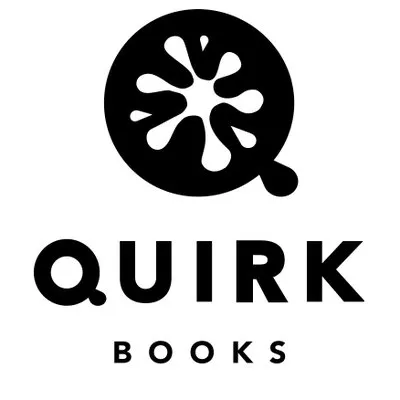
Quirk Books has a fun and, well, quirky logo. The circle looks like a cross between a tomato and an inkblot, and is immediately recognizable among all of the other book publisher logos out there.
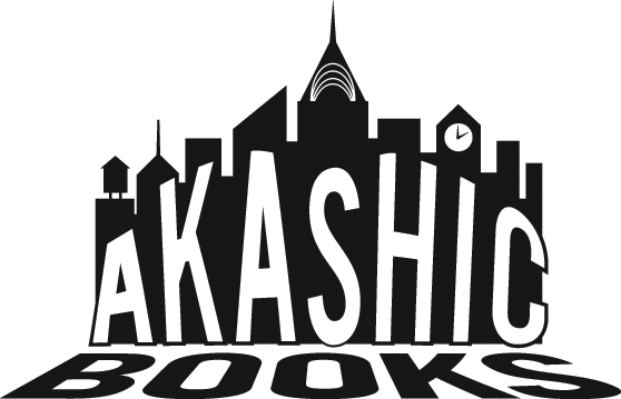
The city skyline in the logo makes sense for this Brooklyn-based publisher that publishes urban literary fiction and political nonfiction books. There are subtle details within the skyline (such as the clock and water tower) that many might overlook, but that give it a more polished and professional feeling.
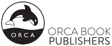
Here’s another simple book publisher logo, but one that draws you in. The entire logo exists within a perfect circle. However, the bottom third is filled with black ink and their name, ORCA, in all caps. A black and white orca dives into the ocean in the top two-thirds.

Self-Publishing School, reinforces what they do with their logo: a black and white graduation cap with a gold tassel stars as the logo.
If you look closer, however, you’ll see the top of the cap is made up of a book and what appears to be a tassel is actually the gold bookmark—fun, unique, and engaging.

The simple line art that Random House Group uses for their logo has a very traditional feel. While they’re not stretching anyone’s imagination with such a literal interpretation of their company name, but the logo does come across as solid and trustworthy.
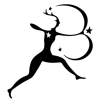
Bloomsbury’s logo looks a lot like an archer, but if you look more closely, the bow and her arm create a letter “B.” This is a really fun take on a publisher logo that looks simple at first but has a surprising amount of detail.

This publisher breaks the trend by using blue rather than the more common black color for their logo. An open book comprises the entirety of their logo: simple, to the point, with hard lines.

The Feminist Press’s logo makes perfect sense when you consider part of their mission is to publish books that “ignite movements and social transformation.” The stylized flame fits perfectly within that mission, and the accompanying typography is bold and easy to read even at smaller sizes.
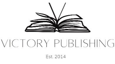
Victory Publishing takes a spin on line art for its logo. An open book, created by what looks like possibly just one line, adds a simplistic spin to what we often recognize as a traditional book logo. A simple font includes the name of the publisher and when it was established (2014).
Time To Brainstorm
Now that you have a list of examples to derive from, it’s time to really think about what type of branding you want to get across to readers. Do you want to be simple like Penguin or Open Book Publishers?
Do you want to provide something more tangible in the logo, such as Orca, Akashic Books, or Self-Publishing School does?
While there is no right or wrong answer, the best answer for you lies on the other side of your brainstorming session. This is the time to sit down, cut out distractions, and get into the zone.
How do you want readers to identify your books? What image do you want them to associate with your work? What type of logo will you be able to use in the various places you’ll need to?
- Book spines
- Website design
- Banners for your book signings
Enjoy the process and playing around with ideas, then commit, and take the plunge!
