Everywhere you turn people are talking about ebooks and the future of book publishing. My explorations of the iPad have landed me in the iBooks app for long periods of time, and deep in Stanza on my iPhone, Calibre on my Mac, and Kindles on the various Kindle reader programs on all these platforms.
But this is certainly the “bleeding edge,” because it’s not that common to see people actually reading ebooks down at Starbucks, or hanging around the fountain in downtown San Rafael. No, they are probably reading paperbacks more than anything else. Maybe it’s just me, with tunnel vision, who sees ebooks and their accouterments everywhere.
Then of course I spend hours working on books for design clients, designing pages and variants, producing cover after cover. But all these designs, and the files into which we pour the final manuscripts, are digital, visible only on screen.
When you’ve been designing books on a computer for a while, you begin to merge the images on the screen and your visceral expectations of the finished book. In other words, when I look at the spread on my monitor, I’m experiencing a kind of projection of what the finished book will be like.
Books designed this way are sometimes oddly disappointing. They can never be as perfect as their digital representation on the screen, the colors never as bright, the pages never as sharp and square. This is a legacy of the digital age.
Books, and Books
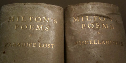
Vaguely disattisfied, I wandered out of my office, and noticed the cabinet where we keep the remnants of my book collection, such as it is. At one time I had collected fine books, but that was many years ago. I had only kept a few favorites. I pulled out two large volumes, cases covered in a printed paper, spines wrapped in vellum.
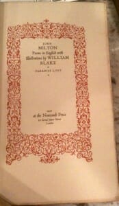
This is the 1926 edition of Milton’s Poems from the legendary Nonesuch Press. The first volume is Paradise Lost, the second Miscellaneous Poems. I’m sorry these photographs don’t show these books any better, but here’s the title page:
The Nonesuch Press was an interesting experiment in improving books for the reading public. The revival of the book arts that had started near the end of the nineteenth century with the founding of William Morris’ Kelmscott Press had produced numerous small private presses dedicated to producing books by hand and at the highest level of design and production.
Francis Meynell founded Nonesuch Press with his wife Vera Mendel, and the noted Bloomsbury writer David Garnett. Meynell thought there was a way to improve books, without the exclusivity and high prices of the artisan presses. Like Kelmscott, they produced tiny editions of 100 or 150 books, each of which commanded extravagant prices.
At the time books were almost all printed letterpress. Letterpress printing, invented by Gutenberg in the fifteenth century, had very nearly been perfected by the twentieth century. Mechanization had brought cheap printing to more people, but the book arts were in decline.
Meynell thought he could bring the two sides of book production together. He set up Nonesuch Press with a hand press, just like the other private presses. But after he had completed designing a book in the handpress model, he turned the actual production of the books over to large, commercial printers.
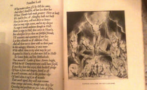
This Milton, for example, was produced in an edition of 1450 copies, a quantity that no handpress could contemplate. It was printed by the printing office of Cambridge University Press, and is accompanied by illustrations by William Blake. Here’s his “Satan Calling Up His Legions.”
A Cutting Edge Design in 1926
You may have noticed that the entire book is printing in italic type. This was an unusual decision even in Meynell’s day. The italic handwriting of the Rensaissance was considered one of its humanistic accomplishments, and it had given rise to the very first italic type, cut for Aldus Manutius, one of the earliest and most influential of the Venetian printers.
When the Linotype Foundry decided to resurrect one of the classic roman typefaces of the time, Francesco Griffo’s Poliphilus, they decided to combine it with an italic typeface designed by the papal scribe and type designer Ludovico Vicentino degli Arrighi. The modern italic was given the name Blado, after the printer who had used Arrighi’s italic fonts.
Meynell decided, in a stroke of design genius, to cast his entire publication of Milton’s poems into the Renaissance, the cradle of modern civilization as well as modern bookmaking. The sturdy Blado italic is not some wimpy slanted typeface playing the role of weak sister to a roman face. Oh no, this is a typeface that needs no roman at all, it’s complete in itself.
The Long Winter
I sat down and read a few pages of the Milton. The opening lines of this great English poem still resonate for me, many years removed from English class.
Of Mans First Disobedience, and the Fruit
Of that Forbidden Tree, whose mortal tast
Brought Death into the World, and all our woe . . .
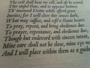
It took me back to a winter many years ago, after I got this Nonesuch Milton, when I read through the entire Paradise Lost. It was an incredible experience. The paper Meynell used for this edition was specially made, coarse, entirely composed of cotton and linen fiber. It’s thick by today’s standards, and nobbly. It has such a pronounced texture it becomes part of the reading experience. It shows the bite of the metal type beautifully. Here’s a closeup to try to show the paper and typography a little better.
You can see the completely even color of the type, something not that easy to do with this kind of letterpress printing. The whole effect of reading this book is unlike other kinds of reading experiences. The artfulness of the type, the energy of Arrighi’s italic and the otherwordly illustrations by Blake combine to bring Milton’s words to life in an immediate way.
Back to the Future
As I put the Milton back on the shelf, I realized that it’s probably not possible to reproduce books like this one any longer. There are many fine printers at work today, and letterpress printing is more popular than it has been for some time. Typography has enjoyed an explosion of interest and talent in recent years, spurred on by digitization.
But Nonesuch managed to hit a “sweet spot” in book design and production at a time when all the printing expertise in the world was concentrated on letterpress. There simply is no “commercial letterpress” industry any more, and the big iron letterpresses were long ago melted down, replaced by faster, cheaper offset printing.
Anyway, I had to go back to the survey I was doing of the latest publication for the iPad: a video-enhanced, hot-linked, multi-media text that blinked and pulsed at me from the screen. No matter what speed and convenience we’ve gained, I couldn’t help but feel that we’ve also lost something in the process.
Is there a role for fine printing in our hurried electronic life? Would any of us take the time to spend a winter reading Milton today? What do you think?
Takeaway: Digital books, new ways of looking at text, and the toppling of old structures in the book business are pushing us toward the future. A look back at the past can remind us of what our ancestors thought important about the design of books.


