


Perhaps we shouldn’t judge book by their covers, but we can certainly learn a thing or two from them. In fact, there are many design lessons to be learned from well-crafted book covers, and the Harry Potter book covers are among some of the best.
So what can we learn from Harry Potter book covers as designers? After all, the magic isn’t just between the pages—it’s right in front of our eyes!
In this blog, we’ll go over ten important design lessons you can learn from everyone’s favorite wizarding world.
This blog on Harry Potter book covers will discuss:
10 Design Lessons to Be Learned From Harry Potter Book Covers
The Harry Potter book covers were a resounding success worldwide, and here are just a few tips you can take away from them:
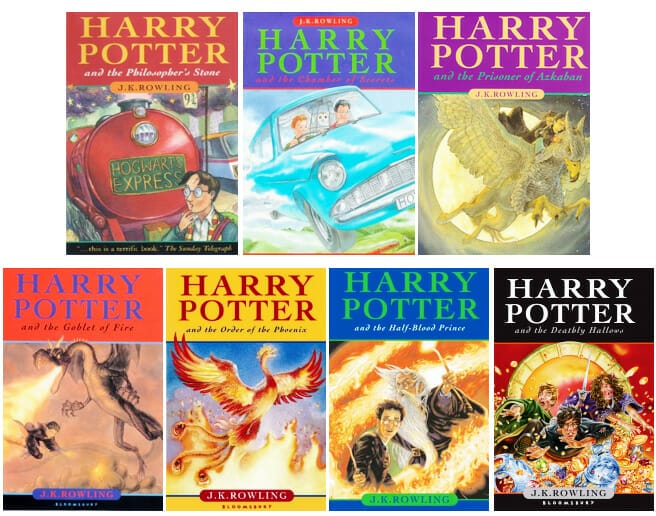
1. Use Consistency Across a Series
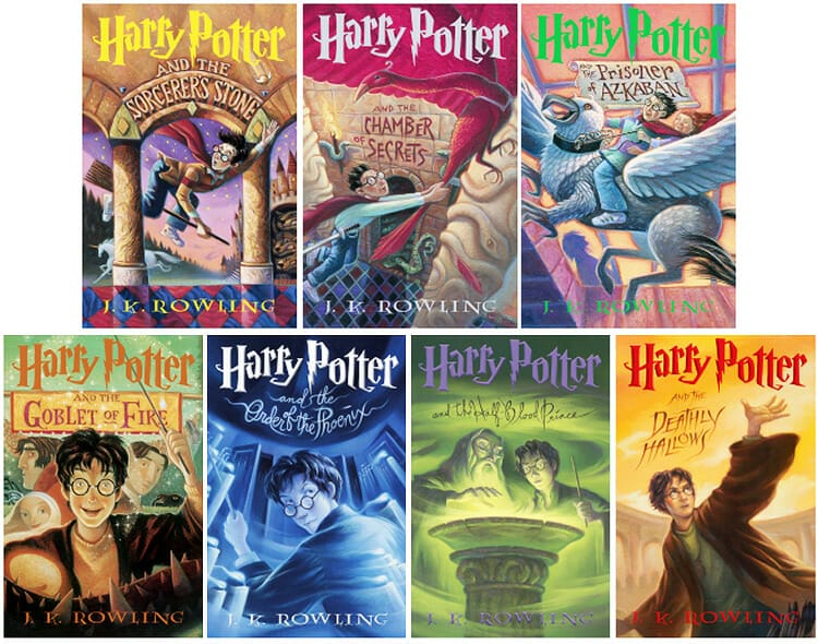
Take one look at the original US edition of the Harry Potter book covers and you immediately know they are from the same series—as you should. When you work with a series, it’s important to consider which design elements will be carried throughout.
Here, for example, the illustrator has used the same font (and font placement) for the title and author name. They have also chosen to change the color of the coin for every book, but have kept that change consistent.
The consistency of design, format, and style across a book series helps to build a strong brand identity.

2. Pull Captivating Scenes From the Story
An effective book cover should use strong visual storytelling. It’s a good idea to include a key element or scene from within the novel to provide hints about the content of the book.
Of course, you don’t want to give too much away when you do this, but you can encapsulate the essence or mood of the book easily through imagery.
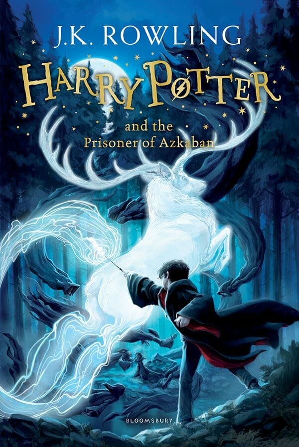
The 2014 UK edition of Harry Potter and the Prisoner of Azkaban did a great job with this. We see dynamic imagery that makes you want to know more about what happens in the story. What is the animal? Is there a battle? What is Harry fighting? This image makes you want to open the book and find out.
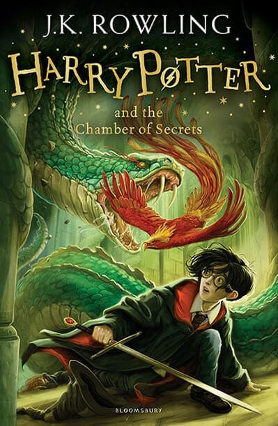
In the 2014 UK edition of Harry Potter and the Chamber of Secrets, the storytelling may not be as effective. While there is no doubt that this cover is visually stunning, in my opinion, it also gives too much of the story away.
This picture not only shows what the beast is (which is a mystery for most of the book), but also how Harry is saved in the end. When crafting an eye-catching book cover design, keep this in mind. Choose visually interesting scenes from the story that don’t ruin twists or climactic moments.
3. Play with Typography

Mary GrandPré did a great job when designing the US edition of the Harry Potter books. Just look at the font—she has taken Harry’s iconic lightning bolt scar and added the design into the title.
Genius.
Distinctive typography can make your book series instantly recognizable. When choosing your font combinations, just make sure that your custom fonts are as legible as they are unique.
4. Use Dynamic Movement to Draw Readers In
Your book cover should, ideally, stop potential readers in their tracks. Creating a lot of movement within your imagery can do that. Convey action, depth, and visual interest through your illustration.
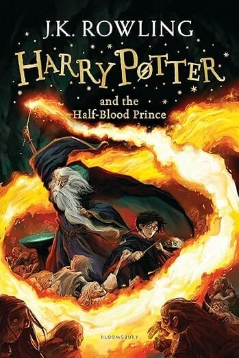
Take the 2014 UK edition of Harry Potter in the Half-Blood Prince, for example. This Harry Potter book cover draws your eye to every corner of the book with the artful arc of fire.
5. Convey Mood Through Color

The last three Harry Potter books see a major mood shift, and each Harry Potter book cover follows suit. Instead of the bright, cheerful covers of Harry’s early school days, we have been given a somber monochromatic blue in the US edition of Harry Potter and the Order of the Phoenix.
Upon looking at this cover, we can instantly see that the innocence of youth is gone, and we are left with something a bit ominous and sinister. Even the font has taken on an eerie, ghostly appearance.
If there is a major tonal shift in your book series, you can easily show that through the color scheme without deviating from the overall feel and consistency of the other book covers.
6. Choose Illustrations vs Photography
Are you writing a book for children? Is this a book about magic? Well then, only an illustration could truly capture the whimsical, fantastical feel you are looking for. Save photographs for non-fiction and serious adult affairs.
When designing your book covers, carefully consider the genre and tone of the book when deciding on illustrations vs. photos.
7. Consider Your Target Audience
When considering how to design your book cover, your audience is just as important (if not more important) than the genre. You should think about the age of your target reader, of course, but you should also consider what will appeal to them culturally.
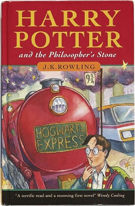
When Harry Potter was first released in the UK, it was under the name “Harry Potter and the Philosopher’s Stone." It featured a boy standing next to a train. While the platform 9 ¾ would give a good laugh to many British children, it’s not as understandable or relatable to children who don’t often travel by train.
Upon looking at the book, you can’t instantly see that this is a story about magic. When targeting this book to a US audience, this became a concern. It was believed that American children wouldn’t want to read about a philosopher, and wouldn’t understand that Harry was a wizard.
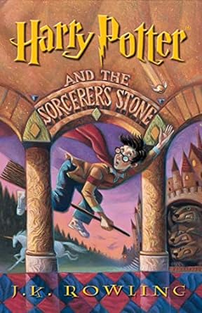
Thus, the original US Harry Potter book cover was born. We see Harry flying on a broom and a unicorn running in the background. Not only that, but the title has swapped out “philosopher” for “sorcerer.” Now there is absolutely ZERO doubt that this is a story about magic.
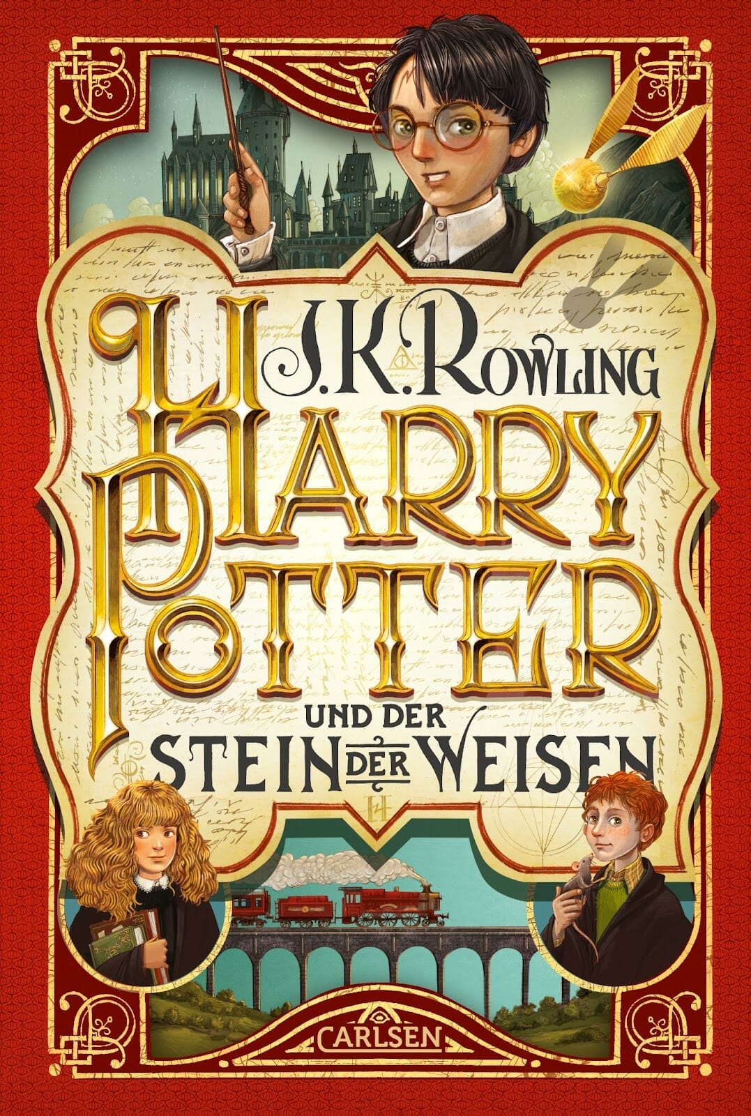
But this isn’t the only way you can consider culture when creating your book cover. Take this Harry Potter book cover from Germany, for example. It nods to German heritage with a stunning heraldic crest-like design, which is instantly relatable to German readers.
When designing your book covers, adapt your art to suit the target audience’s preferences.
8. Sprinkle in Some Intrigue
When creating book covers, you want to strike a balance between mystery and familiarity. You want to create imagery that the reader can understand and relate to, but want to learn more about.
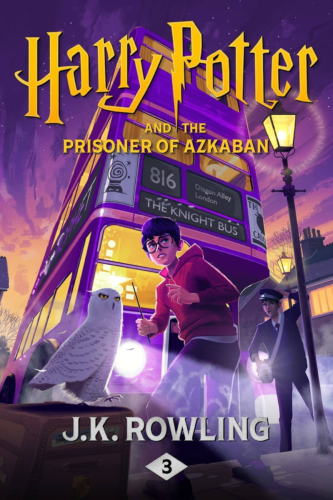
Take a look at this new digital Harry Potter book cover for eBook and audiobook. There are exciting elements for fans to recognize—Harry, Hedwig, a wand…but what is that bus? What are they all looking at? Is there danger?
You should aim to pique the curiosity of potential readers while maintaining a connection to the story they already know and love.
9. Add Hidden Details
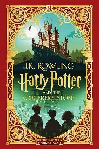
Look at all the hidden easter eggs on this 2020 Harry Potter book cover, illustrated by MinaLima. As you continue to stare at it, more and more details will begin to pop out at you.
These intricate details add depth to the story and invite readers to explore. Think about how you can incorporate subtle or hidden details into your book covers.
10. Consider Collectability

Want a sure-fire way to ensure more book sales? Make a collector’s set.
Just look at this stunning Russian edition of the Harry Potter series. Once you’ve collected the entire set, the spines of the books depict an illustration of the Hogwarts castle.
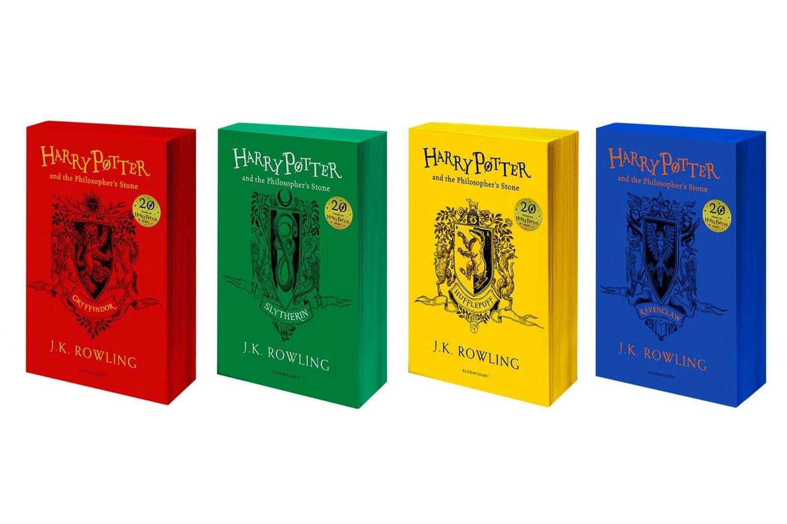
Now examine this smart take on the Harry Potter book covers. The designer has created editions for each Hogwarts house—and what Harry Potter fan could possibly resist!?
Consider how you can make readers collect and cherish your book covers.
Make Magic with Your Book Covers
There are so many lessons you can learn from the Harry Potter book covers, from the power of consistent branding to cultural sensitivity. You can take inspiration from these lessons while designing the covers for your next book series.
Need more cover design tips? At The Book Designer, we have a wealth of information to help you design better books inside and out.
