• Skip to primary navigation
  • Skip to main content
  • Skip to primary sidebar
  • Skip to footer
  • Self-Publishing
  • Author Blogging
  • Sitemap
  • Fonts/Typography

The Book Designer

Practical advice to help build better books

by selfpublishing.com

COACHING


PUBLISHING


WRITING


PRODUCTION


FREELANCE


WRITING JOBS

  • Home
  • About
  • Articles
  • Contact
  • Shop
You are here: Home / Book Design / Confessions of a Drop-Shadow Addict

Confessions of a Drop-Shadow Addict

by Joel Friedlander on April 30, 2012 34 Comments

Table of Contents

  • My Addiction Grows Worse
  • More and More Realistic Illusions
  • The Healing Begins

Hi, my name is Joel, and I’m an addict.

Like a lot of you, my graphic design addiction started innocently enough. It was long ago, in a different and simpler time.

There I was, designing brochures and advertisements, keeping the waxer hot and the t-squares lined up, when I noticed it for the first time.

A simple box in an ad, but this box was different from any other box I had ever seen drawn around a bullet list. For a moment I was confused, visually and aesthetically.

The box was casting a “shadow” on the page.

Oh sure, it was just an illusion. In fact, it was just a box with a thick black line drawn on the left side and bottom of the box.

But it introduced something radical, something powerfully attractive, something paradigm-shifting: it seemed to add a third dimension to what was just a piece of paper with type on it.

Zounds! I had to try it for myself. Could it really be that simple?

Half of the rest of the day was spent on experimenting with this miraculous invention, a shadow.

My Addiction Grows Worse

We had our own typesetting equipment in my studio. We had drafting equipment. We could add those shadows too, and soon enough, almost every design coming out of the studio had drop shadows somewhere.

Thick black lines were added to the left and bottom sides of every box, panel, rule, you name it.

Years went by, and eventually we moved to typesetting on early PCs with “desktop publishing” programs. For some reason, when graphic design transitioned to computers, the drop shadows moved from the left side to the right. I adjusted.

Soon, this software made it even easier to put in shadows when the clever engineers extended the “third dimension” metaphor by introducing “layers.”

These imaginary layers allowed you to just duplicate your object and put it on a lower layer to create your shadow. Cool!

Printed pieces including objects that appeared to float above the background became more and more common. Everyone, it seemed, was doing it.

More and More Realistic Illusions

By this time, nothing left my computer without shadows. This third dimension was changing everything. Then one day the stakes got even higher.

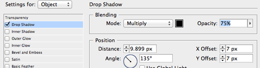
Adobe Photoshop, the leader in image manipulation and processing, added what they called “blending modes” to control how these different layers of your image interacted with each other.

Soon thereafter, I discovered the miraculous “multiply” mode. OMG, now the shadows created on one layer could blend realistically with whatever was on the layer below.

These shadows were no longer just heavy lines drawn around a box, they were semi-transparent, modeling themselves to fit the contours of the background image.

Soon enough, we were given the amazing ability to adjust the “opacity” of the shadows and objects.

Gone were the awkward rules, hard edges and all-black shadows. Now they were subtle, realistic, and even more addictive than ever.

Layers, blending, opacity controls. These were like giving an alcoholic a lifetime “drink all you want” card to their local bar.

Finally, the last step in the evolution of my addiction: the introduction of the “drop shadow button.”

Drop Shadow Button

Instead of figuring out how to make your drop shadows work properly, now the scheming engineers had put it all into a simple button. Anyone could do it!

And everyone did. Type and objects floating off the background were everywhere. I guess there are a lot of other addicts, although they won’t admit it in public.

The Healing Begins

Sure, I’m in recovery. I woke up one day and started noticing that lots of the designers I admire the most didn’t use drop shadows. Not at all.

I started studying book covers, looking at thousands of examples. It seemed like the top designers almost never used a drop shadow and, when they did, it was subtle, discreet, and part of the whole effect they were looking for.

Going back over my own designs, I felt the shame of the addict. When you’re an addict, you’re always looking for a way to indulge your addiction. They are insatiable, that’s part of the illness.

Now they looked mechanical, unnecessary, ugly. What the hell had I been thinking? I was repulsed, ashamed of my own weakness.

Determined to break free of the grip drop shadows had on my designer’s soul, I swore off, determined to find the design that didn’t need a shadow to be effective.

Sure, there were lots of times my mouse edged toward that drop shadow button, that tantalizing big dialog box with all those sexy controls. And yes, I’m not too proud to admit I fell off the bus, but it was less and less often.

Pretty soon I felt my discipline returning, I knew I was strong enough to stand up to that illusion of three dimensionality. After all, typography is a two-dimensional art form, why not celebrate that?

Hey, I’m not saying I’m totally over it. Every day I’m designing is a day I have to avoid those shadows. I use them sometimes, but it’s just a fraction of what it once was.

But now when I see the designs from other addicts, I feel sorry for them. Don’t they see how artificial their designs look? Don’t they know they are substituting artifice for art?

Everyone’s journey is different, that’s for sure. Thanks for listening to my story. I may be a drop-shadow addict, but I’m over the worst part. How about you? Is it drop shadows, embossed type, fancy box corners?

Tell me, I’ll understand. We can heal together.

Photo by Wayne Wilkinson

Filed Under: Book Design, Cover Design, Self-Publishing Tagged With: Adobe InDesign, adobe photoshop, book design, graphic design, publishing a book, self-publish, typography

journal marketing

Reader Interactions

Comments

  1. clippingpathgraphics says

    January 23, 2021 at 10:49 am

    Really good article about drop shadow I learn a lot of things thanks for sharing this kind of article

    Reply
  2. Rashel Ahmed says

    January 15, 2021 at 11:20 am

    its a really wonderful website. I really appreciate your post. Tanks

    Reply
  3. Clipping Factory says

    March 15, 2019 at 10:18 am

    Really great article.

    Reply
  4. Ellian says

    February 4, 2019 at 9:17 am

    I checked here super article, thanks a lot for this good idea

    Reply
  5. Michel Thomas says

    May 30, 2018 at 9:52 pm

    Really great article. Thanks for taking the time to explain things in such great detail in a way that is easy to understand.

    Reply
  6. Trevor Glue says

    December 23, 2013 at 2:59 am

    Hi Joel,

    I too am an addict to drop shadow. I once used so much drop shadow, photoshop actually ran out of shadows……..

    When will the medical profession take this condition seriously and help!

    Reply
  7. Donna Benton says

    May 31, 2012 at 8:44 am

    After reading about the flagrant use of the shadow dropping I am ashamed to admit, as a newbie to design, I have a predilection for the same. I am also rather partial to the inner bevel, not always at the same time though, I am happy to say. Am I on the slippery slope?

    Reply
  8. bowerbird says

    May 4, 2012 at 1:31 am

    i can stop any time i want. really!

    -bowerbird

    Reply
  9. Lisa Nicholas says

    May 1, 2012 at 6:50 pm

    That is eerie — have you been living inside my head? I remember well the thrill of learning that my favorite drawing program now had the ability to produce objects with varying opacity and fuzzy edges — more realistic drop shadows! Those and drop caps were my soft spots. But I’m all over it now.

    Reply
  10. Kit Foster says

    May 1, 2012 at 12:54 pm

    Kids – say no to drop shadows!
    The only covers that should use drop shadows are books about drop shadows (and even then, I’m not so sure).

    Great post as usual Joel!

    Reply
  11. Lucy Tobias says

    May 1, 2012 at 6:35 am

    I sat up and laughed at the title”Confessions of a drop shadow addict”, oh yes, I too have been here, done this and I remember drawing them in with rulers.
    All the “wizz bang” things come and go and come again, like hulu hoops and stockings with seams. When Kai’s Power Tools came out, people went crazy adding a zillion effects to a design which of course, turned to mud. In the end it is all about simple, elegant design that grabs the viewer. Deep in my heart I believe there is a place for drop shadows – once in a while

    Reply
    • Joel Friedlander says

      May 1, 2012 at 10:45 am

      Yes, Lucy, for those of us who started out with just a thick line and a thin line, and saw magic in that, the dream dies hard. Good luck with your recovery.

      Reply
  12. Christopher Wills says

    May 1, 2012 at 1:02 am

    Interesting post and comments. Don’t worry everybody; I expect Drop Shadows are like flared trousers and tank tops; if we hang on long enough they will come back in to fashion. Not that I’ve got any flares or tank tops you understand… :)

    Reply
  13. Deb Dorchak says

    April 30, 2012 at 10:09 pm

    I have to admit I was a bit of a chrome addict too for a while. *shakes fist* Damn you Alien Skin and your amazing plugins!

    Reply
    • Joel Friedlander says

      May 1, 2012 at 10:43 am

      Oh for pete’s sake, why don’t we just call them what they really are? Effects pushers. I think as long as they stay at least 200 yards away from art schools, we should be safe.

      Reply
  14. Drew says

    April 30, 2012 at 8:57 pm

    It’s fine for all you drop shadow addicts. There’s so many of you to support each other.

    I’m a high-pass filter addict with nowhere to turn.

    Reply
    • Bev Robitai says

      April 30, 2012 at 9:06 pm

      Don’t worry, Drew, we’re an inclusive bunch – you can join us! I’ve heard about the high-pass filter but never tried it myself. Is it a good high?

      Reply
    • Joel Friedlander says

      May 1, 2012 at 10:42 am

      Well, Drew, it’s long been known that drop-shadow is a “gateway” effect that soon leads users down the slippery slope to high-pass filters, crackle textures, and the dreaded “emboss/deboss” conundrum.

      Reply
  15. Anya Kelleye says

    April 30, 2012 at 7:06 pm

    I just discovered the drop shadow option when I couldn’t get my font to stand out on a cover I designed. Now I can’t seem to get away from it! Arrgghh! This post came a great time for me. Thanks so much! ;)

    Reply
  16. Kathy Dannel Vitcak says

    April 30, 2012 at 5:02 pm

    I still remember the shame I felt when a designer friend of mine sneered, “I would never use a drop shadow, my clientele is more sophisticated than that.” I felt “less than”, I was immediately transported back to 6th grade where I stood, last again to be picked for…well, everything. All those self-help books and the countless weekend seminars–POOF–gone with one comment about my passion for drop shadows.

    I am determined to hold my head high and not turn my back on my dear friend, DS, but to remember when we were both sexy, fresh and fun. Waving my drop shadow freak flag!

    Thanks for the great article!!! I just wish I could add just a teeny bit of a shadow to this comment box…

    Reply
    • Bev Robitai says

      April 30, 2012 at 5:06 pm

      Good heavens, there are more of us out there than I thought! I don’t feel so bad now. And the cover of Body on the Stage looks pretty good with the merest hint of shadow. Maybe there’s no need to go cold turkey after all!

      Reply
    • Joel Friedlander says

      May 1, 2012 at 10:40 am

      Yes, the comment boxes would really “pop” then, wouldn’t they? So boring, just sitting there with no third dimension to them.

      But remember, on the healing journey you don’t want to substitute one affliction (drop shadow obsession) with another (sneering at newbies). Onward!

      Reply
  17. Deb Dorchak says

    April 30, 2012 at 4:28 pm

    *sigh* Yes, the shame of the drop shadow. I had to go back and look at my novel’s cover and reassure myself I did it for all the right reasons.

    I’ve been aware of this affliction for some time now and I’m always challenging myself to find better ways of making that text copy pop. It’s not always easy, but I take it day by day, project by project.

    The first step to healing is always admitting you have a problem…My name is Deb and I’m a recovering Drop Shadow Addict.

    Reply
    • Joel Friedlander says

      May 1, 2012 at 10:39 am

      Hi Deb, and welcome to the recovery room. Careful handling of type, backgrounds and colors seem to be what’s indicated for your condition. Now that you’ve accepted it, I sense that your healing journey has begun.

      Reply
  18. Bev Robitai says

    April 30, 2012 at 2:06 pm

    *wails* I didn’t know I was doing anything wrong! I’m sorry, I’m so sorry…I can change, honestly. Just give me another chance, pleeeaaaaase. *trails off, sobbing, to redesign latest book cover*

    Reply
  19. Carol Frome says

    April 30, 2012 at 12:18 pm

    Illuminating and funny!

    Reply
  20. Jim Crigler says

    April 30, 2012 at 7:44 am

    A fun read and a good lesson in moderation, even when moderation means (near) abstention.

    Reply
  21. Joanne Phillips says

    April 30, 2012 at 5:51 am

    The best post I’ve read all year so far – made me laugh out loud. I’ve emailed it my book cover designer – could there be just a touch of a drop shadow on my cover? Oh, yes, I think there is…

    Reply
    • Joel Friedlander says

      April 30, 2012 at 2:01 pm

      Pretty hard to avoid them, Joanne, they’re everywhere.

      Reply
  22. Turndog Millionaire says

    April 30, 2012 at 3:10 am

    Congrats on your healing journey :)

    I have a love hate relationship with them. They can be good, at times, but I try to avoid most of the time. With the right colours you dont usually need it i find. Sometimes though it’s a must :)

    Oh, and i look back at all my future designs with a sad face. What was i thinking :(

    Matt (Turndog Millionaire)

    Reply

Trackbacks

  1. Designing with light and shadow | The Web Centre says:
    February 25, 2019 at 7:12 am

    […] light and shadow effects are easy to overdo. As one designer admitted in his amusing blog post “Confessions of a Drop-Shadow Addict”, in our modern world of instant, click-and-it’s-done design, it’s much too easy to add one […]

    Reply
  2. 设计中的光影应用:10种极为有效的小技巧(附案例分析) - Learn says:
    June 25, 2018 at 9:14 pm

    […] 但是,如果你经常上网你就会发现光影效果很容易被滥用。正如一位设计师在他的博客“关于沉迷使用垂直投影(Drop-shadow&…”中幽默地描述道,在现代世界,对于只需动几下鼠标就马上能完成设计来说,人们很容易添加阴影效果到停不下来,而没有真正的思考阴影对他们的设计项目到底有没有必要或者有没有帮助。 […]

    Reply
  3. 光と影を使った、デザイナーが実践したい10個の有効デザインテクニックまとめ – PSアクション says:
    January 22, 2017 at 6:53 pm

    […] しかしネットサーフィンなどをしていると、この光と影のエフェクトは使いすぎているのをよく見かけます。ひとりのデザイナーは記事”Confessions of a Drop-Shadow Addict“のなかで、私たちの世界では、クリックひとつでデザインを完成させることができることもあり、デザインプロジェクトに本当に必要かどうかを考えずに、次から次へのエフェクトを追加してしまいがち、と述べています。 […]

    Reply
  4. Friday Link Love for Writers « Hunter's Writing says:
    May 11, 2012 at 3:11 am

    […] Confessions of a Drop-Shadow Addict – Joel Friedlander spoke to my heart and funny bone with this admission, shared with myself. Mind you, I still have excuses to use drop-shadows, when doing my other creative hobbies within the digital arts fields, so I’m okay with my fixes, thanks very much. […]

    Reply

Leave a Reply Cancel reply

Your email address will not be published. Required fields are marked *

This site uses Akismet to reduce spam. Learn how your comment data is processed.

Primary Sidebar

Get the Advanced Publishing Kit

Topics

  • Audiobooks
  • Author Blogging 101
  • Book Construction Blueprint
  • Book Design
  • Book Printing
  • Book Production
  • Book Reviews
  • Cameras
  • Contributing Writers
  • Cover Design
  • E-Books & Readers
  • Editorial
  • Guest Posts
  • Interior Design
  • Interviews
  • Journey of a Book
  • Legal Issues
  • Marketing
  • Podcasts
  • Project Focus
  • Reports
  • Reviews
  • Samples
  • Self Publishing Basics
  • Self-Publishing
  • Social Media
  • Training
  • Video
  • Webinars
  • Writing
Self Publishing Platform
Self Publishing School

COACHING

Self Publishing

PUBLISHING

The Write Life

WRITING

The Book Designer

PRODUCTION

Make a Living Writing

FREELANCE

Freelance Writers Den

WRITING JOBS

Footer

  • Home
  • About
  • Articles
  • Contact
  • Shop
  • Self-Publishing
  • Author Blogging
  • Sitemap
  • Fonts/Typography
Terms of Service
Privacy Policy
Comment Policy
Guest Author Guidelines
Why?
"Writers change the world one reader at a time. But you can't change the world with a book that's still on your hard drive or in a box under your bed. This blog exists to help you get that book into people's hands."
—Joel Friedlander

Copyright Self Publishing School All Rights Reserved. © 2022