


Color psychology in marketing is used to influence people's emotions and decisions. Brands leverage colors color to capture people's attention and shape their feelings about a product. For example, a bright yellow makes people feel happy and energetic, while a deep blue is calming and trustworthy.
Color psychology is especially important in book marketing. The color of a book cover can be the first thing that catches a reader's eye, whether browsing in a store or scrolling online.
Understanding color psychology can be a powerful tool. It's not just about picking a pretty color; it's about choosing the right color that speaks to the reader and fits the story.
This article will explore how color can attract readers and help your book stand out:
Why Color Psychology is Important in Book Marketing
Color psychology in marketing is used to influence people's emotions and decisions. Brands leverage colors color to capture people's attention and shape their feelings about a product. For example, a bright yellow makes people feel happy and energetic, while a deep blue is calming and trustworthy.
Color psychology is especially important in book marketing. The color of a book cover can be the first thing that catches a reader's eye, whether browsing in a store or scrolling online.
Understanding color psychology can be a powerful tool. It's not just about picking a pretty color; it's about choosing the right color that speaks to the reader and fits the story. This article will explore how color can attract readers and help your book stand out.

The Power of Color in Reader Perception
The role of colors on book covers is not only to provide a high-contrast background but also to make the title and your name visible. Colors play a significant role in influencing people's emotions and decisions. This is especially true when we choose books. Each color can evoke different feelings and ideas, making it a key factor in how readers perceive a book.
Let's look at the list of basic colors and the emotions that they commonly evoke:
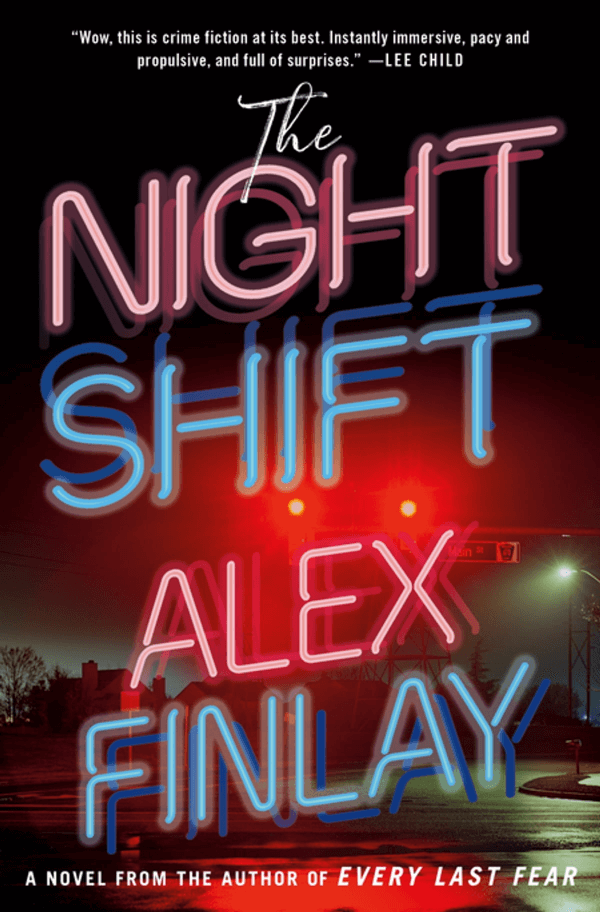
- Red is a powerful color that stands for love, passion, and excitement. From another angle, it can also signal danger and anger. He is a highly visible color, making it ideal for grabbing attention. The color is often used for both romance and action-packed genres.
- Orange is an energetic color that blends red's power with yellow's friendliness and is often associated with creativity. Many humorous and innovative books use orange on their covers to attract attention.
- Yellow symbolizes warmth, energy, and happiness. This is a great choice for children's books or any cover that wants to evoke cheerfulness and optimism.
- Green represents growth, health, and tranquility, suggesting a connection with the earth. It has a calming effect that works well for self-help and wellness books or stories set in nature.
- Blue evokes feelings of calmness, trust, and stability. It is also the most popular color worldwide. For these reasons, blue is often chosen for non-fiction and business books.
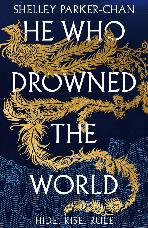
- Purple conveys mystery, spirituality, and luxury. Many fantasy and sci-fi book covers use purple, which has become associated with magic and space.
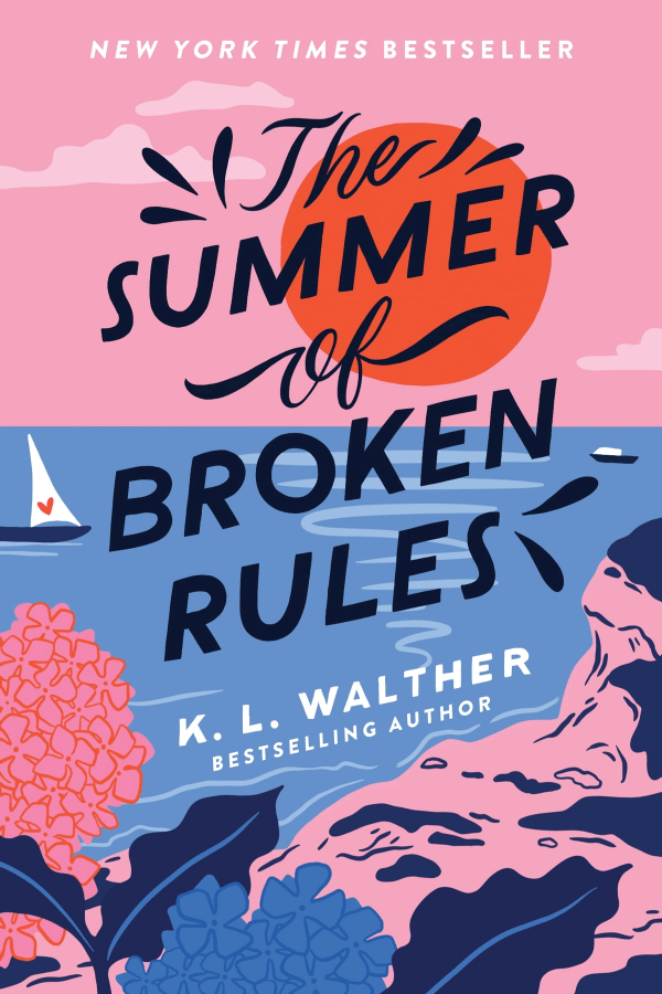
- Pink reflects tenderness and romance. It's a lighter and softer version (a tint) of red, perfect for romantic stories or topics dealing with care and compassion.
- The black-and-white combination is a classic. It's quite versatile, and it can convey either sophistication or simplicity. These colors are used across various genres for their ability to create contrast and elegance.
- Brown is considered a grounded and solid color. It evokes reliability and comfort and is often used for historical fiction book covers.
- Gray balances sophistication and purity attributed to black and white, respectively. Gray offers a neutral, mature backdrop that can complement any genre.
Understanding what emotions color brings helps you make your cover design more deliberate. This means you can base your choice of cover color on the story and the emotions you are trying to evoke, appealing to your potential readers.
Genre-Specific Color Trends and Their Meanings
Color is rarely used in isolation. Different book genres often use specific color palettes that resonate with their readers. Each genre is associated with certain colors whose job is to draw in its target audience.
Romance
Shades of red, pink, and pastels are the colors usually associated with romance. These colors signal the story's focus on love and emotional connections.
Thriller/Mystery
Thriller and mystery covers typically use darker colors like black, dark blue, and grey. The choice of dark colors suggests suspense and intrigue and aims to set a serious and mysterious tone.

Science Fiction & Fantasy
Science fiction and fantasy covers often feature purple, blue, and metallic hues. These colors hint at otherworldly adventures and are intended to spark curiosity.


Self-Help & Inspirational
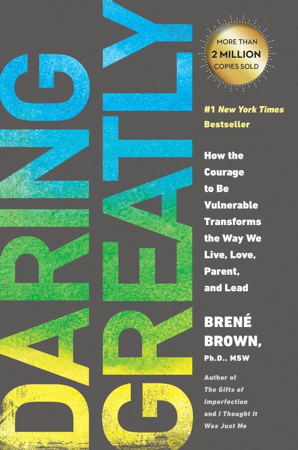
Bright greens, blues, and yellows dominate self-help and inspirational book covers. These colors are considered uplifting and are designed to evoke feelings of growth, peace, and positivity.


Historical Fiction
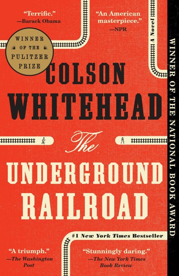
Historical fiction books favor earth tones like browns, deep reds, and golds, reflecting the depth of the past. These colors work well to complement stories that transport readers to the past.


Children's Books
Primary colors, such as red, blue, and yellow, are used in children's books. This helps create visually engaging covers that appeal to young readers. The bright color schemes are chosen to capture children's attention, making the books inviting and fun.
Business
Business books often feature blues and greens, which convey a sense of professionalism. These are also calming colors that convey a sense of reliability and trust, appealing to readers seeking knowledge and expertise.


Knowing what colors are often used in different book genres will help you pick the best colors for your book. This allows you to tell your readers what story they can expect before they even read the title.
Case Studies: Successful Color Psychology in Marketing Books
Let's closely look at a couple of popular books to see how they use colors to convey their stories' themes.
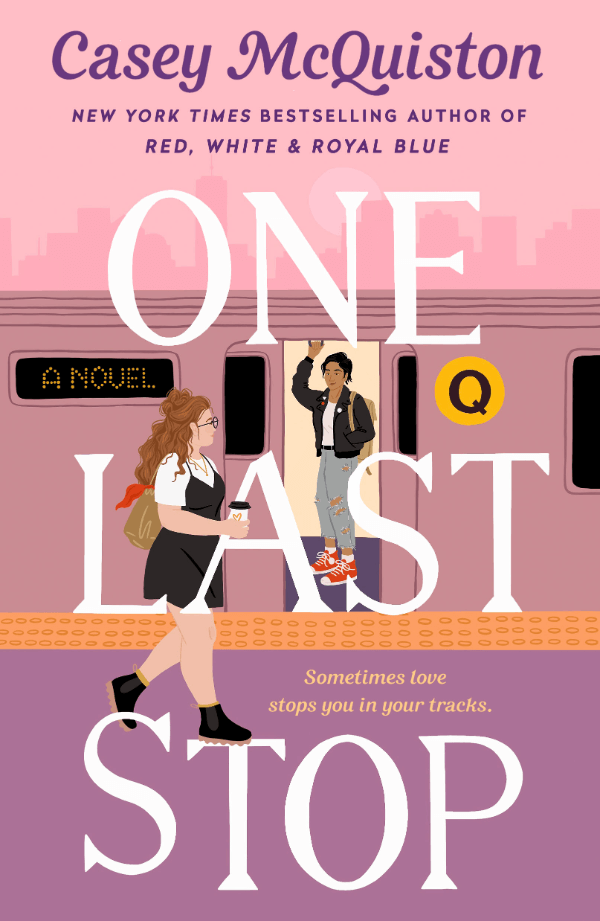
Red, White & Royal Blue by Casey McQuiston
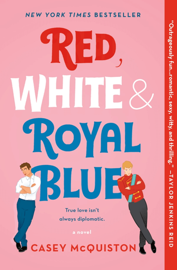
This book is about an unexpected love story filled with humor and touching moments. The cover's pink hints at romance, while red and blue nod to the characters' countries. These colors fit the romance genre's use of warm shades that suggest love, drawing in readers looking for a heartfelt story.
Gone Girl by Gillian Flynn
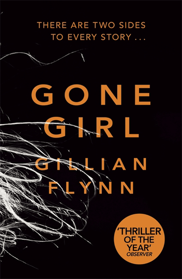
In this suspenseful thriller, a wife's disappearance turns her husband into the main suspect. The cover is dark with a touch of orange, echoing the intense and mysterious plot. The cover perfectly reflects the book's genre, appealing to thriller enthusiasts.
The Very Hungry Caterpillar by Eric Carle
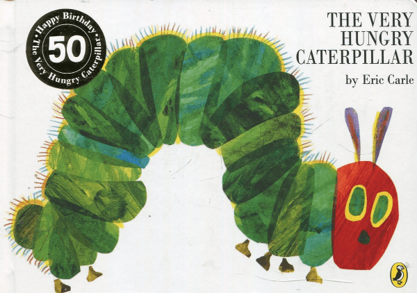
This children's book is popular because it delivers a great sensory experience. Bright illustrations draw kids' attention in the first place, but the tactile experience is no less important. The book is made with thick paper and cut-out holes to follow the caterpillar's eating trail, inviting kids to touch and explore. This design makes reading fun and helps the book stand out as a learning tool for children.
In each case, the color choices play a critical role in conveying the book's genre and mood, helping to attract the right audience. The popularity and sales of these books show the power of color in making a book stand out and appeal to readers' emotions and expectations.
Practical Guide for Choosing Colors
Here are some points to consider when choosing colors for a book cover:
- Understand Your Genre. Genres often have color associations (e.g., romance with reds and pinks, thrillers with dark colors, etc.). Choose colors that align with genre expectations.
- Know Your Audience. Consider the age and interests of your target readers. Bright, bold colors appeal to younger readers, while older audiences prefer more subdued tones.
- Digital vs. Print Formats. Colors can look different on screens than in print. Ensure your chosen colors work well in both formats. For digital covers, vibrant colors often stand out more in online bookstores.
- Mood and Theme Matching. Choose colors that reflect the mood and theme of your book. If your book is lighthearted, opt for brighter shades. For more serious themes, select deeper, more intense colors.
- Contrast and Readability. A good contrast between the background color and text enhances readability. The title should be easily readable at a glance.
- Experiment with Color Psychology. Use color psychology to evoke the desired emotional response. For example, use blue for trust, green for growth, or yellow for happiness.
- Seek Feedback. Before finalizing the cover, get feedback from potential readers or fellow authors. They can provide valuable insights into how the color scheme is perceived.
This is an important step, as the right color choice can significantly impact the appeal and success of your book.
Common Mistakes and How to Avoid Them
In book cover design, avoiding pitfalls can be more crucial than choosing perfect colors. Let's have a closer look at what you should avoid doing:
Overcomplicating Your Design
Adding too many colors or complex patterns can confuse or overwhelm readers. It's better to use a few colors that complement each other and convey the book's mood or theme. This will make the cover look clean and appealing.
Ignoring Genre Conventions
Every book genre has its color scheme that readers expect. For example, horror books often have dark covers, while romance novels might use reds and pinks. If your cover looks too different from these expectations, people might not realize what your book is about. Before you decide on your cover, look at other books in your genre to get a feel for common color schemes.
Forgetting About Contrast and Legibility
The text on your cover, like the title and your name, must be easy to read. Ensure a strong contrast between the text and the background color. This is especially important for online thumbnails, where your cover must stand out even when small.
Neglecting Emotional Impact
Colors can make people feel certain ways. Bright yellow makes us happy and energetic, while blue can be calming. Think about what emotions you want your book to evoke and choose colors that help bring those feelings to life.
Mismatching Digital and Print
Remember that colors can look very different on a computer screen compared to a printed cover. What looks great digitally might not work well in print, and vice versa. Always check how your chosen colors look in both formats to ensure your cover looks good, no matter how readers see it.
Incorporating Color with Overall Design
Combining color with the design elements of your book cover is key to making it stand out. The colors should work well with the elements on your cover and help set the mood.
The style and size of the text on your cover are important. The font needs to be clear, easy to read, and match the feeling you're trying to create with your colors. For example, a serious nonfiction book might use strong, straightforward fonts, while a fantasy novel could use more decorative letters.
If you use pictures or illustrations on the cover, make sure they complement your color choices. The images should tell your book's story at a glance — for example, if your book is about nature, you might use greens and browns in your background colors and images.
All these elements — color, text, and images — need to come together to form a unified design. This means they should all support the book's theme without competing for attention. A well-designed cover looks balanced and makes it easy for readers to know what the book is about and if they'd like it.
A good cover gives potential readers a hint of what's inside, helping attract the right audience. The colors, text style, and images should all point to the main theme or message of the book.
Conclusion: The Impact of Color Psychology in Marketing Your Book
Authors who design their own book covers must understand color psychology and its role in attracting readers. The right colors bring book covers to life, convey emotions, and set expectations based on genre, all of which can be leveraged in book marketing.
Understanding and applying these principles is key to creating covers that resonate with your target audience. Don't be afraid to experiment with colors; use them strategically to make your book visually appealing and emotionally engaging.
