When independent authors get started publishing a book these days, their projects usually include plans for both print books and eBooks. And that makes a lot of sense. With the growing popularity of E-readers like the Kindle, it’s important to ensure the book you’ve worked so hard on is available to readers no matter which format they prefer.
But there are big differences between print books and eBooks. For instance,
- Print books can be manufactured in different sizes and proportions, while eBooks are mostly just a text file.
- Some fonts or layouts might work great in print books, but will mostly be lost in eBooks.
- The basis of the design of print books is quite different than the design for eBooks.
It’s this last point that we’ll focus on today. First, some background.
The Book as Two-Page Spreads
What is a book? Seems like a simple question, doesn’t it? But the basic form of the traditional book comes from binding pages together inside a cover.
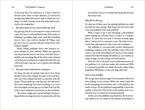
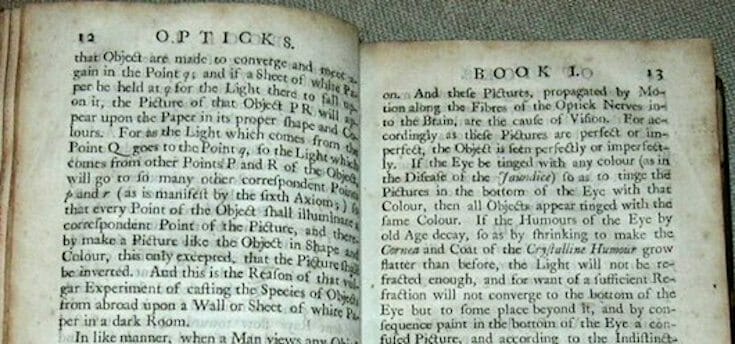
What this means, if you think about it, is that all the pages are connected to each other in a printed book. When you open the book, what you see is two pages side by side, or what we call a spread.
The page spread has historically been the basis of book design, since you never see just one page all by itself.

When we design books, we can use lots of design elements to help readers navigate them, and many of these elements are based on the two-page spread. Here are some elements that use the spread to create well-designed print books:
- Putting your running heads at the outside margins of the pages will make your book look more solid.
- Putting the running heads on the inside page margin will give the layout a very open look due to the negative space at the top of the pages.
- You can center your running heads and put your folios (page numbers) at the bottom outside margins of the pages, for a classic look.
- For a change try running feet – these are exactly the same as running heads, but placed at the bottom of the page instead of the top.
- Combine the running feet with page numbers (folios) on the same line, with the folios at the outside margin and the running foot at the inside margin. This is a very unique look.
- Create sidebars by enlarging the outside margins. Use a thin rule under your running head to help unify the page, and create text boxes that spread into the sidebar, or run illustrations on the full width of the page, protruding into the sidebar.
You can see there are a lot of variations available when you design with the two-page spread. All of these possibilities use the symmetry of the spread as the basis of their design.
Now Comes the eBooks
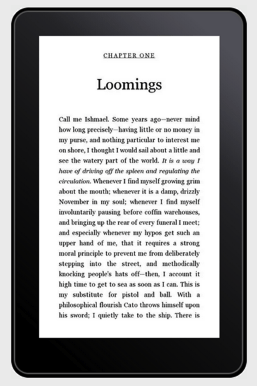
Of course, most of those elements don’t apply to eBooks. In the eBooks we have today, the basic unit of design is the screen.
This makes sense because the hardware that’s needed to display eBook files—and the software that interprets the text for a specific E-reader—determines how your book will look.
You can show something that looks like a two-page spread in some eBook readers and tablets, but it’s a software invention designed to make the transition to eBooks easier for people who have been holding bound books in their hands for their entire lives.
The spread is unnecessary and artificial in eBooks. However, a single page fits the screen perfectly, and most E-readers, including the Kindle, were designed quite intentionally to mimic the size and proportions of a trade paperback book page.
All of this means that the basic unit of design for eBooks is the single page, not the two-page spread.
If you’re a self-published author who plans to issue your book in both print and eBook editions, you’ll need to realize that a lot of the design we do based on the two-page spread must be thrown out in the eBook conversion.
If you’ve paid for a professional book design or taken the time and trouble to teach yourself enough to design your own book, this might be disheartening. But it’s part of our production workflow now, and the dual production streams of almost all books have become the norm.
If you constructed your print book with the sole intention of making it easily convertible to eBook formats, you’d likely end up with a different-looking book than you would have if you just designed it for print. It wouldn’t have any of the two-page spread design elements listed above, and there wouldn’t be any sidebars. Material you might have put into a sidebar would simply be styled within the flow of the text.
Design Smarter
So think about what you might do with your book when you move into production.
- If you’ll mainly be selling print books, design with the spread in mind.
- If eBooks will be your main sales vehicle, design your eBook based on a single page, and forget about the spreads.
- If you’re doing both, plan to use two different designs for each form of media.
Templates Solve Problems
If you plan on formatting your own book in Microsoft Word, whether it’s destined for print, ebook, or both, our new site at BookDesignTemplates.com can help.
We’ve taken the guesswork out of creating great looking books that work for both print and ebooks, and all of our book designs are available in both formats, or bundled together at a reduced price.
Click this link and you’ll see what I mean: BookDesignTemplates for Microsoft Word.
Photo by arendle Originally published in a slightly different form by CreateSpace.


