In recent articles I’ve been talking about how important typography is to good book design. When looking at the submissions to the first e-Book Cover Design Awards, no area stood out so clearly as a challenge for amateur designers.
Combined with this is the widespread belief among anyone with a drop-down menu of fonts that creating good typography is just a matter of picking the right name from the list.
Cover design failures, in general, are often traceable to typography deficit disorder.
So I’m always on the lookout for resources you can use to make your covers look a whole lot better. Here are three that will teach you a lot, or just give you an excuse to spend a few minutes admiring the wizardry of type designers and the graphic artists who use those typefaces.
Letterhead Fonts
The motto here is
“Uncommonly Good Letters for Your Ocular Amusement.”
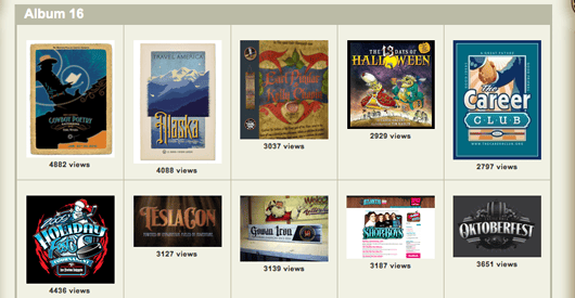
Although this site from an amazing digital type foundry is focused more on typefaces that are useful in signage, logos and other types of graphic design, there are also examples of book covers.
But just taking in the typefaces and the massive gallery of samples that show real-world uses of their type will amaze you.
Don’t miss the tutorials that show exactly how some of the effects are created. And try out any fonts you like with the typetester
Here are just a few of the more than 700 sample files in the Gallery:
I Love Typography
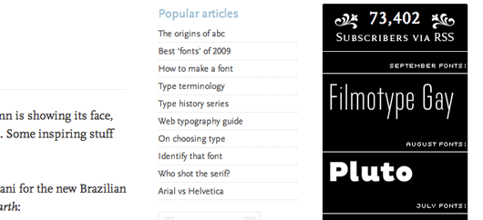
Probably the premier typography website that I know of. John Boardley has gathered a community of type designers and graphic artists and many of them contribute articles. Just reading the list of recent articles is enough to make you want to call in sick.
The aim of the site, in Boardley’s words, is
“to make the subject more accessible, to bring the study of typography to the masses.”
With over 80,000 followers on Twitter and an avid community of type nerds, I Love Typography is the place to hang out if you want to learn from professionals.
Boardley is also behind the very popular iPhone and iPad app, The Font Game, as well as a new magazine, Codex, The Journal of Typography.
But the third site I have for you today is another effort by John Boardley:
We Love Typography
I don’t know if Boardley also has the domains HeLovesTypgraphy.com or TheyLoveTypography.com but there does seem to be a lot of room for expansion.
In this case, it’s brilliant. We Love Typography is
“an image, video, & text ‘bookmarking’ site that is wholly dedicated to type-related content.”
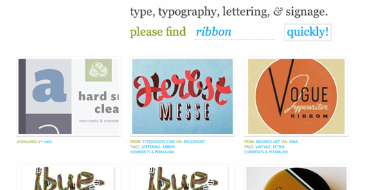
What this means: You go to the site and you’re presented with a somewhat whimsical search bar that says, “Please find ______ quickly!”
You can put anything you want in the search bar, and the site will return search results of images that are somehow typographic. There are over 18,000 images so far, although that seems likely to increase.
Here are the first six hits I got when I searched on the word “ribbon.” Watch out you don’t lose the afternoon searching through the images, they are fascinating.
More Resources and Goodies
Also check out Typenuts for free iPhone and iPad wallpaper files from many great graphic designers.
For another bonus, see this video about the typesetting machine that changed the world, the Linotype. This is an excerpt from a feature film scheduled to be released in 2012.


