


This is a story about bad book design decisions, and how to avoid them.
Jill and I visited Copperfield’s Books in Sebastapol this afternoon.
Copperfield’s is a small chain of independent bookstores here in California, and a favorite place to browse their curated selection.
As an aside, when you consider all the books that are published each year, every independent bookstore is essentially an exercise in commercial curation. If customers buy the books the bookstore buyers have curated, the store will succeed, so effective curation is an existential necessity for any indie bookstore.
In any event, Jill found a book she had been curious about and brought it over to show me.
“I would never buy this book,” she said. “It’s a mess!”
The book, as it turned out, was Princesses Behaving Badly from Quirk Books.
The book had many design elements you don’t ordinarily see in commercial books, including 2-color printing. But what bothered Jill was the many graphics used in the book. Here’s a typical page, with ornaments running up and down both sides of the page:
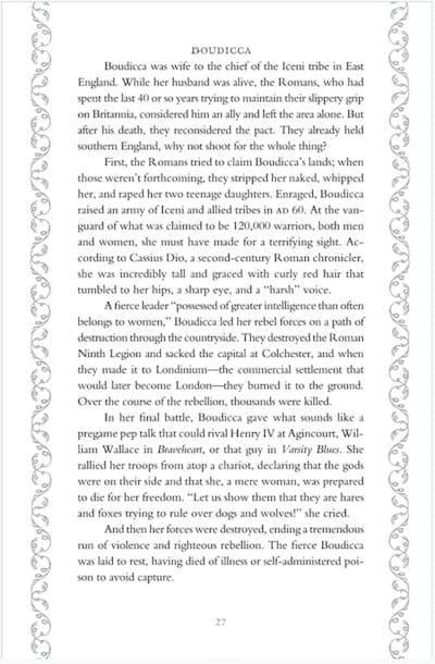
She simply felt the patterns, ornaments, and colors would interrupt her reading, and said she would look for a Kindle version when we got home.
Clearly, although the publisher put a lot of effort into the design of the book, that’s something of a loss. After all, was all this something readers wanted? In this case, no, and a sale was lost for the bookstore, the publisher, and the author.
More Book Design Problems
You can see another example of design overtaking the main purpose of the book—communicating the author’s words to the reader’s brain—in one of Haruki Murakami’s sensational novels, Sputnik Sweetheart, originally published by Knopf:
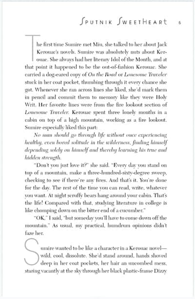
This book contains two examples of what not to do: The running heads are large and distracting, and when repeated on every single page, soon become overbearing. Running heads are there as a courtesy to the reader and could be considered optional in novels anyway.
Even worse is the use of gigantic initial capitals every time there’s a text break. Talk about distracting! And what purpose could they possibly serve? This is a fairly short book with many text breaks, so this assault on the reader’s attention happens over and over again.
Bad pagination
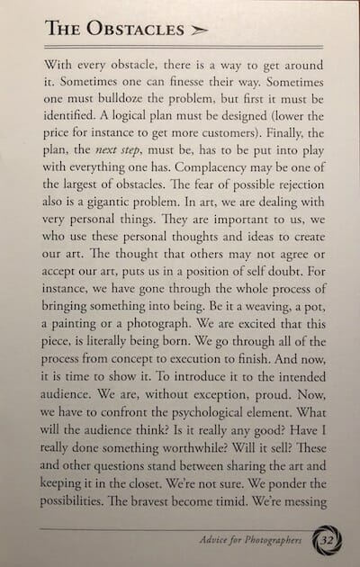
Another example of a book design “fail” is getting your page numbers in the wrong place.
In this lovely book of advice for photographers (Cafe Margo, publisher), the designer failed to look at any other books and put all the odd-numbered pages on the left side, and the even-numbered pages on the right.
You might not notice this right away, but for anyone who does (me) it is extremely disconcerting and of course, a true “mistake” from the point of view of any publishing professional. Mistakes like this brand your book as an amateur production.
Is that the look you’re going for? No, I didn’t think so.
Printing in Odd Colors
Book design, like other forms of design, can be subject to fashions. At one time a lot of books started to show up printed in odd colors like sepia (dark brown), dark green (I have a vegetarian cookbook like this, and never look at it) or even dark blue.
Some authors have told me they wanted to print in sepia to make their book look “antique” but they don’t realize you put an extra burden on the reader when you do this. If 99.999% of the books you’ve read are printed in black ink, why make reading your book more difficult?
Here’s a page from a cookbook printed in sepia, and it’s very tiring to read (Kathy Cooks Vegetarian, Low Cholesterol from Fireside Books):
Narrow Margins
Since the advent of print on demand (PoD), some authors have become very conscious of how many words they get on each book page.
The reason is simple, since all PoD vendors charge by the page.
Therefore, you can make more money by fitting more words on a page. Genius!
The problem is when the author really doesn’t know how to do this effectively (book designers do know how to do this, by the way) and create books that can be very uncomfortable to read. I mean, really, where are you supposed to put your fingers?
Bad Paper
As it happened, Jill bought another book while we were at Copperfield’s, Jack Kornfield’s newest, No Time Like the Present from Atria, a division of Simon & Schuster.
No bad margins, intrusive design, odd pagination, or any of the other failings we’ve looked at:
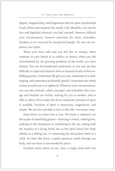
Although you can’t tell from the illustration, this book, which retails for $16.00, is printed on one of the cheapest kinds of paper you can find. Really, it’s one step above newsprint, or the groundwood papers used in mass market paperbacks.
Now, that might be fine for a thriller or vampire romance the reader is likely to read once and then recycle, but Kornfield’s book is more likely to gain a treasured spot on the reader’s shelf, and be referred to often.
I can tell you that it would have cost the publisher a few pennies per copy to step up to a better grade of paper, but in conglomerate publishers many decisions like this are made by financial staff, not production editors. And that’s a shame.
Over to You
So now you’ve seen some of my book design pet peeves, the things that put me off a book I might otherwise have really enjoyed.
What about you, do you run across books with defects that have nothing to do with the content, and everything to do with making bad design choices?
I’d love to hear, so let me know in the comments, and if you have a screenshot or photo of the offender, I’ll post that too with credit to you.
Let’s make better books!
