


Welcome to the e-Book Cover Design Awards. This edition is for submissions during June, 2017.
This month we received:
77 covers in the Fiction category
19 covers in the Nonfiction category
Comments, Award Winners, and Gold Stars
I’ve added comments (JF: ) to many of the entries, but not all. Remember that the aim of these posts is educational, and by submitting you are inviting comments, commendations, and constructive criticism.
Thanks to everyone who participated. I hope you enjoy these as much as I did. Please leave a comment to let me know which are your favorites or, if you disagree, let me know why.
Although there is only winner in each category, other covers that were considered for the award or which stood out in some exemplary way, are indicated with a gold star: ★
Award winners and Gold-Starred covers also win the right to display our badges on their websites, so don’t forget to get your badge to get a little more attention for the work you’ve put into your book.
Also please note that we are now linking winning covers to their sales page on Amazon or Smashwords.
Now, without any further ado, here are the winners of this month’s e-Book Cover Design Awards.

e-Book Cover Design Award Winner for June 2017 in Fiction
James Egan submitted Pulped designed by James T. Egan of Bookfly Design.
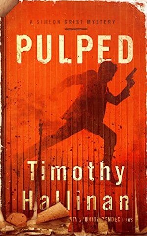

JF: The heavily stressed cover looks like it’s been put through a shredder, even annihilating some of the text at the bottom. But the energy, intensity, and clear message delivered in layers of meaning make this cover a true winner.
e-Book Cover Design Award Winner for June 2017 in Nonfiction
Glyn Haynie submitted When I Turned Nineteen: A Vietnam War Memoir designed by 1106 Design. “The cover picture is of me as a 19-year-old soldier in Vietnam which contrasts my youth to a battle hardened veteran.”
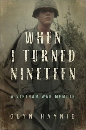

JF: One of the most successful covers I’ve seen based on an old personal photo. The font choice and layout, as well as the softened photo, make a great impression.
Fiction Covers
Aaron Carpenter submitted The Ending is Everything designed by Aaron M. Carpenter. “I wanted a cover that evoked the genre, yet hinted at something more. The light of the event and the shadow of the character. I created the cover in Photoshop.”

JF: I get the concept, but the result really looks raw.
Alexander Charalambides submitted Black Blade designed by Mina Chara. “The brief was to depict an event from the story, the finding of the sword, which would show right from start, that this is a different type of story about the sword Excalibur, set firmly in the modern day, but tied to the past – the author wanted an element of kitsch and chose the cheesy font.”

JF: Not sure turning the font selection over to the author was a winning idea, and the main point of focus of the cover is pushed so far back it’s barely relevant.
Andrew Anzur Clement submitted Keepers of the Stone: Book Two: Exile designed by Andrew Anzur Clement. “The design incorporates the mystical stone in the title. The background is meant to give the cover a dark aged feel & reflects the travel-log nature of the plot. It features the story’s protagonist-antagonist character & one of the protagonists (who can turn into a cat). Both introduced in book 1.”

JF: Murky and awkwardly assembled.
Andrew Orange submitted The Game of VORs designed by Dane Low.

JF: A clear and clean cover for this sci-fi story.
Andy Conway submitted Bright Star Falling designed by Sean Strong.

JF: A strong cover that balances lots of elements without losing focus on the woman at the center. That “branding” hand in the bottom is really off-putting, unfortunately, and completely out of sync with the rest of the cover.
Ankit Kadam submitted Tussle designed by Tatiana. “The cover design captures a glimpse of the universe of the consciousness of the protagonist in which an idea of digital resurrection is born from the sea of ideas. As this idea emerged from the deep sea of ideas, a digital personator assumes a personality which emerges from the dark web.”

JF: Evocative.
Annie Arcane submitted Hart Broken: A Wounded Hero Romance designed by Annie Arcane. “Hmm… This cover has been redesigned seven times. Finally satisfied with it haha! Thank you so much for even considering!! ^_^ Hugs, Ann”

JF: Nice series design, and I think this one is the strongest because the male character engages with us. I like the restraint that allows the message to come through clearly. Would have liked to see what these would look like with the title in red.
Annie Arcane submitted Hart of His: A Wounded Hero Romance designed by Annie Arcane. “Book 2 of the Cale & Mickey series.”

Annie Arcane submitted Hart of Hers: A Wounded Hero Romance designed by Annie Arcane. “Book 3 of the Cale & Mickey series. My personal favorite ^_~ Thanks again!! x”

Arjay Lewis submitted Fire In The Mind designed by Marianne Nowicki. “This is a novel of supernatural suspense, featuring a psychic lead character with a crippled leg. I loved this design as it shows the character with his cane, surrounded by ephemeral wisps of energy to signify his paranormal awareness.”

JF: I missed the cane at first because the figure is so small, but this cover does have impact.
Bernadette Pruitt submitted Oldies but Goodies designed by Bernadette Pruitt. “The cover design is my own, based on the book’s characters and plot. The cover is a composite of photographs (live models were used), which I put together with Photoshop.”

JF: The image has possibilities, but the typography is very amateurish, and it weakens the whole cover.
Cecelia Mecca submitted The Lord’s Captive: Border Series Book 2 designed by Kim Killion. “Thank you!”

JF: A solid genre cover with some great details. The variety of type treatments is a bit dizzying.
Charles Dyer submitted Abatwa designed by Charles G. Dyer. “I used 3d models to create a typical scene from the book with a photographic background. The title font is Ameno and the author is Franchise with the subtitle in Ariel. Some people say that fonts should not have bevels or shadows. I used a subtle shadow to improve contrast and legibility.”

JF: Although I respect the work that went into these covers, they show not even a hint of professionalism and were obviously self-published, a result that will not help prospects for these books.
Charles Dyer submitted River God designed by Charles G. Dyer. “The background is a real Irish river with a 3D model of an ancient water mill. Fonts used were – Liberation Serif (author), St Charles (title) and Calibri (subtitle). I used a single pixel outline on the author font because of contrast issues and I didn’t want a dark color fr the text.”

Cheryl Carpinello submitted Guinevere: At the Dawn of Legend designed by Berge Design. “This is book 2 in a trilogy. The overall design and colors to chosen to be compatible with book 1 and to reflect the magic of legend.”

JF: The illustration is terrific and the strongest part of the cover, but I bet it would be a whole lot better if the branding “ribbon” was at the bottom, allowing the title and art to breathe and receive the main focus of attention.
Chris Diamond submitted The Lioness of Exeter designed by Chris Diamond. “This is a period romance novel. The hero of the book spends a length of time in the forest fending for herself with nothing but a dagger. I thought I would capture that on the cover.”

JF: I really like the layout and palette in this cover, and especially the creative typography used on the title, but I wish you had “zoomed in” on the figure a bit more, it is pretty distant from the viewer.
Chrissy Lessey submitted The Coven designed by Anita Carroll.

JF: Pretty but confusing, with a hard-to-read title. “Coven” also doesn’t immediately seem related in any way to this happy light blue color.
CYNTHIA ADINA KIRKWOOD submitted TURN ON, TUNE OUT designed by CYNTHIA ADINA KIRKWOOD. “Los Angeles is a character. Computers have hijacked lives. Graffiti “Los Angeles”; light trails (computer connections); illuminated towers (look good in thumbnail or paperback); white larger font TURN ON and black smaller TUNE OUT, and two descriptive lines in opposing colors.”

JF: Looks more like nonfiction, and not very well designed nonfiction at that. Start over or hire one of the great professionals whose work you see here.
Cynthia Vespia submitted Karma designed by Ka Rolding (character design) and Original Cyn Creative Services (titles).

JF: Lots of style, would have liked to see her face more clearly.
Dan Van Oss submitted The Nemesis Cell designed by Dan Van Oss / CoverMint Design.

JF: Solid sci-fi cover.
Dan Van Oss submitted Zollocco designed by Dan Van Oss / CoverMint Design.

JF: A really evocative, beautifully put together image excites us about the story inside, and simple but effective type seals the deal. ★
Dan Van Oss submitted The Hit-and-Run Man designed by Dan Van Oss / CoverMint Design.

JF: A good thriller cover, but I found the two shadows at the bottom and the erratic burnt edges added a bit of confusion.
Dan Van Oss submitted Girl With A Secret designed by Dan Van Oss / CoverMint Design.

JF: Fully controlled eyepath, a strong and engaging image, and expert typography make this cover stand out.
Dan Van Oss submitted Engaging The Dragon designed by Dan Van Oss / CoverMint Design.

JF: Aimed squarely at fantasy fans, and you have to admire the font used in the title treatment.
Dane Low submitted Cat in a Bag designed by EbookLaunch.com.

JF: Stylish and effective, and that mask is a brilliant branding element.
Dane Low submitted Shadows of Valor designed by EbookLaunch.com.

Dane Low submitted A Wall for Teeth and Stingers designed by EbookLaunch.com.

JF: You can almost hear the buzzing when you look at this cover, it’s a great “hook.”
Dane Low submitted Death Jars of Broams Eld designed by EbookLaunch.com.

JF: Beautiful, atmospheric, balanced, and engaging. What more can a cover do? ★
Dane Low submitted A Trinity of Wicked Tales designed by EbookLaunch.com.

JF: Looks deliciously wicked, with expert type handling including the cool warping of the title.
Dane Low submitted The Terror of Miracles designed by EbookLaunch.com.

JF: Great art combined with classical typography
Deborah Coonts submitted Lucky the Hard Way designed by Andy Brown.

JF: It works.
Elizabeth Raven submitted Matanzas Moon: Ablaze designed by Elizabeth Raven.

JF: The shock factor of the woman’s bizarre face works to attract our attention, along with the mysterious finger she’s pointing at herself.
Erik Carter submitted The Clements Kettle designed by Erik Carter. “While these mysteries are set in the American West, I didn’t want the covers to look at all like Louis L’Amour or Longarm novels. So, after pondering it forever, I finally decided to use a stark background with a simple vector art representation of Western iconography for each book.”

JF: A creative solution that telegraphs your setting without relying on visual cliches. In the west we recognize the scorpion on the cover, not sure if others will identify its regional origins, but the series looks great.
Erik Carter submitted The Preston Emerald designed by Erik Carter.

Farah Oomerbhoy submitted The Rise of the Dawnstar designed by Scarlett Rugers.

JF: A complex, challenging image somewhat undone by type that’s just too hard to read.
Gergő Pocsai submitted The Genetic Imperative designed by Gergő Pocsai.

JF: I’m wondering if this font was lacking a lowercase “t”? Dynamic style, but I’m not sure I would know what this book is about.
GG Atcheson submitted The Legacy: Dax designed by Yanik Dallaire. “A science fiction partly set on a planet where everything, including the inhabitants, is in hues of titian. The font used in ‘The Legacy’ serves to link the books in the series together.”

JF: An interesting visual ruined by absurdly bad font choices, especially when compared to the slick, futuristic world the cover pictures.
Ingrid Seymour submitted One Wish Away designed by Tara O’Shea.

JF: Lovely textures, atmospheric effects and sensitive typography add to the air of mystery so well evoked by the art.
J.H. Moncrieff submitted City of Ghosts designed by Kelly Ann Martin. “Going for a mysterious, eerie vibe that highlights the Chinese setting, the ghostly element, and the protagonist. Kelly hit it out of the park. She’s a phenomenal artist.”

JF: Both eerie and ghostly, and it all hangs together quite well, creating a unified message.
James Egan submitted Double or Nothing designed by James T. Egan of Bookfly Design.

JF: Fantastic textures and stressed details highlight the dynamic composition of this cover that forces our edgy attention on the steaming knife at the center. Great stuff. ★
Jamie Ferguson submitted The Faerie Summer designed by Jamie Ferguson. “My goal was to create a cover that conveyed both a sense of magic and summertime to fit the ‘faerie summer’ theme of this short story collection. The winged fairy sitting on flowers much larger than her captured that feeling, and I tied in the font with a dark pink color selected from the flowers.”

JF: Good solution for an anthology (those are all author names in the unreadable little type) and you really have to enlarge it to appreciate the lovely faerie at the center and the floral details that make the scene delightful.
Jefferson Smith submitted All These Shiny Worlds II designed by Jefferson Smith. “It’s always a challenge to design a cover for an anthology, because there’s no single image that can sum up everything inside. So instead, I went for a celebration of the stories themselves, as a collection, hoarded by an old bard, to be displayed around the midnight campfire with a bit of drama.”

JF: With anthologies you want to communicate the genre and the presence of lots of voices, and I think you’ve clearly accomplished both of those tasks.
Jennifer Hallock submitted Tempting Hymn designed by Stephen Wallace. “This is the third in a historical romance series, and all the books have the same style with black background. In print, the black is a “soft black,” but online we use the full black for contrast.”

JF: The provocative art is the main draw. Note the subtitle is unreadable at this size.
Jim Martin submitted Dark Nights On Shadow Lake designed by Jim Martin. “In keeping with the title, I wanted the convey mystery and foreboding, serving as a representation of the darkness which grips the town, and providing a shadowy glimpse of the storied witch who cursed the town in the 19th century and is rumored to still lurk within the woods surrounding Shadow Lake.”

JF: Simplicity really helps this atmospheric, well designed cover, but I don’t see the witch anywhere. Is it just me?
Joanna Huntley submitted The Bearded Shadow – New Recruit designed by Design M. “A vibrant and eye-catching children’s eBook cover design, which is aimed at 8-11 year olds. The requirements were that it use the colour red and feature the story’s main character.”

JF: Cute cat. The heavy outline on the top title makes the bottom one look unfinished.
Jordon Greene submitted Anywhere But Here designed by Jordon Greene. “I was looking to create something simple that still portrayed the fear in the story.”

JF: Imaginative and arresting, although the subtitle gets a bit lost at this size. ★
K. Fletcher submitted A Boon for Baphomet designed by K. Fletcher. “The novella plot revolves around a statue of Baphomet; the cover’s focus on the Space Needle combines a sly nod to the mythic goat-headed figure’s iconic torch as well as to the story location: an alternate future Seattle. Rexalia + Jura were selected as typefaces expressing the cyberpunk aesthetic.”

JF: The surrealistic goat’s head and weird color scheme definitely set the tone for this story, but it looks like the title could have used some help to stand out a bit more.
Kaelan Rhywiol submitted ILAVANI designed by Kaelan Rhywiol. “I have a graphic design minor, and have been doing it for 20 years, only about 3 of those for book covers. This cover is several layers, all images sourced/purchased from adobe stock. It took roughly a week to make. It’s a science fantasy romance. Thank you for the fantastic site.”

Kate Stead submitted Adam Exitus designed by Nicholas Abdilla. “The cover is designed to reflect the comic/graphic novel origins of the story. It also aims to link the X on the character with the X in the book title to highlight the importance of this for the book.”

JF: Graphically strong, but I think it would have been stronger if you eliminated the line of shadowy alien figures, you already have enough of the story without them.
Kathy Denver submitted Forest of Ancestors, (The Guardians Series, BOOK ONE) designed by Kathy Denver – The Cover Girl. “I am an indie author with a dash of OCD (one of the reasons I have not even thought about traditional publishing). I make my own covers using Photoshop (I am self-taught and am still learning).”
")
JF: The strong lighting effect that seems to pin the man to the background is very effective, and the font choices are spot on.
Katie Stewart submitted Son of the Sixth designed by Katie Stewart. “The author wanted a cover that would give a better feel for the YA Fantasy genre of the book.”

JF: Some interesting visual elements that somewhat relate to each other, but the typography doesn’t seem to acknowledge the genre of the book.
Kimberly Meehan submitted Battle for the Canal designed by Kimberly Cynthia Meehan. “Battle for the Canal is named after a neighborhood event in Van Bakel Beach, Brooklyn (real neighborhood is called Gerritsen Beach). This image is of the marinas which line Plumb Channel which is part of the waterway system and canals of the beach.”

JF: Essentially a series design (see the two following), these covers start with good ideas but get awkward quickly. One wonders why the vertical stripe is a different width on each cover, the quirky color choices, and the old fashioned typeface chosen for the titles.
Kimberly Meehan submitted Rockaway Run designed by Kimberly Cynthia Meehan. “The clock imaged is at Jacob Riis Park – one of the most popular public beaches in the Rockaways. It is iconic for the location and the starting point of the book’s theme – a “marathon” in the Rockaways which is really a hoax event meant to rip people off.”

Kimberly Meehan submitted The Coney Island Hot Dog Heist designed by Kimberly Cynthia Meehan. “The primary image used on the cover was manipulated from an image taken at the Coney Island Mermaid some years ago. The climax event of the book occurs at and during this annual event.”

Marie Deaconu-Baylon submitted North for Sun designed by Marie Deaconu-Baylon and Cosmin Deaconu. “I made this oil painting when I was deeply depressed and had dropped out of college twice. The painting is now the cover of my debut novel. I based my book on my experiences living with mental illness.”

JF: With all due respect for your suffering the the efforts to recover, this is a classically bad decision because while the image is meaningful to you it has no meaning to anyone else. The out of touch typography confirms the amateur nature of the design. Rule #1: We design covers for buyers, not to please authors.
Martina Potucek-Palladino submitted MARTINKA, “Thru Eyes of REM…” designed by Whendell Souza.

JF: The very sexy illustration almost makes you forget the lackadaisical and hard to read type.
Michael Fleming submitted Ada: Solstice Volition designed by Michael J. Fleming. “I drew inspiration for this design from the flat colors and clean lines of book covers from the 1930’s. Aiming for a minimalist design that is distinct even at the tiniest thumbnail sizes, the cover depicts a key character moment from the climax of the story.”

JF: It is very legible. Not sure how well the sans serif font matches the fantasy element, but it works for sci-fi.
Michael Melville submitted The Diner – The Oregon Series: Book Two designed by Victor Fuentes.

JF: Visually confusing.
Natasha Snow submitted The Simplicity of Being Normal designed by Natasha Snow.

JF: Delicate and effective at evoking a mood.
Natasha Snow submitted Awakened Spells designed by Natasha Snow. “Thanks!”

JF: Strong layout that focuses on the woman at the center and the magic of her spell. The colors seem odd and the title, which has strong typography, loses contrast by being too close to the colors around it.
Natasha Snow submitted Land of the Dogs designed by Natasha Snow.

JF: Makes the point with an interesting perspective, but at a glance it seems to say “Land Dogs.”
Reese Inman submitted Big Deck designed by Reese Inman. “In the words of one reviewer who loved the book and gave it five stars, “I have to admit that I chose this book because of the cover. Who wouldn’t?””

JF: Its appeal is rather blatant.
Rhian Waller submitted Ship Rats designed by Rhian Waller. “I am pretty much a design neophyte, so this process involved teaching myself how to use several types of software. I wanted something crisp, simple, nautical and cute. The ratty was originally hand drawn from a reference picture I took of my pet rat then digitised in Photoshop.”

JF: So you’ve written a book about rats, and you have a pet rat? Cute. Cover, not so much. Hire a pro unless you intend to really put in the time to teach yourself design. This one won’t help sell your book.
Sean-Paul Thomas submitted The Old Man and The Princess designed by Sean-Paul Thomas. “I bought the image from Shutterstock and then put the rest of the cover together myself.”

JF: Yes, I see. A tip: the balance is off because the illustration has been given too much leeway, making the type less relevant to the cover.
Shelley Schanfield submitted The Mountain Goddess designed by Streetlight Graphics. “Glendon Haddix does it again. I wished for a cover as riveting as for my first book, The Tigress and the Yogi, and he came through. Gold filigree and the design elements of the eyes link this second book in a trilogy to the first. Readers have commented on how those eyes drew them in.”

JF: Her eyes are very attractive, but the cover seems split because it’s difficult to combine the very “cold” mountains with the “warm” woman’s face. The title looks overworked.
Shirish Jugare submitted Dreamy and the Swami designed by Manoj Vijayan.

JF: This cover really stands out for its clear and graphic communication, deceptively simple illustration, and great layout. ★
Shoshana Brand submitted The English Teacher Comics: Epic School Life- Issue 1 designed by Shoshana Brand. “Congratulations on your great e-book cover design idea! Thanks-Shoshana Brand”

JF: [sigh] It looks like exactly what it is… a very rough sketch by someone with limited artistic ability. Start over or hire a cover designer, there are plenty right here on this page!
Summer Munger submitted The Crossing of Bridges designed by Staci Richards.

JF: Another deceptively simple design that has an unmistakable pull due to the human connection and the questions that arise from the title.
Tanja P. submitted Silverglen designed by Tanja P. Bookcoverworld.

JF: A beautifully rendered fantasy cover the puts the owl at the center of the cover and visually communicates the energy it is generating. ★
Tanja P. submitted Verliebt aus Heiterem Himmel designed by Tanja P. Bookcoverworld.

JF: Well targeted cover for the lighthearted romance genre with great color control, and I love those little hearts on the tree.
Tonya Kerrigan submitted Blood Promise designed by Germancreative. “I wanted a cover that related to the book – a woman with a sword who fights creatures. Germancreative had me go to a site and choose a picture. She then cropped it, turned it around and added the other elements in based on my blurb. I was extremely happy with the cover.”

JF: It’s a strong image, the type seems to have been simply layered on top.
Valerie Brooks submitted Revenge in Paris designed by Ana Grigoriu-Voicu. “I gave Ana a basic design and the photo. She took it from there.”

JF: Pro-quality typography with an image that’s emphatic in black and white. Although I wonder what it would look like without the red band at the top.
Veronica Dale submitted Dark Twin designed by Christa Holland. “This is book two of the four-part series Coin of Rulve, for which Christa has designed the same frame. It incorporates symbols important to the story arc. The book is about twins, so she used the same model with modifications to differentiate them.”

JF: To be honest, I think the frame with its lovely details is the best part of this serviceable cover.
XIO AXELROD submitted Camden designed by Lou Harper Designs. “We went for an almost graphic novel feel for this one, starting with a black-and-white photograph and working from there.”

JF: This cover is so compelling it overcame my resistance to vertical type, and my preference for figures to be facing right (where the book opens). The determined figure of the man, with the city in the distance and careful type treatments guarantees it will have an impact. ★
Yvonne Less submitted Unwritten Rules designed by Yvonne Less. “I created this fantasy book cover for the author Adam Horne with 3D, a stock image and photo editing software.”
JF: It works, creating a good fantasy atmosphere, although the title could have been a bit more prominent.

Nonfiction Covers
A. L. Bryant submitted The Truth About White Supremacy, Sexism, and Mind Control in America designed by A. L. Bryant. “The colors emphasize the black and white races. The orange represents other races. The mind control theme is emphasized with the slanted word “Mind Control” in the MindPlay font, and the two heads with brains communicating thoughts. Both heads are the same with no defined sex to appear asexual.”

JF: Looks like an amateur production, which I’m sure it is.
ajit roy submitted Surprising Mind Blowing Facts and Figures of Big Data (Revised): Big data Statistics (Big data-Series-2 Book 1) designed by ajit roy.
: Big data Statistics (Big data-Series-2 Book 1)")
JF: Does this make any sense at all?? It’s a book of statistics??
Amanda Ross-White submitted Joy at the End of the Rainbow: A Guide to Pregnancy After a Loss designed by Kellie Wright. “This book is designed for women who are pregnant after a previous loss, so it really needed to capture the mix of emotions a woman might be feeling: happy, yet mournful, excited yet fearful, etc. Kellie created a few mock ups that we tested on our facebook page to test with our audience/create buzz.”

JF: It’s a great idea to test your covers as long as you have a large enough sample of people who will be the target market for the book. This is a strong and creative design, but the bottom section loses me a little because it’s feeding onto the page, and the two type elements create unnecessary tension because they seem to be opposing each other and there’s no clear hierarchy to the information they present.
Aurora Seraph submitted Diary of a Dad designed by Aurora Seraph. “Dad vs Mum. Man vs Evil. A battle with darkness”

JF: Dark vs. light. Day vs. night. We could go on, but it won’t rescue this murky and weak cover.
Beth Tancredi submitted Pursuing My Wonderful designed by Kelly McGovern. “I was looking for a fun comparison that really tied analogy of post-divorce dating (online dating specifically) to starting a business. I ran a rough concept of lipstick on a laptop by Kelly and she ran with it.”

JF: Comes across as rather awkward. Did you consider making the monitor much larger and scrawling the entire title in lipstick?
Cathy Wild submitted Wild Ideas designed by Gina Bostian. “I was the art director for this cover; that is to say, I created the concept and the art used on the cover was created by me. Gina Bostian implemented the design.”

Dane Low submitted The 1-Hour College Admissions Essay: A Simple Path to a Successful Personal Statement designed by EbookLaunch.com.

JF: Perfectly targeted to its intended market, and expresses the concept of the book in the simple graphics that anchor the design. Nice. ★
Fabian Geyrhalter submitted How to Launch a Brand (2nd Edition) designed by Leah E. Bisch. “We visualize the idea of transforming start-ups into powerful brands.”
")
JF: Clean and well positioned for business readers.
Gustavo Razzetti submitted Stretch for Change designed by ebookLaunch. “Everyone wants to change but have a hard time changing. You can prepare for it. Just as you stretch your muscles before playing sports. A rubber band ball is a rigid object yet it’s made out of flexible elements. It creates a tension with the name of the book without necessarily showing the stretch”

JF: A terrific cover that makes its point with simplicity and expert type handling. ★
Jacqueline Simonds submitted Mentoring Intentional Excellence designed by Beagle Bay, Inc.. “When we were developing the book with Mr. Stewart, he mentioned he wanted to help “Lift up” people who were wondering how to deal with their corporate careers. The moment we saw the balloons image, we knew it was right for MENTORING INTENTIONAL EXCELLENCE.”

JF: I think you were right on with the hot air balloons, but the typography is weak and the cover never comes together.
Jen George submitted Playful Roses designed by myself. “The artwork is drawn and designed by me.”

JF: Might be the first coloring book cover we’ve had entered here. The illustration looks interesting, but as a book cover not sure I understand that heart in the middle of the title, and the background color seems strange.
Jessica Bell submitted Dear Reflection: I Never Meant to be a Rebel designed by Jessica Bell. “Designed by the author. Other books by the author are also branded with the same design.”

JF: This cover really stood out for me. Maybe it’s the combination of the hot colors, the intimacy of the moment shown, and the interesting type choices, but it seems pregnant with interesting and possibly erotic events. ★
Jim Bay submitted Miracle On Hammertown Road designed by Hudson House Publishing. “I fell off a road and was injured very badly and I met God in the process. I also had two kids die and the book is a flash back book of my life. The cover represents the road I fell off and also is symbolic for the journey of my life. Hudson House nailed what I wanted on the first design.”

JF: Does a good job of bringing all your themes together and promising a good story.
Patti Shank submitted Write and Organize for Deeper Learning designed by Patti Shank, PhD. “I developed my own cover as I had a fairly quick turnaround needed. After using Joel’s interior templates with great success, I decided to try my hand at doing a simple book cover as well. It’s selling well and people have told me they like the cover.”

JF: Patti, glad you found our templates easy to use, thanks. But if your book is selling well with this cover that has very little impact, I’m betting it would sell a whole lot better with a stronger cover. Just a thought.
Shawn Flynn submitted THE KITTY Who Rescued Me After I Rescued Him designed by Shawn P Flynn.

JF: Aw, who doesn’t love cats? This amateur cover makes it clear what you will find inside.
Tanja P. submitted and then there were four designed by Tanja P. Bookcoverworld.

JF: A delightful cover for this helpful book on adoption, with the type and illustration in perfect harmony. ★
Tanja P. submitted Fiction in a Weekend designed by Tanja P. Bookcoverworld.

JF: Clean and apt, if low-impact.
Teresa Kocudak submitted The Ostrich Paradox: Why We Underprepare for Disasters designed by Michael Rehder. “One might guess the cover evokes the metaphor of the ostrich as a flightless bird who buries its head in the sand when faced with danger. In reality ostriches offer an example of risk adaptation: a bird that has developed survival tools that allow it to overcome its many endowed handicaps.”

JF: Very awkward. Looks like it was assembled from odd bits that have no relation to each other. Start over.
