

So far the Apple iPad is turning out to be anything but a fad. As Wired magazine’s Eliot Van Buskirk reported last month,
“One million iPads in 28 days — that’s less than half of the 74 days it took to achieve this milestone with iPhone,” said Apple CEO Steve Jobs. “Demand continues to exceed supply,” he claimed, “and we’re working hard to get this magical product into the hands of even more customers.” . . . Regardless, this announcement marks a big vote of confidence by consumers. Nearly one out of every 300 Americans already owns one of these devices.
Apple’s original estimate of 5 million iPads sold in 2010 is well on its way, and it’s only June. I foresee a lot of flat boxes under the tree this holiday season.
Periodical publishers have been as eager for the introduction of a full-color, multi-media tablet as anybody else who publishes content on paper, perhaps more so. Everyone’s looking for a new way to deliver their signature content to readers in the face of subscribers fleeing to free, web-based content. This raises the real fear that your publication will lose its franchise as your subscribers create new brand loyalties.
One of the first to show a new form of content delivery was Sports Illustrated, with a very fluid demo of what a digital “magazine” might look and act like, and it was pretty heady stuff. Now magazines have made the first steps onto this remarkable new platform. I thought, as publishers, we can learn something from the steps—and missteps—the pioneers will make. I looked at two very different releases for the iPad, each connected to a print publication with a serious franchise.
Here’s what I found.
Wired Magazine App for the iPad

Wired Magazine issued a complete electronic version of their June issue, to much fanfare. They chose to package the issue as an app, sold through the App Store for $4.99. The app takes a massive 527 MB, over half a gigabyte just for the one issue. On a 16 G iPad this is not a trivial amount of space.
The app, which launched to much fanfare and excited talk, is basically a canned version of a print publication. Wired has outstanding editorial design, sophisticated typography, precise graphics and picture placements, and luscious advertisements.
Given the limitations of the platform, the only way these elements could be displayed is in an app, where the whole publication is fixed as pages of graphics that you navigate by swiping. There are, as in the print magazine, a large number of ads.
How did Wired use the capabilities of the iPad? There are numerous “interactive” elements. Most of them are connected to ads. There are many videos you can play in place, buttons to press to rotate content within the window you’re looking at. There are animations and other effects. Want to watch one of the latest Intel commercials? It’s right here.
The entire production comes off as very slick, and very canned. Despite the profusion of buttons, I felt like an observer, not a participant. There is, however, one area where you get to play a kind of guessing game.
Unfortunately, that area is the page navigation. The designers have assembled Wired’s beautiful fixed pages into a kind of strange tree diagram. From any page, you might be able to scroll right, scroll up, scroll down. But not from every page. How do you tell the difference? Good question! There are very few navigation cues, so you end up swiping every page in every direction tring to uncover the hidden content or the continuation of the story.
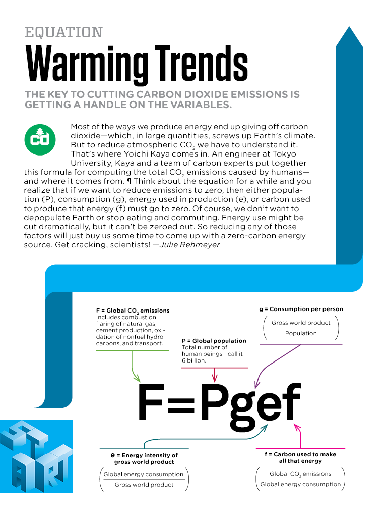
Check out the page above, “Warming Trends.” You’ll see a blue “start” box and a blue ribbon running through the page. Do you think the blue navigation ribbon pointing up means there’s content up there? Fooled you! There’s nothing there.
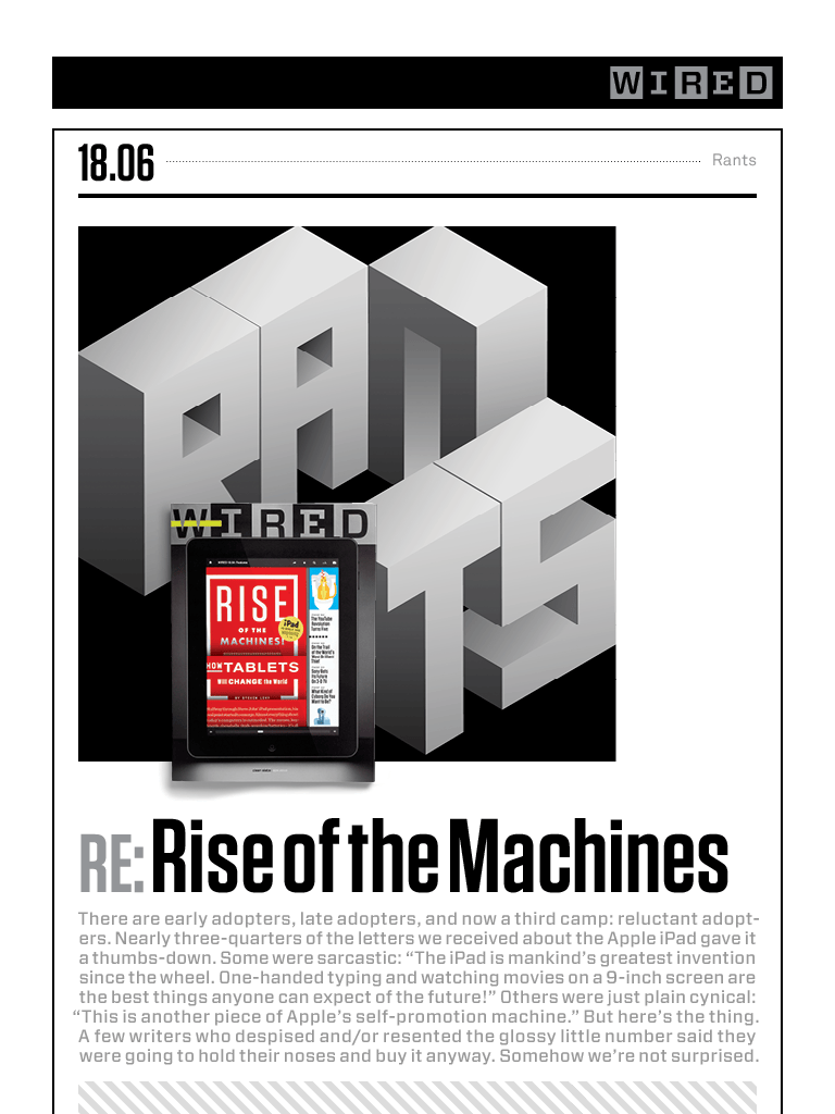
The other page, “Rise of the Machines” is early in the magazine. From this page you can go right or go down to more editorial content. See any way to know that? No, I didn’t think so. This interface is incredibly irritating. This irritation is punctuated by ads, many with meaningless buttons to play with. Other buttons, that look similar, do nothing, and you end up feeling a bit foolish poking the screen to absolutely no effect.
I will say, the Wired app has the coolest scroll bar, where you can see thumbnails of each page as you run your finger along the bottom of the screen. Other than that, it came across as a beautiful, clueless corporate production.
Virginia Quarterly Review (VQR)

This “National Journal of Literature and Discussion,” published since 1925 by the University of Virginia, has a different kind of franchise. They have just published their Spring 2010 issue on the iPad, but under the direction of Web Developer Waldo Jaquith, they have gone a different route and created an ePub file, for sale in iBookstore.
Now, you might think that this is a suicidal move for a publication that carries advertising and regularly shows illustrations and photographs in their editorial matter. We’ve seen some of the terrible-looking ePub files being produced, and the disappointing iBooks typography of the books in the iBookstore, no matter who publishes them.
But VQR has made the transition to ePub brilliantly, and their publication is far and away the best I’ve seen on this platform. There is nothing Jaquith and company can do about the limitations of the ePub format, but here they show just what is possible with attention to detail and painstaking care.
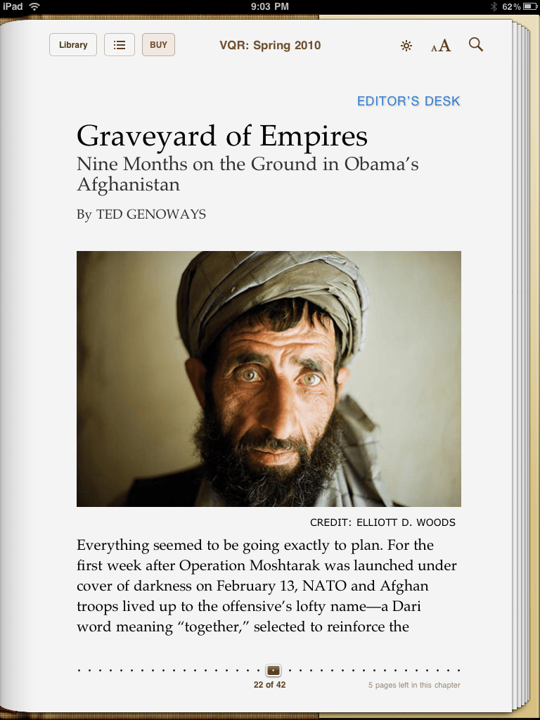
Obviously, we are in the familiar iBook environment. But it’s been adapted to the purposes of a magazine. Even the page above shows how careful this ePub conversion was done. First of all, we’ve got rag right composition, defeating the awful full justification-without-hyphenation common in iBooks. This is enough to improve the overall look of the page considerably.
But the careful ordering of the iPad fonts, the type sizes, the arrangement on the page, is calmingly logical and orderly. There are no buttons, videos (that I saw anyway) or commercials. You page through the story as you would an iBook. There are ads, and the ads are hot-linked so you can go directly to an advertiser’s site in Safari, but that appears to be the limit of the interactivity.
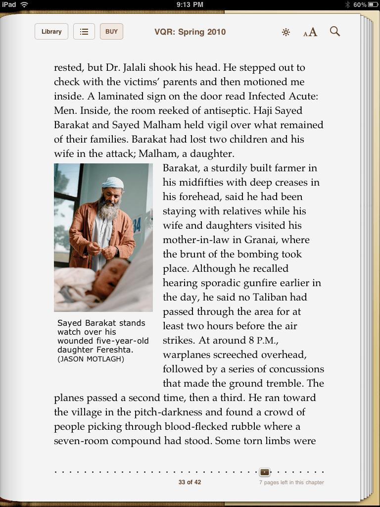
In the interior page above, you can see the placement of a spot photograph along with its caption. Just seeing this page in ePub really raised my spirits. Maybe there is survival for typographers in an ePub world.
Two Completely Different Experiences
These two publications couldn’t be more different, and I encourage you to take a look at them if you have an ePub reader. For me, the choice was pretty clear.
No matter how much I admired the artfulness and typographic beauty of the Wired pages, I felt lost in a corporate maze, with only the stylized prose to keep me company.
Reading VQR was the first enjoyable experience I’ve had with an iBook. It achieved one of the goals of publication design, at least in my mind: to present the story in such a way that the reader has unimpeded access to the fulness of the author’s intent. The iBook environment in this case worked in VQR’s favor, and the calm design did a superb job of transmitting the writing. No bells and whistles, but a great and humane reading experience.
VQR really makes me more optimistic than I have been for some time. And if you really need a bolt of inspiration, fire up Safari and take a look here.
<
p class=”note”>Takeaway: The first two magazines on the iPad—Wired and VQR—show completely different approaches to the platform. VQR looks like the clear winner.
Resources
Wired: “Apple iPad Reaches One Million Sold Twice as Fast as iPhone”
Wired Magazine: June 2010 $4.99, 527 MB
VQR Now Available for the iPad By Waldo Jaquith and Kevin Morrissey, $3.99, iBookstore
