Everyone wants to join the ebook revolution, from what I can see, and ebook covers are a big part of that potential success. More books are going “straight to digital” the way films used to go “straight to video.” You can almost hear people scratching their heads, wondering, “Why should I deal with the cost of a printed book? Is anyone still buying them?”
Rationally, we know that print books continue to make up the vast majority of the market, but the momentum seems to be all on the digital side. Displays of digital ebook readers face the doorways of many of the retailers we’re headed for before the holidays. Amazon, Apple, Barnes & Noble, and Samsung are on television with their devices.
And more people are asking about converting their books to ebooks. New projects are starting off with an eye to being sold online anyway.
Going for a Walk on the Other Side of Town
I took a stroll over to the Kindle store to do some browsing in the granddaddy of the ebook stores. Looking through the “Top 100,” it’s remarkable how many different forces are at work in presenting ebooks. I picked out a bunch of covers to take a closer look at.
Some of these clearly are winners—they’ve made the leap to a different format successfully, and do a great job of selling their books. Others . . . not so much. Take a look.
Samples from the Top 100
You see these covers in two formats, like the rest of Amazon’s displays. A page of search results will show very small thumbnails—60 x 90 pixels—that are extremely challenging to carry off as any kind of good design.
When you go to the product detail page, you’ll get a larger—300 pixels high—image, which makes it a lot easier to see the covers. In some cases, I have both versions for you to look at.
This title exhibits the most common failing of ebook covers I saw in the Kindle store: complete fidelity to the print book covers. You’ll see more below, but no matter how lovely this cover is in print, it fails even at legibility in the small preview size.

On the other hand, here’s a book that sticks with the design of the printed work for a good reason: the book is widely known, and the cover design is instantly recognizable.
Another book in the same category. This series is world-famous, and a publisher would be nuts to change the cover now.
It seems like the thriller writers have the easiest time making the transition to ebooks. Here, the design is so graphic, simplified, and typographically distinct that the book works at every size.
Another thriller with a similar design showing just how effective this is, even at the tiny size of the search results images.
Here’s an atmospheric cover with typography and a scene that becomes unreadable at small sizes.
Another, similar set of problems.
Here’s a book that’s delightfully delicate and effective in print, but never should have just been dumped onto an ebook cover, at least if you care whether people can read it.
Another wrinkle of the Kindle store is that games and “adventure texts” get lumped in with books in these lists. You can see that behind the simplicity of this graphic, unconstrained by any pre-existing book cover or any other “real” object, is a great communication. Forget books, it grabs your attention and packs a lot of “information” into a small space.
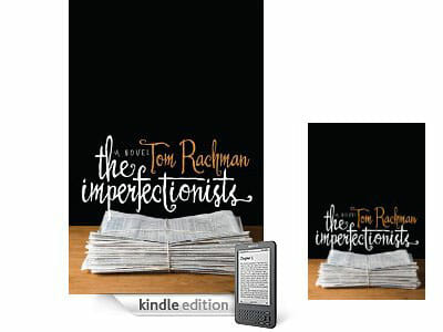
Here’s an example of a great print book cover that fails as an ebook preview. In the small size, the distinctive typography just about disappears into illegibility, and the most valuable real estate on the cover—the top half—is just a black rectangle. In the larger image, enough detail is restored so you can see the cover well. Works in one size, not in the other.
Here’s a cover that works wonderfully in both print and ebook, and for good reason. Balanced, strong typography and graphics that clearly signal both the subject matter and tone of the book.
And one last book that works really well online. The light touch, clear color scheme, and simplified graphic messaging all work to create a recognizable and attractive “book” cover.
I think even this short tour of the Kindle store shows me that the most common mistake publishers make is simply dumping the cover of the print books into a tiny file to use online. It’s easy to see how some of these covers could have been rescued, doing much better duty as product packaging for their authors and publishers.
Perhaps as more books move to “straight to digital,” we’ll start seeing covers specifically designed for this environment. The books that seem to translate best are ones with simple shapes, typography, and colors, although the ability to design these covers is not so simple.
It makes it more important than ever to know in advance what your plans are for your book, so you can create the best path to publication for all the effort you’ve put into your project.
Perhaps designers will start to experiment, even breaking free of the “book cover” confines that rule the print world. That would make for some interesting covers.


