
By Joel Friedlander
Welcome to the e-Book Cover Design Awards. This edition is for submissions during April, 2020.
This month we received:
36 covers in the Fiction category
8 covers in the Nonfiction category
Guest Judge
 We are once again pleased to welcome Tanja Prokop to The Book Designer as a guest judge this month. Tanja was born in Germany, but lives and was raised in Croatia. Her three beautiful daughters and her amazing husband are her biggest inspiration in life. She has an MA degree in German language and literature and philosophy. A few years ago she started her own design company and became a professional book cover designer. She designs covers, and is constantly creating new visual experiences for her clients. Tanja is also a multiple winner of various book cover design contests and has created thousands of covers. You can find her pre-made covers at Book Design Templates, or visit her site at www.bookcoverworld.com.
Comments, Award Winners, and Gold Stars
I’ve added comments (TP: ) to many of the entries, but not all. Remember that the aim of these posts is educational, and by submitting you are inviting comments, commendations, and constructive criticism.
Thanks to everyone who participated. I hope you enjoy these as much as I did. Please leave a comment to let me know which are your favorites or, if you disagree, let me know why.
Although there is only winner in each category, other covers that were considered for the award or which stood out in some exemplary way, are indicated with a gold star: ★
Award winners and Gold-Starred covers also win the right to display our badges on their websites, so don’t forget to get your badge to get a little more attention for the work you’ve put into your book.
Also please note that we are now linking winning covers to their sales page on Amazon or Smashwords.
Now, without any further ado, here are the winners of this month’s e-Book Cover Design Awards.

e-Book Cover Design Award Winner for April 2020 in Fiction
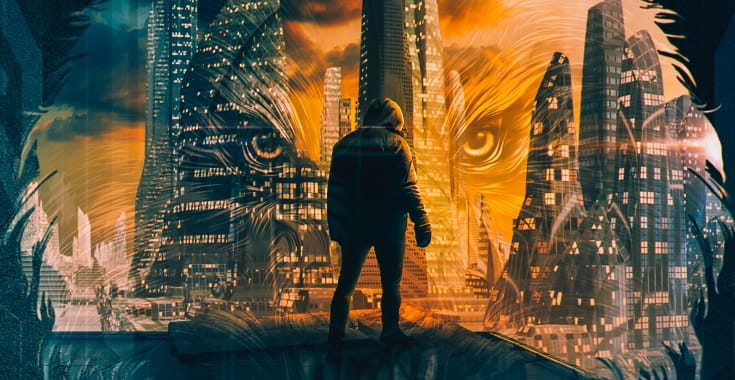
Ihor Tureha submitted Cynetic Wolf designed by MiblArt.

TP: Beautiful and appealing! A wonderful cover design.
e-Book Cover Design Award Winner for April 2020 in Nonfiction
Wageedah Salie submitted Habits for Happiness designed by Wageedah Salie – One Story Creative.

TP: An eye-catching cover design.
Fiction Covers
Amber Polo submitted The Pharaoh & the Librarian designed by Connie Fisher. “The Pharaoh & the Librarian is a light alternative history novel. Using the map as background emphasizes the theme – “What if Cleopatra faked her death and escaped on a pirate ship for the New World?””

TP: I really like this cover because it doesn’t look like a regular cover design that you see every day. Very nice!
Beati Bellicosi submitted Trust No One designed by Dillon Hearns. “Thank you for the opportunity to submit “Trust No One””

TP: I like the appealing typography in this cover design. The background image isn’t too appealing, but all in all, it works well together.
Bernard Jan submitted January River designed by Domi at Inspired Cover Designs.

TP: A nice cover design.
Buck Wilde submitted The Grumpian Scythe designed by Damonza. “This political satire takes aim at Trump, renamed Grump. The idea in the cover is about his campaign of misinformation whittling down people’s minds through fatigue so they accept whatever he says. I thought they nailed it.”

TP: The main purpose of a good cover is to attract the reader to pick it up. This cover definitely nailed that part. A very eye-catching cover, I must say.
Christopher C. Fuchs submitted The Depths of Redemption (Origins of Candlestone #1) designed by Christopher C. Fuchs. “Author’s photo of an early medieval Dutch shield boss, here used as a symbol for a lost explorer haunted by his past (he also deals with snakes, as the shield shows). Procreate and Acrobat. Pro edited.”
")
TP: The images are different and unique and I really like that part in all three covers.
Christopher C. Fuchs submitted A Light in the Depths (Origins of Candlestone #2) designed by Christopher C. Fuchs. “Author’s photo of ceiling painting in German monastery ruin, here used to symbolize light orbs as well as a heroic character. Background is fabric stylized to appear as cave chambers. Procreate and Acrobat.”
")
TP: An intriguing cover design.
Christopher C. Fuchs submitted Lords of Deception (War of Four Kingdoms #1) designed by Christopher C. Fuchs. “Author’s photo of a Congolese wedding blessing mask, here used as a symbol for a secretive order of assassins. Background is two layers: torn fabric and ancient script. Procreate and Acrobat. Pro edited.”
")
TP: The designer did a good job with the typography, because you can immediately tell that these books are sequels.
David Madison submitted Sulphur Mountain: Idylls of Time Past designed by David Madison. “Recipe for poetry book cover: Pour well-aged vintage photo into mixing bowl; fold in sleepy bloodhound; pour onto tray; garnish with subtitle bursting with double entendre; top with title crust; bake for a few seconds. Serves to convey sense of narrative-verse accounts of a place and a time past.”

TP: The typography and the image aren’t following each other. The colors are too harsh and a softer looking color and a different font would look a bit better here. All in all, the cover lacks a bit of a professional touch.
Diana Savone submitted Giacomo’s Daughter designed by Diana Savone. “Our dark, sexy, retro cover, reflects Sofia Spera, an Italian Mafia wife swept into a dark criminal underworld by a volatile mobster during the Roaring ’20s.”

TP: A nice cover, however, I do find the geometrical shapes and lines a bit confusing.
Freddie Silva submitted Heart of Odin designed by Melissa McArthur. “Heart of Odin deals with Celtic and Norse mythological themes. The green cover and celtic patterns blend with the world tree and wolf motiff to reflect this.”

TP: Everything on this cover is balanced and harmonious. Nice.
G. E. Hathaway submitted Burn designed by G. E. Hathaway. “Original art commissioned by Sofia Bjerned”

TP:The cover is very appealing and I truly love the artwork. ★
Gabrielle Prendergast submitted How to Lasso a Billionaire designed by Gabrielle Sara Prendergast. “The author wanted a new, modern look for this first book in a contemporary romance series. I thought an illustrated cover was the way to go so put this one together with manipulated stock illustrations. The author loved it!”

TP: The artwork definitely captures the essence of the book. Appealing and nicely structured.
Ihor Tureha submitted A Luna’s Course designed by MiblArt.

TP: Beautiful and appealing images don’t necessarily mean a great cover, but when combined with a great typography treatment, then you have a great cover. I would just like to see the author name a bit better. ★
Ihor Tureha submitted Conquest: The Seam Travelers designed by MiblArt.

TP: This cover definitely doesn’t lack appeal. Very nice!
Jean Gill submitted Arrows Tipped with Honey designed by Jessica Bell.

TP: A truly amazing cover, however, I wish the title treatment was better. It isn’t clear and some parts are completely unclear in a thumbnail size.
Joanna Starr submitted Farseeker designed by DerangedDoctorDesign.

TP: Strong colors and design elements. Very nice.
Joey Rodriguez submitted Raptures of the Deep designed by Joey Rodriguez. “Because the novella is an homage to the great Jules Verne and HG Wells adventures of the turn of the 20th century, I wanted the exterior of the hardcover version to have a textured feel to it which lead me to use the linen pattern to accentuate the subtle waves behind the diver.”

TP: I love the artwork and the title treatment, but the author name and the rest of the text on the front is unreadable. A nicely placed author name at the bottom would look much better.
José María Bravo submitted Runas de Sangre designed by Víctor García Puig.

TP: The artwork is amazingly beautiful. Very nice. ★
Jovana DDD submitted Fae Academy – Primal designed by Milo from Deranged Doctor Design. “College and Academy Fantasy book cover design, Fae Academy Book 1”

TP: Another amazing cover design. Very well done! ★
Jovana DDD submitted Fae Academy – Captive designed by Milo from Deranged Doctor Design. “College and Academy Fantasy book cover design, Fae Academy Book 2”

TP: Amazing! Beautiful and genre-appropriate! Very well done, as always!
Jovana DDD submitted Thunder’s Keeper designed by Kitten from Deranged Doctor Design. “Horror & Paranormal Suspense book cover design”

TP: Very eye-catching and appealing. Nice work!
Jovana DDD submitted Into Darkness designed by Marushka from Deranged Doctor Design. “Thriller & Mystery book cover design, Shannon Ames Book 1”

TP: Great title treatment! Wonderful image. Very nice.
Kathleen Contine submitted Metal Bones designed by J.M. Ivie. “The cover is set in space because it’s a sci fi and the person and font are metal because a character in the book is a cyborg.”

TP: A very interesting cover design. Nice title treatment.
Kerelyn Smith submitted Mulrox and the Malcognitos designed by Illustrator: Matt Rockefeller, Cover Designer: Tim Barber .

TP: I really love the overall look of this cover. Very well done.
Kerrie Flanagan submitted Big Game designed by Karri Klawiter. “This book is a romantic comedy told from the hero and heroine’s points of view. I wanted the cover to reflect that by having a image that represents each main character (hero-park ranger, heroine-event planner who enjoys martinis). Tone is meant to be more light.”

TP: This cover needs to be re-designed by a professional cover designer. I’m sure that the idea behind it is good, but the typography treatment isn’t too good. Too many different fonts and colors.
Konn Lavery submitted Fire, Pain, & Ruin designed by Konn Lavery. “The source photo was shot in the fall of 2019 with painted rocks, demonstrating a key scene. The three rocks represent the 3 midwives who specialize in fire, pain, & ruin. The typographic choices are to bring a strong attention to “ruin” which is the primary theme in the novel.”

TP: Appealing and good looking. The subtitle isn’t visible enough.
Laura Jenski submitted Falling Plaster designed by Tamie Baker. “Tamie Baker built this cover design around clues to the mystery, and used the courier font and old-fashioned wallpaper to place the story in the past. As soon as I saw it, I knew it was the perfect cover for my book.”

TP: The typography needs a bit more work. The placement of the title and author name could be a bit better and I would suggest a different font choice here.
Linda Rae Sande submitted The Pleasure of a Pirate designed by Linda Rae Sande. “The color scheme for this cover took its cue from the Bo Peep character. She’s described as wearing a bright pink costume, so we wanted a way to tie in her image with the usual ship and sea background. The text elements follow the style of the other historical romance books by this author.”

TP: Very genre appropriate.
Matthew Ralph submitted Sam The Speedy Sloth designed by Khansadk.

TP: A very sweet cover design. I really like it!
Matthew Ralph submitted The Little Book of Jokes For Funny Kids designed by Matthew Ralph. “I designed this cover myself and wanted it to be simple but fun, as this book is for children.”

TP: The typography needs a lot more work.
Neal Cassidy submitted The Final Weekend: A Stoned Tale designed by Denise Medve. “The man on the right is Professor Goodkat, a main character in the novel. He is a hedonist who smokes a copious amounts of pot (hence smoking on the cover), drinks heavily, & had a lot of casual sex. The blowup doll is used as a joke by a group of college kids (main characters) & is seen in the book”

TP: I can’t stop looking at the image, which isn’t always a good thing (but captures the theme here, very well). The author name isn’t visible at all.
Paramita Bhattacharjee submitted Paraplegic designed by Paramita Bhattacharjee. “It’s a story of a girl, who is paralysed. She can’t walk but want to live her life — the cover focus ob her love, loss and hope. She is sitting on a swing on a sea, this refers to her dream, her hope of her life.”

TP: A beautiful background image. I would only suggest to use a different font for the subtitle.
Pieter Vermeulen submitted Spartan designed by Pieter Vermeulen. “man reflect on dark past.”

TP: The typography works well with the image, but I would strongly recommend a different color for the title.
Terry Connell submitted A Little Chatter designed by Kelly Davidson. “A Little Chatter is the title of one of the twelve stories in this collection. At first, my design was 12 images – one from each story – scattered across front and back cover. I sent Kelly a pdf I made and said I wanted the images to feel like they are floating. This was her response. I love it!”

TP: A really nice cover design. I only wish the cover would pop a bit more.
Tony Berryman submitted The Night Nurse – a massage therapy thriller designed by Shawn Wernig, Eggplant Studios. “These eyes will be the last thing you ever see. That was my thought on first seeing the image Shawn chose for the cover of The Night Nurse. Gave me chills, actually. He did a brilliant job of merging text and images into an engaging design.”

TP: A solid cover. I would only recommend a better title treatment.
Nonfiction Covers
Adrian V. Proca submitted 7 Surprising Ingredients for a Healthier Life designed by Adrian V. Proca. “This is a cookbook for vegetarians who don’t like to spend too much time on the internet looking for delicious recipes. The cover design is meant to be simple, accessible and eye-catching. I would love an opinion about the overall cover design, fonts chosen etc.”

TP: A very nice background image. Try to use up to two different fonts on the cover, not to mention in the title. All in all, this cover has a lot of potential, but the typography needs more work.
David Kaemmerer submitted Fireside Tales of a Knight designed by Eric Kuehn. “Eric chose elements from the short stories in the book to make up this unique cover.”

TP: An interesting cover design. I would only suggest a more professional typography approach.
Kkmal A. Hammouda submitted Recreational Mathematics: Roots and Values designed by Kkmal A. Hammouda. “This cover shows the core exists inside the book, by showing simple calculating of the known roots values of known numbers, in a simple way, attracting so many more people, without reading inside.”

TP: I would suggest different and bolder fonts for this cover design. Also, the typography needs more work.
Ramesh Thota submitted You can LEARN to be HAPPY! designed by Thota Ramesh. “The book is about happiness. So, I chose a font that reminds us about child-like mindset and an image that sets a mood of happiness & peace.”

TP: A nice looking cover. I would only suggest a bit more color. ★
Randy Ellefson submitted 185 Tips on World Building designed by Randy Ellefson. “A self-made cover. I let the image do most of the work, drawing the eye. I just style lettering to both match and stand out, using the Trajan Pro font that fits my genre (leans more fantasy than sci-fi).”

TP: A really nice background image. I would suggest to change the title color to white.
Sharon Hartung submitted Your Digital Undertaker designed by Vincent Murakami. “”Heart” is a theme through book (estate planning in the digital age) & represents many concepts ie your life, your death, your loved ones, your wishes & appears in many of the 36 diagrams. The color dots represents our digitized life. The fading of the dots: from color for living to grey for death.”

TP: An interesting cover design. I think that the textual parts of the cover should be placed a bit lower. It still wouldn’t change the dynamics of the image.
Simeon Davis submitted The Upanishads for Awakening designed by Brother Simeon Davis. “The Upanishads are the ancient teachings of India, usually taught in a teacher’s forest hermitage. Hence the illustration on the cover.”

TP: A nicely balanced cover design.
Well, that’s it for this month. I hope you found it interesting, and that you’ll share with other people interested in self-publishing.
Use the share buttons below to Tweet it, Share it on Facebook, Link to it!
Our next awards post will be on June 29, 2020. Deadline for submissions will be May 31, 2020. Don’t miss it! Here are all the links you’ll need:
- The original announcement post
- E-book Cover Design Awards web page
- Click here to submit your e-book cover (See New Submission limits)
- Follow @JFBookman on Twitter for news about the E-book Cover Design Awards
- Check out past e-Book Cover Design award winners on Pinterest
- Subscribe to The Book Designer Blog
- Badge design by Derek Murphy
