

By Joel Friedlander
Welcome to the e-Book Cover Design Awards. This edition is for submissions during March, 2020.
This month we received:
30 covers in the Fiction category
10 covers in the Nonfiction category
Guest Judge
 We are once again pleased to welcome Tanja Prokop to The Book Designer as a guest judge this month. Tanja was born in Germany, but lives and was raised in Croatia. Her three beautiful daughters and her amazing husband are her biggest inspiration in life. She has an MA degree in German language and literature and philosophy. A few years ago she started her own design company and became a professional book cover designer. She designs covers, and is constantly creating new visual experiences for her clients. Tanja is also a multiple winner of various book cover design contests and has created thousands of covers. You can find her pre-made covers at Book Design Templates, or visit her site at www.bookcoverworld.com.
Comments, Award Winners, and Gold Stars
I’ve added comments (TP: ) to many of the entries, but not all. Remember that the aim of these posts is educational, and by submitting you are inviting comments, commendations, and constructive criticism.
Thanks to everyone who participated. I hope you enjoy these as much as I did. Please leave a comment to let me know which are your favorites or, if you disagree, let me know why.
Although there is only winner in each category, other covers that were considered for the award or which stood out in some exemplary way, are indicated with a gold star: ★
Award winners and Gold-Starred covers also win the right to display our badges on their websites, so don’t forget to get your badge to get a little more attention for the work you’ve put into your book.
Also please note that we are now linking winning covers to their sales page on Amazon or Smashwords.
Now, without any further ado, here are the winners of this month’s e-Book Cover Design Awards.

e-Book Cover Design Award Winner for March 2020 in Fiction
Ebook Launch submitted Meet Me At World’s End designed by Ebook Launch.

TP: When I went through this month’s cover designs, this cover caught my eye immediately. A true winner in my opinion! Beautiful!
e-Book Cover Design Award Winner for March 2020 in Nonfiction
Ebook Launch submitted Jazz improvisation made simple designed by Ebook Launch.
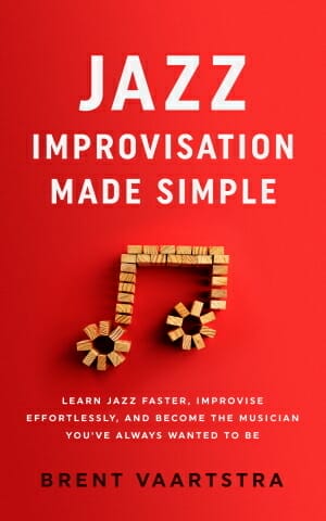
TP: Simple, clean and beautiful! Well done.
Fiction Covers
Alex Bujorianu submitted Fallen Love designed by Hampton Lamoureux. “The design brief I gave Hampton stipulated that the cover must convey the genre of teen urban fantasy, with just a hint of romance. The winged boy depicted in the artwork is Mark, the protagonist. I really liked the colour palette—gold font, blue fire, red background—which wasn’t easy to get right.”

TP: A nice looking cover design. I would just like to see a little bit more space around the main character and more balance in the textual parts.
Amala Benny submitted Extranormal Academy designed by Amala Benny.

TP: A very strong and appealing cover. Nice job!
Annelise Driscoll submitted Pieces of Pink designed by Annelise Driscoll. “”Pieces of Pink” centers around a dystopian caste system–distinguished by colored hats–so there is a pink matchstick for each named character in the lowest caste (Pinkcaps) and a gray matchstick for the main character, Grey. The high-contrast background was chosen for emphasis and visibility.”

TP: A solid cover design with all elements in its right place.
Arti Manani submitted The Colours of Denial designed by Arti Manani. “The Colours of Denial is a twisted psychological romance thriller. A major part of the setting takes place in a park with a pond and the two protagonists in the book love watching the sunset together. There is also a lot of darkness within the novel where I talk about the shadows of the trees.”

TP: I would love to see the title or the author name written in the same shade as the sunset color. That way the whole cover would look harmonious.
Bernard Dillard submitted Two ‘Til Midnight: A Novel designed by Augusto Silva. “The mission was to design a cover that was totally horizontal in nature to stand out from the average cover. It was a marketing move so that those who saw others reading the book would be intrigued to inquire about the book further.”

TP: I have to say that the approach is very interesting and the idea is diverting. The fonts should be a bit bolder and more visible, maybe. But that is just my opinion.
Darja DDD submitted The Next World – EXISTENCE designed by Milo from Deranged Doctor Design. “Post-Apocalyptic book cover design, A Post-Apocalyptic Thriller Book 1”

TP: There isn’t much I can say here. Perfect! Very well done! ★
Darja DDD submitted The Next World – RESISTANCE designed by Milo from Deranged Doctor Design. “Post-Apocalyptic book cover design, A Post-Apocalyptic Thriller Book 2”

TP: Another amazing cover design! Beautiful!
Darja DDD submitted The Next World – RESURGENCE designed by Milo from Deranged Doctor Design. “Post-Apocalyptic book cover design, A Post-Apocalyptic Thriller Book 3”

TP: A skilled and talented designer. Another beautiful series design!
Darja DDD submitted What Happens in the Highlands designed by Marushka from Deranged Doctor Design. “Contemporary Romance book cover design, What Happens Series Book 1”

TP: All elements are clearly visible and nicely combined.
Darja DDD submitted What Happens in the Ruins designed by Marushka from Deranged Doctor Design. “Contemporary Romance book cover design, What Happens Series Book 2”

TP: Again, very well done!
Darja DDD submitted What Happens in the Castle designed by Marushka from Deranged Doctor Design. “Contemporary Romance book cover design, What Happens Series Book 3”

TP: A very consistent series design with all, genre-appropriate elements. Even though the images are changing, you can tell at first glance that this is a series. Well done!
Darja DDD submitted The Blood Zone designed by Milo from Deranged Doctor Design. “Medical Thriller book cover design, A Plague Walker Pandemic Medical Thriller”

TP: A very eye-catching cover design with beautiful colors.
Darja DDD submitted The Devil’s Noose designed by Milo from Deranged Doctor Design. “Medical Thriller book cover design, A Plague Walker Pandemic Medical Thriller”

TP: Another great design, with an intriguing cover art.
Darja DDD submitted The Reaper’s Scythe designed by Milo from Deranged Doctor Design. “Medical Thriller book cover design, A Plague Walker Pandemic Medical Thriller”

TP: Very appealing colors and typography effects.
Ebook Launch submitted The Quiet Ones designed by Ebook Launch.

TP: I really love the typography treatment here. Well done!
Ebook Launch submitted One for Sorrow designed by Ebook Launch.

TP: A great design with amazing typography.
Ebook Launch submitted Two For Joy designed by Ebook Launch.

TP: Amazingly well done!
H.R. van Adel submitted Covenant of Blood designed by mibl art. “Grimdark fantasy is dark, gritty and violent – I think this cover reflects the genre.”

TP: This cover is scenic, genre-appropriate and amazing. Beautiful! ★
Haruto Tonbogiri submitted Senkumo War Stories: Book of Betrayal (Part 1) designed by Vaanilleste. “I knew exactly what I wanted the moment I got these covers designed. Red backgrounds with white kanji laid over the various character art. This series is a work of historical fiction set in Japan, a place known for finding beauty in simplicity. This cover is devoted to that same ethos.”
")
TP: At first glance, the cover looks very appealing, however, the main information aren’t visible at all. I would love to see a different typography approach here.
Julie Donofrio submitted The Curist designed by Dane. “The book has a strong female lead who’s a detective, her silhouette with the gun conveys that. The title The Curist, so we used the medical symbol of the Caduceus. The muted background shows symbols from ancient civilizations. The book starts with an epilogue in the 1500’s and the Inca Civilization.”

TP: A professionally done cover design. Very attractive and appealing.
Kelly Channick submitted Asbury High and the Thief’s Gamble designed by Susan Schafer. “The four main characters are all holding items, and wearing colors, that symbolize their personality and parts of Asbury. Also, this is a mystery and there are clues hidden on the cover, i.e. the cat lounging off to the side is important!”

TP: I think that the font color should be white here, because this way the typography has no appeal. Also, always try to use only two different fonts or styles on the cover.
Khaled Talib submitted Smokescreen designed by JUAN JOSÉ PADRÓN. “This is an upated cover of the novel after getting my rights back. I planned to use the same for the paperback later. I decided to change as the first cover was too high brow for the masses. The story can be appreciated by all classes of readers.”

TP: The imagery is very powerful and appealing and the title is also placed perfectly, even though I’m not too crazy about the font choice. The rest is completely unreadable in a thumbnail size.
Lawrence Byram submitted The NightShade Forensic Files designed by Lawrence.

TP: The designer should have used only one or two font styles and this cover would be perfect. If I didn’t know better, I would guess that “Under Dark Skies” is the title. This way, too much is going on on the cover, even though it doesn’t look bad at all.
Mason Malone submitted Backbeat designed by Mason Malone.

TP: The cover lacks appeal and it is very clear that it was done by someone who isn’t a designer.
Michele Orwin submitted Waiting for Next Week designed by Al Pranke. “The designer created this cover for another book. I loved it, but the author had something else in mind. I was so pleased when we found another way to use the cover with only a few changes, since it was a great fit for this novel.”

TP: I love the simplicity of this cover design. Very nice.
Sallianne Hines submitted Her Summer at Pemberley designed by Sallianne Hines, Rachael Ritchey. “First in standalone group of novels of Austen side characters. The lace motif and font will repeat on all, but bkgrnd color and small art above title will change for each book. Rachael Ritchey digitized my design and tweaked the title font.”

TP: The background is very distracting and the title isn’t appealing or visible enough. It would be best to use a full font here, in order to make everything visible.
Thuan Doan submitted Sophia Freeman and the Mysterious Fountain designed by T.X. Troan.

TP: I have to say that I really love some parts of the art, but the head on the main character somehow seems off and I keep looking at it. Other than that, the cover looks ok.
Tony Moyle submitted Last of the Mountain Men designed by Damonza. “The design was a joint effort from author and designer. The themes are to mimic soviet propaganda postures of the early 20th century with a twist of surrealism in the items being brandished by the oppressed.”

TP: I truly love the simultaneous complexity and simplicity of this cover design. The colors are just right. Nice work! ★
Winnie Tataw submitted Child of Tempus designed by Larch Gallagher. “The colors for this red tie in the next to color schemes in the book’s series. Along with the red hair on the book, which is of the main character, Rodrick. The book focuses a lot on time travel and elements of time, thus I wanted that to be present on the cover.”

TP: A very appealing and intriguing cover design. Well done! ★
Nonfiction Covers
Cathi Stevenson submitted 22 Fantastical Facts About Dolphins designed by Cathi Stevenson. “I don’t often have the privilege of working on covers marketed to both adult and younger audiences, and this subject matter is very dear to my heart. I wanted the cover to clearly convey the subject matter and reflect its academic nature, while still being fun.”

TP: Interesting but even though it’s colorfull, it doesn’t pop.
Dave Lewis submitted Scratching The Surface designed by Dave Lewis. “The theme running through many of the poems is ‘scratching the surface’ i.e. we don’t quite know everything, we are constantly searching for the answers, don’t believe all you read / hear and that life can often be an itch that you can’t quite scratch :)”

TP: The typography needs to be redone a bit in order to make the cover more appealing.
Ebook Launch submitted The Great American Healthcare Scam designed by Ebook Launch.

TP: A nicely done and balanced cover design. Very genre-appropriate.
Ebook Launch submitted Narcissist designed by Ebook Launch.

TP: I love this cover design. Very simple and eye-catching. ★
G. Elizabeth Kretchmer submitted Writing Through the Muck: Finding Self and Story for Personal Growth, Healing, and Transcendence designed by Annemieke Beemster Leverenz. “The boots, flowers, and pencils represent essential symbols: Hiking boots help us make it through difficult places; flowers represent growth and hope; and pencils obviously reflect the premise that writing can be an important tool to carry with us on our various journeys through life.”

TP: An interesting cover design. Everything works well together!
Kady Dash submitted How to find care for your elderly parent designed by Kady Dash. “The sunset image signifies the sunset period of people’s lives, as this book is about aging parents. A road into a sunset suggests that this book will help people find an easier path into the sunset. Orange and blue colors used in the cover are complementary colors that make the text and image pop”

TP: This cover design isn’t bad, but the typography could be done a little bit better.
Kitty Arceneaux submitted Ruth Ready designed by Richellb. “The interlocked rings represents the commitment of marriages”

TP: Very interesting and appealing.
Richard Stanley submitted Up on Game. When I Ruled the World designed by Teddi Black. “Second book from bank robber Richard Stanley, true crime book (When I Ruled the World) chronicles Stanley’s years in a tough California prison with a bit of humor and a whole lot of scary true stories that confirm the worst you’ve heard about prison life (and death). Stark, brutal, the real deal.”

TP: I really like this cover design. Very simple but appealing. ★
Steve Friedman submitted In Search of Courage: An Introvert’s Struggle with Addictive Behaviors designed by Cathi Stevenson. “The cover captures my own journey in search of courage with a glider drifting over a wide expanse with the distant sunset signifying the “light at the end of the tunnel”. The word courage is meant to stand out as a major theme of the book.”

TP: I think that this cover would look much better if the word “courage” was written in the same orange shade as the background. Also, less is more, so don’t use too many different fonts at the same time.
Well, that’s it for this month. I hope you found it interesting, and that you’ll share with other people interested in self-publishing.
Use the share buttons below to Tweet it, Share it on Facebook, Link to it!
Our next awards post will be on May 25, 2020. Deadline for submissions will be April 30, 2020. Don’t miss it! Here are all the links you’ll need:
- The original announcement post
- E-book Cover Design Awards web page
- Click here to submit your e-book cover (See New Submission limits)
- Follow @JFBookman on Twitter for news about the E-book Cover Design Awards
- Check out past e-Book Cover Design award winners on Pinterest
- Subscribe to The Book Designer Blog
- Badge design by Derek Murphy
