

By Joel Friedlander
Welcome to the e-Book Cover Design Awards. This edition is for submissions during November, 2019.
This month we received:
45 covers in the Fiction category
8 covers in the Nonfiction category
Guest Judge
 We are once again pleased to welcome Tanja Prokop to The Book Designer as a guest judge this month. Tanja was born in Germany, but lives and was raised in Croatia. Her three beautiful daughters and her amazing husband are her biggest inspiration in life. She has an MA degree in German language and literature and philosophy. A few years ago she started her own design company and became a professional book cover designer. She designs covers, and is constantly creating new visual experiences for her clients. Tanja is also a multiple winner of various book cover design contests and has created thousands of covers. You can find her pre-made covers at Book Design Templates, or visit her site at www.bookcoverworld.com.
Comments, Award Winners, and Gold Stars
I’ve added comments (TP: ) to many of the entries, but not all. Remember that the aim of these posts is educational, and by submitting you are inviting comments, commendations, and constructive criticism.
Thanks to everyone who participated. I hope you enjoy these as much as I did. Please leave a comment to let me know which are your favorites or, if you disagree, let me know why.
Although there is only winner in each category, other covers that were considered for the award or which stood out in some exemplary way, are indicated with a gold star: ★
Award winners and Gold-Starred covers also win the right to display our badges on their websites, so don’t forget to get your badge to get a little more attention for the work you’ve put into your book.
Also please note that we are now linking winning covers to their sales page on Amazon or Smashwords.
Now, without any further ado, here are the winners of this month’s e-Book Cover Design Awards.

e-Book Cover Design Award Winner for November 2019 in Fiction
Thiago d’Evecque submitted Limbo designed by Marina Ávila.
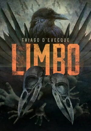
TP: A true winner, every element is placed perfectly.
e-Book Cover Design Award Winner for November 2019 in Nonfiction
Ebook Launch submitted The Neurotypical Field Guide designed by Ebook Launch.
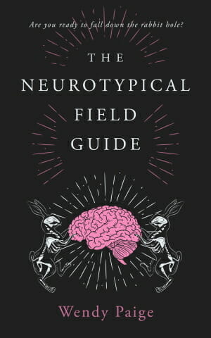
TP: I really like how the title and the image compliment each other. A true winner. Amazing work!
Fiction Covers
Adira Augst submitted Fractured Men designed by Adira August. “The 6th book in the Hunt&Cam4Ever murder mystery series. All the books are “Something” Men. The title font is Plane Crash, the author name is Domine. The colors came from the images. The storm drives the story.”

TP: This cover is very eye-catching, which is always a good thing, however, I would recommend changing the typography and image treatment, so that it looks a little bit more professionally done.
Angeline Janeiro submitted The Unnamed Bears Favor designed by Rio’s Book Cover Art. “Genre: Fantasy/ Historical Fantasy/ YA Fantasy”

TP: A nicely balanced cover design. Good work!
Bryan Covington submitted Between Magic and Dreams designed by Bryan D. Covington. “The font used for the title was created specifically for this novel. It and the color scheme are to display a magical feel but the distance between the two subjects is to portray a void or gap to be bridged.”

TP: I have to say that this font choice works very well with the image and the cover overall is very appealing and genre-appropriate.
Catherine Richmond submitted Off the Ground designed by Kim Killion.

TP: Nicely balanced, however, I would work a bit more on the title treatment. A larger title would work a bit better and the author name would look better if it was a bit larger.
CD Baxter submitted From Dawn Until Forever! designed by CD Baxter.

TP: You have used a very beautiful image here, which is why I would remove the frame. Without the frame, the cover would look more genre-appropriate.
Darja DDD submitted First Shot designed by Milo from Deranged Doctor Design. “Cyberpunk Science Fiction book cover design, Jin & Tonick Book 1”

TP: Such a color usage creates an instant appeal. I can only say is – a beautiful cover design!
Darja DDD submitted I Know What You Did designed by Marushka from Deranged Doctor Design. “Mystery, Thriller & Suspense book cover design”

TP: An amazing cover design! I love the colors and the typography!
Darja DDD submitted The Lies She Told designed by Marushka from Deranged Doctor Design. “Mystery, Thriller & Suspense book cover design”

TP: I think that the orange in this cover design is amazing. The cover screams “read me”. Fantastic work.
Darja DDD submitted The Silent Surrogate designed by Marushka from Deranged Doctor Design. “Mystery, Thriller & Suspense book cover design”

TP: The whole series looks amazing and is definitely professionally done. Great work!
Darja DDD submitted Extinction Shadow designed by Milo from Deranged Doctor Design. “Post-Apocalyptic book cover design, Extinction Cycle: Dark Age, Book 1”

TP: The whole series is very nicely done. Strong images! Great work!
Darja DDD submitted Extinction Inferno designed by Milo from Deranged Doctor Design. “Post-Apocalyptic book cover design, Extinction Cycle: Dark Age, Book 2”

TP: It is very hard to place the author name well, when you have large names and not to mention multiple authors. But Milo managed to nail it. A great cover design.
David Madison submitted Love Handles: Carried Away designed by David Madison. “A metaphor for the many ways I handled love in 53 poems, how I was carried away by this powerful emotion. The original image was horizontal against an unappealing background. I saw the potential of being lifted to heaven (swept away), how I could effectively place the subtitle on her forearms.”

TP: A very simple cover design, which is good. I would only recommend to place the author name in the centre.
Dorothy Zemach submitted The Secret Keeper designed by Keri Knutson. “The Secret Keeper series is contemporary chick lit. We love the author name, a combo of upper & lowercase letters, which is used on all the other books.”

TP: Very genre-appropriate and appealing. The author name font choice is nice.
Dorothy Zemach submitted The Secret Keeper Confined designed by Keri Knutson. “Book 2 in the Secret Keeper series”

TP: The series is very consistent, yet different. Nice.
Dorothy Zemach submitted The Secret Keeper Up All Night designed by Keri Knutson. “Book 3 in the Secret Keeper series”

TP: Again, a nicely created cover design.
E.G. Radcliff submitted The Hidden King designed by Micaela Alcaino. “Title font is Orpheus. The background image is a triskelia, a Celtic symbol insinuating the Celtic themes in the book. The crown made of fire conjures the identity and mystery of the protagonist. The gritty, charcoal/black background reflects the gritty conditions of the protagonist’s life.”

TP: I really love every “hidden” meaning in this design. Very nicely done. Good work, however, I wish the background wasn’t this dark. ★
Ebook Launch submitted Heart of a Thespian designed by Ebook Launch.

TP: A nicely balanced cover design. Good work!
Ebook Launch submitted A Certain Kind of Power designed by Ebook Launch.

TP: A very interesting image perspective and very clear typography.
Ebook Launch submitted The Jewelled Clasp designed by Ebook Launch.

TP: I instantly fell in love with this cover design because of it’s beautiful title treatment and amazing colors. Fantastic work! If I could choose two winners, this would be one. ★
Elle Cardy submitted Wielder’s Prize designed by Elle Cardy. “The book is a YA fantasy set on the high seas. I added an easter egg for anyone paying close attention: the image is upside down and the ship is underwater. If you look closely, you can see the upside down bubbles on the waves.”

TP: A nice cover, but I’m not sure that the water bubbles are blending well. The cover could look a bit more appealing if a bit more of white was used on it.
Farah Oomerbhoy submitted The Return of the Dragon Queen designed by Steven Meyer-Rassow.

TP: A very nice cover even though a lot of different design elements are being used. Everything is well balanced and in its place.
Glyn Haynie submitted Promises To The Fallen: A Vietnam War Novel designed by Rob Williams.

TP: Everything is exactly where it should be, but somehow the cover lacks a bit more appeal.
Hampton Lamoureux submitted The Vampire Eirik designed by Hampton Lamoureux.

TP: A fantastic cover design! I’m not sure what I like more, the image or the typography. Brilliant. ★
Hampton Lamoureux submitted A Chance Beginning designed by Hampton Lamoureux.

TP: Another amazing cover. I love the colors here! The subtitle isn’t very readable, but that often isn’t very important.
Hampton Lamoureux submitted The Burden I Am designed by Hampton Lamoureux.

TP: A beautiful cover design!
Harald Johnson submitted NEANDER: A Time Travel Adventure designed by Harald Johnson. “This is a five-image composite featuring the most famous (and realistic) Neanderthal reconstruction by the Dutch company Kennis & Kennis.”

TP: I really like the typography, but the image and the title color don’t work too well together. I would try softening the color to a more beige looking color.
Heidi Slowinski submitted The House on Maple Street designed by Maggie Duford. “The various clippings and articles were inspired by the subplot about a research project into the history of the house. The color of the house and the shading around it eludes to the secrets the house holds. The font relates to the heroine’s naive assumption that all is perfect in her new home.”

TP: A very interesting cover design that would look amazing if the typography was much stronger and written in a brighter color.
Ihor Tureha submitted Who Killed Harlan Parker? designed by MiblArt.

TP: A very interesting illustration combined with good typography.
Ihor Tureha submitted The Carnelian Fox: A Monster Catching Gamelit Adventure designed by MiblArt.

TP: I really like the image and its colors. The typography is spot on! ★
Ihor Tureha submitted The Panopticon Experiment designed by MiblArt.

TP: The only thing I would like to see here is a different color choice. It would maybe look a bit more appealing if the colors weren’t this uniform, however, sometimes the designer has to work with the guidelines that the author provides.
Jacqueline Kibby submitted Retribution Darkened designed by Jacqueline Kibby. “The 2nd in a trilogy, the cover for this book needed to convey the darkness of the plot. The image chosen was decided on as a simple reflection of one of the main character’s decent into insanity. The title style and cobweb effect are consistent through all three of the titles.”

TP: Spooky! I would love to see a different font for the subtitle and I’m not a fan of inner shadows on serif fonts.
Jill Marsh submitted Black Widow designed by JD Smith. “Our aim was a composite image which hints at an established European criminal network and deadly females.”

TP: A very nice cover design. Good work!
John Byrne Barry submitted When I Killed My Father: An Assisted-Suicide Family Thriller designed by John Byrne Barry.

TP: A very strong title that should probably be accompanied by a stronger color. Turquoise is used for a bit “softer” topics.
Lois Wickstrom submitted Bees in Loretta’s Bonnet designed by Francie Mion. “The cover depicts a key scene in this picture book about leafcutter bees.”

TP: The art looks nice. It could use a bit more balance in the typography. The bottom text is touching the illustration without any intention to create a visual effect, so I would definitely move it more down.
M. L. Buchman submitted Drone designed by M. L. Buchman. “Focus 1: author’s thriller brand (as I write in many genres). Focus 2: a unique plane to satisfy techno-enthusiasts–a future design model was found. Focus 3: Darkening it down to create mystery, then finding a dynamic background for tension. The title look took the longest to resolve.”

TP: A very solid cover design. As I have said before, I’m not a fan of inner shadows even though they don’t look bad here, however, I would like to see a bit more color balance on the cover.
Robert Mashburn submitted Honor designed by Robert Mashburn.

TP: Such a beautiful illustration needs a very special typography treatment and I’m afraid that the current one is to plain for this kind of illustration.
Sarah Daneen submitted Corsets and Aliens designed by Olivia prodesign.

TP: A beautiful cover design with well balanced elements.
Stanford Apseloff submitted The Third Syzygy designed by Michael Cheval. “In this young-adult fantasy, the cover symbolizes the eerie magic of the woods and the young adventurer who tempts fate.”

TP: A very interesting illustration! I would love to see a different font here, which would look better with the cover art.
Stephanie Barr submitted Catalyst designed by Ryn Katryn Designs. “Although a premade, the main figures were perfect for a book centered around an ignorant but very powerful magic user in a world without magic and a knowledgeable but largely powerless partner trying to keep her in check. The colors are pertinent to a familiar with bicolored eyes.”

TP: Interesting colors and image usage. I would love to see how the title would look like without the dark gradient.
Susan Bingaman submitted San Francisco 1967: My Romance with the Summer of Love designed by Susan BIngaman. “The book is based on the author’s visit to San Francisco for one week at the hight of the Summer of Love. The tie dye background is iconic for the time and place, as is the stylized street sign. The Barricada Pro font is a style associated with the 60s that is easy to read even when warped.”

TP: I can see what the message of this book should be, but it could look more appealing with a professional touch.
Sylvia Frost submitted The Assistant designed by Sylvia Frost of thebookbrander.com.

TP: I instantly saw the appeal of this cover design and I think every element is placed perfectly. An amazing cover design. ★
Sylvia Frost submitted Beauty in Darkness designed by Sylvia Frost of thebookbrander.com.

TP: Amazing colors! Everything is placed very well.
Tom Leveen submitted A Little Insurrection Now & Then designed by Tom Leveen. “The novel is mostly a comic but realistic YA contemporary that takes a dark turn toward the end and includes very serious topics woven in between the humor.”

TP: A solid cover, that reminds me of a movie poster.
Warren Armour submitted When Clouds Take Form designed by Tamara Viskovic. “Cover eerily represents a persistent shadow of morning and loss, hence the symbolism of the mysterious ravens. Also innocence of childhood within a troubled environment marked by the red shoes that pop in contrast to the greenish blue sky & clouds.”

TP: A very beautiful cover design!
Nonfiction Covers
Belinda Pollard submitted Use the Power of Feedback to Write a Better Book designed by Belinda Pollard. “Covers in the Useful Writing Tips series incorporate the top two black and white stripes, similar font treatments, and feature images that communicate the content and “pop” when viewed in a sea of thumbnails for the category.”

TP: Very genre-appropriate. I would maybe place the author name a bit differently.
Chris Cox submitted From Love to Loss: A NICU Odyssey designed by Chris Cox. “I chose this image because my story is about dealing with the depths of depression after losing my son. I thought black, gray, and white would convey this better than any colored image could have. I chose my face because, although I lost my son, I now have to be the one to find my way again.”

TP: A strong cover design. The typography could be a bit more balanced, but other than that, very nice.
Dave Lewis submitted Hadrian’s Cycleway & Coast 2 Coast designed by Dave Lewis. “A cycling memoir which covered two specific rides – 1) Hadrian’s Wall (Roman, bricks, castles, inland) and 2) C2C (from the North Sea to the Irish Sea, water, coast)”

TP: I really like this cover design. Very appealing and unique. ★
Ebook Launch submitted Narcissist designed by Ebook Launch.

TP: Strong image usage. Clean typography! A great cover design.
Susan Bingaman submitted Eat Yoga! designed by Susan Bingaman. “The pure primary colors not only make this book stand out from the competition, but also reflect the simplicity of the yogic lifestyle, as does the whimsical yet serene stick figure.”

TP: A very head-on cover design. I would love to change the imagery to the typography treatment, while leaving the colors as they are.
Wageedah Salie submitted What the Elephant Knows designed by Wageedah Salie.

TP: I think that this cover design would look amazing if the title was more plain and simple. Other than that, very beautiful.
Wendy Elliott submitted Grit and Grace in a World Gone Mad: Humanitarianism in Talas, Turkey 1908-1923 designed by Wendy Elliott. “Photo: US+Cdn missionaries c1914 near Talas (G&G of the story), plus sepia for warmth. Red text emphasizes the “mad” genocidal conditions. Fonts: Bank Gothic, American UncD, Zurich Black, Vivaldi, Arial Narrow, Boycott & Garamond Pro. I am the sole publisher of the ebook .”

TP: Parts of the typography simply don’t seem to follow the image. I don’t recommend using so many different fonts in one place, even though I understand what the designer wanted to achieve with it.
Well, that’s it for this month. I hope you found it interesting, and that you’ll share with other people interested in self-publishing.
Use the share buttons below to Tweet it, Share it on Facebook, Link to it!
Our next awards post will be on January 27, 2020. Deadline for submissions will be December 31, 2019. Don’t miss it! Here are all the links you’ll need:
- The original announcement post
- E-book Cover Design Awards web page
- Click here to submit your e-book cover (See New Submission limits)
- Follow @JFBookman on Twitter for news about the E-book Cover Design Awards
- Check out past e-Book Cover Design award winners on Pinterest
- Subscribe to The Book Designer Blog
- Badge design by Derek Murphy
