

This is the twelfth in my on-going series of posts here on ebook creation; it’s also the second on the subject of Cascading Style Sheets (CSS).
Last time, we talked about how (and where) to add CSS in order to define how the HTML that makes up an ebook will look.
This time, I’m going to talk about some of the most useful properties, the rules that help you define the way a particular chunk of text or an image displays. (See the section “Location, location, location” in the previous post for information about where these properties go.) Like the post on HTML, this is going to be more of a list than a lesson, so feel free either to read it in order or to skim in search of what you’re looking for.
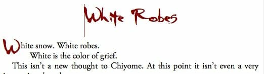
So, let’s look at a typical block of CSS—this one defines the style for the body text in the ebook White Robes that I’ve shared with you.
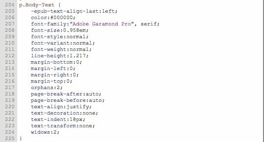
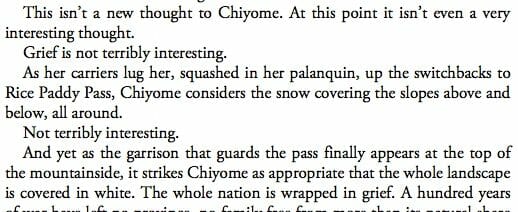
What this does is make sure that the majority of the text in the book looks like this:
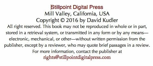
As opposed, say, like the copyright section:
Great, I hear you say, but what does all of that gobbledygook mean?
Good question. It should be pretty easy to figure out what some of those properties do. But some of them are probably a bit… opaque.
So let’s break them down.
For the purposes of this discussion (a brief intro), let’s decide that there are basically two kinds of properties[1]:
- Properties that define position
- Properties that define appearance
The Room where it happens: Position properties
A number of the properties you are going to deal with the most are all about positioning elements or text on the screen. Some will be familiar to you (margin, say); some may be unfamiliar (padding, say).
Here’s where I need to remind you of something from the HTML post: each HTML tags defines the beginning and end of an element. Position properties define how that element is positioned relative to the other elements in the document.
Remember, however, that sometimes elements can be nested—they can show up inside each other.
So, with that in mind, let’s look at our first pair of properties: margin, say, and padding, say. (Oh, and we’ll talk about the border property too.)
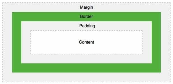
Margin/Padding/Border
So let’s say we’ve got an element — our old friend the paragraph (<p></p>), for example.
That element exists on the screen as a rectangle. The outline of the rectangle is defined by the border.
The margin defines how much space there is between the element and its neighbors or the element it’s inside.
The padding defines how much space there is between the element and any elements or content (words, images) inside of it.
Here’s a diagram that gives a sense of what I’m talking about (it’s from the W3Schools website):
The padding and margin properties each take four values, in this order:
- Top
- Right
- Bottom
- Left
The values define the distance between the element and the elements outside (if it’s a margin) or inside (if it’s padding). The distances (and this will be true for a number of other properties) can be defined in any of the following units:[2]
- Pixels (dots on a screen) — 5px
- Percentage (in terms of the height and/or width of the surrounding element) — 10%
- Ems (the height and width of a capital M—basically the standard text size) — 1.5em
Pixels are precise; this is great when you know how big the screen is going to be, and what text-size the reader has set for the ebook. However, as I’ve mentioned a number of times, your ebook may be displayed on a 5” iPhone or on a 27” monitor. The reader may decide to make the text ENORMOUS or tiny — and you have no control over that.
In order to make the book and all of its elements responsive (that is, scaled properly, no matter the screen size or user preferences), it’s often best to use percentages or ems.
Nota bene: percentages are defined in terms of the surrounding element. Every paragraph element is inside of the <body></body> element. Let’s say I set the left and right margin each to 10%, like this:
<p style="margin: 0 10% 0 10%">Some text.</p>
Remember, those measurements define, in order, the top, right, bottom, and left margins. So that paragraph will have no margin on the top or bottom, and 10% margins to either side. [3]
On my iPhone 7, which is 2.64” wide, 10% would be about a quarter of an inch. On my 27” (diagonal) monitor, which is 25.3 inches wide, 10% is about 2.5” inches. So the white space stays proportional to the screen.
Another way of handling this is to scale the elements to the text size using the em as the basic unit of measurement. This leads to relationships between elements that stays consistent whether the reader has their app set to display text at 8 point Times or 36 point Zapfino.
For example, I usually set the margin for the <body></body> element of my ebooks — the outermost container that displays on the screen — at .5em. This means that there will always be a proportional strip of white space between the edge of the screen and the text.[4]
So, if the margin defines the space between the element’s border and the next or surrounding element, the padding, as we said, defines the space inside the border before the content displays.
What’s the difference? [5]
Well, the margin will always display the background color/style of the surrounding element — the page color, if you will. If you want to create a text box, say, or want to set images and their captions off by placing them within a border or a colored or shaded field, you use padding to make sure that there’s space between the outside of the field and the content—the image and/or text.
Here’s a sidebar from Creative Mythology, an ebook I recently created for Joseph Campbell Foundation:
See how there’s white space to the left of the text box? That’s the margin. See the white space (well, okay, yellow space) inside the box? That’s the padding.
That red line? That’s the border.
Borders can get really complicated, but essentially, the border property takes three values: weight (or thickness), color, and style.
Those first two values should be pretty self-explanatory. The weight is defined the same way that any other distance is in CSS — you can use pixels, ems, or a percentage (in this case, it’s a percent of the height/width of element itself). Color can be defined in a number of ways (we’ll be talking about that more below), but the color value for that border above is… darkred. Really.
Style is more complex. There are a dozen or so standard border styles, including: dotted, dashed, solid, double, groove, ridge, inset, and outset. (The last four are pseudo-3d effects.) You can learn more about them at this article on W3Schools.
So the border property for that text box above is this:
border: 1px solid darkred;
By the way, each of these properties can be specified by direction:
margin-left: 10%;
padding-top: 3em;
border-bottom: 4px ridge green;
Height/Width
The other most important positioning properties for HTML elements are height and width. Obviously, they define how tall and wide the element should be.
They’re not necessary all of the time, but they’re one of the ways that you can make your ebook look really good — especially if you’re dealing with images and text boxes.
Once again, the values each property takes is a distance, expressed as… Yeah, pixels, ems, or a percentage.
So let’s say you want an image to display at full size—no smaller or bigger. You could add the dimensions (you remember the dimensions, don’t you?) in pixels:
height: 160px; width: 100px;
Or say you want to have the image be inset to the side, with the text flowing around it. You would use this:
width: 40%; height: auto; [6]
Float/Clear
Now, in order to make it so that text flows around that picture, we have to use the float property. It takes one of three values: left, right, or none. What those do should be clear. Remember that sidebar above? Here’s what it looks like in CSS:
float: right;
What that means is that the element displays all of the way on the right, and all of the following or surrounding elements will flow around the floated element.
Combine that with the margin, padding, border, and width properties, and voilà! Instant sidebar!
However, you might not want the sidebar to squeeze certain elements — section headers, for example — to the side, or you might want it only squeezed to one side, not the other. Then you use the clear property on the element that follows the floating text box or image. It also takes three possible values: left, right, or both.
Most of the time, I add this to my <h1>, <h2>, and <h3> styles:
clear: both;
That way, I know that an image from the previous section won’t push past the header for the new section.
Page-break-before/Page-break-after/Page-break-inside
These properties attempt to ensure that there’s a… Well, yeah, a page break where you want it.
For the purposes of ebook design, each of them takes one of two values: always and avoid.
Here’s the thing: a number of ereaders — especially the older ones — ignore the always page breaks. Don’t know why, but they do. If you want to force a new page, then you should create a new XHTML file within the ebook structure. Basically, create a new chapter. [7]
So why did I bother including these? Ah. Because the avoid value can be useful sometimes. If you’ve got a list or a series of images and you want them all displayed together, then use this:
page-break-inside: avoid;
See how that works? This will sometimes force funky page breaks — especially on small screens — but can be very useful.
Widows/Orphans
The widows and orphans properties basically work like page-break-inside: avoid; in very specific circumstances. Each takes a value that’s just a number — no unit.
- widows: specifies the minimum number of lines in a paragraph that can appear at the top of a page
- orphans: specifies the minimum number of lines in a paragraph that can appear at the bottom of a page
If there are fewer than the specified number of lines, the ereader treats the paragraph as if it has page-break-inside: avoid;
Having said that, this is another of those properties that isn’t handled properly by all ereaders. Still, there’s no harm in including it when you can:
widows: 2; orphans: 2;
Other position properties
There are a bunch more properties that will help you position your elements on the screen, but they’re more esoteric. For more information, check out IDPF’s CSS Property Reference.
Dressing up: Appearance properties
The remainder of our most commonly used CSS properties involve refining the appearance of the content within the element — whether it’s text or an image or whatever.
Color/Background-Color
The most dramatic way of changing the appearance of your ebook is to add color. Remember, there’s no premium for adding that extra “ink”!
This is done using the color and background-color properties.
Now when dealing with color CSS gives you a huge number of ways of defining what you want. The easiest is to stick to color names — check out this list at W3Schools of 140 standard defined colors.
I like to use dark red (or rather, darkred) as an accent color — it’s dramatic, it displays well across different screens, and, most importantly, it’s still readable on a black-and-white Kindle or Nook.
The <h1> chapter header and drop cap <span> in White Robes have a color value of darkred:
There are other ways of defining color, though. The most common is hexadecimal — it’s a pound sign followed by six digits… in base 16. [8] Blech. It looks like this:
color: #8b0000;
That in fact is the same color — dark red.
Remember: all color on a computer screen is made of red, green, and blue dots shining more or less brightly. The first two digits in that series define how bright the red dot shines; the third and fourth digit define the brightness of the green dot; and the last two define the brightness of the blue dot. If I wanted the brightest possible red, I’d use this:
color: #ff0000;
Black is this:
color: #000000;
White is this:
color: #ffffff;
Look at that list of colors again. Between the color name (LemonChiffon, say) and the block of the color, there’s a hexadecimal: #FFFACD
You can use either scheme to define your colors — or you can use one of the others.
Now, when you use the color property, it defines the color for the text in that element. If you want to change the color of the field the text is set against, you use the background-color property.
So the CSS for the text box I created above looks like this:
.sidebar {border: solid 1px darkred; margin:0 0 .5em .5em;padding:.5em;background-color:#fefeef;float:right;width:30%}
The value of the background-color property is #fefeef — a pale yellow that I happen to like as a contrast background.
Just a reminder, so that you can see how all of those rules worked together:

Font-size/Font-weight/Font-style/Font-variant/Text-decoration/Font-family
Now, there’s a lot more than color that we can use to define how our ebook looks. We can (within reason) play with the font — in typographic terms, the variations in how the typeface displays.
The most important property for this is font-size. Using the same units as before (pixels, ems, or percentage), you can specify how large the text should be.
Here’s the thing: remember that every ereader gives the reader the opportunity to set the font size in their preferences. That size is, by definition, 1em tall. Now, if you set your font size by pixels (i.e., font-size: 16px), that will be over-ridden by the reader’s preferences. Things can get seriously out of whack.
However, if you set the font size using the em as a unit or as a percentage of that unit, your fonts will always stay properly proportioned to each other! [9]
Since 1em is the standard size, most often I use that as the font size for body text. Sometimes I play with it a bit. In White Robes, you’ll see that the style p.Body-Text has the following property:
font-size:0.958em;
On the other hand, the chapter title style has a font size of 3em — nice and big.
For the text box above, I used a font size of .75em — quite a bit smaller than the body text.
You can also play with the font’s weight; essentially you can make the font bold or (if it’s available) semi-bold (just a bit darker than normal) or black (extremely dark). The font-weight property takes the value bold, bolder, and lighter, as well as normal; you can also use a number between 0 and 900. 400 is the same as normal, and 700 is the same as bold. [10]
Our other favorite way of styling fonts, of course, is to make the characters oblique or italic.[11] To make this happen, you use the following:
font-style:italic
And of course, you can also set the value to normal, if you want a word in roman type in the middle of an italic paragraph.
To get small caps (3:00PM, for example), use the font-variant property:
font-variant: small-caps;
To turn underlining on or off, use the text-decoration property:
text-decoration: underline;
You’ll notice, in all of this talk about fonts… that I haven’t talked about what most people think of as fonts. You know: Times New Roman, Palatino, Helvetica, etc. Printers and designers call those typefaces — fonts are variations of those. In HTML, they’re called a font-family.
It is possible to specify a typeface using the font-family property. You can even embed them in your ebook, as I’ve done with White Robes. Know, however, that a number of ereaders (notably Amazon’s Kindle, in all its flavors) make it nigh-on impossible to get those embedded fonts to display properly, and that no two ereaders have the same set of fonts built in. So while it’s okay to specify something like font-family: Optima;, it’s good to have a backup plan. You can list a number of typefaces — and you should always include at least one generic font-family: serif, sans-serif, monospace, cursive, fantasy.[12]
For White Robes, for example, the body text typeface is this:
font-family:”Adobe Garamond Pro”, serif;
For ereaders that have Adobe Garamond Pro installed, they’ll use it. Others will use the default serif font.
Text-align/Text-indent
We don’t just want to shape our letters — we want to shape our paragraphs. We want CONTROL!
These two properties handle that for us.
The text-align property is probably familiar to you if you’ve ever used a computer. It takes one of the following values: left, right, center, justify
The only thing you might need to know about these is that justification in ereaders, while serviceable (and getting better), can sometimes get strange, especially when the screen or window is small. The ereader doesn’t have as much wiggle room to expand or contract the space between words and letters, and so either you get way too many hyphenations or you get rivers of white space down the middle of the screen.
This is why much computer text is aligned to the left margin only, even though full justification is the standard in print. Play around and see which alignment you prefer.
The text-indent property probably doesn’t need much explanation. It looks like this:
text-indent:1.5em;
That’s a fairly standard paragraph indent.
But wait! There’s something cool you can do: a hanging indent, where the first line is to the left of the rest of the text. To manage this, you use a negative value:
text-indent:-1.5em;
However, to keep that first line from pushing off the left side of the screen, you need to add a positive padding-left value at least as large as the text-indent:
padding-left:2em;
text-indent:-2em;
That allows for a line of poety that overflows the right margin, for example, to be inset:
Cool, right?
Line-height
This is the last bit of control that we apply to the shape of the paragraph: line-spacing. In CSS, the distance between the current line and the previous is always expressed in ems — but, for some reason, without adding the unit. So a typical body paragraph might have this line-height:
line-height: 1.2;
This also works:
line-height: 120%;
Display
Sometimes, it’s not enough to define a piece of text’s size, color, and shape. Sometimes you need to fiddle with its behavior — how it displays.
Remember back in the HTML post I talked about how tags tend to set off either block containers (which always start a new line) or inline containers (which always start immediately following the previous content)? Well, guess what: you can use CSS to change even that. And more.
The display property takes any of the following values (along with a number more which aren’t as useful in an ebook context):
- block
- inline
- inline-block
- none
Adding the property display: block; will make an element act exactly like a paragraph.
On the other hand, display: inline will make a paragraph stream into its immediate predecessor.
Now we get esoteric. If we add display: inline-block, the outside of the container will be treated as a block — like a paragraph — while the contents will be treated as inline content. Essentially the element will behave like a cell in a table.
And of course, when you add display:none; the element disappears.
Why would that be useful? Well, I have used this rule in conjunction with media queries to help me target the formatting for a particular style of Kindle. Since old MOBI7 Kindles only allow very basic CSS (just what was in use at the dawn of the millennium), I have to do some ugly things to get margins and hanging indents to work correctly. I don’t want those ugly things to appear on a shiny new Kindle Fire, so I make those tags disappear by setting display: none; on newer Kindles.
But wait, there’s more
This has been a very quick and dirty introduction to the kinds of CSS that you are likely to find useful in ebook creation. But it should give you enough to work with. Download White Robes and open it up. Look through the CSS. You should be able to figure out what just about every rule in the stylesheet does. Try playing around with some of the settings. See what works. See what doesn’t.
And certainly, there are plenty of resources for more information, both about the properties I introduced here and about more that I didn’t even get to. My two favorite sites are
- W3Schools CSS Reference — an in-depth, evolving guide to all of the ins and outs of HTML styling
- The IDPF CSS Property Reference — a guide that focuses specifically on the style tools that work in ebooks
Next time I’m going to finish up this discussion of CSS by explaining what rules apply when — and also sharing a couple of fun things that I’ve been able to make happen using styles.
[1]This is where I know someone is going to tell me that my classifications aren’t in line with W3 or IDPF standards, or something like that. I accept that, but for the beginners this series is aimed at, I think it makes for a helpful breakdown. Forgive me.
[2]These are the most common units—there are others, but honestly, you won’t need them.
[3]By the way, here is a pro tip for centering an element (since different ereaders handle the “text-align:center” property/value differently, damn them). (That link leads to a wonderful post by the wonderful Liz Castro, author of the wonderful ePub Straight to the Point.) If you use identical left and right margins, your element will be centered. Just saying. ☺
[4]A lot of folks use the @page rule to handle this rather than the <body> element — InDesign and some of the other conversion tools will do this for you automatically. The problem with this is that Adobe Digital Editions, which is the basis for a number of commercial ereaders, breaks if you use media queries. So I avoid them when I can.
[5]One other difference: for reasons that escape me, margin-top won’t add white space at the top of a screen before a paragraph (a chapter title, say) — but padding-top will. FYI.
[6]Why auto? Okay. Here’s the thing: ereaders are really comfortable making an image a percentage of the width of the screen, but many short-circuit when they are trying to look at the height. It leads to some weirdness. So I usually set the width and tell the ereader to make the height proportional: auto. Make sense?
[7]For ePub3 files, you can theoretically use <chapter>; tags to the same effect. However, those same older ereaders won’t accept ePub3, so you’re stuck.
[8]In other words, the lowest value is 0; you count up to 9, but instead of starting over again, you keep going… to F. Then you start over. Computers love counting in hexidecimal, for some reason. Not having ten fingers, I guess there’s no reason to stick to base 10!
[9]Usually. As always, your mileage may vary depending upon a particular ereader.
[10]Most ereaders automatically set all header tags (i.e., <h1>, <h2>, etc.) to font-weight: bold
[11]In typographic parlance, these are different things; when it comes to ebooks, however, they are essentially identical. An oblique style doesn’t add any fancy changes to the glyphs or letter shapes as an italic style might.
[12]Many ereaders will ignore those last two, but come on — they’re fun! ☺
Photo: pixabay.com. Amazon links contain my affiliate code.
