

Welcome to the e-Book Cover Design Awards. This edition is for submissions during December, 2014.
This month we received:
121 covers in the Fiction category
20 covers in the Nonfiction category
Comments, Award Winners, and Gold Stars
I’ve added comments (JF: ) to many of the entries, but not all. Remember that the aim of these posts is educational, and by submitting you are inviting comments, commendations, and constructive criticism.
Thanks to everyone who participated. I hope you enjoy these as much as I did. Please leave a comment to let me know which are your favorites or, if you disagree, let me know why.
Although there is only winner in each category, other covers that were considered for the award or which stood out in some exemplary way, are indicated with a gold star: ★
Award winners and Gold-Starred covers also win the right to display our badges on their websites, so don’t forget to get your badge to get a little more attention for the work you’ve put into your book.
Also please note that we are now linking winning covers to their sales page on Amazon or Smashwords.
Now, without any further ado, here are the winners of this month’s e-Book Cover Design Awards.

e-Book Cover Design Award Winner for December 2014 in Fiction
James Egan submitted The Blood of Brothers designed by James T. Egan of Bookfly Design.
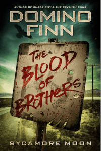
JF: Attracts the eye and won’t let go. You can almost physically sense the pent up energy, and the hint of menace only makes it more attractive. Strong impact and a direct message make this a winner. (The “Sycamore Moon” is series branding.)
e-Book Cover Design Award Winner for December 2014 in Nonfiction
Dane Low submitted How Schopenhauer Got Me Through My Mid Life Crisis designed by Dane & Brittany at EbookLaunch.com.

JF: Love the way the designer has brought all the elements on this cover into a vibrant whole including title, art, and background. Combining energy and humor makes this cover magnetic.
Fiction Covers
Aimee Alexander submitted Pause to Rewind designed by Design For Writers. “The design is very personal to the author. The little boy on the cover is her son. The design began with that photograph. Initial cover drafts were good. Then, one day, the designer went one step further, turning the b/w pic to sepia and adding the swirly design at the top.”

JF: A beautiful and sensitive cover sure to intrigue readers, and the carefully controlled colors help. Please credit the designer by name when possible.
Alastair Pack submitted Quentin Cundick and The Web of Machinations designed by Andrea Orlic. “I requested designs on website 99Designs. A Croatian, Andrea Orlic, of Artrocity, won the competition. The book is a madcap comedy and the title and bold colours hopefully represent the fun within, as do the story elements shown: the bin-dwelling tramp, badger, female spy, etc.”

JF: An interesting and appropriate visual treatment, not sure the typography measures up though.
Amanda DeWees submitted Nocturne for a Widow designed by James T. Egan of Bookfly Design. “I decided to rebrand my historical romantic suspense novels and asked James for something with crossover and even literary appeal that would work well at thumbnail size. He did a brilliant job of creating a distinctive look that captures the mood and Victorian-era setting.”

JF: A beautiful concept, beautifully executed, with fine detail as in many of the covers by this designer. I wonder whether the very delicate title will still be visible at postage-stamp sizes.
Amy Kuivalainen submitted Cry of the Firebird designed by Scarlett Rugers Design.

JF: Appealing, although I find the title a bit fussy, and I’m not sure that the ornamented rules add anything at all.
Anette Pollner submitted Monsoon Midnights designed by Jaran Lakkanawat and Arthawit Pundrikapa.

JF: A magical look that really works for this rather monochromatic design. Not sure I would have used such a “corporate” typeface for the title, it seems to be working against the other elements.
Angelie Stahlnecker submitted Alpha Mission designed by Angelie Stahlnecker. “The cover was created using a photo purchased (with full rights) from www.freedigitalphotos.net for the background. I designed the logo and layout myself.”

JF: A good effort, but the multiple layers (type, logo, clouds, image in the clouds) right in the center add some confusion.
Artemis Greenleaf submitted Exit Point designed by Alicia Richardson. “This is a story about a girl who has a near death experience after falling into a pool and drowning. Whether she lives or dies depends on the outcome of her astral mission. I wanted to convey that while she was in the pool, she had an equal chance of living or dying.”

JF: Doesn’t work for me, I could barely make out the skeleton image that’s crucial to the message, and the typography is simply brutal.
Ashley R. Carlson submitted The Charismatics designed by M.S. Corley. “M.S. Corley designed the cover to replicate an old, ancient red book that plays a role in my YA steampunk fantasy novel, “The Charismatics.” The floating city has meaning, as well as the 3 triangles (a government insignia). Utterly fantastic, and I’ve heard great things from authors & readers alike!”

JF: The covers for steampunk novels are some of the most interesting because of the creativity behind the ornamentation used on many of them. Here, there’s a lot of delicacy to accompany the distinctive type.
Azaria Frost submitted Whore of Babylon designed by Azaria Frost. “The book is set in ancient Sumeria / Babylon, and centres on a strikingly beautiful young woman.”

JF: This would have worked better if the image of the woman was lighter, and there was a more practiced hand behind the type, which just looks lost.
Belinda Pollard submitted Poison Bay designed by Belinda Pollard. “We wanted to convey a sinister feel and a dangerous natural environment, while following the current trend to include human figures. The cover also needed impact in thumbnail size while remaining classy (and LS printable) in 6 x 9 trade paperback size.”

JF: A near-perfect ebook cover that has great balance, drama, and a clear hook into the story. Very accomplished for a cover by an author. ★
Benjamin Wende submitted Expensive Taste designed by Benjamin Wende. “A new title for the same old story. Thanks for your time.”

JF: Visually confusing, and with a clear mismatch between the title font and the image.
Benjamin Wende submitted The “Sweetest” Sin designed by Benjamin Wende. “As a beginner, I have a lot to learn from you. I am all ears. Cheers for your time and opportunity.”

JF: Okay, I’ll try. There’s no need for the quotation marks in the title; the font you’re using is reminiscent of the old west, although the book is modern. It also implies an outdoor life, completely at odds with the roses. And the black background looks ready to swallow everything else.
Bonnie Ferrante submitted Bouquet: Short Stories with a Buddhist Scent designed by Bonnie Ferrante. “SF and fantasy stories with Buddhist themes.”

JF: Cool, might have to get this one. The image is interesting, but all the type needs help. The title is whispering, and the fonts don’t really match very well.
Bonnie Ferrante submitted Leya designed by Bonnie Ferrante. “In a world where eye color may determine your future, Leya is born with one green and one blue eye.”

JF: I could just repeat the comment from your other cover above. Authors might consider working with a designer until they learn more about how to use type.
Bonnie Ferrante submitted Terror at White Otter Castle designed by Bonnie Ferrante. “A campy suspense in the tone of 1950s horror comics.”

JF: Bizarre and off-putting, alongside the dreaded “pasted together” look.
Brandon Zenner submitted The Experiment of Dreams designed by James goon write.com.

JF: Clever and carefully constructed.
Caroline Kaiser submitted Virginia’s Ghost designed by Scarlett Rugers. “Designer Scarlett Rugers was aiming to capture a sense of nostalgia and mystery with the design for Virginia’s Ghost. Inspired by silent movie star Louise Brooks, the cover began with an ethereal image of a flapper to which glamorous typography and elegant deco-style borders were added.”

JF: A gorgeous and beautifully disciplined cover, in which the designer focuses our eye on the ghostly figure at the center. Great choices all around.
Charles Bruner submitted The Janus Theory designed by Ty C. Simmons. “I have always been interested in Janus the Roman God, who represents a theory of looking at your past to see the mistakes you made and then use that knowledge to fashion your future. The obvious thing to do was to use the symbol of Janus which is 2 faces, one looking forward & one looking backwards”

CHERYL MACKEY submitted The Unknown Sun designed by Victoria at WhitandWare.

JF: Lovely.
Christophe Adrien submitted We, The Network designed by Derek Toigo.

JF: I like the layered look and faint air of menace conveyed by this cover, although using a different color for each line of type is distracting.
Christopher Joyce submitted The Creatures of Chichester designed by Jane Dixon Smith. “Jane has designed a very eye catching brand that works well across all three books in the series. Six are planned and I look forward to future covers that work well as a thumbnail and also in print. Strong typography and clear titles work well.”

JF: Some of the type needs work, like the word that appears to be “doud” and the font used for the author’s name, which needs either replacing or letter spacing.
Cinda C. MacKinnon submitted A Place in the World designed by Adriane Bosworth. The artwork is by Martin J.Heade; I love it because I feel it begins the story before you’ve read the first page. A. Bosworth designed the layout.”

JF: Is the story about birds? A fine eye for color and careful composition, although I’m wondering why the author has decided to treat her name as something to be worked out from the complex typography it uses.
Connie Chastain submitted Love in Smallfoot Alley designed by Connie Chastain. “Smallfoot Alley is an area of rural Chatahoula County in Alabama known for infrequent sightings of Bigfoot-like cryptids, except they’re less than five feet tall, and thus are known as the Smallfoot. The road on the cover is the location of a Smallfoot sighting that opens the story.”

JF: Love that visual, it really draws you in and warns you at the same time, but the one discordant note is the word “Love” in the title.
Cora Graphics submitted Armageddon designed by Cora Graphics.

JF: Interesting type, although the rest of the cover looks a bit generic.
Corey Furman submitted The Way of All Flesh designed by Mike Moss. “A small committee of personal (but highly professional) friends worked on the concept and Mike brought it to life. We went through a few iterations, but this was a standout in the pack.”

JF: Glad I didn’t get to see the rest. This one just defeats me. “The Way of All Flesh”? Seriously? Maybe I’ll call my next book “Remembrance of Things Past.” No, maybe “Paradise Lost.” The images clearly don’t belong together and make little sense, and the added-in eye color on the guy in the corner is so obviously fake it makes you suspect this is a parody of some kind. Unless that’s the effect you were going for, I suggest hiring one of the talented designers whose work you see in this post.
Cynthia D. Witherspoon submitted The Fanatic designed by Mika Hearn. “Image is credited to: Cover art: Portrait #8 by Erfi Anugrah; edited for cover use by Mika Hearn.”

JF: Don’t understand how the bottom half is connected to the top half.
D. Otter submitted Nobel Peace Prize designed by D. Otter.

JF: Unmistakably self-published. Putting type on top of a photo does not a cover make.
Dan Walsh submitted When Night Comes designed by Damonza.com. “Just want to plug Damon and his art team. I verbally shared the concept I had in mind, and was so pleased to see this cover as part of the 3 designs they sent me, within a few days of signing up with them. We just tweaked a few things, and we were there.”

JF: Plug away. It kind of gives you the shivers just looking at it.
Dane Low submitted Feast of Fates designed by Dane & Brittany at EbookLaunch.com. “Book one of this series”

JF: Eerie with impressive depth and a great title treatment. Awesome. ★
Dane Low submitted Max’s Revenge designed by Dane, Brittany and Sophia at EbookLaunch.com. “Book one of this children’s adventure series.”

JF: This whole series (see the next two covers) is delightful and nicely targeted to the middle-school crowd. Great color combinations and amusing illustrations create a classic brand look. ★
Dane Low submitted Outback Hero designed by Dane, Brittany and Sophia at EbookLaunch.com. “Book two of this children’s adventure series.”

Dane Low submitted The Venetian Job designed by Dane, Brittany and Sophia at EbookLaunch.com. “Book three of this children’s adventure series.”

Dane Low submitted Naked in the Garden of the Serpent designed by Dane & Brittany at EbookLaunch.com.

JF: Clever and artful, it drew me right in; I couldn’t stop looking at the title in the tree, and gradually the other elements seeped into consciousness.
Danielle Soucy Mills submitted Illusion of an Ending: A novel designed by Mae I Design. “I imagined my cover to be a woman looking out at the ocean with her son’s spirit surrounding her. My friend’s mother graciously donated this photo of herself, the first time she had returned to her and her son’s favorite spot on the water, a year after his passing. Cover design by Regina Wamba.”

JF: Very sensitive and affecting. All the elements are well matched to the content.
Denise Drespling submitted Winter Wishes designed by Denise Drespling. “I designed this cover for an anthology of winter stories (that’s why there’s no author name).”

JF: Obviously a skilled design, but that big flare in the corner really bothers my eye and pulls me away from the message the cover is trying to communicate.
Dexter Price submitted The Chronicles of Fire and Ice: The Revealing designed by Najla Qamber. “The faces: My story is told through the eyes of two friends so that is why half a face of each is on the cover. NYC: is in the background for the location. Fire/Ice: because each one of my main characters has an ability to control one of the elements.”

JF: A strong concept, and effective. The colon (“:”) on the end of the title is superfluous and should be removed, and the subtitle is almost unreadable, something that can be fixed quite easily.
Donna Joy submitted Tangible Illusions designed by Donna Joy. “Tangible Illusions takes the reader on a journey of emotions through seven poems and a short story. The works deal with loss and loneliness. The picture is from Unsplash.”

JF: What works is the simplicity and restraint, good qualities when you’re not a professional. There are some spacing problems with the type, but overall it works even if it’s a bit vanilla.
ED FRIERSON submitted FLUTTER! Wisdom For Living, Loving, Dying designed by Christopher Darling. “The cover features original, hand-drawn, butterfly wings having species integrity. It replicates the cover of main character Casey’s wisdom revealing “Bug Book.” The compelling cover wonder fills a dramatic scene when the notebook unexpectedly appears for the first time…at Casey’s memorial.”

JF: I’m sure people who buy and read this book will be very happy to see the story reflected in the cover. However, in general we design covers for those people who haven’t read it yet, and the problem I have with this cover, pretty though it is, is that it’s hard to make out what I’m looking at at a small size and I’m not sure why I’m supposed to be interested. By the way, your subtitle seems to belong on a self-help book, not a novel.
Elizabeth Maddrey submitted Kinsale Kisses designed by Lynellen Perry.

JF: Awkward. The images seem to fighting each other, not combining, and the white band between is like a no-man’s-land.
Gene Bathurst submitted Magnum Thrax and the Amusement Park of Doom designed by Gene Bathurst. “Wanted something that was loud and clear when a teeny tiny thumbnail.”

JF: You’re almost there. But there are simply too many figures, at too great a distance. Great illustration style, but I would “zoom” in so we can really engage with them.
Georgina Titmus submitted Chicken Nugget Run! designed by Georgina Titmus. “e-published under my pseudonym Ali Aardwolff – I designed this cover combining my own artwork with the technical assistance of Powerpoint.”

JF: But what does it all mean? And why do we have a font right out of the Renaissance along with Comic Sans (or one of it’s imitators)?
Grayer Vaughan submitted The Silent Violent Few designed by Grayer Vaughan. “The cover design was inspired by the submissive pose that a character, Frankie aka Dandelion, does in the book. This is a pivotal scene that was able to be captured and placed on the book cover to represent the tone of the book. The rope corset is a reflection of the struggle she experiences.”

JF: A lesson: when you use an image of this sexy, exotic woman with overtones of bondage and slavery, please don’t pick a font that belongs on an invitation to a Valentine’s Day party.
Grier Cooper submitted WISH: Indigo Dreams Series #1 designed by LJ Anderson, Mayhem Cover Creations. “Original photo of ballet dancer © Grier Cooper (author)”

JF: I like the colors in this cover, but I can’t help but wonder how much more impact it would have if that big mirror thing was eliminated, allowing the ballerina to stand out.
Hanna James submitted Nola designed by Hanna James. “The client/author Giliak Hobson wanted a book cover that emphasized his main character as a woman warrior saving her young child, with a design that’s clear in thumbnail. Fantasy genre.”

JF: Although I like the title and background, it’s hard to see how that font (does it take place in New Orleans?) belongs on a cover with a woman holding a sword and dressed in armor. They just don’t work together well.
Heatherly Bell submitted Somebody Like You designed by Kim Killion.

JF: An example of a designer who knows exactly what genre readers are looking for, and gives it to them. Lovely title treatment.
Iacopo Cavicchini submitted Il Portale -Le Radici designed by Saverio Cavicchini. “The cover shows the characteristic eyes of one of the character looking directly to the reader. The book is the first of a saga, we tried to comunicate this whit the typo. “Il Portale” is the saga title,”Le Radici” the book title. At the bottom you can see a logo, like a publishing house one.”

JF: The illustration is quite interesting, the type is weak, and publishers rarely put their logos on the front cover of their books.
Ioana Visan submitted Broken People designed by Cristina Birtea. “The prosthetic arm belongs to the Golden Lady, one of the main characters in the novel, and the pattern on the sphere is meant to imply she holds the fate of the whole world in her hand. The illustrator drew exactly what I asked her, so if anything doesn’t work, it’s on me.”

JF: Nothing wrong with the illustration, but the title’s been bullied into a corner, and its color is fighting with the very similar color of the illustration.
Ioana Visan submitted The Nightingale Circus designed by Cristina Birtea. “The Nightingale Circus is a prequel to Broken People. The circus crew builds and repairs prosthetics as a side business, so I wanted the illustration to intrigue and invite the reader in. The illustrator drew exactly what I asked her, so if anything doesn’t work, it’s on me.”

JF: This one works much better, and the illustration is quite dramatic and inviting.
J. Zachary Pike submitted Orconomics: A Satire designed by J. Zachary Pike. “Orconomics: A Satire pokes at the economy and corporate culture through the lens of a high fantasy epic, so the cover blends an Orc with design elements associated with a $5 bill.”

JF: Although the “engraving” of the orc and the bill details is obviously very skillful, this doesn’t, in the end, really look much like a book cover.
James Duprie submitted The Leopard Rider designed by Dave Fymbo from Limelightbookcovers. “Title relates to a character in this historical fiction novel.”

JF: Simple but effective. A bit too much black for my taste.
James Egan submitted Forged by Battle designed by James T. Egan of Bookfly Design.

JF: Great texture throughout this design, and the concentric circles focus right on the window into the action.
James T Kelly submitted The Fey Man designed by Annah Wootten-Pinéles. “I thought a stained glass design could be both beautiful and eye-catching. Both the dragon and the tower are from a pivotal scene in the book, but Annah must take all the credit for turning those elements into such a striking image.”

JF: It’s a striking image, would like to see the type a little stronger to achieve a better balance.
Janet Bond submitted Eleventh Elementum (The Primortus Chronicles Book1) designed by Deranged Doctor Designer, MARUSHKA. “This YA Fantasy/Adventure cover features the main character Sky Porter, holding her magical necklace called the Elementum. We asked Deranged Doctor Design for a spectacular sky in the background (a play on our main characters name) and a youthful girl in movement.”
")
JF: Some nice atmosphere. Notice how the extemely active type treatment of the title is the most visually energetic part of the cover.
Janet Bond submitted Hollowed Humusara (The Primortus Chronicles Book 2) designed by Deranged Doctor Designer, MARUSHKA. “For the second book in this YA fantasy/adventure series we wanted a feeling of intensity and action. Sky Porter’s magical book called the Humusara is in danger of losing its pages in a Hollowing ceremony performed by the powerful Primortus Council.”
")
JF: I think this one works better than the first. You can see how the type treatment of the title is being used as a branding element as well.
Jay W Curry submitted Nixon and Dovey, The Legend Returns designed by Radosław Krawczyk. “Set in antebellum South. Nixon, young, lived with the indians (his dress), jockey (the horse). Dovey, Nixon’s love interest, quintessential beautiful, spoiled Southern politician’s daughter thus the mansion and her dress. Nixon was condemned to hang for Negro stealing thus the black man and noose”

JF: Strong story elements combined with artful type and image compositing create a good looking cover.
Jayde Blumenthal submitted Miri’s Hot Challah: A grownup Jewish bedtime story designed by self – KD Cover Pro templates. “This is the first in the series of short stories. The heroine needed to look somewhat Jewish and I wanted an image of bread in the background, even though this story is primarily about how Miri acts out her desire through the bread. Tough call – hard to create a cover for Orthodox Jewish erotica.”

JF: Shows both the advantages and disadvantages of “template” book covers. While you don’t have to worry about it looking very amateurish, it may not suit your book that well either. I’ve never seen a challah with seeds on it, creating a bit of dissonance.
Jenny B. Jones submitted A Sugar Creek Christmas designed by Kelli Standish. “For this cover, we wanted to capture the small town, Southern setting, the warmth of the holidays, and a slightly differently look for the typical couple on the cover.”

JF: A workable genre cover that does what it has to do.
Jenny B. Jones submitted Can’t Let You Go designed by Kelli Standish. “Can’t Let You Go is a New Adult romance, but we wanted to try something a little different and break from trend for the cover.”

JF: Not exactly sure which trends you’re bucking here, since this looks like a perfectly acceptable genre cover. The luggage tags let us know there’s some travel, and the couple tell us everything else we need to know.
Jim Carson submitted A Chasing After The Wind designed by Damonza. “The green shamrock is symbolic of the rich Irish heritage that runs through the veins of the main characters. The gold lettering represents the deleterious wealth exchanged between all the characters, and the blowing grass, stormy clouds against the black skies, follows the storyline of the title.”

JF: The type’s somewhat overworked for me, but you can’t fault the composition or the care that went into this cover.
Jo Michaels submitted Fractured Glass – A Novel Anthology designed by Jo Michaels. “I’ve been working on my typography comfort level. I designed this cover for this new kind of young adult science fiction novel. 5 authors, 1 story. We’ve gotten many compliments on the cover, and I’m curious what you think, Joel. Including all the names was a challenge. Thanks for the opportunity!”

JF: I think the names are handled well, although I usually avoid fonts this fussy. The problem I’m having is with the very bright highlight behind the title that’s rendering it somewhat hard to read, and I find that distracting.
John T O’Halloran submitted The Second Conflict designed by Niall Conlon. “The Sword passes throug a pentagram, the seal of the Magii, representing the four elements and Spirit. These swords were were forged from the ore that came from The Mines of The Moon & were doused in the blood of The Fallen Angels”

Johnathon Major submitted The Nectar Fields designed by Johnathon Major.

JF: Another example that shows how an amateur designer’s best friend is simplicity. Although the title is a bit quiet, overall the cover works.
Josefina Gutierrez submitted The Shadow of Loss designed by BookBaby. “The cover of my e-book, The Shadow Loss, depicts two best friends finding peace after loss. Their faces are faded to focus on the background.”

JF: Not very good, I’m afraid. What’s the point of blurring the most interesting element on the cover in order to focus on some leaves? And the title is lacking in contrast.
Jūratė Žukauskaitė submitted Boris Goes to the Supermarket designed by Julija Linkutė, Jūratė Žukauskaitė. “The cover perfectly reflects the mood of the novel. The weary pursuit towards love and happiness and the touching human (and ursine) warmth are juxtaposed against the alienating bleakness of a generic Eastern European city, where going to a supermarket becomes a dark and humorous fairy-tail.”

JF: There’s some charm in the loose style, but not sure why you are pointing the reader towards what appears to be a smokestack?
Justice Joy submitted Straight and True: A Regency Novella designed by Stephanie Mooney at Mooney Designs.

JF: An expertly assembled cover for a historical romance, it’s got real appeal.
Katharina Gerlach submitted The Dwarf and the Twins (Treasures Retold #1) designed by myself. “The other covers in the series follow the same concept (black silhouettes against a blue sky)”
")
JF: I can see a lot of work went into this cover, which is why it’s a shame that it’s so visually confusing. The silhouettes aren’t really against the sky, they are contained within inverted silhouettes, a tough challenge for anyone. On top of that, I can see that the silhouette on the right is a bearded man inside a girl’s head, but what the heck is the other one? And I’m totally lost as to what the large black shape is supposed to be. One word: simplify.
Kathrese McKee submitted Mardan’s Mark designed by Robin Ludwig. “The color palette, imagery, and composition of Robin’s design beckons readers into the danger and intrigue of this Young Adult adventure fantasy. She integrated a medallion with the mark into the design, serving as a brand for the series.”

JF: Nicely atmospheric and well put together.
Ken Preston submitted Joe Coffin designed by Patrick Fox. “Joe Coffin is a horror novel, with lots of blood.”

JF: Oh really? The type here looks out of balance, with the title both too low and too small to properly balance the type at the top and bottom of the cover.
Ken Preston submitted The Devil and Edward Teach designed by Patrick Fox. “The Devil and Edward Teach is a tale of pirates and the supernatural.”

JF: Cool graphics, hard to read title. What do all those effects really add? Whatever it is, it’s the opposite of design.
Kim DDD submitted Game Theory designed by Kitten from Deranged Doctor Design. “Cover re-design of Women Suspense “Game Theory” by Colleen Cross.”

JF: Cleverly constructed, this is an impressive ebook cover. Notice that even though the cityscape at the very bottom is quite small, it still adds to the information we get from a glance at the cover, and the vast size differences here add to the tension of the whole design.
Kim DDD submitted Kizuna Coast (A Rei Shimura Mystery book 11) designed by Kitten from Deranged Doctor Design. “Cover redesign and branding of Women Mystery series “Rei Shimura Mystery” set in Japan.”
")
JF: Expertly designed series covers (see the one below) that do what they are supposed to: strongly brand the series while giving enough story detail and human interaction to draw us right in.
Kim DDD submitted Shimura Trouble designed by Kitten from Deranged Doctor Design. “Cover redesign and branding of Women Mystery series “Rei Shimura Mystery” set in Japan.”

Kim DDD submitted Tainted (Burdened Series, book 2) designed by Kitten from Deranged Doctor Design. “Design for paranormal Young Adult Romance by Peiri Ann.”
")
JF: I love the way these colors work together and complement the careful typography.
Kirsten Binder submitted Release designed by Lindsay Megahed. “This ethereal, original artwork’s incomplete-seeming, almost hasty swaths of pinks and blues grows more complex as it is examined, perfectly suiting the novel’s subject matter. ”

JF: I can see how artful the illustration is, but can you see how awfully difficult it is to evaluate this as a book cover, since it’s completely bleeding onto the background of the page? Please resubmit this cover with a border around it (even a light gray one would do), thanks.
Kody Dibble submitted Gauntlets of Rage designed by Su Halwerk. “This is a poetry collection I recently published.”

JF: If you want to use a brutally strong element like this chain, put it on the left of the cover, not the right. Here you are directing us to the spine, not where the book opens (the right). Type leaves a lot to be desired.
L.G. O’Connor submitted The Wanderer’s Children designed by Derek Murphy at CreativIndie. “This is the second book of the series and carries some similar elements throughout.”

JF: Although this cover is expertly done, I’m at a loss to understand the bottom half of the image. Anybody?
Laura Espinosa submitted The Devil Behind The Cross designed by Laura Espinosa.

JF: A very dull image will usually not make a good ebook cover, and if your type is over a black background, try a different color than dark red.
Lily Bishop submitted Under His Protection designed by TugboatDesign.net. “We used the city background for this book to tie the series together. Each story takes place in a different city, from Las Vegas to Miami to Atlanta.”

JF: Identity crisis: is it a romance (from the font chosen for the title) or a mystery or thriller (from the figure with the gun and the cityscape)? No idea. And the white corner looks a bit like a mistake, as if something was supposed to go there.
Lindsey Forrest submitted All Who Are Lost designed by Robin Ludwig, Robin Ludwig Design. “I felt that Robin found a photo where the model conveyed a sense of loneliness and loss.”

JF: Graceful typography and images that convey real feeling.
M.L. Gardner submitted 1929: Book One designed by The Thatchery. “The cover was designed by The Thatchery for the rerelease of my book 1929: Book One of The 1929 Series.”

JF: It can be hard to combine more than two images and end up with a cohesive look, but this cover succeeds, and part of that is the careful color decisions and the mood that’s so well expressed. Looks like an epic, something you’d like to really settle down with. ★
Mallory Rock submitted Anyone? designed by Mallory Rock.

JF: Billed as a “YA apocalyptic adventure” this title/cover combo is dynamite. You’ve got the story, and the intrigue, right in front of you, inviting you in.
Margaret Lesh submitted Mr. Katz is a Zombie designed by Steven Lesh. “This lower middle grade book is designed for readers age 8 to 12. Because of the book’s humorous bent–think The Hardy Boys meets Ghostbusters–I wanted the cover to have more of a fun cartoon feel than grotesque imagery that so many of the zombie-themed books have.”

JF: It looks like you made some great decisions here to end up with this delightful cover, but it’s quite difficult to evaluate because it’s bleeding out onto the white page, losing its identity as a book cover. Put a rule of some kind around it when you post it online.
Mark Collins submitted Thicker Than Water designed by Mark C. Collins. “I am the writer (under a pen name) of this short story, I also designed and illustrated the cover. The cover is a depiction of the setting in which the tragic story takes place.”

JF: You have a unique drawing style that really works on this cover. It would be even better if the title were larger, allowing it to integrate with the artwork instead of being framed by it, adding energy and interest.
Mark Steensland submitted Jesus, the Christ designed by Eden Lewis. “Because we were publishing on Amazon, we wanted a cover that looked big even when it was small. This is why the sides of the letters in the title are “cut off.” We also wanted an image of Jesus outside the usual and the Durer sketch we used as the basis communicates the tragic nature of the drama.”

JF: Nice job, and a cover that would easily transition into a theatrical poster.
Mary Ann Vitale submitted The Water Lily Fairy designed by Susan Shorter. “The Water Lily Fairy is walking on the lily pads, ready to discover the little world around her.”

JF: But she is so very far away, it’s hard to engage with her. And I’m sorry for whatever happened to your book title, it’s quite unfortunate.
Melinda Martin submitted Peacock Swamp | The Nine designed by Melinda Martin. “Moths are an element of this story that tie in with the main character. I chose a few images of some moths and then overlapped them in the shape of a 9 and applied shading and highlighting. I then added a light effect inside the 9.”

JF: Although it’s not terrible, I’m not fond of it. The center circle indeed looks like moths ate it, and wasn’t there anything else you could think of for the background?
michelle eastman submitted The Legend of Dust Bunnies, a Fairy’s Tale designed by Kevin Richter. “Hello. Thank you for this opportunity. It was fun to see some familiar names on the November list of winners. I was also glad to see children’s books included. Thank you!”

JF: Always glad to see children’s books in the inbox. This one looks fun.
Missy Meyer submitted We Could Be Villains designed by Missy Meyer. “Chick lit with superheroes. I wanted something simple and bold, with a font that hints that it’s not a serious, heavy superhero book. Pink seemed too obvious for the mask, plus when the lead character wears one, it’s blue.”

JF: I think it was a strong idea, but all that white gives me an unfinished feeling. And I’m not sure your audience will recognize it as “chick lit.”
N. J. Lindquist submitted My Brother’s Keeper designed by N. J. Lindquist.

JF: No, just a photo with some ungainly type on it. Hire a pro.
Nanda Kishore Rajanala submitted AHAM, the other I designed by Nanda Kishore Rajanala. “The cover of my e-book, AHAM-the other I, shows the two main characters of the book sitting on the deck of pier 14 in the San Francisco Bay Area, the location where a significant part of the conversation between the two characters happens- a man and his alter ego or is it God!”

JF: Awkward and indistinct. A cover designer could create a lovely cover for this book.
Nicholas Rossis submitted Runaway Smile: an unshared smile is a wasted smile designed by Dimitris Fousekis, Roula Vonitsi. “Dimitris Fousekis illustrated the boy and did the lettering. Roula Vonitsi designed the cover. Thank you for running the competition! :)”

JF: The illustration looks lovely, but the “design” communicates nothing. Artless.
Nicholas Rossis submitted The Power of Six: Six (plus one) Science Fiction Short Stories designed by Nicholas C. Rossis & Dimitris Fousekis. “Dimitris Fousekis illustrated the silhouette, while Nicholas Rossis designed the cover.”
 Science Fiction Short Stories")
JF: That is one short waisted dude in the illustration, but the cover does an adequate job overall.
Olivia Brown submitted Just Saturday nights designed by Melody Simmons. “The title came from the novella. I wanted the cover to a darker colour, more like Wedding night by Sophie Kinsella, then I saw this cover on Melody’s website.”

JF: Lovely colors. You can see that designers are over-relying on silhouettes, maybe because graphically they are very easy to assemble and work with. But at some point, don’t they start to look more like voids?
Paul Levy submitted Skive designed by Kate Broadhurst. “Kate is a very talented artist. After seeing her work on her website I knew she’d design the perfect cover that reflected the atmosphere I wanted. I hope you lot like it as much as I do. Thanks, Paul.”

JF: The art and typography are gorgeous. But I wonder how it relates to a black comedy that takes place in the streets of London?
Paul Matthews submitted The Remains of Fate designed by Myself.

JF: Okay, let’s talk about it again. There’s so much black on the covers this month. Here you can see how this simply creates a void, a lack of anything, the option taken to not decide on something, to just leave it out. In this case the effect is compounded by pushing the type out of the way so the black can really take over. Despite the attractive girl, it doesn’t work at all for me.
Peggy Rose Soren submitted Love, Money and Murder designed by pro-eBook covers 2 Fiverr. “I ,at first, designed the cover myself using my own artwork. The book didn’t sell. I turned to Fiverr for help. Angie (pro-ebook covers) was wonderful to help me . The photo is from Shutterstock. She put together just what I wanted to show;an innocent young woman with serious problems.”

JF: A nice job. Did you actually pay $5? And you didn’t tell us the punch line: have your sales gone up with the new cover?
Pippa Jay submitted When Dark Falls designed by Victoria Miller. “superhero romance/urban fantasy”

JF: Love that leather. There’s a lot going on here, but the composition and controlled palette help to hold it all together and make it interesting.
R.G. Manse submitted Pursue Friendship designed by R.G. Manse. “Created in Inkscape (open source Scalable Vector Graphics package) applying tips picked up from various sites including here and creativindie.com. Similar elements used in all books in the series. Lato (open) typeface used on covers, internally for chapter headings, and on the author web site.”

JF: Clever and interesting.
Rebecca Bradley submitted Shallow Waters designed by Paperandsage.com.

JF: Expertly done, with beautiful texture and impressive type styling. Pulls you right into the story. ★
Rebecca Cantrell submitted The World Beneath designed by Kit Foster Designs. “I absolutely love what Kit Foster has done with the cover for my thriller–it’s sophisticated, mysterious, and fascinating. It definitely helps draw you into the underground world of Joe Tesla, the book’s main character.”

JF: Fantastic, one of the best I’ve seen from this designer. Full of energy and a bit of menace. ★
Richard Kendrick submitted Phrases of Light designed by Richard Kendrick.

JF: I guess it’s sci-fi, but it’s hard to be sure. The title font is a bizarre choice, and I have no idea what’s going on with the caped man and the floating gear. Odd.
Ronald Walker submitted Jewella Crossing designed by Ronald Walker.

JF: A good job that could have used more light or better composition in the bottom image so we could recognize more easily that it’s a sail boat on the sea. The way it is, dark and running into the upper image behind the title, it’s hard to tell at first.
Ronald Walker submitted Lovers Lies and Lilies designed by Ronald Walker. “Lovers Lies and Lilies. I hoped the cover would entice investigation and my small budget dictated the result.”

Ronald Walker submitted Summer Help Wanted designed by Ronald Walker. “Farming Cowboys Horses Rodeo and Love; albeit at times without acting loving”

JF: A decent composition somewhat undone by the overall dark and murky tone of the cover.
Ruthanne Reid submitted The Sundered designed by Ruthanne V. Reid. “I had a blast designing this. The hint that a living creature made of water has sprung from the depths is evocative, and directly applicable to the book’s theme and characters. I also love the colors; it could be peaceful and soothing, but something about it is chaotic and frightening, as well.”

JF: When I looked at this cover enlarged, I could see everything you describe. But at this size it becomes too dark and muddied to see hardly anything at all.
Sandra Hutchison submitted The Ribs and Thigh Bones of Desire designed by Damonza.com. “I went back to Damon Za, who had redesigned my cover for The Awful Mess, because I wanted a similar look despite a change in genre from women’s fiction to coming of age. I think he handled the challenge of that and the long title quite well.”

JF: Yes! The masterful handling of the title typography is the perfect foil for the illustration and rich, evocative background. A winner. ★
Sarah Channing-Wright submitted The Angels of Islington designed by Sarah Channing-Wright. “The concept for this cover came from combining vampires, goths and the London Underground, which is what the book is about.”

JF: Terrific, everything you want in an ebook cover: impact, a clear signal about the genre and tone of the book, and just enough edgy design to shock and hold the viewer.
Shauna Aura Knight submitted Werewolves in the Kitchen designed by Shauna Aura Knight. “I went for dark earth tones when I designed the cover for this paranormal romance. While there are lighthearted moments between the threesome, there’s also danger and dark magic below the surface of the “normal.” Ellie’s introduced to this when she discovers that her two lovers are werewolves.”

JF: Hopelessly confused and “pasted together.”
Shelley Adina submitted Glory Prep designed by Jenny at Seedlings Design Studio. “Glory Prep is a Christian contemporary YA, and launches a series of six. I found cover designer Jenny (Seedlings Design Studio) right here on the Cover Awards, when she won for an illustrated design and I knew her style would be just right for this series. So thank you, Joel!”

JF: What a great story, thanks Shelley. I love the light touch on this cover, and I think the design is going to work well with your audience.
Sherri Wilson Johnson submitted To Dance Once More designed by Lynnette Bonner. “I love this cover by Lynnette Bonner for my first novel, To Dance Once More. She’s an excellent designer who knows exactly how to capture the heart of a novel.”

Sherri Wilson Johnson submitted To Laugh Once More designed by Lynnette Bonner. “This is the cover for my second novel, To Laugh Once More. The designer is Lynnette Bonner and she’s the best at depicting the mood of the book!”

JF: I much prefer the second of these two related covers. The color scheme is warmer and more cohesive, and the woman makes direct contact with us, where in the one above there’s definitely less human contact and a cooler overall tone.
Simone Colwill submitted What Does Super Jonny Do When Mom Gets Sick? designed by Jasmine Ting.

JF: A fun and exciting cover for this book aimed at early readers.
Slobodan Cedic submitted Recon designed by Slobodan Cedic.

JF: An effective way to integrate the title of the book into the cover art, sets a nice apocalyptic tone for this sci-fi novel.
Stephen Arnott submitted Jack Bleacher: a parody designed by GoOnWrite. “This is the cover for my latest novel ‘Jack Bleacher’. As you might guess, it’s a parody of the Jack Reacher books by Lee Child. It’s an off-the-peg design by James at GoOnWrite. I love the crisp image of the gun against the neutral grey. Having ‘parody’ in black allows the title to stand alone.”

JF: It’s a lovely photo, not sure I see any evidence of the parody in this cover, which could just as easily be a cover for a straight detective story or thriller. Am I missing something?
Stephen Chandler submitted Lasting Love designed by Stephen Chandler. “Two children fall in love, and are then parted when the girl moves to America with her parents.”

JF: I know authors put a lot of time and energy into doing their own covers, but you need to be able to tell when what you have produced is not going to help your book, but instead may well hurt it. This cover falls in that unfortunate category. Hire a designer if at all possible.
Stephen Chandler submitted The Residential Home Murders designed by Stephen Chandler. “Elderly people murdered in care homes.”

JF: See note above.
Taillefer Long submitted How Washington Lost His Birthday and Other Masonic Essays designed by Taillefer Long. “Since the material was pretty varied, without a single, unifying concept, I decided to play with the title in a creative way. Although the word placement was risky, I hope it works to make it more interesting and appealing.”

JF: The various titles and credits add confusion, but I do think you’ve handled the long main title well.
Tamara Leigh submitted Stealing Adda designed by Ravven Kitsune. “I adore the look Ravven developed for the re-release of my 2006 novel, Stealing Adda, and that she beautifully carried it across all four titles in the series. I believe the image, layout, and color selection perfectly capture the story’s essence.”

JF: And it’s lovely, I’m just wondering about why the entire focus of the cover is pointing toward the girl’s foot? Are we meant to be staring at her shoe?
Tom Connelly submitted The Postcard designed by Katie Connelly.

JF: I just don’t know what to say. Does it look like a book cover for a coming of age novel? And an appropriate time for this: “What were they thinking?”
VICTOR TRUTH submitted BOMBAY, DECODED designed by VICTOR TRUTH.

JF: Nice concept but a boring and confused result. The strong horizontal bands don’t help, since they are fighting with the central image for preeminence.
Nonfiction Covers
Allison Moon submitted Bad Dyke designed by Allison Moon. “A bit risque, yes, but I’m hoping you’ll see the inspiration I took from John Kacere’s paintings, and Sophia Coppola’s “Lost In Translation” for this sex memoir.”

JF: Risqué yes, but what else for a book like this? Lots of style and it really connects with your audience. ★
Beth Jones submitted Write That Book designed by Lan Gao. “This design was done by Lan Gao. I requested a cover that really drew the reader in and helped them to feel inspired. The goal of this book is to help new writers discover that they really can write the book of their dreams. More importantly, they can do it right now.”

JF: Both inviting and inspirational, a creative approach for this nonfiction cover.
Bonnie Ferrante submitted What’s Missing: Faces designed by Bonnie Ferrante. “Children must identify which facial feature is missing.”

JF: (It’s the nose.) Lovely illustration that would benefit from a better approach to the typography.
Cappy Love Hanson submitted Love Life, with Parrots designed by Joleene Naylor. “Love Life, with Parrots chronicles my romantic misadventures in search of my life partner, and my growing flock of intelligent, affectionate, and unpredictable parrots–my little knights in feathered armor. It’s mostly serious memoir. The feathers lent just the right touch to the cover.”

JF: Underwhelming, with little impact. Why not use one of your parrots, it would be more colorful.
Clay Rivers submitted The Raindancer: Finding Joy in the Storm designed by Clay Rivers. “This book is about a family-man’s battle with colon and lung cancer. In the same manner that he chose to transform an unsightly surgery into a fun topic of conversation by donning Hawaiian shirts, I sought to wrap a potentially joyless book in a lighthearted cover.”

JF: Visually coherent and with a lot of appeal, strong typography, and a lovely background texture, although the generic subtitle won’t help inform readers about what’s really in the book.
Glasz DeCuir submitted Rebel Machinima Manifesto designed by ChabelaBooks. “Art Book “Rebel Machinima Manifesto” explores New Media Art with an aesthetic definition, content and proposals on Digital Filmmaking.”

JF: An accomplished piece of artwork on a cover that’s fairly confusing to the casual browser.
Hassan Javed submitted A Crammer’s Guide designed by Hassan Javed.

JF: Not every nonfiction book needs a lot of “design” to sell, but at least you should be able to read the title, which is a struggle here.
Heather Day Gilbert submitted Indie Publishing Handbook: Four Key Elements for the Self-Publisher designed by James at Go On Wirte. “This was my first time using a pre-made cover and I was very happy with it. James provided me with many background color samples on this one, and after showing them to a pool of readers, everyone agreed the blue background fit best. Loved the picture that showed our writer “tools of the trade.””

JF: The illustration style adds a lot of charm to the cover, and the fonts are well chosen if a bit quiet.
James Egan submitted Determined designed by James T. Egan of Bookfly Design.

JF: An artful handling of a sober subject, beautifully put together. ★
Jennifer Tzivia MacLeod submitted Spineless Wonders: 10 Incredible Animals Without Bones designed by self. “Needed to suggest nonfiction and immediately let buyers know what the book was about while at the same time distinguishing it as the only book that mixes Jewish Biblical tradition with kids’ science nonfiction.”

JF: Easy winner for title of the month, and I like the bright contrasting colors. However, the cover itself is very out of balance, communicating no idea of how all these elements are supposed to relate to one another.
Joe Sledge submitted Did You See That? On The Outer Banks designed by Joe Sledge & Barb Noel. “The original cover design is by Joe Sledge, the author, and it was put together by Barb Noel, the graphic artist.”

JF: There’s a certain amount of schizophrenia going here. The title typography, background, and overall composition are obviously the work of a professional, then you have those snapshots, which send a completely different message.
Julian Kirkman-Page submitted The 7.52 to London bridge designed by Julian Kirkman-Page. “My book is a humourous autobiography. I am a commuter looking wistfully our of the carriage window and reminiscing on adventures and misadventures past. I designed the cover in Paint.net using a photograph of me and a watercolour from my book painted by me.”

JF: A workable concept but a very ineffective execution. A designer could take all these ideas and elements and turn them into an actual book cover.
Kristen Harrison submitted In These Great Times: Selected Writings designed by The Curved House (Emma King and Kristen Harrison). “Hello, we have designed an ebook series for a start-up indie publisher in Amsterdam. We are pleased to submit one of the covers for your consideration. The brief was to create a striking series style that reflects a German expressionist aesthetic and also appeals to contemporary readers. Thanks.”

JF: A workable and interesting series design. Nice job.
Marcy Goldman submitted The Baker’s Four Seasons designed by Damon of Damonza.

JF: With a mouth watering photo like that, how can you go wrong? Clearly the designer understands what readers want very well.
Noel Chidwick submitted Let’s Build a Human Being designed by Noel Chidwick.

JF: I think a book like this about “functional physiology” would gain a lot by having more text on the cover to explain what it’s about. The visual approach is interesting although the typography doesn’t contribute much.
Sean Michael Hayes submitted Five Weeks in the Amazon designed by Rory Doyle.

JF: A strong cover that cleverly makes the assertive type part of the illustration, drawing us into the image too. And that simmering pot is evocative, it just makes you want to know more. ★
Sue Irving submitted How to conquer a mountain designed by Sue Irving.

JF: I wish I could find something positive to say about this cover, but I can’t. With all the commitment and energy it takes to complete a book, I would hope more care would go into packaging it.
Taillefer Long submitted Spies I Knew designed by Taillefer Long. “I tried to recreate a WWII spy-thriller feel, using a codebreaking approach to the title that hopefully doesn’t take away from the legibility.”

JF: There’s nothing wrong with the device, but overall the tone of this cover is very dull, and the background is providing too much “static” to allow the type to really stand out.
Valerie Rind submitted Gold Diggers and Deadbeat Dads: True Stories of Friends, Family, and Financial Ruin designed by Laura Duffy. “I discovered Laura Duffy after I perused hundreds of covers shown in these design contests. Her clean, clear style appealed to me. She pulled off a striking cover about a serious subject but with a touch of whimsy.”

JF: Exactly what you want in a nonfiction cover, and notice that the title, subtitle, and visual treatment all combine to give us a very clear idea of what this book will be about. ★
Well, that’s it for this month. I hope you found it interesting, and that you’ll share with other people interested in self-publishing.
Use the share buttons below to Tweet it, Share it on Facebook, Plus-1 it on Google+, Link to it!
Our next awards post will be on February 9, 2015. Deadline for submissions will be January 31, 2015. Don’t miss it! Here are all the links you’ll need:
The original announcement post
E-book Cover Design Awards web page
Click here to submit your e-book cover
Follow @JFBookman on Twitter for news about the E-book Cover Design Awards
Check out past e-Book Cover Design award winners onPinterest
Subscribe to The Book Designer Blog
Badge design by Derek Murphy
