

Can the fonts you choose have an effect on your author branding?
That’s the question that keeps popping into my head as I drive around San Rafael the last couple of weeks. We don’t have many things to vote on, but one is a race for a seat on the San Rafael City Council, being contested by Maribeth Bushey Lang and Kate Colin.
How do I know that? Their election posters are side by side throughout town, and you can see them on a chain link fence in the photo at the top of this post.
Fonts Convey Information, Mood, and a Sense of Style
Obviously, the candidates themselves are probably not responsible for creating the graphics for their posters. But campaigns these days do put a lot of thought into the branding they establish for their candidates.
At the highest level, in presidential elections, high-powered advertising and branding agencies are given this task, and some of their work is memorable. Probably the strongest visual brand to emerge from politics in the last 10 years is the Obama “O” that adorns much of his promotional material.

On a local level, which might parallel the efforts of indie authors, branding is conveyed by overall design, by color choices and, most forcefully, by the fonts selected.
Fonts have a long history due to the way typeface design has developed over the 500 years since its invention. Influences from the scribes who predated typography, to technical revolutions in papermaking and metallurgy, to fashions of the times have all had their effect on designs.
Today we have a bewildering number of typefaces to choose from, and working out how to use these fonts is one of the most difficult things to teach do-it-yourself authors.
Compare and Contrast
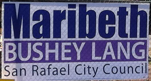
We can learn something about this from these campaign signs. Here’s the sign for Maribeth:
Some of the ways this typography communicates:
- The top line is set in a very heavy, condensed sans serif typeface in upper and lower case letters, and is meant to convey strength.
- The second line is set in a bold, normal sans serif, in all caps. This treatment might be seen to express clarity and precision.
- The third line is set in a light sans serif typeface, once again in upper and lower case. This kind of type might be seen on a corporate report or sci-fi novel.
To my eye, this sign is fighting against itself. It’s as if the designer couldn’t decide which treatment he liked, and the effect of switching from one style to another 3 times in 3 lines of type expresses confusion more than anything else.
The sign also uses 3 colors for the 3 lines as well, with dark blue, white on purple, and black for the bottom line. Does that say “consistency” to you?
Isolating the second line with Maribeth’s middle and last name also emphasizes some unfortunate associations, like “What’s a bushey lang anyway?”
The solidity of the large stripe in the middle, which might give this sign some gravitas is undermined by the very weak, upper and lower case type below it. You can’t create solidity on a foundation that’s weak.
Okay, here’s Kate’s sign:
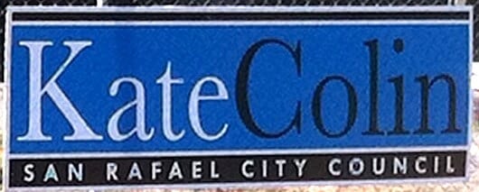
This designer had a completely different approach, using exactly the same elements.
- The name is set quite large, using a classic serif typeface in upper and lower case. Some contrast is introduced by coloring the first and last name differently.
- Colors are unified, with black type and white on a black background tying the upper and lower parts of the design together.
- The bottom line, stretching across the entire sign, is set in letterspaced capitals in a sans serif typeface that’s clean and very readable at a small size.
Everything about this sign says “competence,” “organized,” and “tasteful” at least to me. The design balances well, with the one large element instantly readable, and supported by the solid, block-like base of the capital letters running along the bottom. This forms a solid foundation on which the entirety of the sign balances.
I know nothing about either of these candidates or their party affiliations. But, just from driving by them every day, I’ve already formed associations with each of the people behind the signs, and these associations are constantly reinforced.
In one case, it might be summarized as boldness but without a good foundation, and a confusion about the details. In the other, it’s a classical, balanced, holistic approach that’s emphatic without shouting.
Which would you vote for?
As indie authors, we should think about the kind of effect our font choices have, and whether they create associations that will work in our favor.
More on Branding
Author Branding: The You That Is Everywhere
Our Author Brand—The Choice Between Meaningful and Empty, Sad Imitation—Kristen Lamb
Do You Have the 5 Elements of a Powerful Personal Brand?—Michael Hyatt
Creating an Author Brand to Boost Your Platform—Matthew Turner
Microdomination: Branding, Content Marketing And Social Media With Trevor Young—Joanna Penn
What’s In A Logo? Plenty, If You Want To Be POTUS.—Anna Beth
