The first issue of our monthly eBook Cover Design Awards appeared in August, 2011. Since that time we’ve given awards to dozens of outstanding cover designs, honoring the authors, publishers, and designers.
It’s all good, right?
Well, no, it isn’t because I haven’t really been happy about it since August, 2011.
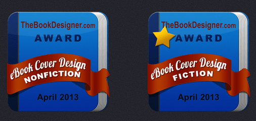
Nothing against those authors, publishers, and designers. No, I’m unhappy with the little badge that represents the award. Here it is:
0. Current Badge Design
Okay, it’s not bad. But it’s not very good, either. It’s the result of a bit of last minute shopping on Odesk.com, to be honest.
The woman who had drawn our wonderful Carnival of the Indies header and badges was unavailable, so I put it up for bid at the last minute and the result is the one you see here.
But I wasn’t happy, and it has taken this long to do something about it.
Now you can help me pick a new, better badge and, in the process, make one designer pretty happy.
The Competition
We asked designers to submit samples of a new badge design, keeping in mind we have to change the “Fiction” and “Nonfiction” designations as well as the month and year of the award. And we now have “Gold Star” covers, so we needed a way to acknowledge those winners, too.
We promised the winner a $100 Amazon Gift Card, so there’s really something at stake here.
Right below here you’ll see all the entries we received. Below that is a ballot to pick your favorite. Keep in mind you can vote for the existing badge, if that’s your favorite.
Which one should we use going forward? It’s up to you.
So have a look, pick the one you like best and vote for it. I’ll announce the winner on Sunday, so please vote by Saturday at noon Pacific time.
New Award Badge Entries
1. Designer: Manoj Vijayan
2. Designer: Kit Foster
3. Designer: Kit Foster
4. Designer: Lafcadio
5. Designer: Amber Shah
6. Designer: Sue Brettell
7. Designer: DJ Rogers
Okay, there you have it. Now it’s time to vote:
(If you are reading this in your inbox, you’ll need to click the title of this article, which will bring you to the blog post where you can vote.)
Note that the designs are listed in a random order, so make sure you have the right number/designer name.
Create your free online surveys with SurveyMonkey, the world’s leading questionnaire tool.
I voted … but I see some book cover violations up there! ๐
Most of the issues with the choices revolve around readability and which text features are highlighted (by size). Might clarify with resizing and new order of “Cover Design Award”, “Fiction eBook”/”Non-Fiction eBook”, Month+year, then (no www) “Bookdesigner.com” in small font (the badge click-throughs to the site anyway).
I love number seven. The gold is a little bright but doesn’t take over the words. And I agree with Ruth about the readability. It is a beautiful design and the illustrator did an excellent job with it.
Julie Jennings
I had a hard time deciding, and eventually chose #7 because it was the most readable overall. However, re evolving a brand, sometimes, it is better to take smaller steps, like with #6. However, I found some of the elements hard to read in #6.
In terms of innovation, I loved the pad version in #4, but not the gold star so much. In hindsight, I “should” have voted for that one.
I just emailed you a few more options, it’s probably too late, if not throw them up and see if people like them.
I like Kit Foster’s #2 design. The spelling is a nonissue for me. It’s about the design, not the spelling (it’ll be fixed when it’s needed and shouldn’t count against the designer). The design is eye-catching and I get a classic, retro feel from it, which I like very much. Also, and I don’t know why, I associate it with books. This more a feeling than anything else, but it’s a good feeling. Not to take anything away from the other designs, because they’re are stunning, but they’re a little too flash for me. Just my humble opinion, of course.
And of course a typo would slip in there. Please forgive the extra “are” on the second last line.
I have to go with Number Two for effectiveness. It echoes the original, so the brand stays on track. The pertinent info is very legible. This is particularly important for the website address, the badge should act as a marketing tools for Joel because it will be reproduced by the winners on their own sites.
I just checked the vote toals so far, and I have to say I’m quite surprised at which badges are in the lead! I’m rooting for my own favorites, but kind of pleased the decision is out of my hands.
So keep voting!
What a great idea, Joel, to let us help you decide. On Facebook, I recently posted images about two book covers I was considering and I received almost 30 comments. The conversation was great and as a result, I have a better cover. I must confess that I’m partial to Kit Foster’s designs so I voted for his.
Lafcadio #4, from my I-Pad.
Loved design number 2—but the misspelling prevented me from voting on it — sorry. I had to go with six instead. I will check and double check my work today because of this, so thank you for that.
#3 is my favorite. It’s beautiful! Would there could be a star that emulates the design, too. (I’m looking at you, Kit Foster. ;-))
I voted! These are great, Joel! Good luck! WRITE ON!
I like #1 simple and classic!
Not only did I like the current design best, I also have begun to recognize it and associate it with your cover designs. I think your branding is already in place.
Yes, that’s a good point, and it’s part of what has kept me from changing the design. But I also think the competition is well enough established now that a change won’t be that disruptive. Even huge companies update their logos and branding, too. Thanks for the input, Ashley.
Cover #2 is a great example of why designers need proofreaders (or at least spell check)
Goodness, Jackie – how did I miss that? I am suitably ashamed of myself! Well spotted!
I apologize for hitting send so quickly — my comment was abrupt and could be interpreted as snippy. Didn’t mean it that way.
Your design is excellent, Kit. It’s got very nice movement, it’s easy to read, it will stand out without overpowering the cover design.
February is one of the hardest words to spell — probably because most of us don’t say it like it’s spelled.
Not at all – you’re quite right to point it out, Jackie. I really should know better, anyway – February is my birth month! Thanks for your kind comments about the design : )
Kit, I wouldn’t worry too much about it. This is a case of “sign-painter syndrome” where you get so close to your work that it’s easy to miss the larger picture. There will be plenty of time to refine the design for the winning designer.