

On Monday mornings I look over the book design projects I’m working on to get a sense for how the week will shape up. This is a persistent form of optimism I can’t seem to shake. The week never works out the way I think it will, but I keep doing this just the same.
This week I was thinking about typefaces and started to take an inventory of type usage in the projects I’ve worked on recently at Marin Bookworks. I was a little surprised at the end, but I learned something too.
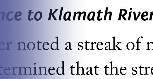
Typeface Combinations That Will Work in Your Book
I was surprised there was so much variety in this list. I tend to return to the same typefaces over and over again, and some are like old friends I’ve shared a lot of experiences with.
Here I want to go the next step. In each of these cases the typefaces had to enhance the readability and reflect something of the tone and genre of the individual work. Each of these combinations was arrived at after deliberation and comparison with other typefaces, in a collaboration between the book designer and the author/client.
If your book is in one of these genres, take a look at these combinations to create an effective and great-looking reading experience for your readers.
7 Typeface Combinations You Can Use
- Collection of interviews—This book uses Electra for the body type and Myriad Pro Black for heads. This is a combination you won’t see very often, and one I’ll be writing about in an upcoming article on font combinations for use in your books.
- Alternative health essays—Adobe Garamond Pro does excellent work here in dealing with a large number of formats requiring different sizes and keeping harmony on the page. Helvetica Neue Condensed for heads.
- Erotic stories—Here I used Warnock Pro, a very classy text face that offers a lot of flexibility when it comes to page length, and Myriad Pro Regular for heads.
- Historical biography—This heavily illustrated and annotated history seemed to demand to be set in Adobe Caslon Pro. Display type is set in several variations of Fontin Sans, a typeface that’s got style and legibility to add to the mix.
- Adventure memoir—Another heavily-illustrated book, this one has parallel text streams and an active approach to on-page graphics. The body type is Century Old Style and the heads are Electra Bold Display. I found the Electra had to be over 20 points to balance the Century, but the combination works beautifully.
- Supernatural novel—This upcoming novel based on old legends was derived from a template in my archives. This allows me to lower the cost of an interior design substantially. I then pick typefaces suitable to the specific book. In this case, I’m using Janson Text for the body type, one of the most-used typefaces in book production, and the lovely Nueva for display fonts.
- Self-help—A book embodying the unique worldview of the author, this design needed to accommodate checklists, activities and the other conventions of this genre. The text is set in the versatile Adobe Garamond Pro, and Chaparral is used for display purposes, with Franklin Gothic appearing in break-out text and subheads.


Every one of these typeface combinations produces a different and unique look. Combined with the typography, the page size and the use of graphic elements, you can mold these looks to suit the genre of the book you’re designing. You can use this list as a guideline, or switch the typefaces around to see what you get.
The more you set up pages and see what kind of impression they give, the more comfortable you’ll be with type design for your books.
Resources
- I’ve written before about combining typefaces and suggested three combinations you could use.
- There’s also a review of a useful book about typeface combinations you might be interested in: The Big Book of Font Combinations by Douglas Bonneville
