

By David Kudler
A while back, I wrote a review of the online ebook conversion tools available through the major retailers and aggregators. 1 It’s been a couple of years, and I thought it would be a good idea to revisit them and share any new findings. I was surprised to find many!
I’ll say this up front — none of the online conversion tools handled my rather complicated test document perfectly. In every case, there was something wrong that I would have to go in and edit in the ePub file. 2 But most (though not all) of the services3 did a passable job of digesting my document and converting it into a form that was at least recognizable. There wasn’t even one that got that far the last time out!
The Test Case
I created a Word document (originally as a .doc file, but saved also as a .docx file, since a number of services only take one and not the other).
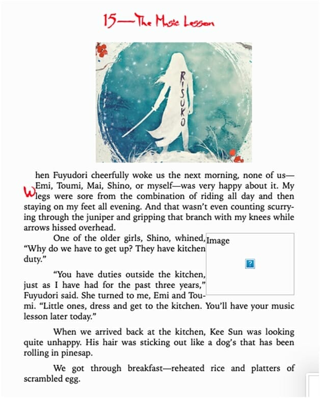
It’s essentially the same file that I used last time out — an extract from my novel Risuko with some added art. The only change I made this time was to add some color to the text, just to see how the conversion engines handled that. You can download the Word doc here.
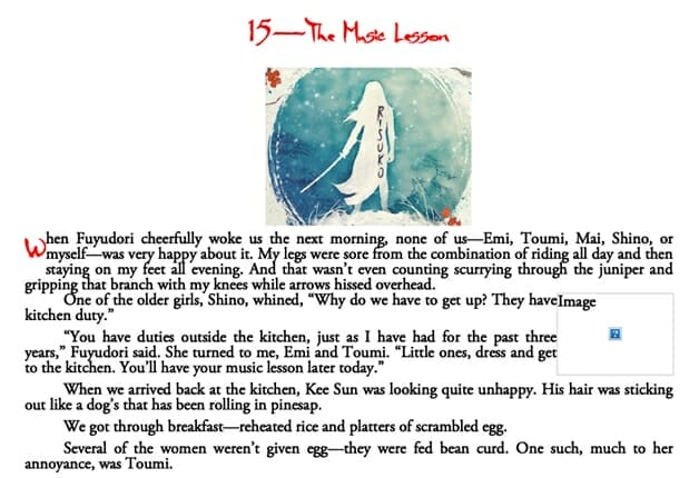
Here’s what the beginning of the file looks like:
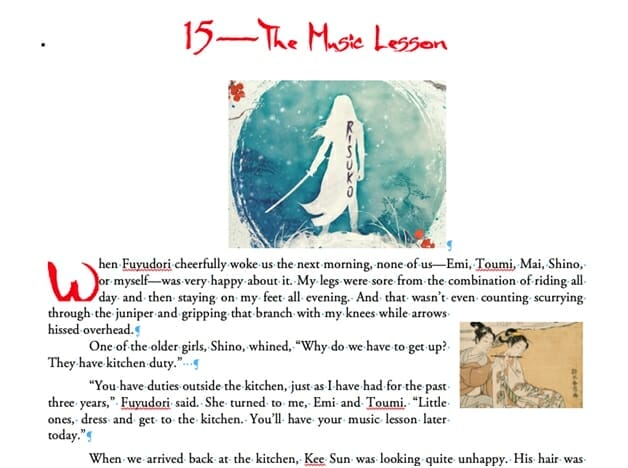
Note a few things, here. First of all, I’ve obviously used some non-standard fonts — one for the chapter number and another for the chapter title and drop cap. I didn’t expect any of the services to be able to handle them — as I mentioned recently, that’s hard to make happen even with an ePub file with properly embedded fonts. Still, I wanted to see what would happen.
Those custom fonts are colored bright red. It’ll be interesting to watch how that gets handled too.
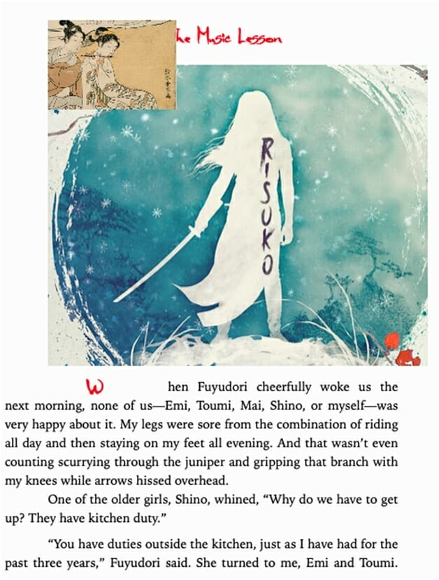
The body text is Garamond — a standard typeface that’s already installed on many computers, ereaders, and tablets. The text is set justified (that is, flush to the left and right margins), with a half-inch indent for each paragraph. There’s a drop cap (the big W) at the beginning — part of the first paragraph.
There are two images. The big one at the top (created from my cover) is on its own line, while the smaller one — the lovely Haranobu print of the flautist — is inset flush with the right margin. The text flows around it.
I figured that the art would be the sticking point for most of the services. I was right.
Now, this is probably more complicated than the typical novel, which has little to no art. But there are ebooks out there that require images, 4 and it’s important to see how the conversion tools are going to handle them. The idea was to push them a bit and see whether they’d buckle under the pressure.
The Competitors Enter
I chose to test all of the major English-language ebook retailers and aggregators that accept Word documents. Here’s who I looked at (listed by category alphabetically):
- Retailers
- Amazon’s KDP
- Barnes & Noble’s Nook Press
- Kobo’s Writing Life
- Aggregators
- Draft2Digital
- PublishDrive
- Smashwords
- StreetLib
Retailers
You’ll notice a couple of major names missing in the retailer category: specifically, Apple and Google. Their stores don’t accept Word documents, so there was no point in attempting the test with them! 5
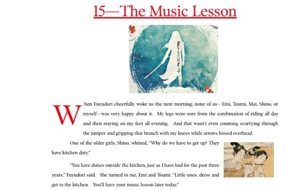
Amazon
The first name we looked at would be Amazon’s KDP, and not just because it’s first alphabetically. It’s the biggest ebook market in the world in every sense — most titles, most sold, most revenue. Outside the US, it may not be nearly as dominant as we see it here, but it remains the 800 lb. gorilla in the ebook room.
I expected KDP’s conversion to be one of the better ones — they’ve been doing this longer than anyone, after all. I wasn’t disappointed — though the result wasn’t perfect. Here’s the online previewer’s view of the converted document:
To give a consistent view with the rest of the reviews, I used the free desktop ebook converter Calibre to convert the .mobi file into ePub format so that I could open it in Apple’s Books app — the one I’ll be using to test the other conversions. For the sake of comparison, here’s the same book as an ePub:
Not bad. The text is properly justified, the colors are correct, and the drop cap is more or less properly sized (if a little small). The image at the top looks to be correctly placed. 6 The text is all set in Bookerly, but why not?
On the downside, the picture of the flautist is placed inline at the top of the paragraph, not inset to the right margin. (That image is going to be the choking point for nearly all of the conversions I look at.) Also, the drop cap is less than two ems (or standard capital letter heights) tall, rather than three, and there’s very little padding — the drop cap touches the text to its right.
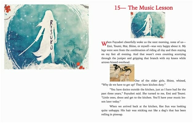
Barnes & Noble
Last time out, B&N’s Nook Press did an okay job — the images and drop cap placed properly and the title text was properly sized, but the body text had some bizarre variations in spacing and it was aligned to the left margin. 7 I expected a similar mixed bag this time out on the rebranded Barnes & Noble Press.
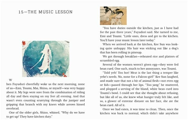
To my surprise, I got this:
That’s… pretty darn good. The colors are correct, the justification is correct, the font sizes are correct, and, more to the point, this was the only conversion I tried that managed to get the image of the flautist not only placed, but placed correctly. The line spacing was generous — actually, it’s larger than in the original, but I don’t mind that too much. Unlike most other conversions I did, there was no white space added after each paragraph. (You don’t need that if you’re indenting.)
The only quibble I might have is with the placement of the drop cap. In the original Word doc, the top of the big W8 is placed flush with the top of the paragraph and it’s three lines tall. Here, the drop cap is half a line below the top of the paragraph and while the letter itself is three lines tall (that’s 3 ems to you and me), the space it takes up is four lines tall — the whole first paragraph.
Still, not bad!
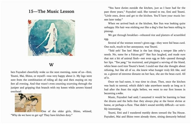
Kobo
Last time, the Kobo conversion was an absolute mess. Images? What images. Drop cap? What drop cap. Even worse, every paragraph had a random 10em space after it, making it look as if each paragraph were its own chapter.
This time out, I initially didn’t even get that far. The converter choked on my file — but when I tried again with the .docx file instead of the .doc file, I got this:
On the plus side, the color text shows up, and the drop cap and the images are both located correctly.
On the down side, the drop cap itself is awfully short — though the proper space is given for it — and the inset image doesn’t show up at all, though the frame does. Also, where the inset image in the original Word doc had a nice margin between it and the text, there’s no space at all here.
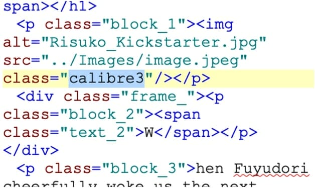
Out of curiosity, I opened the ePub file up and looked at the code. 9 I immediately spotted this:
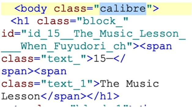
So… Kobo is using the Calibre conversion engine. Interesting. (Keep that in mind.)
Aggregators
Draft2Digital
D2D is a favorite of many indie publishers, both for its ease of use, its (fairly) thorough distribution plan, and its integration with Findaway Voices for audiobook creation and KDP Print for paperbacks.
Last time out, the D2D conversion was okay. It wasn’t as bad as that round’s Kobo conversion, at least. Everything was in more or less the right place, the images were both the right size, and the body text looked fairly clean.
On the other hand, the drop cap was totally out of position and the second image (the flautist) showed up inline at the beginning of the paragraph, not inset to the right.
This time out… was exactly the same:
Well… That’s not great. Also, note that the drop cap and chapter head are both black, not bright red as they were in the original Word doc.
PublishDrive
I wasn’t using this service last time out — it’s quickly become a favorite of mine, since they distribute everywhere Smashwords or Draft2Digital do — with a few additions. For folks with fairly high volume sales ($1000+ gross), they have a flat-rate plan that can save you money. They don’t integrate with Findaway Voices like the other two, but hey, I can set up my own Findaway account and work with them directly. Besides, this is an ebook post!
I’d done some simple conversions when they switched from a paid to a free conversion service last year and knew they’d handle a text-only document fine, but I was curious how they’d handle my test. The answer was… okay:
In fact, this is identical to the Kobo conversion. Huh.
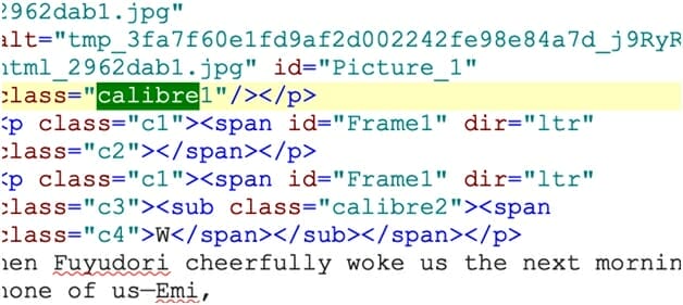
Curious, I once more looked under the hood, and noticed something interesting. Once again, the conversion had been done by a customized version of the open-source software Calibre:
I’ll have more to say about that in a bit.
Smashwords
Like many of you, I owe Mark Coker and Smashwords a great deal. They are one of the best established and best loved aggregators in the business. Mark has been a passionate advocate for independent publishing for more than a decade. Their distribution list is wider than D2Ds, especially overseas — but doesn’t include Amazon or Google, as D2D and PublishDrive do. Their style guide is thorough and well thought through. 10
Last time out, Smashword’s famed “Meat Grinder” conversion provided a mixed bag of results. The drop cap was there and, while a bit smaller than in the original, looked okay. The first image was correctly positioned, though too big. The second image, however, rather than appearing to the right of the second paragraph, overlapped the chapter head. At least it was the right size.
This time out looked… familiar:
The color of the chapter head and the drop cap display correctly, and it even shows the custom brush typeface — but only because the font is installed on my computer.
On the downside, the size of the drop cap is off — it shows up the same size as the body text, and, while not inset, has an enormous amount of white space between it and the rest of the word. And the pictures are still a mess. Again, the inset image is up at the top of the page, and the chapter head image is HUGE, flowing past the right margin.
Again, I was curious and so I looked at the underlying code. 11 Yet again, I saw Calibre-generated tags:
Well, if the Meat Grinder is just Calibre…? Hmm. (I’ll talk about this in depth at the bottom of the post.)
StreetLib
Another newcomer this time out was Italy’s StreetLib, which has a fairly broad distribution list and (like D2D) can help you create not only ebooks but also print.
The results of StreetLib’s conversion was, once again, mixed:
The chapter head text and image seem fine. The paragraphs look good (though the indent is a bit small). The text is properly justified — as I’m pleased to say it has been in every conversion this time out. (Also, unlike last time, the text all displayed in either Garamond or another serif font.)
On the other hand, the drop cap is floating in its own space above the first paragraph, the red text isn’t red, and the inset image shows up on its own line — interestingly, below the paragraph it was anchored to, rather than inline, as in all of the other cases.
Cloudy Conclusions Redux
I need to reiterate that I designed my test document specifically to push these online converters. For most books, with simple formatting and few if any interior images, I can affirm that they work quite well. 12 But a more complex job — like my test doc — can cause havoc on all of them.
I was pleasantly surprised to find that Barnes & Noble Press was the cream of this round’s crop. It handled both text formatting and image placement quite well. You might consider using their converter, and then upload the resultant ePub file to the others. 13
However, since the B&N file wasn’t (for me, at least) perfect, I want to make another recommendation: just use Calibre. It’s a free app that runs on Windows, Mac, and Linux, and can not only open, read, and convert a wide variety of formats — from .mobi to ePub to old Microsoft (LIT) and Sony (LRF) Reader files to, yes, Word .docx — but it can edit the resulting ePub code. The conversion engine is the same one that, as I pointed out, Kobo, PublishDrive, and Smashwords use, but when you run it on your computer the conversion settings are highly customizable.
Running the Word doc through Calibre on my Mac (without customizing the settings at all) I came up with an ePub file that looks a lot like the one that Kobo and PublishDrive created:
Again, the custom typefaces are displaying properly because I have them installed on my Mac. But otherwise there are only really two quibbles: the size of the drop cap and the missing image. By going into Calibre’s Edit book function, 14 it was a trivial matter to fix both of those. I re-imported the image (Calibre no longer read the file as a valid JPEG for some reason), 15 and played around with the CSS for about five minutes, and voilà!
I’m sure there are things to improve there — there always are — but that is pretty close to exactly what I’d put in the Word doc. 16 I even made the chapter head image proportional to the “page” size and added a margin for the inset image. If I wanted to, I could take that ePub file and load it onto any of the retailer and aggregator sites with a high degree of confidence that the ebook would display the way I wanted it to.
You? You get to do what you want to do.
1 Just a refresher — an aggregator distributes ebooks to retailers, taking a cut for the service. Why they’re not called distributors like the folks who do the same thing with print books… I have no idea.
2 Or, in the case of Amazon’s .mobi files, convert to ePub, make the changes, then re-upload and hope the conversion goes better this time.
3 Except Kobo. See below.
4 Even if they’re just screenshots of text used as decorative headers, etc., as I suggested in my last post about fonts.
5 They both accept ePub files, so if you’ve converted the file yourself (or had someone do it for you), you’re all set. Google also accepts PDF files — of the print edition, at least theoretically. But that’s not the same thing as a Word doc.
6 If I were going to nitpick, I’d make the size of the image proportional, using percentages rather than pixels, so that it resized depending on the resolution of the screen. Unfortunately, Word can’t do that, so I’d have to stay with what’s here.
7 What book designers call “rag right” — the right side of the text is uneven.
8 Great. Now I’m thinking of Jimmy Durante in It’s a Mad, Mad, Mad, Mad World.
9 Actually, I did this for all of the conversions.
10 I find it restrictive — but that’s me. For most ebook designers, especially newcomers, it’s a great way to make sure your book will display well on a number of devices… even if many of them haven’t been on the market for years.
11 Again, I actually did this with every conversion; however, I only noticed anything interesting with Kobo, Smashwords, and PublishDrive.
12 Well, okay, because I’m a nut about this, I would still prefer to roll my own. But that’s me.
13 Not absolutely sure that this is okay with their terms of service. Just saying.
14 Try right-clicking (or control-clicking) on the title in the library view. Alternately, you can edit the ePub file in Sigil.
15 Almost certainly something about the way Word handles images.
16 Okay, since you asked: I’d play around with the line spacing — it feels a bit tight. Also, why is there white space after each paragraph (except, weirdly, for the first one) on top of an indent? One or another, people, not both!
Photo: BigStockPhoto
