

Welcome to the e-Book Cover Design Awards. This edition is for submissions during May, 2018.
This month we received:
70 covers in the Fiction category
11 covers in the Nonfiction category
Comments, Award Winners, and Gold Stars
I’ve added comments (JF: ) to many of the entries, but not all. Remember that the aim of these posts is educational, and by submitting you are inviting comments, commendations, and constructive criticism.
Thanks to everyone who participated. I hope you enjoy these as much as I did. Please leave a comment to let me know which are your favorites or, if you disagree, let me know why.
Although there is only winner in each category, other covers that were considered for the award or which stood out in some exemplary way, are indicated with a gold star: ★
Award winners and Gold-Starred covers also win the right to display our badges on their websites, so don’t forget to get your badge to get a little more attention for the work you’ve put into your book.
Also please note that we are now linking winning covers to their sales page on Amazon or Smashwords.
Now, without any further ado, here are the winners of this month’s e-Book Cover Design Awards.

e-Book Cover Design Award Winner for May 2018 in Fiction
James Egan submitted Hell in a Handbasket designed by James T. Egan of Bookfly Design.


JF: A perfect cover for this romantic mystery, subtly emphasizing the contrast between the placid, finely-wrought illustration with the mystery-oriented title. A real winner.
e-Book Cover Design Award Winner for May 2018 in Nonfiction
Jay Artale submitted A Turbulent Mind designed by Jessica Bell. “This is a poetry collection about the ravages of Alzheimer’s and I wanted the cover to reflect the conflict and confusion.”
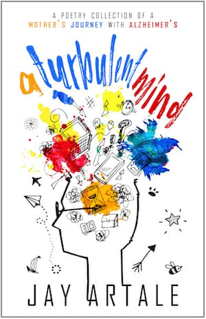
JF: An energetic, cohesive design that combines illustration and title typography in one creative gesture.
Fiction Covers
AJ Ilentamhen submitted Liberty designed by AJ Ilentamhen. “Honestly, the cover speaks for itself”

JF: I agree it speaks for itself, but what is it saying? I like the clean design are artful graphics (needs a border to not “bleed” onto white web pages) but will readers guess what kind of book it is, or for whom it is intended?
Alex Washoe submitted A Land of Iron designed by Alex Washoe. “I wanted a strong, active cover that captured the Western flavor of the story.”

JF: And I think you’ve done that. Although the title might stand out a bit more, there’s little to complain about on this action-oriented cover.
Andrew Schrader submitted What Goes On in the Walls at Night designed by Jordan Harris. “I love old science and speculative fiction covers. There’s something in them that brings me back to childhood, which I hope I also give to readers. Thanks!”

JF: You can’t argue with a crown rack of character, that’s one interesting image. And while the cover is reminiscent of old sci-fi, the combination of the 2 fonts at the top seems jarring, they really don’t go together very well.
Anna Faversham submitted One Dark Night (The Dark Moon Series Book One) designed by Lexi Revellian.
")
JF: All three of these series covers have drama, a clear scene, and allusive type that make them work.
Anna Faversham submitted Under a Dark Star (The Dark Moon Series Book Two) designed by Lexi Revellian.
")
Anna Faversham submitted One Dark Soul (The Dark Moon Series Book Three) designed by Lexi Revellian.
")
Carol Park submitted Banebringer designed by Brit K. Caley. “The cover for this fantasy novel features original artwork by the cover designer.”

JF: The art is atmospheric and menacing, but the title should be easier to read.
Caroline Walken submitted Nowhere on the Map designed by Talia’s Book Covers. “The setting for Nowhere on the Map is a small town, I found an image of the couple embracing with the countryside as a backdrop that was perfect. Talia’s Book Covers did a great job with the raw image creating the perfect cover for me.”

JF: A confusing image and inappropriate fonts weaken this attempt.
Carolyne Aarsen submitted Homecoming designed by Carolyne Aarsen. “I was really happy with what Clarissa did with my cover. To me it conveys the genre and what to expect.”

JF: Gets the point across, and there’s no mistaking what kind of book this is. Good image compositing, too.
Chuck Klinger submitted Islandia: The Lost Colony designed by James Wintle. “The cover design took nearly 8 months to get right. We wanted to make sure that the cover told a story, was different from other sci-fi novels and had a strong juxtaposition between the sailboat and the alien city.”

JF: The sci-fi element is in the details when you look longer at the city on the hill. Handsome and well put together. ★
Cody Wagner submitted The Gay Teen’s Guide to Defeating a Siren, Book 1 designed by Robin Vuchnich.

JF: I really like both the fun artwork and matching title typography, but it seems the title would be more effective if it was a bit larger.
Craig Hart submitted The Legend Fulfilled designed by Craig A. Hart.

JF: A solid sci-fi cover that promises lots of spacecraft-based action.
Craig Hart submitted A Dark Clock designed by Craig A. Hart.

JF: Obscure.
Damon Freeman submitted The Game Bird designed by Damonza.com.

JF: Encapsulates the story, its setting, and the appeal of the unexpected in one dramatic cover.
Damon Freeman submitted The Savage Dawn designed by Damonza.com.

JF: Telegraphs its dystopian milieu and the action that’s about to take place, emphasized by the blocky title with its spiky elements.
Damon Freeman submitted Outbreak designed by Damonza.com.

JF: Here the designer relies on the character and his accoutrements to convey the genre and its implications of action, and it works.
Dan Van Oss submitted Sealing Fate designed by Dan Van Oss.

JF: A strong appeal to readers of political thrillers.
Dan Van Oss submitted Independence Realm designed by Dan Van Oss.

JF: Beautiful artwork and pro-level title typography set this cover apart, and the highlight on the key provides an effective focal point. ★
Dan Van Oss submitted For The Good of All designed by Dan Van Oss.

JF: Although this cover is pretty busy, the composition aids the intended “eye-path” and clearly implies the type of story to be found inside.
Darja DDD submitted Lover’s Rebirth designed by Milo from Deranged Doctor Design. “Paranormal & Urban Fantasy cover design by Milo from Deranged Doctor Design, Circle of Blood Book One”

JF: This series design (see 2 following) has good elements in the portraits, title treatment and background moon, but the elements don’t seem to come together easily.
Darja DDD submitted Lover’s Awakening designed by Milo from Deranged Doctor Design. “Paranormal & Urban Fantasy cover design by Milo from Deranged Doctor Design, Circle of Blood Book Two”

Darja DDD submitted Lover’s Sacrifice designed by Milo from Deranged Doctor Design. “Paranormal & Urban Fantasy cover design by Milo from Deranged Doctor Design, Circle of Blood Book Three”

Darja DDD submitted Wetworld designed by Milo from Deranged Doctor Design. “It was author’s request to keep the same art on all the covers in this series, and just change the overall color.Science Fiction & Fantasy book cover design by Milo from Deranged Doctor Design, Alien Rebellion Book 1”

JF: I think it works. The change of the title and color are more than enough to set off the designs from one another.
Darja DDD submitted Grotto of Silence designed by Milo from Deranged Doctor Design. “Science Fiction & Fantasy book cover design by Milo from Deranged Doctor Design, Alien Rebellion Book 2”

Darja DDD submitted Weave a Wizardry Web designed by Milo from Deranged Doctor Design. “Science Fiction & Fantasy book cover design by Milo from Deranged Doctor Design, Enclave Book 1”

JF: Another strong series design. In addition to the colorful title treatments, central symbol, and varying backgrounds, note how the designer has varied the circle around the symbol with different effects, a subtle but noticeable detail.
Darja DDD submitted Dream a Deadly Dream designed by Milo from Deranged Doctor Design. “Science Fiction & Fantasy book cover design by Milo from Deranged Doctor Design, Enclave Book 2”

Darja DDD submitted Sing a Graveyard Song designed by Milo from Deranged Doctor Design. “Science Fiction & Fantasy book cover design by Milo from Deranged Doctor Design, Enclave Book 3”

Dean Rencraft submitted Mabus designed by Dean Rencraft. “The name Mabus is from the prophecies of Nostradamus, hence the aging of the cover. The Pheonix and the fire represent the antichrist rising from the ashes and it is set within the Mayan calendar. The cover is a mix of religions and beliefs that represent these (and other) elements in the story.”

JF: The concept for the cover and basic layout seem good, but I’m not sure it achieves the effect you were looking for or the impact that would make it stand out from the crowd.
Deborah Coonts submitted Lucky Now and Then designed by Glendon of Streetlight Graphics.

JF: One of a long series of covers using the same basic design with the “neon” lettering and emphasis on the well-known author’s name. This will undoubtedly be warmly received by her fans.
Diane Byington submitted Who She Is designed by Streetlight Graphics. “The book is about a girl who wants to run the Boston Marathon, but she’s poor (which explains the dirty tennis shoes) and there’s a mystery about her family (which explains the title).”

JF: An evocative design that, to my mind, could be improved by stronger typography.
Elmer Reedy submitted Upon Broken Wings designed by Jay Aheer. “Upon Broken Wings is a YA story takes place in the living world, the afterlife, and the borderlands in between. Jay did a fantastic job of capturing the essence of all three. The boys on the cover are silhouettes, because they no longer belong in our world.”

JF: A well designed cover with interesting elements like the casual style for the title, but I’m not sure we get any flavor of the fantasy part of the story. It could just as easily be used for a contemporary romance.
Harald Johnson submitted New York 1609 designed by Harald Johnson. “The new Omnibus Edition of my birth-of-New-York-City historical fiction story. New book, new ISBN/ASIN.”

JF: The simplicity of the design helps it make an impact, although the combination of typefaces—one modern, the other alluding to early America—might seem a bit jarring.
Harmony Ink submitted A Tangle of Secrets designed by Tiferet Design.

JF: The title draws our attention from the boy to the fact that there’s a whole world below, setting us up for the story to come.
Holly Heisey submitted Dead Links designed by Holly Heisey.

JF: A simple and effective genre cover that helps introduce us to the world of the story.
Holly Heisey submitted Playing with Fire designed by Holly Heisey.

JF: Expert type handling and an attractive couple combine with the flame motif to help this cover stand out as a unified whole.
Holly Heisey submitted Night of the Hidden Fang designed by Holly Heisey.

JF: Exactly the right tone for this fantasy/horror novel. The spectral creature in the background drives the young woman right toward us, a very engaging concept.
Isaac Grisham submitted The King’s Sun designed by Dissect Designs.

JF: Interesting idea, the execution has left the art on the edge of being hard to read, and whatever is under the title is indecipherable.
Ivan Zanchetta submitted Perfektion designed by Ivan Zanchetta. “I was asked to create a dystopian cover about genetic manipulations in a near future.”

JF: It has all those elements, although I would have liked to see the title stronger considering how active the background is.
Jade SPS submitted Stolen Obsession designed by Steam Power Studios.

JF: Nicely intriguing details make us wonder how the necklace ended up on a beach, and combine with the title to draw us into the story.
Jaden Sinclair submitted Julaina’s Farewell- Bloodmate 1 designed by Caroline Andrus. “I worked closely with Caroline on all of my covers, to give a special touch. We worked together at finding the right artwork as well as the right model to fit title, or series.”

JF: In a word, awkward. In several ways.
James Callan submitted Political Dirty Trick designed by Adrijus Guscia.

JF: Comes across as slightly muddy, although it works.
James Egan submitted The Neon Boneyard designed by James T. Egan of Bookfly Design.

JF: Part of the excitement of this cover comes from the vivid color combination.
James Egan submitted Serial Killer Z: Infection designed by James T. Egan of Bookfly Design.

JF: Bold and impactful.
Jeffrey Greenberg submitted Veronica Mars – the TV series: The Scarlet Liter designed by Merrick Green. “The cover attempts minimalistic noir iconographic imagery around the titular object (a 1-liter bottle of red soda) and the central scarlet theme. Echoes imagery from other modern neo-noirs (Body Heat). Protagonist’s name and character branding is prominently displayed on the bottom.”

JF: Appears to have been assembled from pieces that don’t necessarily belong together. The weak title and mismatched blocks at the bottom complete the effect.
Jeffrey Greenberg submitted Veronica Mars – the TV series: The Secret World of Callie Beck designed by Merrick Green. “The cover attempts minimalistic noir iconographic imagery of distinctive pink needle-nosed pliers, and related color scheme. Pliers used (or abused) by villain sex trafficker/blackmailer on one of her victims, early on, and later in victim’s redemption. Protagonist’s name and brand is prominent.”

JF: See my comments above. Despite the efforts, these covers appear very amateurish.
Jeffrey Greenberg submitted Veronica Mars – the TV Series: Woolf and Lamb designed by Merrick Green. “The cover attempts noir iconography with distinctive Balboa County Sheriff badge on LGBTQIA flag background. Title characters are antagonists, a sheriff, and a boy who bullies gay classmate. Cover scene from Sheriff Lamb doffing badge to have sex with Woolf’s mom. Protagonist’s name is prominent.”

JF: See above, ditto.
Jewel Allen submitted Heartbreak & Outbreak designed by Jewel Allen.

JF: The basic illustration is adorable, the typography is appropriate, but the hand with the syringe is wildly out of place, regardless of the “point” the designer was trying to make.
John Etzil submitted Airliner Down designed by Damonza.

JF: A masterful treatment that telegraphs dramatically everything we need to know about this book. The upward-looking angle and strong type help enforce the effect. ★
Laurie May submitted Niko and the Shades designed by Kit Foster. “I approached Kit Foster because I liked his ability to convey atmosphere, and a quirky intelligence that I thought would match my book. I gave him some excerpts from the beginning of the novel, and asked for a spooky fantasy cover that would appeal to a broad audience, especially teen boys.”

JF: Good move, it’s pretty spooky.
Laurie Scott submitted In Like a Lion designed by Laurie Scott. “In Like a Lion was published by Cressy Lakeside Books in Prince Edward County, Ontario, Canada. The author designed the cover using Adobe Photoshop.”

JF: A good concept and composition, but it desperately needs more contrast.
Lexi Revellian submitted Future Warrior (Time Rats Book 3) designed by Lexi Revellian.
")
JF: I’m sure fans will love it.
Lisa Lickel submitted Centrifugal Force designed by Rodney Schroeter. “The ring is an important element to the story. The designer, Rodney, suggested the echoing elements of the faces of the main characters, and said he had to learn how to show the opposing profile in the shadow of the stone.”

JF: It’s a lovely but easily-missed detail. The type is very weak and out of balance with the illustration.
Lynn Veevers submitted Pinnacle designed by Cora Graphics.

JF: Well drawn and nicely presented.
Maria Vermisoglou submitted The cursed girl designed by Jessica Allain.

JF: The beautiful illustration does a good job of setting the stage for the story, but it has been allowed to push the title almost off the cover, and the subtitle is unreadable.
Matt Kozar submitted Angels on the Bridge designed by Joe Kindya. “The cover for Angels on the Bridge was designed by Joe Kindya, the ownerof Brooklyn Ink, a tattoo shop in Bay Ridge, Brooklyn.”

JF: With all due respect, Joe should stick to tattoos, and you should hire a professional book cover designer.
Melanie Tomlin submitted Angel’s Demon designed by Melanie Tomlin.

Michael Thies submitted The Trials of the Core designed by Angela Schmitt. “Futuristic fantasy and science-fiction novel. The image is a wax seal that is placed on invitation letters sent to open up the novel.”

JF: Simple and direct, might benefit from some texture in the background.
Michele Orwin submitted Getaway designed by Carol March and Al Pranke. “Carol Marh, an artist friend of the author’s created the striking image. Then Al Pranke made it a book cover.”

JF: Simplicity makes it effective, although large areas of black on ebook covers are usually to be avoided, in my opinion.
Mike Wehner submitted The Girl Who Can Cook designed by Mike Wehner. “Cover was a bit of an accident. I took a photo of my wife to use as reference for a painting and I fiddled with it in Photoshop a bit and the basic design happened. So it’s my wife on the cover! Genre – Psychological Romantic Thriller”

JF: The perspective effect on the title is unnecessary and weakens the overall affect, especially since the font isn’t very strong to begin with.
Monica Bentley submitted Chateau of Desire designed by Rebeca Covers. “I had specific things I wanted in the cover and Rebeca was able to put it all together in a beautiful way. This is book one in a series, and the series contains similar aspects that make sense as a series.”

JF: A lovely series design (2 following) with gorgeous typography, exciting images, with atmospheric touches, all integrated into a consistent and appealing message. ★
Monica Bentley submitted Chateau of Longing designed by Rebeca Covers.

Monica Bentley submitted Chateau of Passion designed by Rebeca Covers.

Nathan Nixon submitted Ace Darkly: The heavy metal man designed by Nathan Nixon. “I designed the cover myself, using dynamic art that I found online as the basis for the main characters. Everything was created using paint.net. I drew the characters individually and spent close to a week putting it all together.”

JF: Nathan, I’m sure you learned a lot, but you can’t make yourself a cover designer in a week, and this “cover” is the proof.
R G Ainslee submitted The Latakia Intercept: A Ross Brannan Thriller designed by RG Ainslee. “I wanted a cover design that fit my Amazon thriller categories: espionage and military.”

JF: Keeping it simple helps, and you’ve got the right visual signals. The deep effect on the title is gratuitous and the cover would be stronger without it.
Rick Holland submitted Outlier Revolutions designed by Rick Holland / Vision Press. “I used a vivid, chiastic composition for this Sci-Fi Thriller.”

JF: Watch out, the action is coming right at you! Well done.
Tabatha Stirling submitted Wolf Head designed by Tabatha Stirling.

JF: The title looks misaligned.
Tim McConnehey submitted Primary Anomaly designed by Andrea Ho.

JF: I love the spectral atmosphere created by the illustration, but do with the title was stronger.
Toni Boughton submitted BLACK HARE designed by Toni L.H. Boughton. “Self-published author. I designed this cover in GIMP for my urban fantasy novel about a woman with a mysterious bond to a mystical black hare.”

Yuvaraja Dhayanithi submitted Merjella designed by Ayobola Kekere. “Merjella is a super powerful character formed when a beautiful octopus engulfs a young girl, who was stabbed and thrown into the sea.”

JF: Wow, that’s some creature! Lots of style in this idiosyncratic design. ★
Nonfiction Covers
Allyson Leak submitted The Goddess Potential: A Guide To Developing A Relationship With Your Inner Self designed by Kia Kelliebrew. “I wanted a cover that was feminine, beautiful, and powerful because that is the whole point of the book itself.”

JF: Very stylish, although for a nonfiction book it’s really important that browsers can easily read your subtitle.
Connie Bombaci submitted Hogan’s Hope: A Deaf Dog, A Courageous Journey, and A Christian’s Faith designed by iUniverse. “The cover photograph was taken candidly by the author’s daughter as they visited on their back porch. It was the only picture that the Connie wanted as it reveals the feeling and bond of the close, loving relationship between Hogan and his human mama.”

JF: Beautiful dog, and a good job given the restriction.
Corrinne Walker submitted Lashonna cargin dealing with OCD part two bonus stores designed by Kindle direct publishing.

Damon Freeman submitted Amsterdam Exposed designed by Damonza.com.

JF: Sets a lovely scene, but the title seems to need more contrast to keep it from becoming murky.
Damon Freeman submitted Rock Your Au Pair Year designed by Damonza.com.

JF: A fun, upbeat design that perfectly suits its audience. ★
Damon Freeman submitted More Than A Millionaire designed by Damonza.com.

JF: Well suited to its intended audience.
Jennifer Clair submitted Six Basic Cooking Techniques: Culinary Essentials for the Home Cook designed by Dan Weise. “This is my first cookbook, but have long known that the cover is critical to make someone want to buy it, and tell the story about what the reader can expect within its pages. I look forward to your comments. Best, Jennifer”

Line Newermann submitted The Universe a Work of Art designed by Eva & Line Newermann. “The cover is an acrylic painting by Eva Newermann, it illustrates the first astronaut to freely float in space.”

Teddi Black submitted Reflections of a Southern Boy designed by Teddi Black.

Trayle Kulshan submitted Revolutions designed by Trayle V Kulshan. “The cover images are part of a “Phenakistoscope” collection, an optical illusion to be spun on a disk making a moving image. It is spinning or “Revolving” harking back to the title. “Revolutions” has several meanings in the book – turning around or returning back, as well as an uprising.”

Well, that’s it for this month. I hope you found it interesting, and that you’ll share with other people interested in self-publishing.
Use the share buttons below to Tweet it, Share it on Facebook, Plus-1 it on Google+, Link to it!
Our next awards post will be on July 30, 2018. Deadline for submissions will be June 30, 2018. Don’t miss it! Here are all the links you’ll need:
- The original announcement post
- E-book Cover Design Awards web page
- Click here to submit your e-book cover (See New Submission limits)
- Follow @JFBookman on Twitter for news about the E-book Cover Design Awards
- Check out past e-Book Cover Design award winners on Pinterest
- Subscribe to The Book Designer Blog
- Badge design by Derek Murphy
